


flex布局,父元素属性可参考:flex布局 ,本文主要介绍flex添加到子元素的属性。
<div class="father">
<div class="left"></div>
<div class="middle"></div>
<div class="middle"></div>
<div class="middle"></div>
<div class="right"></div>
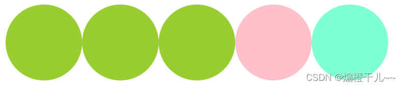
</div>1、order
改变子元素的排列顺序,默认值为 0,可选参数:inherit | initial | unset ,可以为负值,数值越小排列越靠前。
.father{
  display: flex;
}
.left{
  order: 3;
  width: 100px;
  height: 100px;
  border-radius: 50%;
  background-color: aquamarine;
}
.middle{
  order: -2;
  width: 100px;
  height: 100px;
  border-radius: 50%;
  background-color: yellowgreen;
}
.right{
  width: 100px;
  height: 100px;
  border-radius: 50%;
  background-color: pink;
}
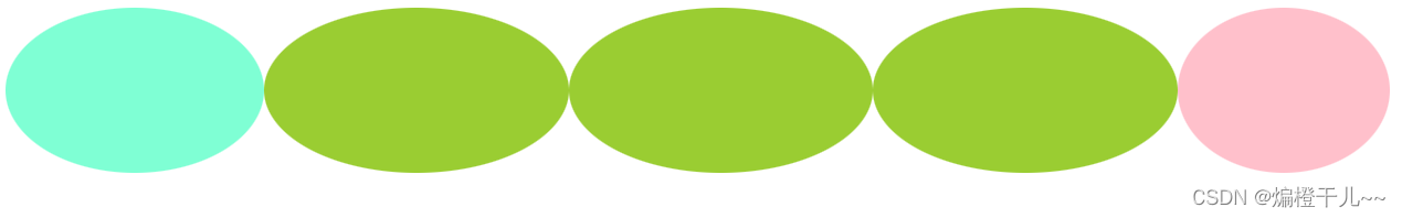
2、flex-grow
子元素弹性扩展的比例,可选参数:inherit | initial | unset ,也可以是数字,不能是负数,默认为 0。如果所有子元素的 flex-grow 的值都为数字的话,则会把父元素分为若干份,每个子元素根据 flex-grow 的值扩展。
.father{
  display: flex;
}
.left{
  flex-grow: 2;
  width: 100px;
  height: 100px;
  border-radius: 50%;
  background-color: aquamarine;
}
.middle{
  flex-grow: 3;
  width: 100px;
  height: 100px;
  border-radius: 50%;
  background-color: yellowgreen;
}
.right{
  width: 100px;
  height: 100px;
  border-radius: 50%;
  background-color: pink;
  flex-grow: 1;
}
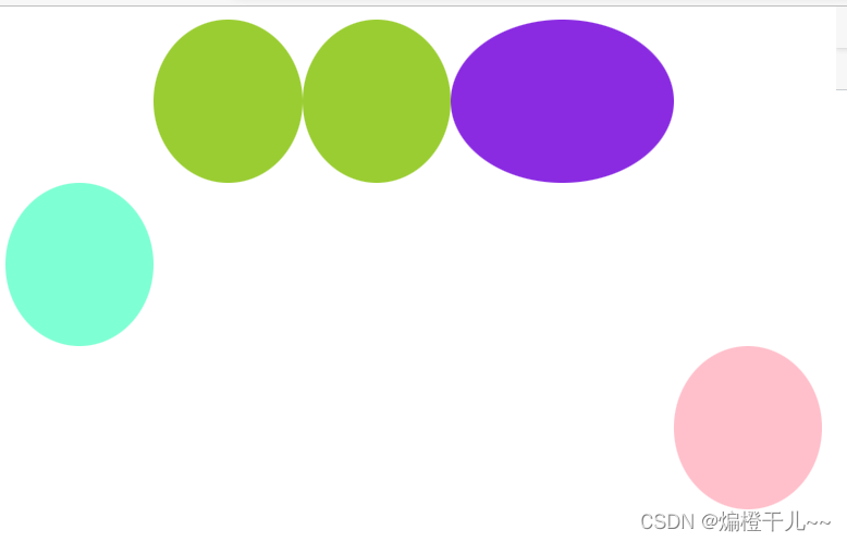
.father{
  display: flex;
}
.left{
  flex-grow: 2;
  width: 100px;
  height: 100px;
  border-radius: 50%;
  background-color: aquamarine;
}
.middle{
  flex-grow: 3;
  width: 100px;
  height: 100px;
  border-radius: 50%;
  background-color: yellowgreen;
}
.middle-unset{
  flex-grow: unset;
  width: 100px;
  height: 100px;
  border-radius: 50%;
  background-color: blueviolet;
}
.right{
  width: 100px;
  height: 100px;
  border-radius: 50%;
  background-color: pink;
  flex-grow: 1;
} 
3、flex-shrink
控制子元素如何收缩,默认是 1,可选参数:inherit | initial | unset ,可以是 number ,不能为负数,一般写 flex-shrink:0,防止变廋。
.father{
  display: flex;
}
.left{
  flex-shrink: 1;
  width: 100px;
  height: 100px;
  border-radius: 50%;
  background-color: aquamarine;
}
.middle{
  flex-shrink: 2;
  width: 100px;
  height: 100px;
  border-radius: 50%;
  background-color: yellowgreen;
}
.middle-unset{
  flex-shrink: 3;
  width: 100px;
  height: 100px;
  border-radius: 50%;
  background-color: blueviolet;
}
.right{
  width: 100px;
  height: 100px;
  border-radius: 50%;
  background-color: pink;
  flex-shrink: 0;
}
4、flex-basis
控制基准大小,默认是 auto,可选参数:inherit | initial | unset ,可以是 width 或 height,也可以是百分数,不能为负值,表示在不伸缩的情况下子容器的原始尺寸。横轴为主轴时,表宽度,主轴为纵向时代表高度。
.father{
  display: flex;
}
.left{
  flex-basis: 10%;
  width: 100px;
  height: 100px;
  border-radius: 50%;
  background-color: aquamarine;
}
.middle{
  flex-basis: 100px;
  width: 100px;
  height: 100px;
  border-radius: 50%;
  background-color: yellowgreen;
}
.middle-unset{
  flex-basis: 100px;
  width: 100px;
  height: 100px;
  border-radius: 50%;
  background-color: blueviolet;
}
.right{
  flex-basis: 200px;
  width: 100px;
  height: 100px;
  border-radius: 50%;
  background-color: pink;
}
5、align-self
单独定义子元素沿交叉轴排列的方式,可选参数:flex-start | center | flex-end | baseline | stretch,与align-items的使用方式基本相同。
.father{
  display: flex;
  height: 300px;
}
.left{
  align-self: center;
  width: 100px;
  height: 100px;
  border-radius: 50%;
  background-color: aquamarine;
}
.middle{
  flex-basis: 100px;
  width: 100px;
  height: 100px;
  border-radius: 50%;
  background-color: yellowgreen;
}
.middle-unset{
  flex-basis: 150px;
  width: 100px;
  height: 100px;
  border-radius: 50%;
  background-color: blueviolet;
}
.right{
  align-self: flex-end;
  width: 100px;
  height: 100px;
  border-radius: 50%;
  background-color: pink;
}


 914
914


 被折叠的 条评论
为什么被折叠?
被折叠的 条评论
为什么被折叠?
 到【灌水乐园】发言


