


datawhalechina/fantastic-matplotlib
第三回:布局格式定方圆
第三回:布局格式定方圆
import numpy as np
import pandas as pd
import matplotlib.pyplot as plt
plt.rcParams['font.sans-serif'] = ['SimHei']   #用来正常显示中文标签
plt.rcParams['axes.unicode_minus'] = False   #用来正常显示负号
一、子图
1. 使用 plt.subplots 绘制均匀状态下的子图
返回元素分别是画布和子图构成的列表,第一个数字为行,第二个为列,不传入时默认值都为1
figsize 参数可以指定整个画布的大小
sharex 和 sharey 分别表示是否共享横轴和纵轴刻度
tight_layout 函数可以调整子图的相对大小使字符不会重叠
fig, axs = plt.subplots(2, 5, figsize=(10, 4), sharex=True, sharey=True)
fig.suptitle('样例1', size=20)
for i in range(2):
    for j in range(5):
        axs[i][j].scatter(np.random.randn(10), np.random.randn(10))
        axs[i][j].set_title('第%d行,第%d列'%(i+1,j+1))
        axs[i][j].set_xlim(-5,5)
        axs[i][j].set_ylim(-5,5)
        if i==1: axs[i][j].set_xlabel('横坐标')
        if j==0: axs[i][j].set_ylabel('纵坐标')
fig.tight_layout()
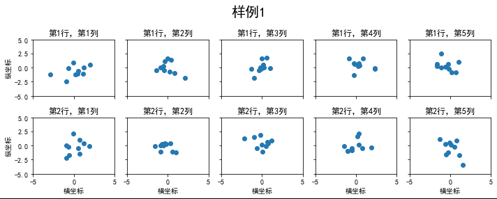
subplots是基于OO模式的写法,显式创建一个或多个axes对象,然后在对应的子图对象上进行绘图操作。
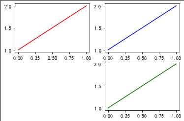
还有种方式是使用subplot这样基于pyplot模式的写法,每次在指定位置新建一个子图,并且之后的绘图操作都会指向当前子图,本质上subplot也是Figure.add_subplot的一种封装。
在调用subplot时一般需要传入三位数字,分别代表总行数,总列数,当前子图的index
plt.figure()
# 子图1
plt.subplot(2,2,1)
plt.plot([1,2], 'r')
# 子图2
plt.subplot(2,2,2)
plt.plot([1,2], 'b')
#子图3
plt.subplot(224)  # 当三位数都小于10时,可以省略中间的逗号,这行命令等价于plt.subplot(2,2,4)
plt.plot([1,2], 'g');
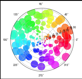
除了常规的直角坐标系,也可以通过projection方法创建极坐标系下的图表
N = 150
r = 2 * np.random.rand(N)
theta = 2 * np.pi * np.random.rand(N)
area = 200 * r**2
colors = theta


plt.subplot(projection='polar')
plt.scatter(theta, r, c=colors, s=area, cmap='hsv', alpha=0.75);
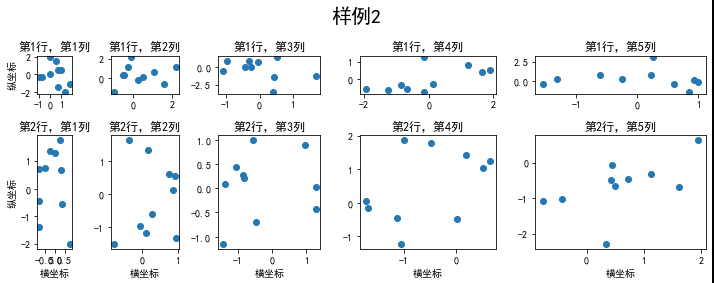
2. 使用 GridSpec 绘制非均匀子图
所谓非均匀包含两层含义,第一是指图的比例大小不同但没有跨行或跨列,第二是指图为跨列或跨行状态
利用 add_gridspec 可以指定相对宽度比例 width_ratios 和相对高度比例参数 height_ratios
fig = plt.figure(figsize=(10, 4))
spec = fig.add_gridspec(nrows=2, ncols=5, width_ratios=[1,2,3,4,5], height_ratios=[1,3])
fig.suptitle('样例2', size=20)
for i in range(2):
    for j in range(5):
        ax = fig.add_subplot(spec[i, j])
        ax.scatter(np.random.randn(10), np.random.randn(10))
        ax.set_title('第%d行,第%d列'%(i+1,j+1))
        if i==1: ax.set_xlabel('横坐标')
        if j==0: ax.set_ylabel('纵坐标')
fig.tight_layout()
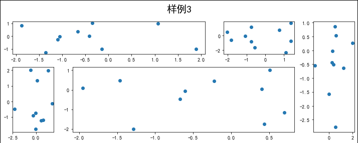
在上面的例子中出现了 spec[i, j] 的用法,事实上通过切片就可以实现子图的合并而达到跨图的功能
fig = plt.figure(figsize=(10, 4))
spec = fig.add_gridspec(nrows=2, ncols=6, width_ratios=[2,2.5,3,1,1.5,2], height_ratios=[1,2])
fig.suptitle('样例3', size=20)
# sub1
ax = fig.add_subplot(spec[0, :3])
ax.scatter(np.random.randn(10), np.random.randn(10))
# sub2
ax = fig.add_subplot(spec[0, 3:5])
ax.scatter(np.random.randn(10), np.random.randn(10))
# sub3
ax = fig.add_subplot(spec[:, 5])
ax.scatter(np.random.randn(10), np.random.randn(10))
# sub4
ax = fig.add_subplot(spec[1, 0])
ax.scatter(np.random.randn(10), np.random.randn(10))
# sub5
ax = fig.add_subplot(spec[1, 1:5])
ax.scatter(np.random.randn(10), np.random.randn(10))
fig.tight_layout()
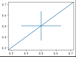
二、子图上的方法
补充介绍一些子图上的方法,
常用直线的画法为: axhline, axvline, axline (水平、垂直、任意方向)
fig, ax = plt.subplots(figsize=(4,3))
ax.axhline(0.5,0.2,0.8)
ax.axvline(0.5,0.2,0.8)
ax.axline([0.3,0.3],[0.7,0.7]);
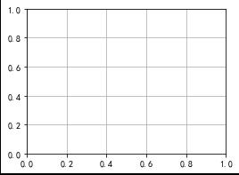
使用 grid 可以加灰色网格
fig, ax = plt.subplots(figsize=(4,3))
ax.grid(True)
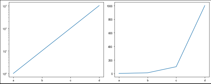
使用 set_xscale 可以设置坐标轴的规度(指对数坐标等)
fig, axs = plt.subplots(1, 2, figsize=(10, 4))
for j in range(2):
    axs[j].plot(list('abcd'), [10**i for i in range(4)])
    if j==0:
        axs[j].set_yscale('log')
    else:
        pass
fig.tight_layout()
思考题
- 墨尔本1981年至1990年的每月温度情况
ex1 = pd.read_csv('../data/layout_ex1.csv')
ex1.head()
fig, axs = plt.subplots(2, 5,                    #2行5列
                        figsize=(12, 3),         #画布大小 宽12 高3
                        sharex=True,             #共享横轴
                        sharey=True)             #共享纵轴
fig.suptitle('墨尔本1981年至1990年月温度曲线',  #大标题内容
             size=14                            #标题大小
            )

for i in range(2):
    for j in range(5):
        if i==0:
            axs[i][j].set_title('%d年'%(j+1981),size = 8)  #子图标题
            axs[i][j].plot(range(1,13),                    #x
                    ex1[ex1['Time'].str[:4].astype(int)==(j+1981)]['Temperature'],#y
                    '-*',                                  #折线的样式
                    markersize = 4,                        #点的大小
                    lw=0.8                                 #线宽
                      )
        else:
            axs[i][j].set_title('%d年'%(j+1986),size = 8)
            axs[i][j].plot(range(1,13),
                      ex1[ex1['Time'].str[:4].astype(int)==(j+1986)]['Temperature'],
                      '-*',
                      markersize = 4,
                      linewidth=0.5
                      )
        axs[i][j].xaxis.set_major_locator(plt.MultipleLocator(1)) #设置x轴刻度间隔
        axs[i][j].xaxis.set_tick_params(size=2)                   #设置x轴刻度线长度
        axs[i][j].yaxis.set_major_locator(plt.MultipleLocator(5)) #设置y轴刻度间隔
        axs[i][j].yaxis.set_tick_params(size=2)                   #设置y轴刻度线长度
        if j==0: axs[i][j].set_ylabel('气温',size=8)              #在第一列,y轴添加标签
fig.tight_layout()

- 画出数据的散点图和边际分布
用 np.random.randn(2, 150) 生成一组二维数据,使用两种非均匀子图的分割方法,做出该数据对应的散点图和边际分布图
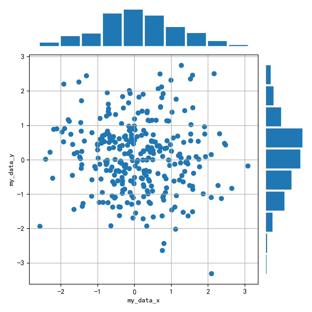
data=np.random.randn(2,150)
fig=plt.figure(figsize=(7,7))
spec = fig.add_gridspec(nrows=10,ncols=10)

axs1 = fig.add_subplot(spec[:2, :8])
axs1.hist(data[0],rwidth=0.9)
axs1.axis('off')

axs2 = fig.add_subplot(spec[2:, :8])
axs2.scatter(data[0], data[1])
axs2.grid(True)
axs2.set_xlabel('data_x')
axs2.set_ylabel('data_y')

axs3 = fig.add_subplot(spec[2:, 8:])
axs3.hist(data[1],rwidth=0.9,orientation='horizontal')
axs3.axis('off')

fig.tight_layout()


 661
661


 被折叠的 条评论
为什么被折叠?
被折叠的 条评论
为什么被折叠?
 到【灌水乐园】发言


