


第六章 对列表应用样式和创建导航条
一.基本列表样式
想添加定制的项目符号,可以使用list-style-image属性,但是这种方法对项目符号图像的位置的控制能力不强。更常用的方法是关闭项目符号(list-style-type:none),在列表项左边增加内边距,并且将定制的项目符号作为背景添加在列表元素上,然后使用背景图像的定位属性精确控制自定义项目符号的对准方式。
二.创建基本的垂直导航条
创建一个良好的语义标记
<ul class="nav">
  <li class="selected"><a href="home.html">home</a></li>
  <li><a href="about.html">about</a></li>
  <li><a href="service.html">our services</a></li>
  <li><a href="news">news</a></li>
</ul>
去掉默认的项目符号,然后处理图片样式
ul.nav{
margin:0;
padding:0;
list-style-type:none;
width:8em;
background-color:#8bd400;
border:1px solid #486b02;
}
不对列表项应用样式,而是对其中的锚链接应用样式,由此提供更好的浏览器兼容性。为了创建与按钮相似的单击区域,需要将锚的display设置为block
把边框的颜色设置比背景色浅比底色深,来创建斜面效果
ul.nav a{
display:block;
color:#2b3f00;
text-decoration:none;
border-top:1px solid #e4ffd3;
border-bottom:1px solid #486b02;
background:url(/img/arrow.gif) no-repeat 5% 50%;
padding:0.3em  1em;
}
最后一个链接的底边框与列表的底边框形成了双线,要去掉列表的底边框。
ul.nav .last a{
border-bottom:0;
}
最后
ul.nav a:hover,ul.nav a:focus,ul.nav .selected a{
color:#e4ffd3;
background-color:#6da203;
}
三.在导航条中突出显示当前页面
<body id="home">
<ul class="nav">
  <li><a href="home.html">home</a></li>
  <li><a href="about.html">about</a></li>
  <li><a href="service.html">our services</a></li>
  <li><a href="news">news</a></li>
</ul>
</body>
为了突出显示当前页面,只需寻找以下ID和类名的组合:
#home .nav .home a,
#about .nav .about a,
#news .nav .news a;
#services .nav .services a{
bockground-position:right bottom;
color:#fff;
cursor:default;
}
当用户在主页上时,具有home类的导航项将显示为被选择状态。为了增加效果,将鼠标光标改为显示默认的箭头。
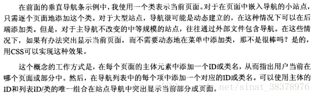
四.创建简单的水平导航条
创建导航条
<ol class="page">
  <li><a href="search.html#1" rel="prev">prev</a></li>
  <li><a href="search.html#1" >1</a></li>
  <li class="selected">2</li>
  <li><a href="search.html#3">3</a></li>
  <li><a href="search.html#4">4</a></li>
  <li><a href="search.html#3" rel="next">next</a></li>
</ol>
注意:用rel属性表示结果集中的前一个和下一个页面,在以后给链接设置不同的样式时很方便。
去掉默认列表样式和默认的浏览器内外边距,同时设置为inline
.page{
    margin:0;
    padding:0;
    list-style-type:none;
}
.page li{
    float:left;
    margin-right:0.6em;
}
设置图形样式
.page a,.page li.selected{
    display:block;
    padding:0.5em 0.5em;
    border:1px dotted #ccc;
    text-decoration:none;
}
.page a:hover,
.page a:focus,
.page li.selected{
    background:
}
想去掉前一个和后一个链接的边框
.page a[rel="prev"],.page a[rel="next"]{
    border:none;
}
希望在列表的开头和结尾加上箭头
.page a[rel="prev"]:before{
    content:"\00AB";
    padding-right:0.5em;
}
.page a[rel="next"]:after{
    content:"\00BB";
    padding-left:0.5em;
}
五.创建图形化导航条

创建无序列表
<ul class="nav">
<li class="first"><a href="#">Home</a></li>
<li><a href="#">About</a></li>
<li><a href="#">News</a></li>
<li><a href="#">Products</a></li>
<li><a href="#">Services</a></li>
<li><a href="#">Clients</a></li>
<li><a href="#">Case Studies</a></li>
</ul>
去掉默认项目符号,增加简单样式
ul.nav{
    margin:0;
    padding:0;
    list-style:none;
    width:72em;
    background: #fff url(image/mainNavBg.gif)  repeat-x;
}
目前是垂直显示的,为了让其水平显示,让它向左浮动
ul.nav li{
    float:left;
}
注意:元素浮动是不占据文档流中的任何空间,因为父列表实际没有内容,就会收缩以至于隐藏了列表背景。可以使用overflow:hidden技术
ul.nav{
    margin:0;
    padding:0;
    list-style:none;
    overflow:hidden;
    width:72em;
    background: #fff url(image/mainNavBg.gif)  repeat-x;
}
与页面导航条示例一样,把每个链接的display属性也设置为block,最好不要显式设置按钮的高度和宽度,可能会导致可维护问题。希望每个按钮的宽度由锚文本的尺寸决定,在锚链接的左右两侧应用内边距,使用行高让链接本文居中
ul.nav a{
    display:block;
    padding:0.3em;
    line-height:1.2em;
    text-decoration:none;
    color:green;
}
希望给每个链接之间创建分割线,可以通过在列表项会锚上设置水平边框来完成,但是为了简单,可以在锚链接中应用一个背景图像
ul.nav a{
    display:block;
    padding:0.3em;
    line-height:1.2em;
    text-decoration:none;
    background:url(image/divider.gif) repeat-y left top;
    color:green;
}
但是导航条的第一个链接会有不必要的分割线,在第一个列表项上增加一个类并且把背景图像设置为none,可以去掉它
ul.nav li.first a{
    background-image:none;
}
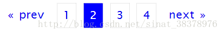
六.简化的“滑动门”标签页式导航
正常字体

字号放大后

HTML部分与前面水平导航条一致
<ul class="nav">
<li class="first"><a href="#">Home</a></li>
<li><a href="#">About</a></li>
<li><a href="#">News</a></li>
<li><a href="#">Products</a></li>
<li><a href="#">Services</a></li>
<li><a href="#">Clients</a></li>
<li><a href="#">Case Studies</a></li>
</ul>
几个常规操作
ul.nav{
margin:0;
padding:0;
list-style-type:none;
width:72em;
overflow:hidden;
}
列表元素向左浮动以水平显示。将组成标签页的两个图像中比较大的图像作为背景图像应用于列表项,这个图像形成标签页的右边缘,故定位到右边
ul.nav li{
float:left;
background:url(image/tab-right.gif) no-repeat  right top;
}
锚显示为块级元素
ul.nav li a{
display:block;
padding:0 1em;
line-height:2.5em;
background:url(image/tab-left.gif) no-repeat left top;
text-decoration:none;
color:#fff;
float:left;
}ul.nav a:hover,ul.nav a:focus{
color:#333;
}七.suckerfish下拉菜单
只要在自导航嵌套在无序列表中,把列表定位到屏幕之外,然后当鼠标悬停在父列表元素项时重新定位它,如图:
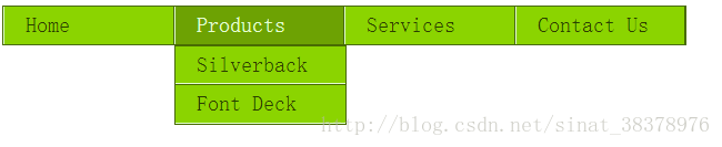
首先,建立多层导航列表
<ul class="nav">
<li><a href="/home/">Home</a></li>
<li><a href="/products/">Products</a>
<ul>
<li><a href="/products/silverback/">Silverback</a></li>
<li><a href="/products/fontdeck/">Font Deck</a></li>
</ul>
</li>

<li><a href="/services/">Services</a>
<ul>
<li><a href="/services/design/">Design</a></li>
<li><a href="/services/development/">Development</a></li>
<li><a href="/services/consultancy/">Consultancy</a></li>
</ul>
</li>
<li><a href="/contact/">Contact Us</a></li>
</ul>
常规设置。因为其中包含的列表项也是浮动的,它们不占据空间,这会导致列表收缩,为了解决这个问题,也让列表浮动
ul.nav,ul.nav ul{
margin:0;
padding:0;
list-style-type:none;
float:left;
border:1px solid #486b02;
background-color:#8bd400;
}

ul.nav li{
    float:left;
    width:72em;
    background-color:#8bd400;
}
为确保下拉菜单中的菜单项垂直对齐,需要把列表的宽度设置为与列表项相同。为激活之前隐藏实际的下拉菜单,把它们的position设置为absolute,然后把它们隐藏在屏幕左边之外
ul.nav li ul{
    width:8em;
    position:absolute;
    left:-999em;
}
关键:在父列表项中添加鼠标悬停伪选择器,把下拉菜单的位置改为正常位置,这样下拉菜单会重新出现:
ul.nav li:hover ul{
    left:auto;
}
最后在设置块级元素,增加样式
ul.nav a{
    display:block;
    color:#2b3f00;
    text-decoration:none;
    padding:0.3em  1em;
    border-right:1px solid #486b02;
    border-left:1px solid #e4ffd3;
}
ul.nav li li a{
    border-top:1px solid  #486b02;
    border-bottom:1px solid #e4ffd3;
    border-right:0;
    border-left:0;
}
 ul a:hover,ul a:focus{
   color:#e4ffd3;
   background-color:#6da203;
}
八.CSS图像映射
利用图像映射可以将图像的一些区域指定为热点
效果:
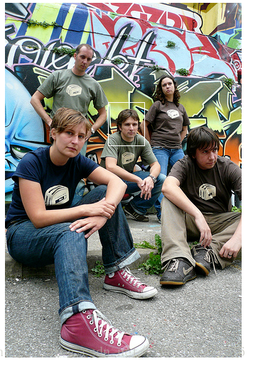
首先,创建HTML
<div class="imagemap">
<img src="image/nerdcore.jpg" width="333" height="500" alt="Some of the Clearleft team" />
<ul>
<li class="rich"><a href="http://www.clagnut.com/" title="Richard Rutter">Richard Rutter</a></li>
<li class="sophie"><a href="http://www.wellieswithwings.org/" title="Sophie Barrett">Sophie Barrett</a></li>
<li class="cath"><a href="http://www.electricelephant.com/" title="Cathy Jones">Cathy Jones</a></li>
<li class="james"><a href="http://www.jeckecko.net/blog/" title="James Box">James Box</a></li>
<li class="paul"><a href="http://twitter.com/nicepaul" title="Paul Annett">Paul Annett</a></li>
</ul>
</div>
为div设置格式,注意:把div的position设置为relative,它让包含的链接可以相对于div的边缘进行绝对定位
.imagemap{
    width:340px;
    height:500px;
    position:relative;
}
去掉项目符号
.imagemap ul{
    margin:0;
    padding:0;
    list-style-type:none;
}
对链接应用样式,将其移动到容器div的左上角,首先让其消失
.imagemap a{
    display:block;
    position:absolute;
    width:50px;
    height:60px;
    text-indent:-1000em;
}
然后将链接对应到每人身上
.imagemap .rich a{
    top:50px;
    left:80px;
}
.imagemap .sophie a{
    top:90px;
    left:200px;
}
.imagemap .cath a {
  top: 140px;
  left: 55px;
}

.imagemap .james a {
  top: 140px;
  left: 145px;
}

.imagemap .paul a {
  top: 165px;
  left: 245px;
}
创建翻转效果
.imagemap a:hover,.imagemap a:focus{
    border:1px solid #fff;
}
Flickr风格的图像映射
为了创建双边框的框,需要在每个锚链接内部添加两个额外的span,说明也需要添加一个额外的span
<div class="imagemap">
<img src="image/nerdcore.jpg" width="333" height="500" alt="Some of the Clearleft team" />
<ul>
<li class="rich">
    <a href="http://www.clagnut.com/" title="Richard Rutter">
    <span class="outer">
    <span class="inner">
    <span class="note">Richard Rutter</span>
    </span>
    </span>
    </a>
</li>

<li class="sophie">
    <a href="http://www.wellieswithwings.org/" title="Sophie Barrett">
    <span class="outer">
    <span class="inner">
    <span class="note">Sophie Barrett</span>
    </span>
    </span>
    </a>
</li>

<li class="cath">
    <a href="http://www.electricelephant.com/" title="Cathy Jones">
    <span class="outer">
    <span class="inner">
    <span class="note">Cathy Jones</span>
    </span>
    </span>
    </a>
</li>

<li class="james">
<a href="http://www.jeckecko.net/blog/" title="James Box">
    <span class="outer">
    <span class="inner">
    <span class="note">James Box</span>
    </span>
    </span>
</a>
</li>

<li class="paul">
    <a href="http://twitter.com/nicepaul" title="Paul Annett">
    <span class="outer">
    <span class="inner">
    <span class="note">Paul Annett</span>
    </span>
    </span>
    </a>
</li>

</ul>
</div>
常规设置
.imagemap{
    width:340px;
    height:500px;
    position:relative;
}
.imagemap ul{
    margin:0;
    padding:0;
    list-style-type:none;
}
包含的锚链接进行绝对定位,但这一次设置内部span尺寸,让外部span和锚链接根据它们确定尺寸。最后,不希望隐藏锚链接中的文本,而是想把它显示为工具提示,
.imagemap a{
    position:absolute;
    display:block;
    background-image:url(image/shim/gif);
    color:#000;
    text-decoration:none;
    border:1px solid transparent;
}
.imagemap a .outer{
    display:block;
    border:1px solid #000;
}
.imagemap a .inner{
    display:block;
    width:50px;
    height:60px;
    border:1px solid #fff;
}
将锚定位到每个人身上
.imagemap .rich a {
  top: 50px;
  left: 80px;
}

.imagemap .sophie a {
  top: 90px;
  left: 200px;
}

.imagemap .cath a {
  top: 140px;
  left: 55px;
}

.imagemap .james a {
  top: 140px;
  left: 145px;
}

.imagemap .paul a {
  top: 165px;
  left: 245px;
}
翻转效果,当鼠标悬停时将锚的边框颜色从透明改为黄色
.imagemap a:hover,
.imagemap a:focus {
  border-color: #d4d82d;
    cursor: pointer;
}
将span的内容定位到热点的下面并设置样式。
.imagemap a .note{
    position:absolute;
    bottom:-3em;
    width:3.2em;
    padding:0.2em  0.5em;
    background-color:#ffc;
    text-align:center;
}
正常情况下隐藏,鼠标悬停时文字说明出现。可以将文本隐藏在屏幕左边之外,鼠标悬停时重新定位
.imagemap a .note{
    position:absolute;
    bottom:-3em;
    width:3.2em;
    padding:0.2em  0.5em;
    background-color:#ffc;
    text-align:center;
    left:-1000em;
    margin-left:-5em;
}


.imagemap a:hover .note,
.imagemap a:focus .note{
   left:60px;
}
再调整:正常情况下内外边框都消失,悬停时出现。可以在默认情况下把span的边框设置透明,当鼠标悬停时设置颜色
.imagemap a:hover .outer,
.imagemap a:focus .outer{
    border-color:#000;
}
.imagemap a:hover .inner,
.imagemap a:focus .inner{
    border-color:#fff;
}
九.远距离翻转
一种鼠标悬停时间,它在页面的其他地方触发显示方式的改变。实现的方法是,在锚链接内嵌套一个或多个元素,然后使用绝对定位对嵌套的元素分别定位,尽管显示在不用的地方,但是它们都包含在同一个父锚中,所以可以对同一个鼠标悬停事件作出反应。
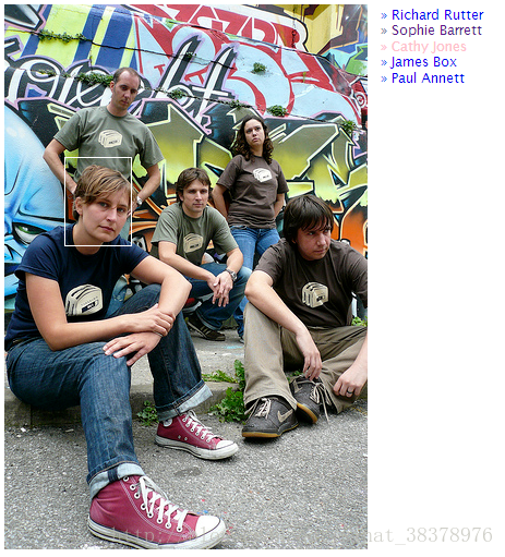
扩展基本的CSS图像映射技术。不过需要添加两个span:一个包围链接文本,一个空的span作为热点
<div class="remote">
<img src="img/nerdcore.jpg" width="333" height="500" alt="Rich, Sophie, Cath, James and Paul" />
<ul>
<li class="rich">
<a href="http://www.clagnut.com/" title="Richard Rutter">
<span class="hotspot"></span>
<span class="link">» Richard Rutter</span>
</a>
</li>
<li class="sophie">
<a href="http://www.wellieswithwings.org/" title="Sophie Barrett">
<span class="hotspot"></span>
<span class="link">» Sophie Barrett</span>
</a>
</li>
<li class="cath">
<a href="http://www.electricelephant.com/" title="Cathy Jones">
<span class="hotspot"></span>
<span class="link">» Cathy Jones</span>
</a>
</li>
<li class="james">
<a href="http://www.jeckecko.net/blog/" title="James Box">
<span class="hotspot"></span>
<span class="link">» James Box</span>
</a>
</li>
<li class="paul">
<a href="http://twitter.com/nicepaul" title="Paul Annett">
<span class="hotspot"></span>
<span class="link">» Paul Annett</span>
</a>
</li>
</ul>
</div>
基本列表样式
.remote{
    width:333px;
    height:500px;
    position:relative;
}
.remote ul{
    margin:0;
    padding:0;
    list-style-type:none;
}
把热点的position设置为absolute并指定尺寸。与上一种技术一样,将所有锚定位到图像的左上角,然后用left和top定位属性,将每个热点定位到图像中相关的人身上
.remote a .hotspot{
    width: 50px;
  height: 60px;
  position: absolute;
    background-image: url(image/shim.gif);
}
.remote .rich a .hotspot {
  top: 50px;
  left: 80px;
}

.remote .sophie a .hotspot {
  top: 90px;
  left: 200px;
}

.remote .cath a .hotspot {
  top: 140px;
  left: 55px;
  width: 60px;
  height: 80px;
}

.remote .james a .hotspot {
  top: 140px;
  left: 145px;
}

.remote .paul a .hotspot {
  top: 165px;
  left: 245px;
  width: 60px;
  height: 80px;
}
同样,包含链接文本的span也进行绝对定位
.remote a .link{
  position: absolute;
  display:block;
    width: 10em;
  right:-11em;
    cursor:pointer;
}
.remote .rich a .link {
  top: 0;
}
.remote .sophie a .link {
  top: 1.2em;
}
.remote .cath a .link {
  top: 2.4em;
}
.remote .james a .link {
  top: 3.6em;
}
.remote .paul a .link {
  top: 4.8em;
}
为了翻转效果,加边框,改颜色
.remote a:hover .hotspot,
.remote a:focus .link{
    border:1px solid white;

}
.remote a:focus .hotspot,
.remote a:hover .link{
        color:pink;;
}
十.对于定义列表的简短说明
之前讨论的都是用无序列表创建效果(也可以扩展有序列表),但是还可以用定义列表
第七章 对表单和数据表格应用样式
一.对数据表格应用样式
1.表格特有元素
1)summary和caption
caption:标题
summary:总结
<table class="cal" summary="A Calendar">
<caption>
  <a href=#>
</caption>
</table>
2)thead、tbody和tfoot
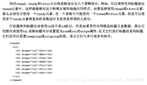
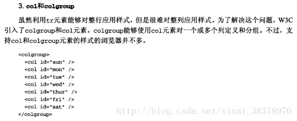
3)col和colgroup
2.数据表格标记
创建简易的日历
<table class="cal" summary="A calandar style date picker">
<caption>
<a href="#" class="prev"><</a> January 2008 <a href="#" class="next">></a>
</caption>
<colgroup>
<col id="sun" />
<col id="mon" />
<col id="tue" />
<col id="wed" />
<col id="thur" />
<col id="fri" />
<col id="sat" />
</colgroup>
<thead>
<tr>
<th scope="col">S</th>
<th scope="col">M</th>
<th scope="col">T</th>
<th scope="col">W</th>
<th scope="col">T</th>
<th scope="col">F</th>
<th scope="col">S</th>
</tr>
</thead>
<tbody>
<tr>
<td>30</td>
<td>31</td>
<td><a href="#">1</a></td>
<td><a href="#">2</a></td>
<td><a href="#">3</a></td>
<td><a href="#">4</a></td>
<td><a href="#">5</a></td>
</tr>
<tr>
<td><a href="#">6</a></td>
<td><a href="#">7</a></td>
<td class="selected"><a href="#">8</a></td>
<td><a href="#">9</a></td>
<td><a href="#">10</a></td>
<td><a href="#">11</a></td>
<td><a href="#">12</a></td>
</tr>
<tr>
<td><a href="#">13</a></td>
<td><a href="#">14</a></td>
<td><a href="#">15</a></td>
<td><a href="#">16</a></td>
<td><a href="#">17</a></td>
<td><a href="#">18</a></td>
<td><a href="#">19</a></td>
</tr>
<tr>
<td><a href="#">20</a></td>
<td><a href="#">21</a></td>
<td><a href="#">22</a></td>
<td><a href="#">23</a></td>
<td><a href="#">24</a></td>
<td><a href="#">25</a></td>
<td><a href="#">26</a></td>
</tr>
<tr>
<td><a href="#">27</a></td>
<td><a href="#">28</a></td>
<td><a href="#">29</a></td>
<td><a href="#">30</a></td>
<td><a href="#">31</a></td>
<td>1</td>
<td>2</td>
</tr>
</tbody>
</table>3.对表格应用样式
table.cal{
    border-collapse: seperate;
    border-spacing:0;
    text-align:center;
    color:#333;
}
.cal.th,.cal.td{
    margin:0;
    padding:0;
}
*CSS的border-spacing属性可以控制单元格之间的距离,但是有时存在兼容性问题,所以使用稳妥的cellspacing属性,是有效的html
<table cellspacing="0" class-"cal summary="A calendar style date picker">4.添加视觉样式
标题处,设置粗体
.cal caption{
    font-size:1.25em;
    padding-top:0.6em;
    padding-bottom:0.6em;
    background-color:pink;
}
.cal caption [rel="prev"]{
    float:left;
    margin-left:0.2em;
}
.cal caption [rel="next"]{
    float:right;
    margin-left:0.2em;
}
鼠标悬停时增加样式
.cal caption a:link,
.cal caption a:visited{
    text-decoration:none;
    color:black;
    padding:0 0.2em;
}
.cal caption a:hover,
.cal caption a:active,
.cal caption a:focus{
    background-color:gray;
}
为了区分包含表格标题的第一行,增加下划线,让文本略小
.cal thead th{
    background-color: #d4dde6;
    border-bottom:1px solid gray;
    font-size:0.75em;
}
默认表格文本是灰色的
.cal tbody{
    color:#a4a4a4;
    text-shadow:1px 1px 1px white;
    background-color:#d0d9e2;
}
为了斜面效果,需要在各个边设置不同的颜色。还要设置锚链接的样式
.cal tbody td{
    .cal tbody td{
    border-top: 1px solid #e0e0e1;
    border-right: 1px solid #9f9fa1;
    border-bottom: 1px solid #acacad;
    border-left: 1px solid #dfdfe0;
}
.cal tbody a{
    display:block;
    text-decoration:none;
    color:#333;
    background-color:#c0c8d2;
    font-weight:bold;
    padding:0.3em 0.6em 0.3em 0.6em;
}
最后设置悬停状态,蓝色背景上的白色文本,添加阴影
.cal tbody a:hover,
.cal tbody a:focus,
.cal tbody a:active,
.cal tbody .selected a:link,
.cal tbody .selected a:visited,
.cal tbody  .selecteda:hover,
.cal tbody  .selected a:focus,
.cal tbody .selected a:active{
    color:white;
    background-color:#6d8ab4;
    text-shadow:1px 1px 2px #22456b;
}
二.简单的表单布局
1.有用的表单元素
fieldset:对相关的信息块进行分组
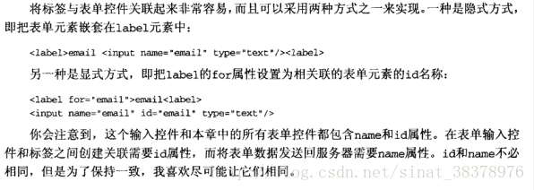
label:表单标签
2.基本布局
html部分
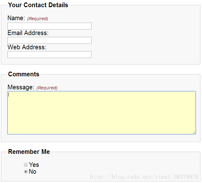
<fieldset>
    <legend>Your Contact Details</legend>
    <div>
    <label for="author">Name: <em class="required">(Required)</em></label>
    <input name="author" id="author" type="text" />
    </div>

    <div>
    <label for="email">Email Address:</label>
    <input name="email" id="email" type="text" />
    </div>

    <div>
    <label for="url">Web Address:</label>
    <input name="url" id="url" type="text" />
    </div>
</fieldset>
设置fieldset和legend元素的一般样式
fieldset{
    margin:1em 0;
    padding:1em;
    border:1px solid #ccc;
    background:#f8f8f8;
}
legend{
    font-weight:bold;
}
将标签定位在表单元素的上方。因为标签在默认情况下是行内元素,但是可以将display设置为block
label{
    display:block;
    cursor:pointer;
}
input{
    width:20em;
}
3.其他元素
同样可以用于文本区域和复选框
<fieldset>
    <legend>Comments</legend>
    <div>
    <label for="text">Message: <em class="required">(Required)</em></label>
    <textarea name="text" id="text" cols="20" rows="10"></textarea>
    </div>
</fieldset>

<fieldset id="remember-me">
    <legend>Remember Me</legend>
        <div>
        <label for="remember-yes"><input id="remember-yes" class="radio" name="remember" type="radio" value="yes" />Yes</label>
        </div>

        <div>
        <label for="remember-no"><input id="remember-no" class="radio" name="remember" type="radio" value="no" checked="checked" />No</label>
        </div>

</fieldset>
设置文本框样式
textarea{
    width:100%;
    height:10em;
}
复选框样式,标签一般在它们右边,加上外边距
.radio{
    width:auto;
    margin-left:4em;
}
4.修饰
悬停
input[type="text"]:focus,textarea:focus{
    background-color:#ffc;
}
必填域

三.复杂的表单布局
复杂的表单布局中,有必要将标签和表单元素水平对齐。
这个实例与前一个的唯一差异是,并不将标签设置为块级元素,而是将标签向左浮动
label{
    float:left;
    width:10em;
    cursor:pointer;
}
如果表单可能跨多行,还应该清理容器div,避免它们干扰下一组标签和弄乱布局
form div{
clear:left;
}
1.可访问的数据输入元素

<div>
<label for="dataofBirth">Data of birth:</label>
  <input name="dataofBirth" id="dataofBirth" type="text"/>
<label id="mouthofBirthLabel" for="mouthofBirth">mouth of birth</label>
  <select name="mouthofBirth" id="mouthofBirth">
    <option value="1">january</option>
    <option value="2">february</option>
    <option value="3">marth</option>
  </select>
<label id="yearofBirthLabel" for="yearofBirth">year of Birth</label>
  <input name="yearofBirth"  id="yearofBirth" type="text"/>
</div>
为了创建这个布局,首先隐藏“mouth of birth”和“year of birth”标签。前面创建的基本表单样式中,标签已经设置了宽度,为了防止标签影响布局,还要将这些标签的宽度设置为0
#mouthofBirthLabel,#yearofBirthLabel{
    text-indent:-1000em;
    width:0;
}
input#dateofBirth{
    width:3em;
    margin-right:0.5em;
}
input#mouthofBirth{
    width:10em;
    margin-right:0.5em;
}
input#yearofBirth{
    width:5em;
}
2)多列复选框
使用标题元素。
为了创建列效果,将复选框分为两组,每一组放在一个div中各有一个col类,然后将这两个div元素一起放在一个具有描述性ID的fieldset中


 扫一扫
扫一扫
 442
442

 被折叠的 条评论
为什么被折叠?
被折叠的 条评论
为什么被折叠?
 到【灌水乐园】发言


