


css3新增的渐变属性在不同浏览器中兼容性不同,所以为了能够兼容所有浏览器,我们最好给其加上前缀。chrome浏览器前缀'-webkit-',并且第一个参数是开始方向。 opera浏览器前缀'-o-', 火狐浏览器前缀'-moz-',这两个浏览器第一个参数是结束方向。标准方法第一个参数是to+终点方向。
代码及效果图示例
<!DOCTYPE html>
<html lang="en">
<head>
	<meta charset="UTF-8">
	<title>Document</title>
	<style type="text/css">
		section{
			width: 900px;
			height: 400px;
			margin: 10px auto;
		}
		section > div{
			width: 250px;
			height: 400px;
			margin-left: 30px;
			float: left;
		}
		.one{
        	width: 250px;
        	height: 50px;
        	text-align: center;
        	line-height: 50px;
        	font-size: 20px;
        	font-weight: bold;
		}
		.one + div{
			width: 200px;
			height: 200px;
			margin-left: 25px;
			margin-top: 10px;
		}
		.one1{
			background: -webkit-linear-gradient(yellow,red);
			background:    -moz-linear-gradient(yellow,red);
			background:      -o-linear-gradient(yellow,red);
			background:         linear-gradient(yellow,red);
		}
		.one2{
			background: -webkit-linear-gradient(left,yellow,red);
			background:   -moz-linear-gradient(right,yellow,red);
			background:     -o-linear-gradient(right,yellow,red);
			background:     linear-gradient(to right,yellow,red);
		}
		.one3{
			background: -webkit-linear-gradient(right bottom,yellow,red);
			background:        -moz-linear-gradient(left top,yellow,red);
			background:          -o-linear-gradient(left top,yellow,red);
			background:          linear-gradient(to left top,yellow,red);
		}
	</style>
</head>
<body>
	<section>
		<div>
			<div class="one">上下方向渐变</div>
			<div class="one1"></div>
		</div>
		<div>
			<div class="one">左右方向渐变</div>
			<div class="one2"></div>
		</div>
		<div>
			<div class="one">对角方向渐变</div>
			<div class="one3"></div>
		</div>
	</section>
</body>
</html>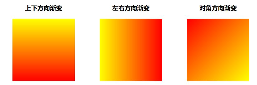
当然有时候不想记住不同浏览器的线性渐变写法不同,也有一种用角度来表示的方法,即第一个参数是角度。向上即0deg,向右即90deg,以此顺时针方向类推。
<!DOCTYPE html>
<html lang="en">
<head>
	<meta charset="UTF-8">
	<title>Document</title>
    <style type="text/css">
    	body > div{
    		width: 250px;
    		height: 300px;
    		float: left;
    		margin-left: 20px;
    	}
    	.one{
    		width: 250px;
    		height: 30px;
    		text-align: center;
    		line-height: 30px;
    		font-size: 20px;
    		font-weight: bold;
    	}
    	.one + div{
    		width: 200px;
    		height: 200px;
    		margin-top: 20px;
    		margin-left: 25px;
    	}
    	.one1{
    		background: -webkit-linear-gradient(90deg,green,red);
    		background:    -moz-linear-gradient(90deg,green,red);
    		background:      -o-linear-gradient(90deg,green,red);
    		background:         linear-gradient(90deg,green,red);
    	}
    	.one2{
    		background: -webkit-linear-gradient(270deg,green,red);
    		background:    -moz-linear-gradient(270deg,green,red);
    		background:      -o-linear-gradient(270deg,green,red);
    		background:         linear-gradient(270deg,green,red);
    	}
    </style>
</head>
<body>
	<div>
		<div class="one">向右渐变</div>
		<div class="one1"></div>
	</div>
	<div>
		<div class="one">向左渐变</div>
		<div class="one2"></div>
	</div>
</body>
</html>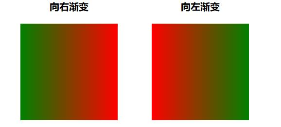


 295
295


 被折叠的 条评论
为什么被折叠?
被折叠的 条评论
为什么被折叠?
 到【灌水乐园】发言


