


最近工作很忙,学习时间也很少,趁着周末休息统计了下自己微信好友男女比例,代码比较粗狂,各位先简单地看下,等下周休息的话再细细整合。
本人最笨,语言表达也是渣渣,还是直接上代码吧。
import matplotlib.pyplot as plt
import itchat
import matplotlib as mpl
login = itchat.login()
friends = itchat.get_friends()
male = 0
female = 0
other = 0
print(friends)
print(type(friends))
for friend in friends:
    #print(friend['Sex'])
    sex = friend['Sex']
    if sex == 0:
        male += 1
    elif sex ==2 :
        female += 1
    else:
        other += 1
print(male) #男性
print(female)#女性
print(other)#其他
print(len(friends))#总微信好友
total = len(friends)
male_rate = male/total
female_rate = female/total
other_rate = other/total

print('好友总数:%d' % total)
print('男性占比: %.2f%%' % (male_rate * 100))
print('女性占比: %.2f%%' % (female_rate * 100))
print('未知性别占比: %.2f%%' % (other_rate * 100))

mpl.rcParams['font.sans-serif'] = ['SimHei']
mpl.rcParams['font.family'] = 'sans-serif'

sex_kind = ['male', 'female', 'unknown']
sex_rate = [male_rate, female_rate, other_rate]
explode = (0, 0.1, 0)  # only "explode" the 1st slice (i.e. 'female')
fig1, ax = plt.subplots()
ax.pie(sex_rate, explode=explode, labels=sex_kind, autopct='%1.1f%%',
       shadow=False, startangle=90)
ax.axis('equal')  # Equal aspect ratio ensures that pie is drawn as a circle.
ax.set_title('微信好友性别比例分布图')
plt.show()
最终效果: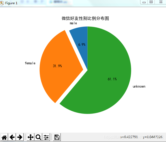


 1603
1603

 被折叠的 条评论
为什么被折叠?
被折叠的 条评论
为什么被折叠?
 到【灌水乐园】发言


