


echarts 图表 环形图
步骤:
1.先下载echarts插件:
npm i echarts / npm install echarts --save
2 引用echarts 文件 :
       import echarts from "echarts"
		Vue.use(echarts)
3 准备一个DOM容器 :
<div id="myChart" style="width:280px;height:260px;margin-left:10px;"></div>
  4.定义一个option 数据

   var options =  {
        tooltip: {
            trigger: 'item',
            formatter: "{a} <br/>{b}: {c} ({d}%)"
        },
        legend: {
          show: false,
          orient: 'vertical',
          x: 'right',
          data: ['90%', '10%'],  //显示的百分比
          textStyle:{
          color:"#fff",
          fontSize:"12"
        }

        },
        graphic:{
                  type:'text',
                  left:'center',
                  top:'center',
                  style:{
                      text:'采集成功率',     //环形中间文字及样式
                      textAlign:'center',
                      fill:'#fff',
                      width:30,
                      height:30,
                      fontSize:"12"
                  }
              },
        series: [
                  {
                      name:'访问来源',
                      type: 'pie',
                      radius: ['40%', '60%'],//第一个参数是内圆半径,第二个参数是外圆半径
                      itemStyle: {
                          normal:{
                              label:{
                                  show:true,
                                  textStyle:{color:'#fff',fontSize:"14"},
                                  //让series 中的文字进行换行
                                  // formatter:function(val){
                                  //     return val.name.split("-").join("\n");}
                              },
                              title:{
                                text:'aaaa'
                              },
                              labelLine:{
                                  show:true,
                                  lineStyle:{color:'#fff'}
                              }
                          },
                          emphasis: {
                              // show:false,
                              shadowBlur: 10,
                              shadowOffsetX: 0,
                              shadowColor: 'rgba(0, 0, 0, 0.5)',
                              textColor:'red'
                          }
                      },
                      data: [
                          {value: 70, name: '90%'},
                          {value: 30, name: '10%'},

                      ]
                  }
        ],
      color: ['rgb(40, 236, 236)','rgb(231, 207, 69)']
    },
5.  获取 准备好的 dom,初始化echarts实例
  var myChart = echarts.init(document.getElementById('myChart'))
6. js 方法 效果的实现:
   mounted(){
      //  图表
       lis();
      function lis(){
        var myChart = echarts.init(document.getElementById('myChart'))
         myChart.setOption(options)
      }
   }
 **注释** :
    如果数据 options是在
            data () {
              return {
               options:[  数据 配置 ]
              }
            }
     方法可使用:
         mounted(){
               drawPie(id){
                this.myChart = echarts.init(document.getElementById(id))
                this.myChart.setOption(this.option);
           },
         },
         mounted(){
            this.$nextTick(function() { //延迟函数调用  dom 数据更新后执行
            this.drawPie('myChart')
            });
         }

         // 也可解决  Cannot read property 'getAttribute' of null"  而页面图表显示不全 问题

echarts 图表 环形图
引用
import * as echarts from 'echarts';
html
<div class="roseChart" ref="roseChart"></div>
JS
mounted() {
this.chartOption()
},
methods: {
chartOption() {
const myChart = echarts.init(this.$refs.roseChart)
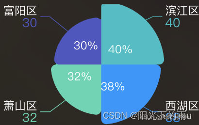
let data = [
{ value: 40, name: '滨江区' },
{ value: 38, name: '西湖区' },
{ value: 32, name: '萧山区' },
{ value: 30, name: '富阳区' },
]
let option = {
grid: {
top: '2%',
left: '20%',
},
color: ['#15BFC5', '#0596FF', '#46D6B2', '#5054C4'],
series: [
// 图标上扇叶的 label 文字显示
{
name: '访问来源',
type: 'pie',
roseType: 'area',
selectedMode: 'single',
radius: ['10%', '30%'],
label: {
position: 'inner',
fontSize: 18,
color: '#fff',
formatter: '{c}',
},
labelLine: {
show: false,
},
data: data,
},
{ // 正常数据显示
name: '面积模式',
type: 'pie',
radius: [0, 100], //设置中间环形空隙
// center: ['50%', '50%'],
roseType: 'area',
itemStyle: {
borderRadius: 8,
},
label: { //自定义设置label 样式 formate 搭配 rich 使用
show: true,
formatter: function (params) {
if (params.name == '滨江区') {
return ('{b|' + params.name + '}' + '\n' + '{c|' + params.value + '}')
} else if (params.name == '西湖区') {
return ('{b|' + params.name + '}' + '\n' + '{c1|' + params.value + '}')
} else if (params.name == '萧山区') {
return ('{b|' + params.name + '}' + '\n' + '{c2|' + params.value + '}')
} else {
return ('{b|' + params.name + '}' + '\n' +'{c3|' + params.value+ '}' )
}
},
rich: {
b: {
color: '#fff',
fontSize: 18,
},
c: {
fontSize: 20,
color: '#15BFC5',
},
c1: {
fontSize: 20,
color: '#0596FF',
},
c2: {
fontSize: 20,
color: '#46D6B2',
},
c3: {
fontSize: 20,
color: '#5054C4',
},
},
},
labelLine: { //设置引导线
show: true,
// length: 50,
// length2: 30,
lineStyle: {
width: 1,
type: 'solid',
cap: 'round',
join: 'round',
miterLimit: 10,
},
},
data: data,
},
],
}
myChart.setOption(option)
},
},


 2451
2451


 被折叠的 条评论
为什么被折叠?
被折叠的 条评论
为什么被折叠?
 到【灌水乐园】发言


