


根据 jQuery旋转展开菜单栏 修改成想要的效果
<div class='selector'>
  <ul  class='selector1'>
    <li>
      <input id='1' type='checkbox'>
      <label for='1'>Option 1</label>
    </li>
    <li>
      <input id='2' type='checkbox'>
      <label for='2'>Option 2</label>
    </li>
    <li>
      <input id='3' type='checkbox'>
      <label for='3'>Option 3</label>
    </li>
    <li>
      <input id='4' type='checkbox'>
      <label for='4'>Option 4</label>
    </li>
    <li>
      <input id='5' type='checkbox'>
      <label for='5'>Option 5</label>
    </li>
    <li>
      <input id='6' type='checkbox'>
      <label for='6'>Option 6</label>
    </li>
    <li>
      <input id='7' type='checkbox'>
      <label for='7'>Option 7</label>
    </li>
    <li>
      <input id='8' type='checkbox'>
      <label for='8'>Option 8</label>
    </li>
  </ul>
  <ul  class='selector2'>
    <li>
      <input id='11' type='checkbox'>
      <label for='11'>Option 1</label>
    </li>
    <li>
      <input id='12' type='checkbox'>
      <label for='12'>Option 2</label>
    </li>
    <li>
      <input id='13' type='checkbox'>
      <label for='13'>Option 3</label>
    </li>
    <li>
      <input id='14' type='checkbox'>
      <label for='14'>Option 4</label>
    </li>
    <li>
      <input id='15' type='checkbox'>
      <label for='15'>Option 5</label>
    </li>
    <li>
      <input id='16' type='checkbox'>
      <label for='16'>Option 6</label>
    </li>
    <li>
      <input id='17' type='checkbox'>
      <label for='17'>Option 7</label>
    </li>
    <li>
      <input id='18' type='checkbox'>
      <label for='18'>Option 8</label>
    </li>
  </ul>
  <button>Click here</button>
</div>
html, body {
  height: 100%;
}

body {
  margin: 0;
  background: linear-gradient(#eee, #ccc);
  overflow: hidden;
}

.selector {
  position: absolute;
  left: 50%;
  top: 50%;
  width: 140px;
  height: 140px;
  margin-top: -70px;
  margin-left: -70px;
}

.selector, .selector button {
  font-family: 'Oswald', sans-serif;
  font-weight: 300;
}

.selector button {
  position: relative;
  width: 100%;
  height: 100%;
  padding: 10px;
  background: #428bca;
  border-radius: 50%;
  border: 0;
  color: white;
  font-size: 20px;
  cursor: pointer;
  box-shadow: 0 3px 3px rgba(0, 0, 0, 0.1);
  transition: all .1s;
}

.selector button:hover {
  background: #3071a9;
}

.selector button:focus {
  outline: none;
}

.selector ul {
  position: absolute;
  list-style: none;
  padding: 0;
  margin: 0;
  top: -20px;
  right: -20px;
  bottom: -20px;
  left: -20px;
}

.selector li {
  position: absolute;
  width: 0;
  height: 100%;
  margin: 0 50%;
  -webkit-transform: rotate(-360deg);
  transition: all 0.8s ease-in-out;
}

.selector1 li input {
  display: none;
}

.selector1 li input + label {
  position: absolute;
  left: 50%;
  bottom: 150%;
  width: 0;
  height: 0;
  line-height: 1px;
  margin-left: 0;
  background: #fff;
  border-radius: 50%;
  text-align: center;
  font-size: 1px;
  overflow: hidden;
  cursor: pointer;
  box-shadow: none;
  transition: all 0.8s ease-in-out, color 0.1s, background 0.1s;
}

.selector1 li input + label:hover {
  background: #f0f0f0;
}

.selector1 li input:checked + label {
  /* background: #5cb85c; */
  color: white;
}

.selector1 li input:checked + label:hover {
  /* background: #449d44; */

}
.selector1.open li input:hover + label:before {
   background: #449d44;
}

.selector1.open li input + label {

  margin-left: -80px;
  /* box-shadow: 0 3px 3px rgba(0, 0, 0, 0.1); */
  font-size: 14px;
  height:80px;
  width: 150px;
  overflow:hidden;
  transform-origin: 0 100%;
  transform: skew(-50deg);
  position: relative;
  background: none;
}

.selector1.open li input + label:before{
  height:inherit;
  width: inherit;
  position: absolute;
  content: "";
  border-radius: 10px;
  background: #fecb2f;
  transform-origin: 0 100%;
  transform: skew(0deg);
  z-index: -1;
}


.selector2 li input {
  display: none;
}

.selector2 li input + label {
  position: absolute;
  left: 50%;
  bottom: 80%;
  width: 0;
  height: 0;
  line-height: 1px;
  margin-left: 0;
  background: #fff;
  border-radius: 50%;
  text-align: center;
  font-size: 1px;
  overflow: hidden;
  cursor: pointer;
  box-shadow: none;
  transition: all 0.8s ease-in-out, color 0.1s, background 0.1s;
}

.selector2 li input + label:hover {
  background: #f0f0f0;
}

.selector2 li input:checked + label {
  /* background: #5cb85c; */
  color: white;
}

.selector2 li input:checked + label:hover {
  /* background: #449d44; */

}
.selector2.open li input:hover + label:before {
   background: #449d44;
}

.selector2.open li input + label {

  margin-left: -80px;
  /* box-shadow: 0 3px 3px rgba(0, 0, 0, 0.1); */
  font-size: 14px;
  height:80px;
  width: 150px;
  overflow:hidden;
  transform-origin: 0 100%;
  transform: skew(-50deg);
  position: relative;
  background: none;
}

.selector2.open li input + label:before{
  height:inherit;
  width: inherit;
  position: absolute;
  content: "";
  border-radius: 10px;
  background: #fecb2f;
  transform-origin: 0 100%;
  transform: skew(0deg);
  z-index: -1;
  text-align: center;
}
var angleStart = -360;
// jquery rotate animation
function rotate(li,d) {
$({d:angleStart}).animate({d:d}, {
step: function(now) {
$(li)
.css({ transform: 'rotate('+now+'deg)' })
.find('label')
.css({ transform: 'rotate('+(-now)+'deg)' });
}, duration: 0
});
}
// show / hide the options
function toggleOptions(s) {
$(s).toggleClass('open');
var li = $(s).find('li');
var deg = $(s).hasClass('half') ?180/(li.length-1) : 300/li.length;
for(var i=0; i<li.length; i++) {
var d = $(s).hasClass('half') ? (i*deg)-360 : (i*deg)-220;
$(s).hasClass('open') ? rotate(li[i],d) : rotate(li[i],angleStart);
}
}
function toggleOptions1(s) {
$(s).toggleClass('open');
var li = $(s).find('li');
var deg = $(s).hasClass('half') ?180/(li.length-1) : 360/li.length;
for(var i=0; i<li.length; i++) {
var d = $(s).hasClass('half') ? (i*deg)-360 : (i*deg)-220;
$(s).hasClass('open') ? rotate(li[i],d) : rotate(li[i],angleStart);
}
}
// $('.selector button').click(function(e) {
// toggleOptions($(this).parent());
// });
setTimeout(function() { toggleOptions('.selector1'); }, 100);
setTimeout(function() { toggleOptions1('.selector2'); }, 100);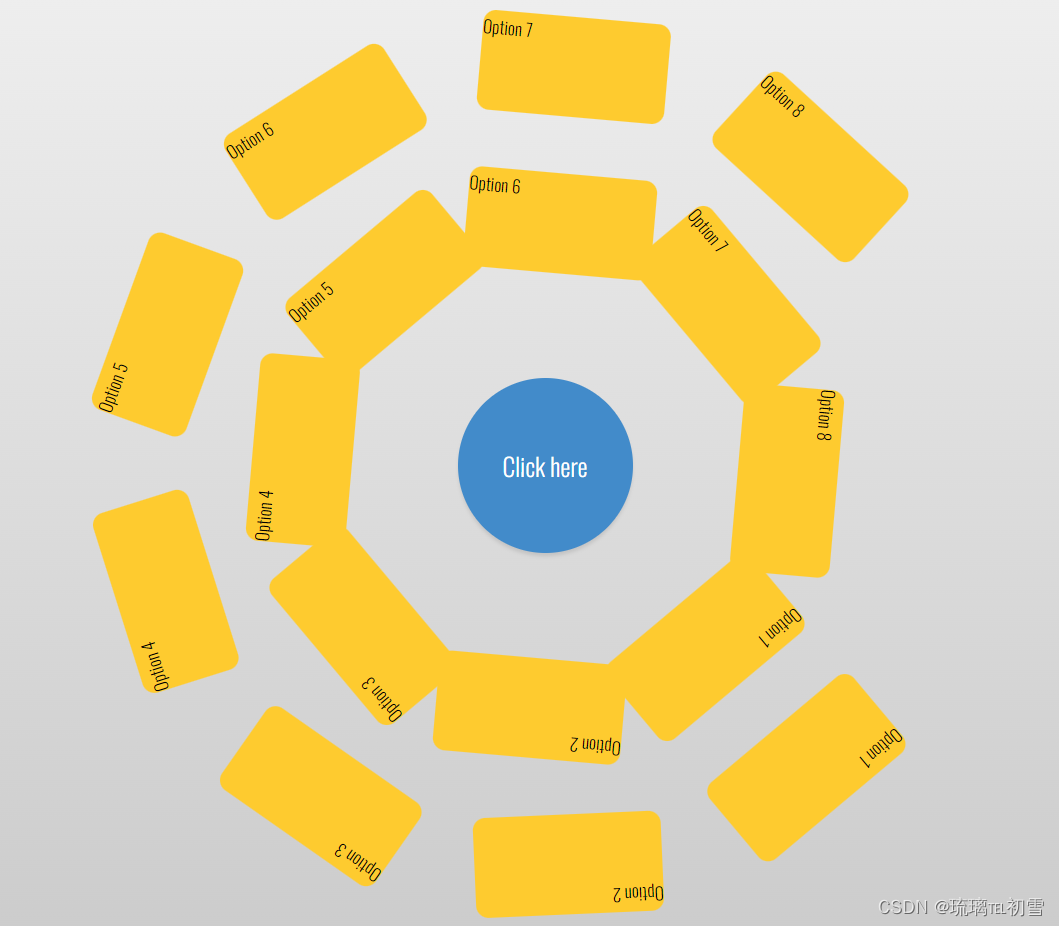


 764
764


 被折叠的 条评论
为什么被折叠?
被折叠的 条评论
为什么被折叠?
 到【灌水乐园】发言


