


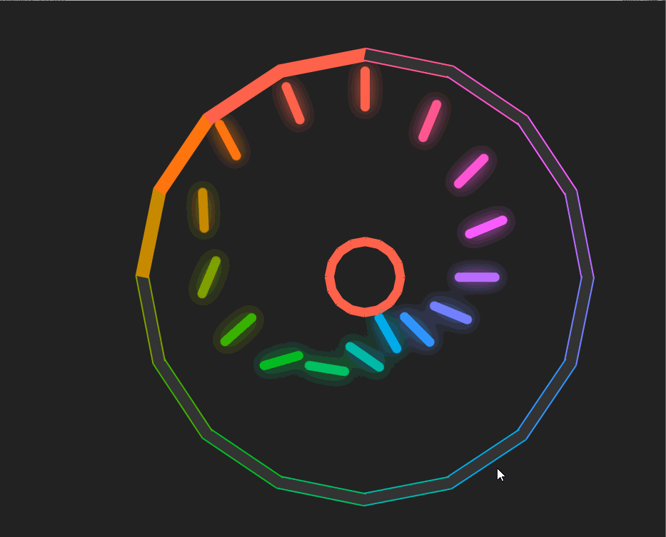
今天这个练习是一个用纯CSS实现的动画效果,非常有趣,大家可以看一下它的最终效果:
HTML代码:
<!doctype html>
<html>
  <head>
    <meta charset="utf-8">
    <title>【每日一练】134—一个好玩有趣的CSS动画效果</title>
    <link rel="stylesheet" href="style.css">
  </head>
  <body>
    <div class="box">
      <span style="--i:0;"><i></i></span>
      <span style="--i:1;"><i></i></span>
      <span style="--i:2;"><i></i></span>
      <span style="--i:3;"><i></i></span>
      <span style="--i:4;"><i></i></span>
      <span style="--i:5;"><i></i></span>
      <span style="--i:6;"><i></i></span>
      <span style="--i:7;"><i></i></span>
      <span style="--i:8;"><i></i></span>
      <span style="--i:9;"><i></i></span>
      <span style="--i:10;"><i></i></span>
      <span style="--i:11;"><i></i></span>
      <span style="--i:12;"><i></i></span>
      <span style="--i:13;"><i></i></span>
      <span style="--i:14;"><i></i></span>
      <span style="--i:15;"><i></i></span>
    </div>
  </body>
</html>
CSS代码:
*
{
  margin: 0;
  padding: 0;
  box-sizing: border-box;
}
body
{
  display: flex;
  justify-content: center;
  align-items: center;
  min-height: 100vh;
  background: #222;
}
.box
{
  position: relative;
  width: 500px;
  height: 500px;
  display: flex;
  justify-content: center;
}
.box span
{
  position: absolute;
  width: 10px;
  height: 250px;
  border-bottom: 40px solid transparent;
  transform-origin: bottom;
  transform: rotate(calc(22.5deg * var(--i))) translateX(0px);
}
.box span::before
{
  content: '';
  position: absolute;
  width: 100%;
  height: 50px;
  background: #03a9f4;
  box-shadow: 0 0 20px #03a9f4;
  border-radius: 10px;
  transform: translateY(160px);
  animation: animate 1.5s linear infinite;
  animation-delay: calc(0.1s * var(--i));
}
@keyframes animate
{
  0%
  {
    transform: translateY(160px) rotate(0deg);
    filter: hue-rotate(0deg);
  }
  50%
  {
    transform: translateY(0px);
  }
  100%
  {
    transform: translateY(160px) rotate(360deg);
    filter: hue-rotate(360deg);
  }
}
.box span::after
{
  content: '';
  position: absolute;
  bottom: 0;
  width: 10px;
  height: 17px;
  background: #03a9f4;
  transform-origin: bottom;
  transform: rotate(102deg);
  animation: animateColor 1.5s linear infinite;
}
.box span i
{
  position: absolute;
  width: 15px;
  height: 100px;
  transform-origin: top;
  transform: rotate(79deg);
  animation: animateSide 1.5s linear infinite,animateColor 1.5s linear infinite;
  animation-delay: calc(0.1s * var(--i));
  border-left: 2px solid #03a9f4;
  border-right: 2px solid #03a9f4;
  display: flex;
  justify-content: center;
  align-items: center;
}
@keyframes animateSide
{
  0%,25%,50.1%,100%
  {
    background: transparent;
  }
  25.1%,50%
  {
    background: #03a9f4;
  }
}
@keyframes animateSide
{
  0%,40%,65.1%,100%
  {
    background: #333;
  }
  40.1%,65%
  {
    background: #03a9f4;
  }
}
@keyframes animateColor
{
  0%
  {
    filter: hue-rotate(0deg);
  }
  100%
  {
    filter: hue-rotate(360deg);
  }
}
写在最后
以上就是每日一练的全部内容,希望今天的小练习对你有用,如果你觉得有帮助的话,请点赞我,关注我,并将它分享给你身边做开发的朋友,也许能够帮助到他。
我是杨小爱,我们明天见。
推荐阅读
学习更多技能
请点击下方公众号


 425
425


 被折叠的 条评论
为什么被折叠?
被折叠的 条评论
为什么被折叠?
 到【灌水乐园】发言


