


数据的分布主要有以下几种表现形式:
- 直方图
- 密度图
- 箱线图
- 点图+箱线图
- 塔夫特箱线图
- 小提琴图
- 金字塔图
数据前准备
- R
library(tidyverse)
library(plotrix)

## 全局主题设置
options(scipen=999)  # 关掉像 1e+48 这样的科学符号
# 颜色设置(灰色系列)
cbp1 <- c("#999999", "#E69F00", "#56B4E9", "#009E73",
          "#F0E442", "#0072B2", "#D55E00", "#CC79A7")

# 颜色设置(黑色系列)
cbp2 <- c("#000000", "#E69F00", "#56B4E9", "#009E73",
          "#F0E442", "#0072B2", "#D55E00", "#CC79A7")


ggplot <- function(...) ggplot2::ggplot(...) +
  scale_color_manual(values = cbp1) +
  scale_fill_manual(values = cbp1) + # 注意: 使用连续色阶时需要重写
  theme_bw()

data("midwest", package = "ggplot2") #加载数据集
- python
import numpy as np
import pandas as pd
import matplotlib as mpl
import matplotlib.pyplot as plt
import seaborn as sns
import warnings
#warnings.filterwarnings(action='once')

# 主题设置
plt.style.use('seaborn-whitegrid')
sns.set_style("whitegrid")
#print(mpl.__version__)# 3.5.1
#print(sns.__version__)# 0.12.0
直方图
连续变量直方图
- R
ggplot(mpg, aes(displ)) + scale_fill_brewer(palette = "Spectral")+
  geom_histogram(aes(fill=class),
                   binwidth = .1,
                   col="black",
                   size=.1) +  # change binwidth
  labs(title="Histogram with Auto Binning",
       subtitle="Engine Displacement across Vehicle Classes")

- python-matplotlib
df = pd.read_csv("./data/mpg_ggplot.csv")

# Prepare data
x_var = 'displ'
groupby_var = 'class'
df_agg = df.loc[:, [x_var, groupby_var]].groupby(groupby_var)
vals = [df[x_var].values.tolist() for i, df in df_agg]

# Draw
plt.figure(figsize=(10, 6), dpi=80)
colors = [plt.cm.Set1(i / float(len(vals) - 1)) for i in range(len(vals))]
n, bins, patches = plt.hist(vals,
                            30,
                            stacked=True,
                            density=False,
                            color=colors[:len(vals)])

# Decoration
plt.legend({
    group: col
    for group, col in zip(
        np.unique(df[groupby_var]).tolist(), colors[:len(vals)])
},title="Class",loc="right",ncol=1,fontsize=12,columnspacing=0.2, handletextpad=0.5,
         bbox_to_anchor=(0, 0, 1.2, 1.1))
plt.title(f"Stacked Histogram of ${x_var}$ colored by ${groupby_var}$",
          fontsize=22)
plt.xlabel(x_var)
plt.ylabel("Frequency")
#plt.ylim(0, 25)
plt.xticks(ticks=bins[::3], labels=[round(b, 1) for b in bins[::3]])
plt.show()

- python-seaborn
df = pd.read_csv("./data/mpg_ggplot.csv")


# Draw
plt.figure(figsize=(10, 6), dpi=80)
g = sns.histplot(
    x=df.displ,hue=df["class"],
    bins=20, ## 指定直方图个数,类似R的bin
    shrink = .7,## 指定直方图宽度,类似R的binwidth
    kde=False, ## 是否添加核密度曲线
    stat = "count", ## 统计数目类型,分为count观测数(默认),frequency频数,density密度,probablity概率
    multiple = "layer", ## 指定直方图表现形式,类似R的position参数,layer分层(默认),dodge并排,stack堆叠,fill填充
    #col = df.model, ## 分面参数
    )
sns.move_legend(g,loc="right",bbox_to_anchor=(0,0,1.2, 1),ncol=1)
g.set_title("Histogram with Auto Binning",fontsize=18)

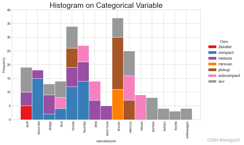
分类变量直方图
- R
ggplot(mpg, aes(manufacturer))+
  geom_bar(aes(fill=class), width = 0.5) +
  theme(axis.text.x = element_text(angle=65, vjust=0.6)) +
  labs(title="Histogram on Categorical Variable",
       subtitle="Manufacturer across Vehicle Classes")

- python-mat
df = pd.read_csv("./data/mpg_ggplot.csv")

# Prepare data
x_var = 'manufacturer'
groupby_var = 'class'
df_agg = df.loc[:, [x_var, groupby_var]].groupby(groupby_var)
vals = [df[x_var].values.tolist() for i, df in df_agg]

# Draw
plt.figure(figsize=(10, 6), dpi=80)
colors = [plt.cm.Set1(i / float(len(vals) - 1)) for i in range(len(vals))]
n, bins, patches = plt.hist(vals,
                            df[x_var].unique().__len__(),
                            stacked=True,
                            density=False,
                            color=colors[:len(vals)])

# Decoration
plt.legend({
    group: col
    for group, col in zip(
        np.unique(df[groupby_var]).tolist(), colors[:len(vals)])
},title="Class",loc="right",ncol=1,fontsize=12,columnspacing=0.2, handletextpad=0.5,
         bbox_to_anchor=(0, 0, 1.23, 1.05))
plt.title("Histogram on Categorical Variable",
          fontsize=22)
plt.xlabel(x_var)
plt.ylabel("Frequency")
plt.ylim(0, 40)
xloc = [(x+y)/2 for x,y in zip(bins[1:],bins[:-1])]
plt.xticks(ticks=xloc,
           labels=np.unique(df[x_var]).tolist(),
           rotation=90,
           horizontalalignment='left')

plt.show()
- python-seaborn
df = pd.read_csv("./data/mpg_ggplot.csv")

# Draw
plt.figure(figsize=(10, 6), dpi=80)
g = sns.histplot(
    x=df.manufacturer,hue=df["class"],
    bins=20, ## 指定直方图个数,类似R的bin
    shrink = .7,## 指定直方图宽度,类似R的binwidth
    kde=False, ## 是否添加核密度曲线
    stat = "count", ## 统计数目类型,分为count观测数(默认),frequency频数,density密度,probablity概率
    multiple = "layer", ## 指定直方图表现形式,类似R的position参数,layer分层(默认),dodge并排,stack堆叠,fill填充
    #col = df.model, ## 分面参数
    )
sns.move_legend(g,loc="right",bbox_to_anchor=(0,0,1.2, 1),ncol=1)
g.set_title("Histogram with Auto Binning",fontsize=18)
g.set_xticklabels(labels=np.unique(df[x_var]).tolist(),
           rotation=90,
           horizontalalignment='center')
plt.show()

密度图
- R
ggplot(mpg, aes(cty))+
  geom_density(aes(fill=factor(cyl)), alpha=0.8) +
  labs(title="Density plot",
       subtitle="City Mileage Grouped by Number of cylinders",
       caption="Source: mpg",
       x="City Mileage",
       fill="# Cylinders")

- python
# Import Data
df = pd.read_csv("./data/mpg_ggplot.csv")

# Draw Plot
plt.figure(figsize=(10, 8), dpi=80)
count = [4,5,6,8]
color = ["#01a2d9","#dc2624","#C89F91","#649E7D"]
plattes = {count:color for count,color in zip(count,color)}

for i,c in plattes.items():
    sns.kdeplot(df.loc[df['cyl'] == i, "cty"],
            shade=True,
            color=c,
            label="Cyl=%d"%i,
            alpha=.7)

# Decoration
sns.set(style="whitegrid", font_scale=1.1)
plt.title('Density Plot of City Mileage by n_Cylinders', fontsize=18)
plt.legend(title="# Cylinders",loc="right",bbox_to_anchor=(0,0,1.15, 1),ncol=1)
plt.show()

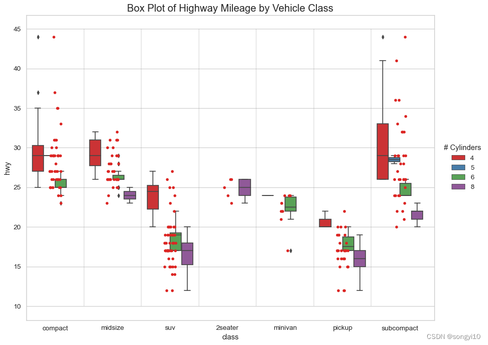
箱线图
- R
ggplot(mpg, aes(class, cty))+
  geom_boxplot(varwidth=F, fill="plum") +  # varwidth与组中观察数成正比
  geom_text(data=mpg %>% select(class,cty) %>%
              group_by(class) %>%
              summarise(count = n(),
                        loc = mean(cty)) %>%
              ungroup(),aes(x=class,y=loc+.5,label=paste0("# obs:",count)))+
  labs(title="Box plot",
       subtitle="City Mileage grouped by Class of vehicle",
       caption="Source: mpg",
       x="Class of Vehicle",
       y="City Mileage")

- python
# Import Data
df = pd.read_csv("./data/mpg_ggplot.csv")

# Draw Plot
plt.figure(figsize=(10, 6), dpi=80)
sns.boxplot(
    x='class',
    y='hwy',
    data=df,
    notch=False,
    color="plum",
)


# Add N Obs inside boxplot (optional)
def add_n_obs(df, group_col, y):
    medians_dict = {
        grp[0]: grp[1][y].median()
        for grp in df.groupby(group_col)
    }
    xticklabels = [x.get_text() for x in plt.gca().get_xticklabels()]
    n_obs = df.groupby(group_col)[y].size().values
    for (x, xticklabel), n_ob in zip(enumerate(xticklabels), n_obs):
        plt.text(x,
                 medians_dict[xticklabel] * 1.01,
                 "#obs : " + str(n_ob),
                 horizontalalignment='center',
                 fontdict={'size': 12},
                 color='black')


add_n_obs(df, group_col='class', y='hwy')

# Decoration
sns.set(style="whitegrid", font_scale=1.1)
plt.title('Box Plot of Highway Mileage by Vehicle Class', fontsize=16)
plt.ylim(10, 40)
plt.show()

点图+箱线图
- R
ggplot(mpg, aes(manufacturer, cty))+
  geom_boxplot(aes(fill=factor(cyl))) +
  geom_dotplot(binaxis='y',
               stackdir='center',
               dotsize = .3,
               fill="red") +
  theme(axis.text.x = element_text(angle=65, vjust=0.6)) +
  labs(title="Box plot + Dot plot",
       subtitle="City Mileage vs Class: Each dot represents 1 row in source data",
       caption="Source: mpg",
       x="Class of Vehicle",
       y="City Mileage",
       fill="# Cylinders")

- python
# Import Data
df = pd.read_csv("./data/mpg_ggplot.csv")

# Draw Plot
plt.figure(figsize=(13, 10), dpi=80)
sns.boxplot(
    x='class',
    y='hwy',
    data=df,
    hue='cyl',
    palette="Set1",
)

sns.stripplot(x='class',
              y='hwy',
              data=df,
              color='#dc2624',
              size=5,
              jitter=.1)

for i in range(len(df['class'].unique()) - 1):
    plt.vlines(i + .5, 10, 45, linestyles='solid', colors='gray', alpha=0.2)

# Decoration
plt.title('Box Plot of Highway Mileage by Vehicle Class', fontsize=18)
plt.legend(title="# Cylinders",loc="right",bbox_to_anchor=(0,0,1.13, 1),ncol=1)
print()
plt.xlim(min(plt.gca().get_xticks())-0.5,max(plt.gca().get_xticks())*1.1)
plt.show()
小提琴图
- R
ggplot(mpg, aes(class, cty,fill=class))+
  geom_violin() +
  guides(fill="none")+
  labs(title="Violin plot",
       subtitle="City Mileage vs Class of vehicle",
       caption="Source: mpg",
       x="Class of Vehicle",
       y="City Mileage")

- python
# Import Data
df = pd.read_csv("./data/mpg_ggplot.csv")

# Draw Plot
plt.figure(figsize=(13, 10), dpi=80)
sns.violinplot(x='class',
               y='hwy',
               data=df,
               scale='width',
               palette='Set1',
               inner='quartile')

# Decoration
plt.title('Violin Plot of Highway Mileage by Vehicle Class', fontsize=18)
plt.show()

金字塔图
- R
email_campaign_funnel <- read.csv("https://raw.githubusercontent.com/selva86/datasets/master/email_campaign_funnel.csv")

# X Axis Breaks and Labels
brks <- seq(-15000000, 15000000, 5000000)
lbls = paste0(as.character(c(seq(15, 0, -5), seq(5, 15, 5))), "m")

# Plot
ggplot(email_campaign_funnel, aes(x = Stage, y = Users, fill = Gender)) +   # Fill column
  geom_bar(stat = "identity", width = .6) +   # draw the bars
  scale_y_continuous(breaks = brks,   # Breaks
                     labels = lbls) + # Labels
  coord_flip() +  # Flip axes
  labs(title="Email Campaign Funnel") +
  theme_tufte() +  # Tufte theme from ggfortify
  theme(plot.title = element_text(hjust = .5),
        axis.ticks = element_blank()) +   # Centre plot title
  scale_fill_brewer(palette = "Dark2")  # Color palette

- python
# Read data
df = pd.read_csv("./data/email_campaign_funnel.csv")

# Draw Plot
plt.figure(figsize=(12, 8), dpi=80)
group_col = 'Gender'
order_of_bars = df.Stage.unique()[::-1]
colors = [
    plt.cm.Set1(i / float(len(df[group_col].unique()) - 1))
    for i in range(len(df[group_col].unique()))
]


for c, group in zip(colors, df[group_col].unique()):
    sns.barplot(x='Users',
                y='Stage',
                data=df.loc[df[group_col] == group, :],
                order=order_of_bars,
                color=c,
                label=group)

# Decorations
plt.xlabel("$Users$")
plt.ylabel("Stage of Purchase")
plt.yticks(fontsize=12)
plt.title("Population Pyramid of the Marketing Funnel", fontsize=18)
plt.legend(title="Gender",loc="right",bbox_to_anchor=(0,0,1.2, 1),ncol=1)
plt.show()

峰峦图
- R
#install.packages("ggridges")
library(ggridges)
data(mpg,package = "ggplot2")

ggplot(mpg,aes(fill=class))+
  geom_density_ridges(aes(x=cty,y=class))+
  theme_ridges() +
  theme(legend.position = "none")

- python
#pip install joypy #安装依赖包
#每组数据绘制核密度图,R中有ggridges
import joypy

# Import Data
mpg = pd.read_csv("./data/mpg_ggplot.csv")

# Draw Plot
plt.figure(figsize=(10, 6), dpi=80)
fig, axes = joypy.joyplot(mpg,
                          column='cty',
                          by="class",
                          ylim='own',
                          colormap=plt.cm.Set1,
                          figsize=(10, 6))

# Decoration
plt.title('Joy Plot of City and Highway Mileage by Class', fontsize=18)
plt.show()

参考资料
R语言绘图:https://mp.weixin.qq.com/s/zLIsgnfKgSFjL6jrboIgkg
python绘图:https://mp.weixin.qq.com/s/DY_K1CisYElFL7Tt0Si6hw


 526
526


 被折叠的 条评论
为什么被折叠?
被折叠的 条评论
为什么被折叠?
 到【灌水乐园】发言


