


了解animation
所有动画属性的简写属性,除了animation-play-state
@keyframes
规定动画
属性
- animation-name:规定动画的名称(none | custom-ident | string;)
- animation-duration:属性指定一个动画周期的时长,单位为s或ms;默认值为0s,表示无动画。
- animation-timing-function:属性定义CSS动画在每一动画周期中执行的节奏。可能值为一或多timing-function。默认是ease;可以是贝塞尔曲线;也可以是step等
- animation-delay:定义动画于何时开始,即从动画应用在元素上到动画开始的这段时间的长度。
- animation-iteration-count:定义动画在结束前运行的次数 可以是1次 无限循环(infinite)
- animation-direction:属性指示动画是否反向播放(normal|reverse|alternate|alternate-reverse|initial|inherit)
- animation-fill-mode:用来指定在动画执行之前和之后如何给动画的目标应用样式(none | forwards | backwards | both)
- animation-play-state: 属性定义一个动画是否运行或者暂停。可以通过查询它来确定动画是否正在运行。
部分属性重点值详解
- animation-timing-function
关键字:ease,ease-in,ease-out,ease-in-out,linear,step-start,step-end。
贝塞尔曲线:一般用它需要用到可视化图像
steps:steps(number_of_steps, direction);step-start或者step-end,分别对应steps(1, start) 和 steps(1, end)。 - animation-direction
normal 每个循环内动画向前循环,换言之,每个动画循环结束,动画重置到起点重新开始,这是默认属性。
alternate 动画交替反向运行,反向运行时,动画按步后退,同时,带时间功能的函数也反向,比如,ease-in 在反向时成为ease-out。计数取决于开始时是奇数迭代还是偶数迭代
reverse 反向运行动画,每周期结束动画由尾到头运行。
alternate-reverse 反向交替, 反向开始交替
动画第一次运行时是反向的,然后下一次是正向,后面依次循环。决定奇数次或偶数次的计数从1开始。
- animation-fill-mode
none 动画执行前后不改变任何样式
forwards 目标保持动画最后一帧的样式
backwards 动画采用相应第一帧的样式
both 动画将会执行 forwards 和 backwards 执行的动作。 - animation-play-state
running 当前动画正在运行。
paused 当前动画以被停止。
实现时钟的结构

分析结构:外面一个圆形的div–接着是刻度线(6个div)–最后用一个大的div将其覆盖,展示一下我最自信的画工

- 整体的HTML代码结构
<div class="clock">
    <!-- 时间刻度线 -->
    <div class="line line1"></div>
    <div class="line line2"></div>
    <div class="line line3"></div>
    <div class="line line4"></div>
    <div class="line line5"></div>
    <div class="line line6"></div>
    <!-- 覆盖部分刻度线 -->
    <div class="cover"></div>
    <!-- 分针 -->
    <div class="minute"></div>
    <!-- 秒针 -->
    <div class="second"></div>
    <!-- 放置分针秒针 -->
    <div class="dotted"></div>
</div>
- 形成基本的时钟
<style>
    .clock{
        width: 200px;
        height: 200px;
        margin: 100px auto;
        border: 10px solid #000000;
        border-radius: 110px;
        position: relative;
    }
    .line{
        width: 4px;
        background: grey;
        position: absolute;
        height: 100%;
        left: 50%;
        margin-left: -2px;
    }
    /* 通过旋转实现各个时间点 */
    .line2{
        transform: rotate(30deg);
    }
    .line3{
        transform: rotate(60deg);
    }
    .line4{
        transform: rotate(90deg);
    }
    .line5{
        transform: rotate(120deg);
    }
    .line6{
        transform: rotate(150deg);
    }
    .line1,.line4{
        width: 6px;
        margin-left: -3px;
    }
    /* 覆盖时间点,覆盖居中显示 */
    .cover{
        height: 160px;
        width: 160px;
        background: #FFFFFF;
        position: absolute;
        left: 50%;
        top: 50%;
        border-radius: 80px;
        margin-left: -80px;
        margin-top: -80px;
    }
</style>- 画出分针和秒针
.dotted {
	width: 20 px;
	height: 20 px;
	border - radius: 10 px;
	left: 50 % ;
	top: 50 % ;
	position: absolute;
	background: black;
	margin - left: -10 px;
	margin - top: -10 px;
}
.minute {
	position: absolute;
	left: 50 % ;
	width: 4 px;
	height: 75 px;
	background: green;
	top: 25 px;
	margin - left: -2 px;
}
.second {
	position: absolute;
	left: 50 % ;
	width: 2 px;
	height: 95 px;
	background: gold;
	top: 5 px;
	margin - left: -1 px;
	transform - origin: bottom center;
}- 让时间走动
上面的所有方法只要通过定位层级和旋转基本都能实现的,现使用动画解决秒针和分针走动。 - 动画规则
秒针走一圈是是360度,60秒,一步一秒。分针走一圈也是同理,定义动画规则
@keyframes time_rotate {
	from {

	}
	to {
		transform: rotate(360 deg)
	}
}
秒针旋转360度需要60s,那么每一秒走一步,无限次。
.second {
	........
	transform - origin: bottom center;
	animation: time_rotate 60 s steps(60) 0 s infinite;
}
分针走一圈也是360度,需要60分钟…
.minute {
	.......
	transform - origin: bottom center;
	animation: time_rotate 3600 s steps(60) 0 s infinite;
}
我们可以利用该效果配合我们的JS来控制
加个时针
......
		<!-- 时针 -->
        <div class="hour"></div>
        <!-- 分针 -->
        <div class="minute"></div>
......
.hour {
	position: absolute;
	left: 50 % ;
	width: 6 px;
	height: 55 px;
	background: red;
	top: 45 px;
	margin - left: -3 px;
	transform - origin: bottom center;
}
实现JS,这里我们使用定时器,结合动画效果来实现;之前的动画效果要去除掉
.minute {
	transform - origin: bottom center;
	/* animation: time_rotate 3600s steps(60) 0s infinite; */
}
.second {
	transform - origin: bottom center;
	/* animation: time_rotate 60s steps(60) 0s infinite; */
}
/* @keyframes time_rotate {
    from {
    }
    to{
        transform: rotate(360deg)
    }
} */
JS代码
let secDom = document.querySelector('.second')
let minDom = document.querySelector('.minute')
let hourDom = document.querySelector('.hour')
// 获取现在的时分秒
let timerId = setInterval(function() {
	let timer = new Date()
	let tHour = timer.getHours()
	let tMin = timer.getMinutes()
	let tSec = timer.getSeconds()
	// 将其可视化
	// 秒针可视化,当前秒数应旋转多少度
	let secDeg = 360 / 60 * tSec
	secDom.style.transform = `rotate(${secDeg}deg)`
	// 分针可视化,当前分数应旋转多少度
	let minDeg = 360 / 60 * tMin
	minDom.style.transform = `rotate(${minDeg}deg)`
	// 时钟可视化,当前小时应旋转多少度
	let hourDeg = 360 / 12 * tHour
	hourDom.style.transform = `rotate(${hourDeg}deg)`
}, 1000)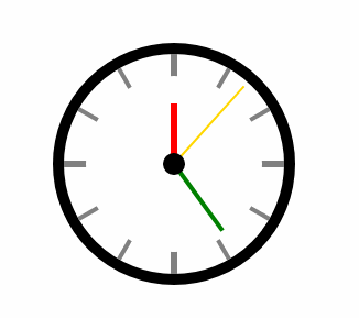
整改后的HTML和CSS
<div class="clock">
    <div class="line line1"></div>
    <div class="line line2"></div>
    <div class="line line3"></div>
    <div class="line line4"></div>
    <div class="line line5"></div>
    <div class="line line6"></div>
    <div class="cover"></div>
    <div class="hour"></div>
    <div class="minute"></div>
    <div class="second"></div>
    <div class="dotted"></div>
</div>
.clock {
width: 200 px;
height: 200 px;
margin: 100 px auto;
border: 10 px solid #000;
border-radius:110px;
position:relative
}
.line{
width:4px;
background:grey;
position:absolute;
height:100%;
left:50%;
margin-left:-2px
}
.line2{
transform:rotate(30deg)
}
.line3{
transform:rotate(60deg)
}
.line4{
transform:rotate(90deg)
}
.line5{
transform:rotate(120deg)
}
.line6{
transform:rotate(150deg)
}
.line1,.line4{
width:6px;
margin-left:-3px
}
.cover{
height:160px;
width:160px;
background:# fff;
position: absolute;
left: 50 % ;
top: 50 % ;
border - radius: 80 px;
margin - left: -80 px;
margin - top: -80 px
}
.dotted {
width: 20 px;
height: 20 px;
border - radius: 10 px;
left: 50 % ;
top: 50 % ;
position: absolute;
background: black;
margin - left: -10 px;
margin - top: -10 px
}
.hour {
position: absolute;
left: 50 % ;
width: 6 px;
height: 55 px;
background: red;
top: 45 px;
margin - left: -3 px;
transform - origin: bottom center
}
.minute {
position: absolute;
left: 50 % ;
width: 4 px;
height: 75 px;
background: green;
top: 25 px;
margin - left: -2 px;
transform - origin: bottom center
}
.second {
position: absolute;
left: 50 % ;
width: 2 px;
height: 95 px;
background: gold;
top: 5 px;
margin - left: -1 px;
transform - origin: bottom center
}


 720
720


 被折叠的 条评论
为什么被折叠?
被折叠的 条评论
为什么被折叠?
 到【灌水乐园】发言


