


RippleDrawable
简介
Android5.x的水波纹效果就是通过RippleDrawable实现的,根据有无边界可以分为:右边界效果 + 无边界效果。边界类型可以是mipmap,也可以是自定义的drawable(shape),可以是是drawabel(selector).API>=21才可以使用。
- 在drawable创建xml文件
- 根节点是ripple,属性color是水波纹的颜色
- ripple节点下是item节点:
android:id="@android:id/mask"表示有水波纹边界,android:drawable=""边界drawable
无边界水波纹
效果图:

<TextView
    style="@style/TextStyle1"
    android:background="@drawable/no_mask_ripple"
    android:text="无边界"/>
no_mask_ripple.xml
<?xml version="1.0" encoding="utf-8"?>
<ripple xmlns:android="http://schemas.android.com/apk/res/android"
        android:color="@color/colorPrimary">
</ripple>
有边界水波纹
效果图:

<TextView
    style="@style/TextStyle1"
    android:background="@drawable/mask_ripple"
    android:text="有边界"/>
mask_ripple.xml
<?xml version="1.0" encoding="utf-8"?>
<ripple xmlns:android="http://schemas.android.com/apk/res/android"
        android:color="@color/colorPrimary">
    <item
        android:id="@android:id/mask"
        android:drawable="@android:color/holo_blue_dark"/>
</ripple>
图片作为边界
效果图:

<TextView
    style="@style/TextStyle1"
    android:background="@drawable/pic_mask_ripple"
    android:text="图片作为边界"/>
pic_mask_ripple.xml
<?xml version="1.0" encoding="utf-8"?>
<ripple xmlns:android="http://schemas.android.com/apk/res/android"
        android:color="@color/colorPrimary">
    <item
        android:id="@android:id/mask"
        android:drawable="@mipmap/ic_launcher"/>
</ripple>
自定义边界
效果图:

<TextView
    style="@style/TextStyle1"
    android:background="@drawable/custom_mask_ripple"
    android:text="自定义边界"/>
custom_mask_ripple.xml
<?xml version="1.0" encoding="utf-8"?>
<ripple xmlns:android="http://schemas.android.com/apk/res/android"
        android:color="@color/colorPrimary">
    <item
        android:id="@android:id/mask"
        android:drawable="@drawable/custom_ripple_mask_shape"/>
</ripple>
custom_ripple_mask_shape.xml
<?xml version="1.0" encoding="utf-8"?>
<shape xmlns:android="http://schemas.android.com/apk/res/android"
    android:shape="rectangle">

    <corners android:topLeftRadius="100dp"/>
    <solid android:color="@color/colorAccent"/>

</shape>
带有selector的边界ripple
效果图

<TextView
    style="@style/TextStyle1"
    android:background="@drawable/selector_mask_ripple"
    android:text="带有selector的ripple"/>
selector_mask_ripple.xml
<?xml version="1.0" encoding="utf-8"?>
<ripple xmlns:android="http://schemas.android.com/apk/res/android"
        android:color="@color/colorPrimary">
    <item>
        <selector>
            <item
                android:drawable="@mipmap/ic_resume"
                android:state_pressed="true"/>

            <item
                android:drawable="@mipmap/ic_update"
                android:state_pressed="false"/>
        </selector>
    </item>
</ripple>
源码
RippleDrawableDemo01Recommend_gray
CardView
效果图:
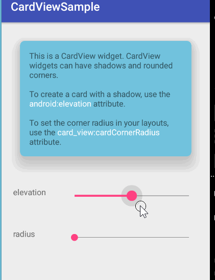
简介
CardView 就是 Material Design 设计语言中关于 Card 卡片概念的实现。API>=21 Android5.0 使用
- CardView 可以在一个卡片布局中一致性的显示内容
- CardView 是一个 Layout,可以布局其他 View
- CardView 在 FrameLayout 之上添加了圆角和阴影效果
属性
常用属性
- card_view:cardElevation:阴影的大小
- card_view:cardMaxElevation:阴影最大高度
- card_view:cardBackgroundColor:卡片的背景色
- card_view:cardCornerRadius:卡片的圆角大小
- card_view:contentPadding:卡片内容于边距的间隔
card_view:contentPaddingBottom
card_view:contentPaddingTop
card_view:contentPaddingLeft
card_view:contentPaddingRight
card_view:contentPaddingStart
card_view:contentPaddingEnd
card_view:cardUseCompatPadding
设置内边距,V21+的版本和之前的版本仍旧具有一样的计算方式 - card_view:cardPreventConrerOverlap:在V20和之前的版本中添加内边距,这个属性为了防止内容和边角的重叠
API>=21:
android:elevation="50dp"无限制
app:cardElevation="50dp"使用步骤
1 导包
dependencies {
    ...
    compile 'com.android.support:cardview-v7:25.0.0'
    ...
}
2 使用 CardView 作为 Layout
CardView 没有什么神秘的,就是一个 FrameLayout 的特效版(Framelayout 有的它都有,Framelayout 没有的它也有),直接用就好了:
<android.support.v7.widget.CardView
    android:id="@+id/cardView"
    android:layout_width="match_parent"
    android:layout_height="200dp"
    app:cardBackgroundColor="@color/colorPrimary"
    app:cardCornerRadius="20dp"
    app:cardElevation="50dp"
    app:cardMaxElevation="50dp"
    android:clickable="true"
    android:foreground="?android:attr/selectableItemBackground">

    <ImageView
        android:layout_width="match_parent"
        android:layout_height="match_parent"
        android:scaleType="fitXY"
        android:src="@mipmap/show_img2"/>

    <TextView
        android:layout_width="wrap_content"
        android:layout_height="30dp"
        android:gravity="center"
        android:text="jadjdjowjqoejqljlq"
        android:layout_gravity="bottom|center_horizontal"/>

</android.support.v7.widget.CardView>
3、设置 CardView 的属性
CardView 提供了一个 cardElevation 和 cardCornerRadius 属性,这就是它给 FrameLayout 加的特效。
Layout:
- cardElevation:用来设置 CardView 的Z轴阴影,Android 5.0 以上有效
- cardCornerRadius:用来设置 CardView 卡片的四角圆角矩形程度
Java 代码:
- setCardElevation()
- setRadius()
seekBar_radius.setOnSeekBarChangeListener(new SeekBar.OnSeekBarChangeListener() {
    @Override
    public void onProgressChanged(SeekBar seekBar, int progress, boolean b) {
        cardView.setRadius(progress);
    }

    @Override
    public void onStartTrackingTouch(SeekBar seekBar) {

    }

    @Override
    public void onStopTrackingTouch(SeekBar seekBar) {

    }
});
4、添加点击效果
默认情况,CardView 是不可点击的,并且没有任何的触摸反馈效果。触摸反馈动画在用户点击CardView时可以给用户以视觉上的反馈。为了实现这种行为,必须提供以下属性:
<android.support.v7.widget.CardView
    ...
    android:clickable="true"
    android:foreground="?android:attr/selectableItemBackground"
    ...
/>使用android:foreground=”?android:attr/selectableItemBackground”可以使CardView点击产生波纹的效果,有触摸点向外扩散。
其实大部分View添加下面的代码都有水波纹效果。
android:background="?android:attr/selectableItemBackground"
android:clickable="true"CardView用android:foreground="" 但是TextView用android:background=“”+android:clickable=""
5、遇到的问题
1 没有阴影效果
CardView有阴影是因为属性app:cardElevation=,而不是android:elevation=,但凡是CardView特有的属性,都已card


 扫一扫
扫一扫
 4686
4686

 被折叠的 条评论
为什么被折叠?
被折叠的 条评论
为什么被折叠?
 到【灌水乐园】发言


