


Android控件之EditText
EditText类的结构如下
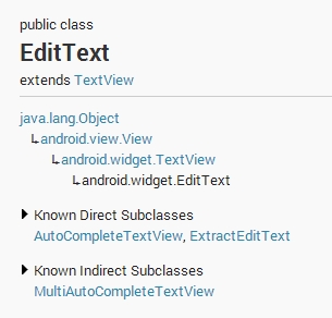
EditText类继承与TextView类
EditText的属性很多,详细的可见Android Develops的官网
http://developer.android.com/reference/android/widget/EditText.html#inhfields
下面简单说几种呆会可能要用到的属性
android:drawableTop在text的正上方输出一个drawable
android:drawableBottom在text的下方输出一个drawable
android:drawableLeft在text的左边输出一个drawable
android:drawableRight在text的右边输出一个drawable
android:hint Text为空时显示的文字提示信息,可通过textColorHint设置提示信息的颜色
android:inputType 设置文本的类型,用于帮助输入法显示合适的键盘类型
android:maxLength 限制输入字符数
android:singleLine设置单行显示
android:textColor 设置文本颜色
android:textSize 设置文字大小,推荐度量单位”sp”,如”15sp”
定义一个EditText控件
<EditText
        android:layout_width="fill_parent"
        android:layout_height="wrap_content"
        />"
如下图所示
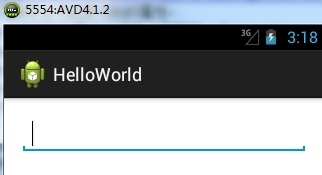
注意有光标在闪动
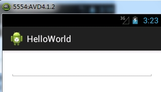
要不想有闪动的光标,这里有个小技巧,就是再定义一个EditText,并将其宽度和高度设为0
<EditText
        android:layout_width="0dp"
        android:layout_height="0dp"
        />
    <EditText
        android:layout_width="fill_parent"
        android:layout_height="wrap_content"
        />"
如下图所示,相当于第一个EditText被隐藏了
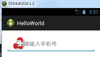
下面定义一个EditText,要求只能输入数字,最大长度为11,有提示信息,且控件的左侧有图片
<EditText
        android:layout_width="fill_parent"
        android:layout_height="wrap_content"
        android:maxLength="11"
        android:inputType="number"
        android:hint="请输入手机号"
        android:drawableLeft="@drawable/yingmu"
        />"
运行图示如下
若我们需要让EditText的左右两端有个弧度,可以在drawable里添加个shape.xml
shape.xml的内容如下
<?xml version="1.0" encoding="utf-8"?>
<shape
    xmlns:android="http://schemas.android.com/apk/res/android"
    android:shape="rectangle">
    <!-- 填充的颜色 -->
    <solid android:color="#FF8C69"/>
    <!-- 设置矩形的四个角为弧形 -->
    <corners android:radius="10dip"/>
</shape>
布局文件
<EditText
android:layout_width="fill_parent"
android:layout_height="wrap_content"
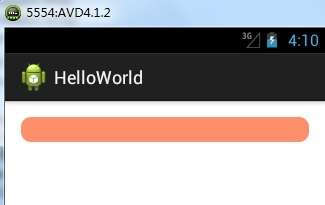
android:background="@drawable/shape"
/>"
运行图示如下,可见控件左右两端有明显的弧度


 2677
2677

 被折叠的 条评论
为什么被折叠?
被折叠的 条评论
为什么被折叠?
 到【灌水乐园】发言


