


本文记录一些平时常见的折线图的效果图及代码,需要时方便直接套用。本文只列出echarts的配置项代码,不了解echarts的使用方法可查看 官方文档。
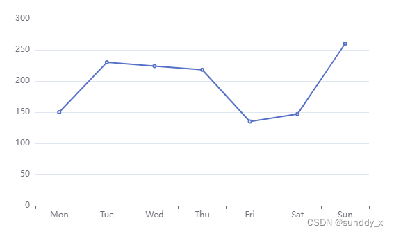
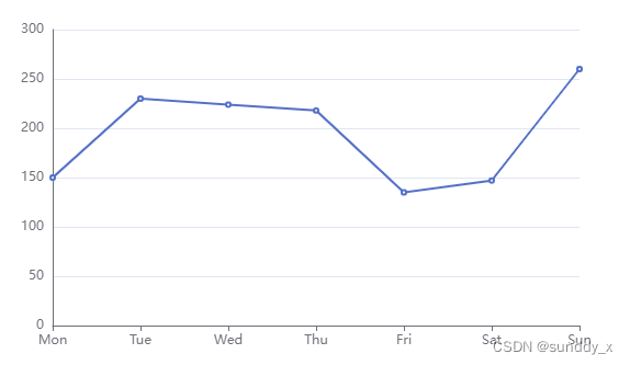
基础
效果图:
配置项:
option = {
  xAxis: {
    type: 'category',
    data: ['Mon', 'Tue', 'Wed', 'Thu', 'Fri', 'Sat', 'Sun']
  },
  yAxis: {
    type: 'value'
  },
  series: [
    {
      type: 'line',
      data: [150, 230, 224, 218, 135, 147, 260]
    }
  ]
}
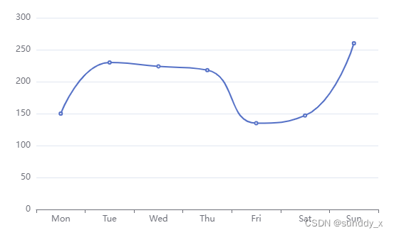
平滑
效果图:
配置项:
option = {
  xAxis: {
    type: 'category',
    data: ['Mon', 'Tue', 'Wed', 'Thu', 'Fri', 'Sat', 'Sun']
  },
  yAxis: {
    type: 'value'
  },
  series: [
    {
      type: 'line',
      smooth: true,
      data: [150, 230, 224, 218, 135, 147, 260]
    }
  ]
}
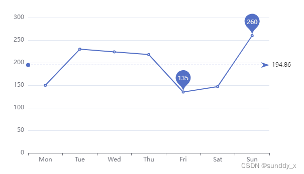
最大值、最小值、平均值
效果图:
配置项:
option = {
  xAxis: {
    type: 'category',
    data: ['Mon', 'Tue', 'Wed', 'Thu', 'Fri', 'Sat', 'Sun']
  },
  yAxis: {
    type: 'value'
  },
  series: [
    {
      type: 'line',
      data: [150, 230, 224, 218, 135, 147, 260],
      markPoint: {
        data: [
          {
            name: '最大值',
            type: 'max'
          },
          {
            name: '最小值',
            type: 'min'
          }
        ]
      },
      markLine: {
        data: [
          {
            name: '平均值',
            type: 'average'
          }
        ]
      }
    }
  ]
}
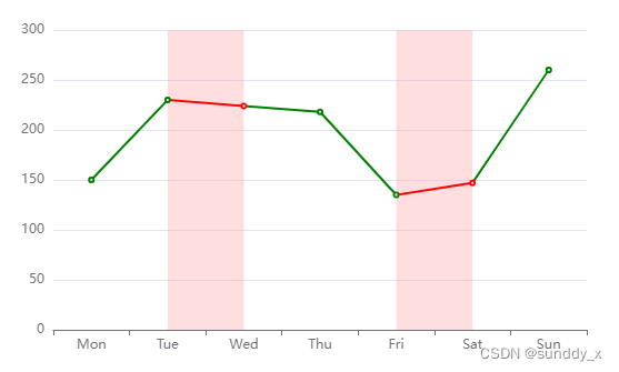
图表标域
效果图:
配置项:
option = {
  xAxis: {
    type: 'category',
    data: ['Mon', 'Tue', 'Wed', 'Thu', 'Fri', 'Sat', 'Sun']
  },
  yAxis: {
    type: 'value'
  },
  visualMap: {
    show: false,
    dimension: 0,
    pieces: [
      {
        lte: 1,
        color: 'green'
      },
      {
        gt: 1,
        lte: 2,
        color: 'red'
      },
      {
        gt: 2,
        lte: 4,
        color: 'green'
      },
      {
        gt: 4,
        lte: 5,
        color: 'red'
      },
      {
        gt: 5,
        color: 'green'
      }
    ]
  },
  series: [
    {
      type: 'line',
      data: [150, 230, 224, 218, 135, 147, 260],
      markArea: {
        itemStyle: {
          color: 'rgba(255, 173, 177, 0.4)'
        },
        data: [
          [
            {
              xAxis: 'Tue'
            },
            {
              xAxis: 'Wed'
            }
          ],
          [
            {
              xAxis: 'Fri'
            },
            {
              xAxis: 'Sat'
            }
          ]
        ]
      }
    }
  ]
}
区域填充
效果图:
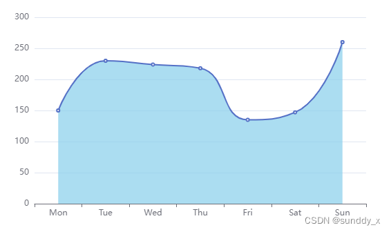
配置项:
option = {
  xAxis: {
    type: 'category',
    data: ['Mon', 'Tue', 'Wed', 'Thu', 'Fri', 'Sat', 'Sun']
  },
  yAxis: {
    type: 'value'
  },
  series: [
    {
      type: 'line',
      smooth: true,
      data: [150, 230, 224, 218, 135, 147, 260],
      areaStyle: {
        color: 'skyblue'
      }
    }
  ]
}
坐标轴留白策略:紧挨边缘
效果图:
配置项:
option = {
  xAxis: {
    type: 'category',
    // 类目轴中 boundaryGap 可以配置为 true 和 false。默认为 true,设置false可紧挨边缘。
    boundaryGap: false,
    data: ['Mon', 'Tue', 'Wed', 'Thu', 'Fri', 'Sat', 'Sun']
  },
  yAxis: {
    type: 'value',
    axisLine: {
      show: true
    }
  },
  series: [
    {
      type: 'line',
      data: [150, 230, 224, 218, 135, 147, 260]
    }
  ]
}
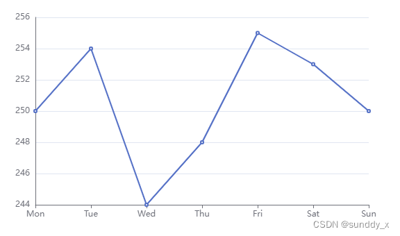
缩放:脱离 0 值比例
配置前效果图:
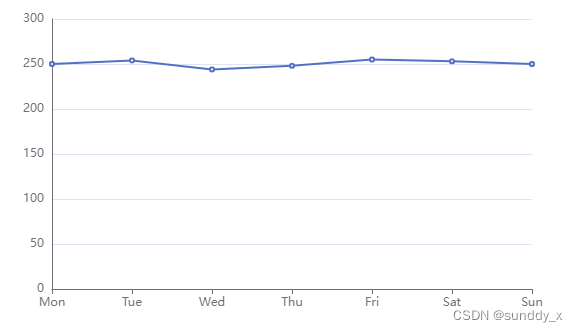
配置后效果图:
配置项:
option = {
  xAxis: {
    type: 'category',
    boundaryGap: false,
    data: ['Mon', 'Tue', 'Wed', 'Thu', 'Fri', 'Sat', 'Sun']
  },
  yAxis: {
    type: 'value',
    // 是否是脱离 0 值比例。设置成 true 后坐标刻度不会强制包含零刻度
    // 只在数值轴中(type: 'value')有效。
    scale: true,
    axisLine: {
      show: true
    }
  },
  series: [
    {
      type: 'line',
      // data: [150, 230, 224, 218, 135, 147, 260]
      data: [250, 254, 244, 248, 255, 253, 250]
    }
  ]
}
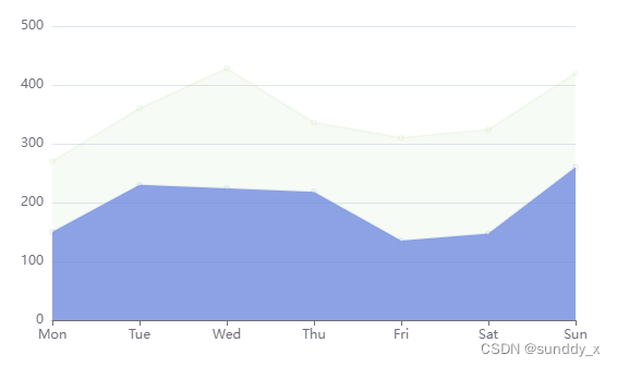
堆叠
效果图:
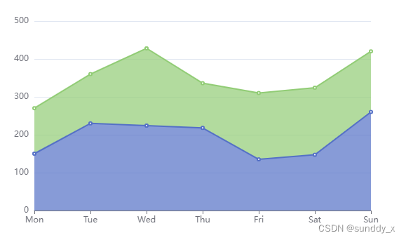
高亮聚焦淡出效果图:
配置项:
option = {
  xAxis: {
    type: 'category',
    boundaryGap: false,
    data: ['Mon', 'Tue', 'Wed', 'Thu', 'Fri', 'Sat', 'Sun']
  },
  yAxis: {
    type: 'value'
  },
  series: [
    {
      type: 'line',
      stack: 'sale',
      data: [150, 230, 224, 218, 135, 147, 260],
      areaStyle: {},
      emphasis: {
        focus: 'self'
      }
    },
    {
      type: 'line',
      stack: 'sale',
      data: [120, 130, 204, 118, 175, 177, 160],
      areaStyle: {},
      emphasis: {
        focus: 'self'
      }
    }
  ]
}
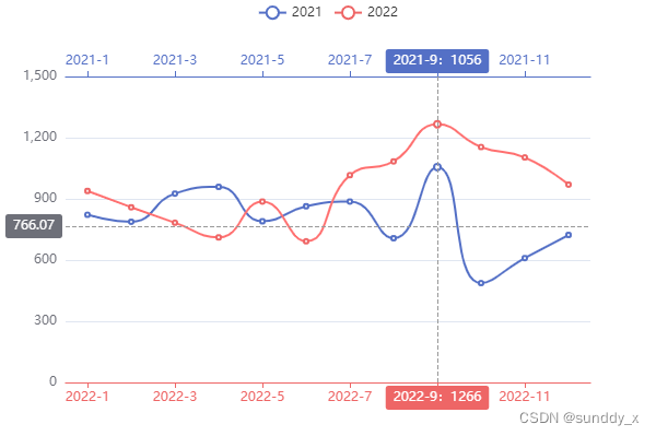
同期比对、多x轴
效果图:
配置项:
const colors = ['#5470C6', '#EE6666'];
const option = {
  color: colors,
  tooltip: {
    trigger: 'none',
    axisPointer: {
      type: 'cross'
    }
  },
  legend: {},
  grid: {
    top: 70,
    bottom: 50
  },
  xAxis: [
    {
      type: 'category',
      axisTick: {
        alignWithLabel: true
      },
      axisLine: {
        onZero: false,
        lineStyle: {
          color: colors[1]
        }
      },
      axisPointer: {
        label: {
          formatter: function (params) {
            return (
              params.value +
              (params.seriesData.length ? ':' + params.seriesData[0].data : '')
            );
          }
        }
      },
      data: ['2022-1', '2022-2', '2022-3', '2022-4', '2022-5', '2022-6', '2022-7', '2022-8', '2022-9', '2022-10', '2022-11', '2022-12']
    },
    {
      type: 'category',
      axisTick: {
        alignWithLabel: true
      },
      axisLine: {
        onZero: false,
        lineStyle: {
          color: colors[0]
        }
      },
      axisPointer: {
        label: {
          formatter: function (params) {
            return (
              params.value +
              (params.seriesData.length ? ':' + params.seriesData[0].data : '')
            );
          }
        }
      },
      data: ['2021-1', '2021-2', '2021-3', '2021-4', '2021-5', '2021-6', '2021-7', '2021-8', '2021-9', '2021-10', '2021-11', '2021-12']
    }
  ],
  yAxis: [
    {
      type: 'value'
    }
  ],
  series: [
    {
      name: '2021',
      type: 'line',
      xAxisIndex: 1,
      smooth: true,
      emphasis: {
        focus: 'series'
      },
      data: [822, 788, 926, 959, 790, 864, 887, 707, 1056, 487, 610, 723]
    },
    {
      name: '2022',
      type: 'line',
      xAxisIndex: 0,
      smooth: true,
      emphasis: {
        focus: 'series'
      },
      data: [939, 859, 783, 711, 887, 692, 1016, 1084, 1266, 1154, 1103, 970]
    }
  ]
}
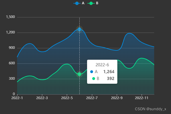
渐变面积图、拐点描边样式、悬停显示拐点
效果图:
配置项:
const option = {
  legend: {
    textStyle: {
      color: '#fff'
    }
  },
  xAxis: {
    type: 'category',
    boundaryGap: false,
    axisLabel: {
      color: 'rgba(255,255,255,0.8)'
    },
    axisTick: {
      alignWithLabel: true,
      lineStyle: {
        color: 'rgba(255,255,255,0.8)'
      }
    },
    data: ['2022-1', '2022-2', '2022-3', '2022-4', '2022-5', '2022-6', '2022-7', '2022-8', '2022-9', '2022-10', '2022-11', '2022-12']
  },
  yAxis: {
    type: 'value',
    axisLabel: {
      color: 'rgba(255,255,255,0.8)'
    },
    splitLine: {
      lineStyle: {
        color: '#666'
      }
    }
  },
  tooltip: {
    trigger: 'axis'
  },
  series: [
    {
      name: 'A',
      type: 'line',
      symbol: 'circle',
      symbolSize: 12,
      // 是否显示 symbol, 如果 false 则只有在 tooltip hover 的时候显示
      showSymbol: false,
      itemStyle: {
        color: '#0184d5',
        borderColor: 'rgba(221, 220, 107, 0.1)',
        borderWidth: 12
      },
      smooth: true,
      emphasis: {
        focus: 'series'
      },
      areaStyle: {
        color: new echarts.graphic.LinearGradient(0, 0, 0, 1, [
          {
            offset: 0,
            color: 'rgba(1, 132, 312, 0.4)'
          },
          {
            offset: 0.8,
            color: 'rgba(1, 132, 312, 0.1)'
          }
        ])
      },
      data: [722, 988, 826, 959, 1090, 1264, 987, 907, 856, 1187, 1010, 923]
    },
    {
      name: 'B',
      type: 'line',
      symbol: 'circle',
      symbolSize: 12,
      showSymbol: false,
      itemStyle: {
        color: '#00d887',
        borderColor: 'rgba(221, 220, 107, 0.1)',
        borderWidth: 12
      },
      smooth: true,
      emphasis: {
        focus: 'series'
      },
      lineStyle: {
        color: '#00d887',
        width: 2
      },
      areaStyle: {
        color: new echarts.graphic.LinearGradient(0, 0, 0, 1, [
          {
            offset: 0,
            color: 'rgba(0, 216, 135, 0.4)'
          },
          {
            offset: 0.8,
            color: 'rgba(0, 216, 135, 0.1)'
          }
        ])
      },
      data: [239, 359, 283, 411, 587, 392, 516, 484, 666, 504, 703, 570]
    }
  ]
}
不定期更新…


 被折叠的 条评论
为什么被折叠?
被折叠的 条评论
为什么被折叠?
 到【灌水乐园】发言


