


<!DOCTYPE html PUBLIC "-//W3C//DTD HTML 4.01//EN"
"http://www.w3.org/TR/html4/strict.dtd">
<html xmlns="http://www.w3.org/1999/xhtml" lang="en">
<head>
<meta http-equiv="Content-Type" content="text/html; charset=utf-8" />
<title>上中下布局</title>
<style type="text/css">
body{
background: #42413C ;
margin: 0;/*消除body中的留白*/
padding: 0;
text-align: center;
}
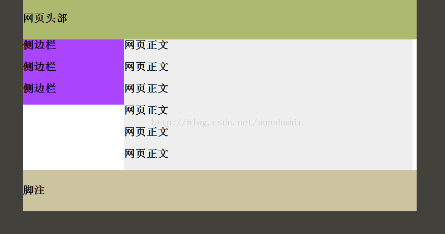
.container{
width: 778px;
background: #FFF;
margin: 0 auto;/*侧边的自动值与宽度结合使用,可以将布局居中对齐*/
text-align: left;
}
.header{
padding: 10px 0;
background: #ADB96E;
}
.sidebar{
float: left;/*侧边栏居左,改为right可令侧边栏居右*/
width: 200px;
background: #a4f;
}
.maincontent{
width: 570px;
background: #eee;
}
.footer{
clear: both;/*清除前后的浮动元素,使页脚显示在其下方*/
position: relative;/*修改IE浏览器中clear无效的bug*/
padding: 10px 0;
background: #CCC49F;
}
</style>
</head>
<body>
<div class="container">
<div class="header">
<h1>网页头部</h1>
</div>
<div class="content">
<div class="sidebar">
<h1>侧边栏</h1>
<h1>侧边栏</h1>
<h1>侧边栏</h1>
</div>
<div class="maincontent">
<h1>网页正文</h1>
<h1>网页正文</h1>
<h1>网页正文</h1>
<h1>网页正文</h1>
<h1>网页正文</h1>
<h1>网页正文</h1>
</div>
</div>
<div class="footer">
<h1>脚注</h1>
</div>
</div>
</body>
</html>


 扫一扫
扫一扫
 2368
2368

 被折叠的 条评论
为什么被折叠?
被折叠的 条评论
为什么被折叠?
 到【灌水乐园】发言


