


目录
一、CSS高级选择器(复合选择器)
1、 【常用】后代选择器
	<style>
        .name p{ color: red; } /* 指name这个类中的<p> */
    </style>
    ..................................................................
	<body>
    	<div class="name">
            <h1> 标题 </h1>
    		<p> 一段文字</p>
    	</div>
	</body>

如图,选择器只对name的“后代”进行了选择
2、子元素选择器
	<style>
        .cont > a{ color: red; } /* 指向c这个类中最外层(儿子)的<a> */
    </style>
    ..................................................................
	<body>
    	<div class="cont">
        <a href="#"> 我是儿子 </a>
        <p> <a href="#"> 我是孙子 </a> </p>
    	</div>
	</body>
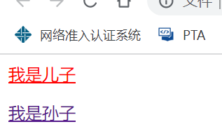
如图,选择器只对cont的“儿子”(最外层的)元素进行了选择
3、 【常用】并集选择器
	<style>
        .a,.b,.c{
            background-color: pink;
        }
        /* 同时选择了a,b,c三类 */
    </style>
    ..................................................................
	<body>
    	<div class="a">a</div>
    	<div class="b">b</div>
    	<div class="c">c</div>
	</body>
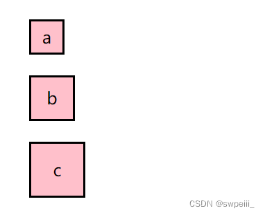
用“ ,”隔开每一项,同时选择他们
二、伪类选择器
1、链接伪类选择器
- a:link{} 选择所有没有被访问(点击)的链接
	<style>
        a:link{
            color: #000;
            text-decoration: none;
        }
        a:visited{
            color: gray;
            /* 被访问过的链接变为灰色 */
        }
    </style>
..................................................................
	<body>
    	<a href="#">没被访问过的链接1</a>
    	<a href="##">已经访问过的链接2</a>
    	<a href="###">没被访问过的链接3</a>
	</body>
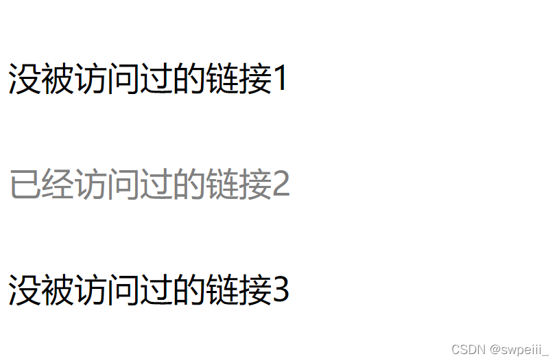
- a:visited{} 选择被访问(点击)过的链接
- 具体操作和样例详见上文
- 测试心得:清除visited缓存需要通过删除浏览记录来完成!
- a:hover{} 选择鼠标移过的链接
	<style>
        a:link{
            color: #000;
            text-decoration: none;
        }
        a:hover{
            color: aqua;
        }
    </style>
..................................................................
	<body>
    	<a href="#">链接1</a>
    	<a href="##">链接2</a>
    	<a href="###">链接3</a>
	</body>
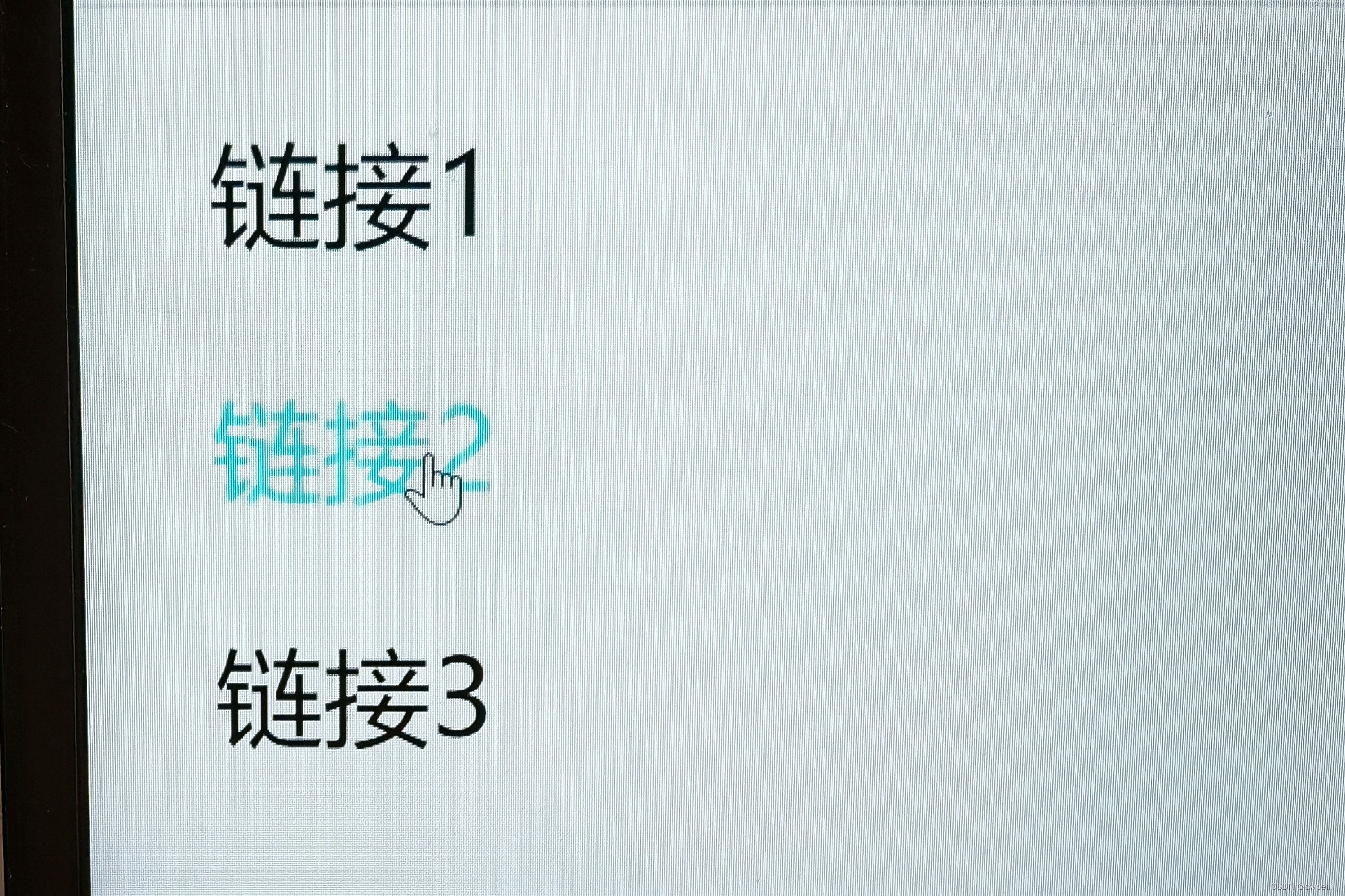
划过就变色
- a:active{} 选择鼠标键正在按下还未抬起的链接
	<style>
        a:link{
            color: #000;
            text-decoration: none;
        }
        a:active{
            color:orange;
        }
    </style>
..................................................................
	<body>
    	<a href="#">链接1</a>
    	<a href="##">链接2</a>
    	<a href="###">链接3</a>
	</body>
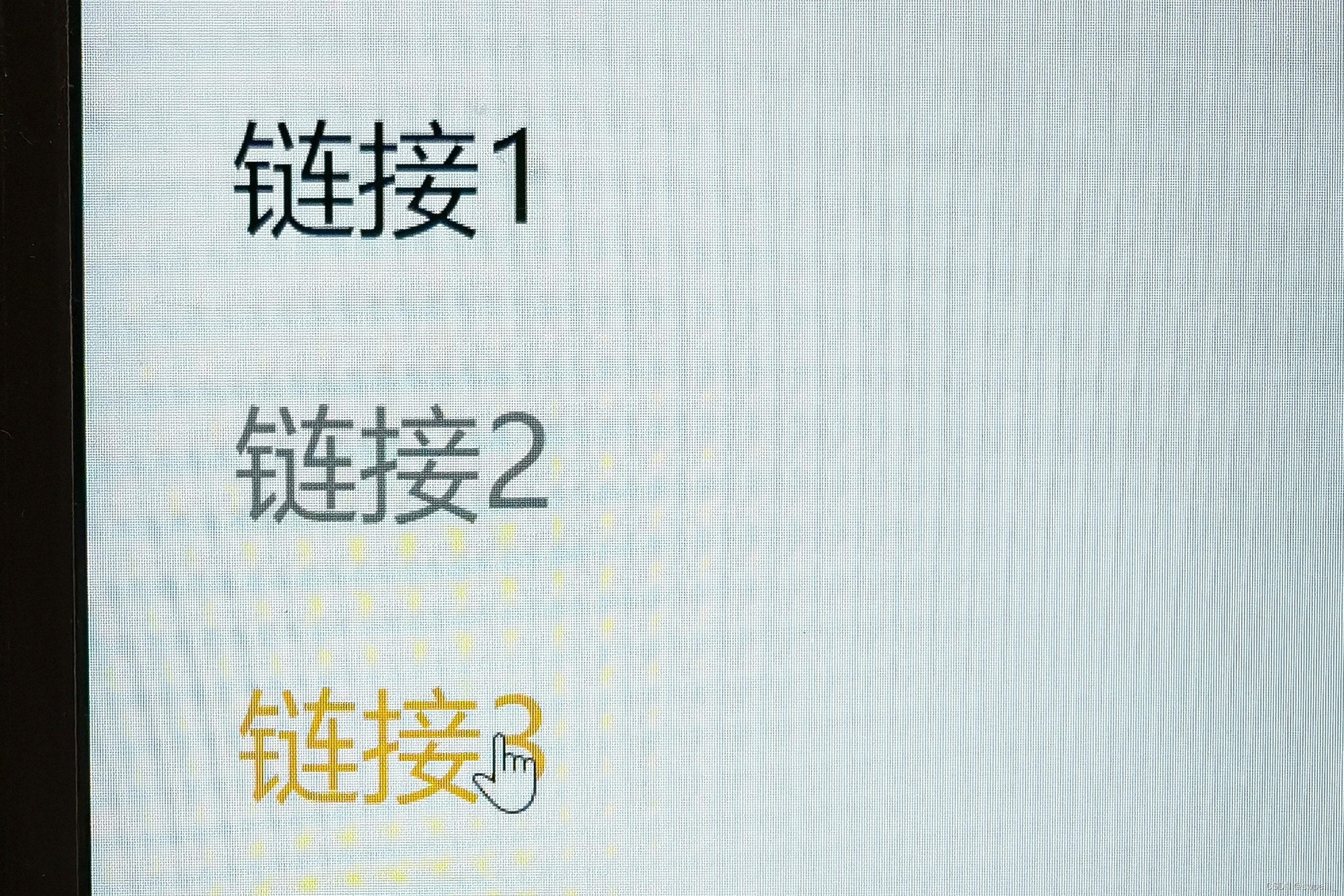
按住就变色
- L(link)、V(visited)、H(hover)、A(active)顺序不能变!
2、focus伪类选择器
- focus指焦点即光标,选择光标选中的输入框
- 一般用于选取form表单元素
	<style>
        input:focus{
            background-color: skyblue;
        }
    </style>
..................................................................
	<body>
    	<form action="">
        	<input type="text">
       	 	<input type="text">
        	<input type="text">
    	</form>
	</body>
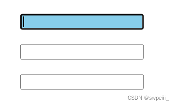
被光标选中后,文本框背景变为skyblue
三、背景、阴影、圆角边框
1、背景
- 背景颜色
	<style>
        .a{
            margin: 20px;
            border: 2px solid;
            height: 200px;
            width: 200px;
            background-color: pink;
        }
    </style>
..................................................................
	<body>
    	<div class="a">给这个div换个背景</div>
	</body>
- 背景图片
	<style>
        .a{
            margin: 20px;
            border: 2px solid;
            height: 200px;
            width: 200px;
            background-image: url(images/image.jpg);
        }
    </style>
..................................................................
	<body>
    	<div class="a"></div>
	</body>
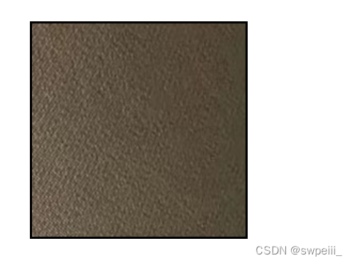
background-image: url() || none;
- 背景平铺(默认平铺)
	<style>
        .a{
            margin: 20px;
            border: 2px solid;
            height: 400px;
            width: 400px;
            background-image: url(images/csdn-logo.png);
            background-repeat: repeat || no-repeat || repeat-x || repeat-y;
        }
    </style>
..................................................................
	<body>
    	<div class="a"></div>
	</body>
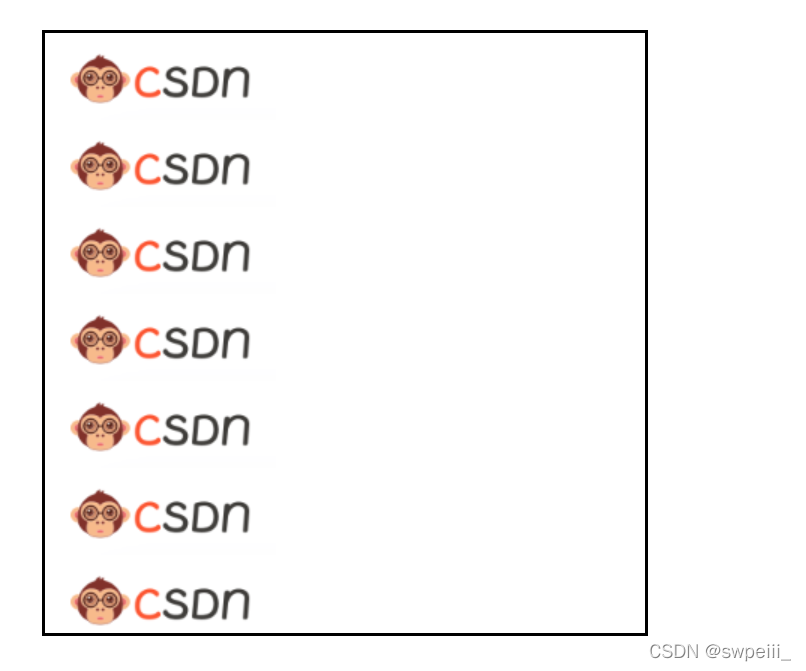
图例为repeat-y(沿y轴平铺)
- 背景位置——方位名词
第一个x坐标,“空格”后为y坐标,下同
	<style>
        .a{
            margin: 20px;
            border: 2px solid;
            height: 400px;
            width: 400px;
            background-repeat: no-repeat;
            background-position: left bottom; /* 方位为左下 */
        }
    </style>
..................................................................
	<body>
    	<div class="a"></div>
	</body>
方位名词:center || left || right || top || bottom(当指定了x轴方位y省略时,其默认居中)
- 背景位置——精确单位
	<style>
        .a{
            margin: 20px;
            border: 2px solid;
            height: 400px;
            width: 400px;
            background-repeat: no-repeat;
            background-position: 20px 50px; /* 以左上角为原点,沿x轴方向向右20px,沿y轴方向向左50px */
        }
    </style>
..................................................................
	<body>
    	<div class="a"></div>
	</body>
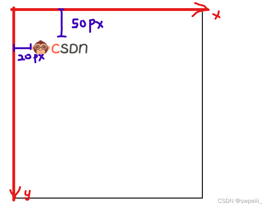
使用精确单位把背景图移至目标方位
-
背景位置——混合单位【常用】
把方位名词和精确单位混合使用,切记先x坐标后y坐标不能乱!
- 背景固定(背景附着)
	<style>
        .a{
            text-indent: 100px;
            color: #fff;
            font-size: larger;
            margin: 20px;
            border: 2px solid;
            height: 1200px;
            width: 1200px;
            background-image: url(images/巴萨.jpeg);
            background-repeat: repeat-y;
            background-attachment: fixed || scroll; /* fixed-固定悬浮不动;scroll-随对象内容滚动 */
        }
    </style>
..................................................................
	<body>
    	<div class="a">
    		p{Farca Barca}*20
    	</div>
	</body>

如上图即为fixed情况,此时repeat-y不会被应用

上图为scroll情况
- 背景属性复合写法【常用,节省代码】
	<style>
        .a{
        	background: color(颜色) url(图片地址) repeat(平铺) scroll/fixed(滚动/固定) position(位置);
        }
    </style>
- 背景颜色透明度
	<style>
        .a{
            color: #fff;
            font-size: larger;
            margin: 40px auto;
            height: 410px;
            width: 295px;
            background-image: url(images/梅西.jpg);
        }
        .b{
            width: 295px;
            height: 90px;
            text-align: center;
            font-size: 25px;
            line-height: 90px;
            background-color: rgba(0, 0, 0, 0.6);
            /* 给rgb属性设置透明度(alpha),取值范围在0~1之间(0.6可简写为.6) */
        }
        .blank{
            width: 295px;
            height: 320px;
            background-color: transparent;
        }
    </style>
..................................................................
	<body>
    	<div class="a">
        	<div class="blank"></div>
        	<div class="b">小将梅西</div>
    	</div>
	</body>
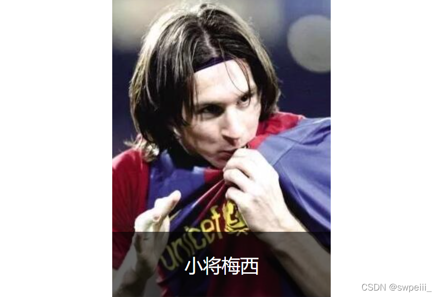
rgba(red,green,blue,alpha)中alpha为透明度值,取值范围在0~1之间(0.6可简写为.6)
2、阴影
- 盒子阴影
	<style>
        .a{
            color: #fff;
            font-size: larger;
            margin: 40px auto;
            height: 410px;
            width: 295px;
            background-image: url(images/梅西.jpg);
            box-shadow: 16px 16px 10px -4px rgba(0, 0, 0, .3);
        }
    </style>
..................................................................
	<body>
    	<div class="a">
        	<div class="blank"></div>
        	<div class="b">小将梅西</div>
    	</div>
	</body>
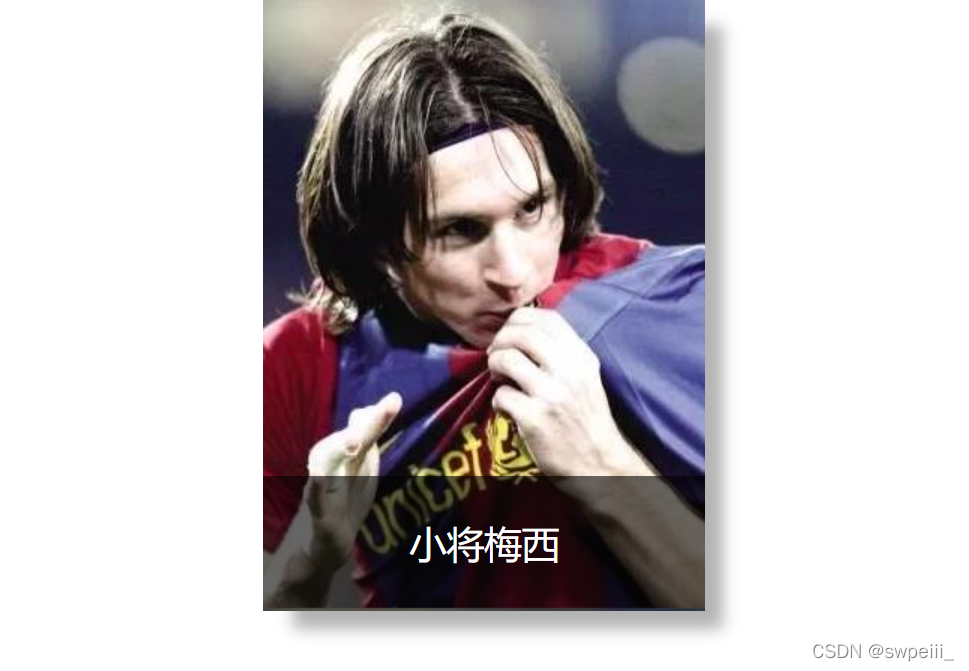
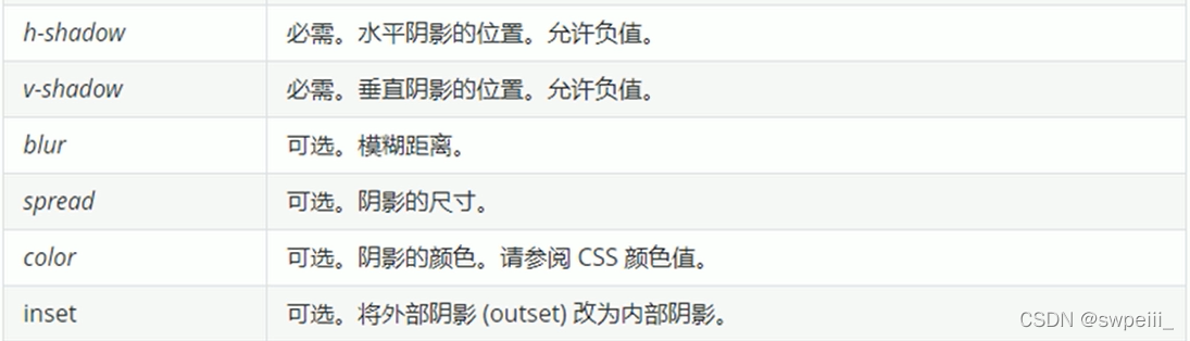
box-shadow: h-shadow水平阴影位置(允许负值) v-shadow垂直阴影位置(允许负值) blur模糊程度 spread阴影尺寸 color inset内外阴影;
- 阴影位置允许使用负值,负值时阴影会出现在左侧和上侧
- spread、inset属性可选,可以省略
- 通常在设置color颜色属性时使用rgba(),用于设置阴影透明度
- 阴影不占用空间,,不影响盒子排列
- 盒子阴影可配合:hover伪类选择器使用
- 文字阴影
text-shadow: h-shadow v-shadow blur color;
3、圆角边框
- 代码
border-radius: 10px;
-
原理
border-radius: x px; 中的x值即为处在四个角上圆的半径
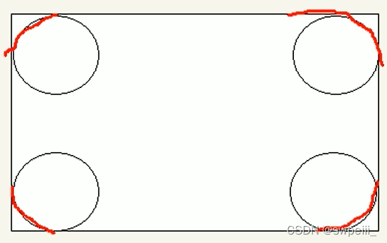
- 圆角边框的使用
	border-bottom-left-radius: 20px;
	border-bottom-right-radius: 20px;
	border-radius: 20px 20px 20px 20px; /* 简写属性,顺序依次为:上、下、左、右 */

可以独立调整盒子的上下左右圆角;简写属性,顺序依次为:上、下、左、右


 92
92


 被折叠的 条评论
为什么被折叠?
被折叠的 条评论
为什么被折叠?
 到【灌水乐园】发言


