


自定义组件:
概念: 由框架直接提供的称为 系统组件, 由开发者定义的称为 自定义组件。
源代码:
@Component
struct MyCom {
build() {
Column() {
Text('我是一个自定义组件')
}
}
}
@Component
struct MyHeader {
build() {
Row() {
Text('我是头部')
.fontColor(Color.White)
}
.width('100%')
.height(50)
.backgroundColor(Color.Brown)
}
}
// 快捷点 comp
@Component
struct MyMain{
build() {
Column() {
MyCom()
MyCom()
}
// .height(400)
.layoutWeight(1)
.width('100%')
.backgroundColor(Color.Gray)
}
}
@Component
struct MyFooter {
build() {
Row() {
Text('我是底部')
.fontColor(Color.White)
}
.width('100%')
.height(50)
.backgroundColor(Color.Green)
}
}
@Entry
@Component
struct Index {
build() {
Column() {
MyHeader()
MyMain()
MyFooter()
}
}
}
自定义组件-通用属性和方法
// 尽量使用按需导出
@priview // 自定义view的预览
@Component
export struct 组件名{}
自定义组件---成员函数变量
除了必须要实现 build() 函数外,还可以定义其它的成员函数,以及成员变量
成员变量的值 -> 外部可传参覆盖 也就是带=号的变量及其方法都可以被覆盖
源代码:
@Component
struct MyPanel {
// 成员变量
title: string = '默认的大标题'
extra: string = '查看更多 >'
// 成员变量 - 函数 - 可以外部传入覆盖的
getMore = () => {
AlertDialog.show({
message: '查看更多'
})
}
// 成员函数 - 不可以外部传入覆盖 【没有等号】
sayHi() {
AlertDialog.show({
message: '你好'
})
}
build() {
Column() {
Row() {
Text(this.title).fontSize(18)
Text(this.extra).fontSize(18)
.onClick(() => {
this.getMore()
})
}
.width('100%')
.justifyContent(FlexAlign.SpaceBetween)
Row() {
Text('内容部分').fontSize(18)
}
.padding(20)
}
.width('100%')
.height(200)
.padding(10)
.margin({bottom: 20})
.borderRadius(10)
.backgroundColor(Color.White)
}
}
@Entry
@Component
struct Index {
build() {
Column() {
MyPanel({
title: '我的订单',
extra: '全部订单 >',
getMore() {
AlertDialog.show({
message: '查看全部订单'
})
}
})
MyPanel({
title: '小米有品众筹',
extra: '7款众筹中 >',
getMore() {
AlertDialog.show({
message: '查看7款众筹'
})
}
})
}
.width('100%')
.height('100%')
.backgroundColor('#ccc')
.padding(20)
}
}
@BuilderParam 传递UI
利用 @BuilderParam 构建函数,可以让自定义组件 允许外部传递UI。

@Component
struct SonCom {
// 1、定义构建函数
@BuilderParam ContentBuilder: () => void = this.defaultBuilder
@Builder
defaultBuilder() {
Text('默认的内容')
.fontColor('#000')
}
build() {
// 2、使用构建函数,构建结构
Column() {
this.ContentBuilder()
}
}
}
@Entry
@Component
struct Index {
build() {
Column() {
// SonCom()
SonCom() {
Button('跳转') // 则显示这个button,否则显示上面默认的内容
}
}
}
}
完善的源代码:
@Component
@Preview
struct MyPanel {
// 成员变量
title: string = '默认的大标题'
extra: string = '查看更多 >'
// 成员变量 - 函数 - 可以外部传入覆盖的
getMore = () => {
AlertDialog.show({
message: '查看更多'
})
}
// 成员函数 - 不可以外部传入覆盖 【没有等号】
sayHi() {
AlertDialog.show({
message: '你好'
})
}
@BuilderParam ContentBuilder: () => void = this.defaultBuilder
@Builder
defaultBuilder() {Text('默认文本')}
build() {
Column() {
Row() {
Text(this.title).fontSize(18)
Text(this.extra).fontSize(18)
.onClick(() => {
this.getMore()
})
}
.width('100%')
.justifyContent(FlexAlign.SpaceBetween)
Row() {
// Text('内容部分').fontSize(18)
// 这里的结构不希望写死,需要通过 BuilderParams 来进行构建
this.ContentBuilder()
}
.padding(20)
}
.width('100%')
.height(200)
.padding(10)
.margin({bottom: 20})
.borderRadius(10)
.backgroundColor(Color.White)
}
}
@Entry
@Component
struct Index {
build() {
Column() {
MyPanel({
title: '我的订单',
extra: '全部订单 >',
getMore() {
AlertDialog.show({
message: '查看全部订单'
})
}
}) {
Text('我是订单 - 相关的文本')
}
MyPanel({
title: '小米有品众筹',
extra: '7款众筹中 >',
getMore() {
AlertDialog.show({
message: '查看7款众筹'
})
}
}) {
Button('我是小米有品众筹的按钮')
}
}
.width('100%')
.height('100%')
.backgroundColor('#ccc')
.padding(20)
}
}
效果图:

多个 @BuilderParam 参数
子组件有多个BuilderParam, 必须通过参数的方式来传入
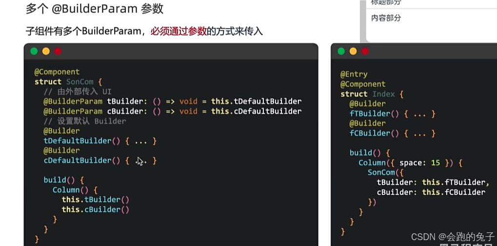
@Component
@Preview
struct MyCard {
  @BuilderParam titleBuilder: () => void = this.titleDefaultBuilder
  @Builder
  titleDefaultBuilder() {Text('我是默认的大标题')}

  @BuilderParam contentBuilder: () => void = this.contentDefaultBuilder
  @Builder
  contentDefaultBuilder() {Text('我是默认的内容')}

  build() {
    // 卡片组件
    Column() {
      // 标题部分
      Row() {
        this.titleBuilder()
      }
      .height(30)
      .width('100%')
      .border({color: '#ccc', width: {bottom: 1}})
      .padding({left: 10})

      // 内容部分
      Row() {
       this.contentBuilder()
      }
      .width('100%')
      .padding(10)
    }
    .width('100%')
    .height(100)
    .borderRadius(10)
    .backgroundColor(Color.White)
    .justifyContent(FlexAlign.Start)
  }
}

@Entry
@Component
struct Index {

  @Builder ftBuilder() {
    Text('我是传入的大标题结构')
  }

  @Builder fcBuilder() {
    Text('我是传入的大标题结构')
  }

  build() {
    Column({space: 10}) {
      // 希望标题部分和内容部分是自定义的
      MyCard({
        titleBuilder: this.ftBuilder,
        contentBuilder: this.fcBuilder
      })
      MyCard({
        titleBuilder: this.ftBuilder,
        contentBuilder: this.fcBuilder
      }) // {} 尾随闭包是不可以
    }
    .width('100%')
    .height('100%')
    .padding(20)
    .backgroundColor('#ccc')
  }
}


 4504
4504


 被折叠的 条评论
为什么被折叠?
被折叠的 条评论
为什么被折叠?
 到【灌水乐园】发言


