


前言
这个项目主要使用的技术为vue2+Echarts+Axios。
实现了五个图表的显示:
- 地区销量趋势(折线图)
- 商家销量图统计(柱状图)
- 商户分布与销量排行(地图+散点图)
- 地区销量排行(柱状图)
- 热销商品金额占比统计(饼图)
前端项目的准备
- 安装脚手架和创建项目
npm install -g @vue/cli
vue create web
-
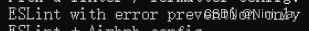
后续选择自定义安装,注意ESLint设置为如下图所示,并且在.eslintrc.js中添加如下代码不然很容易报格式上的错误。
-
创建完成后使用如下代码启动项目
npm run serve
项目的基本配置
配置端口号和自动打开浏览器的设置
在vue.config.js文件里面添加如下代码
// 使用vue-cli创建出来的vue工程, Webpack的配置是被隐藏起来了的
// 如果想覆盖Webpack中的默认配置,需要在项目的根路径下增加vue.config.js文件
module.exports = {
devServer: {
port: 8080, // 端口号的配置
open: true // 自动打开浏览器
}
}
配置全局echarts 对象
- 首先引入echarts 包,在 public/index.html 文件中引入 echarts.min.js 文件
    <!-- 通过script标签引入文件 -->
    <script src="static/lib/echarts.min.js"></script>
- 然后挂载到 Vue 原型上,在 src/main.js 文件中挂载。
由于在 index.html 中已经通过script标签引入了 echarts.js , 故在 window 全局对象中存在 echarts 全局对象
// 将全局的echarts对象挂载到Vue的原型对象上
// 别的组件中 this.$echarts
Vue.prototype.$echarts = window.echarts
这样在其他组件中可以直接用this.$echarts
axios 的配置和处理
- 首先安装axios包
npm install axios
- 然后在main.js中封装axios对象,便于使用
import axios from 'axios'
axios.defaults.baseURL = 'http://127.0.0.1:8888/api/'
// 将axios挂载到Vue的原型对象上
Vue.prototype.$http = axios
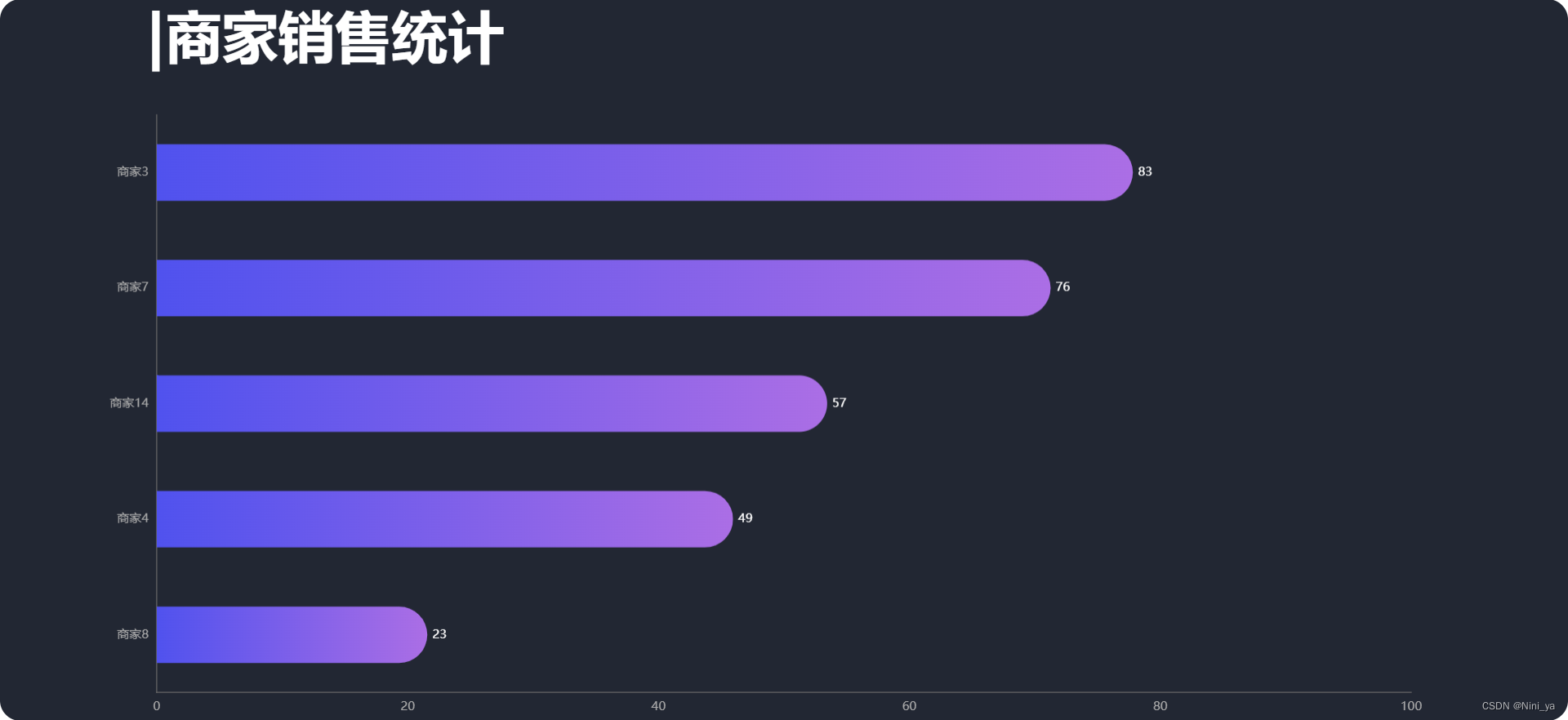
商家销量图统计(柱状图)
最终效果展示图
组件结构设计
在 src/components/ 目录下建立 Seller.vue , 这个组件是真实展示图表的组件,在 src/views/ 目录下建立 SellerPage.vue ,这个组件是对应于路由 /seller 而展示的。
另外说一嘴组件的注册和使用
<template>
	<div class="com-page">
		<!-- 第三步:使用 -->
		<seller></seller>
	</div>
</template>
<script>
//第一步:引入组件
import Seller from '@/components/Seller'
export default {
	data () {
		return {}
	},
	methods: {},
	components: {
	//第二步:在compoents里面注册
	seller:Seller
	}
}
</script>
增加路由规则
在 src/router/index.js 文件中修改
......
import SellerPage from '@/views/SellerPage'
......
const routes = [
{
	path: '/sellerpage',
	component: SellerPage
}
]
图表基本结构的搭建
<!--  -->
<template>
  <div class='com-container'>
    <div class="com-chart" ref="seller_ref"></div>
  </div>
</template>

<script>

export default {
  data() {
    return {
      chartInstance: null,
      allData: null
    };
  },
  mounted(){
    // 第四步使用方法
    this.initChart()
    this.getData()
    // 第五步:监听窗口缩放事件
    window.addEventListener('resize',this.screenAdapter)
    this.screenAdapter()
  },
  destroyed(){
    // 第六步:销毁监听器
    window.removeEventListener('resize',this.screenAdapter)
  },
  methods: {
    // 第一步引入
    initChart() {
      this.chartInstance = this.$echarts.init(this.$refs.seller_ref)
      const initOption = {}
      this.chartInstance.setOption(initOption)
    },
    // 第二步获取数据
    async getData() {
      // await this.$http.get()
      // 对allData赋值
      this.updateChart() //调用第三步的方法
    },
    // 第三步更新图表
    updateChart() {
      // 处理数据
      const dataOption = {}
      this.chartInstance.setOption(dataOption)
    },
    // 第五步:监听窗口缩放事件
    screenAdapter(){
      const adapterOption = {}
      this.chartInstance.setOption(adapterOption)
      this.chartInstance.resize()
    }
  },
}
</script>
<style lang='less' scoped></style>
初始化数据
获取服务器数据
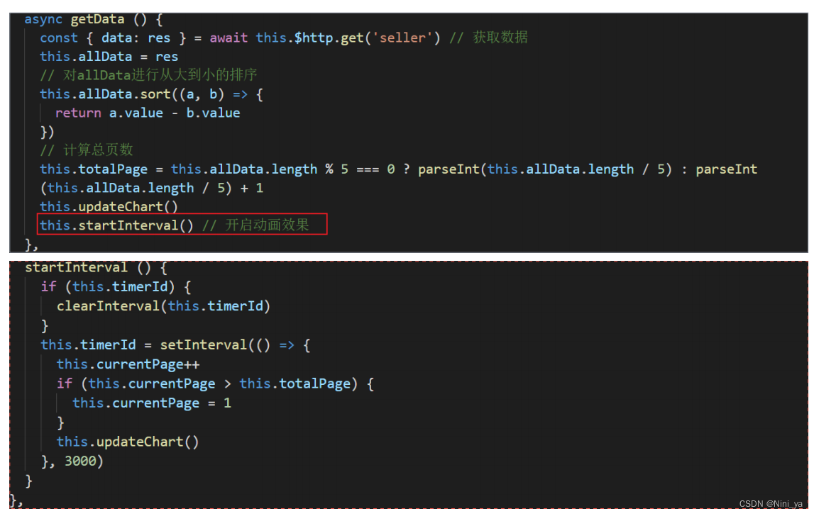
在getData中获取数据
// 获取服务器数据
    async getData() {
      // 这里使用了一个解构赋值
      const { data: ret } = await this.$http.get('seller')
      this.allData = ret
      // console.log(ret);
      this.allData.sort((a, b) => {
        return a.value - b.value //从小到大的排序
      })
      this.updateChart()
      this.startInterval()
    },
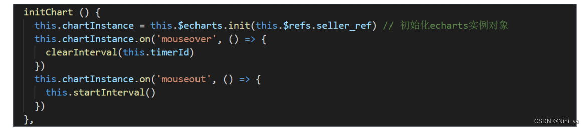
初始化echartInstance对象
initChart() {
      this.chartInstance = this.$echarts.init(this.$refs.seller_ref, 'chalk')
      // 对图表初始化的控制
      const initOption = {
        xAxis: {
          type: 'value'
        },
        yAxis: {
          type: 'category',
        },
        series: [
          {
            type: 'bar',
            },
          }
        ]
      }
      this.chartInstance.setOption(initOption)
    },
updateChart() {
      const sellerNames = this.allData.map((item) => {
        return item.name
      })
      const sellerValues = this.allData.map((item) => {
        return item.value
      })
      const dataOption = {
        yAxis: {
          data: sellerNames
        },
        series: [
          {
            data: sellerValues,
          }
        ]

      }
      this.chartInstance.setOption(dataOption)
    },
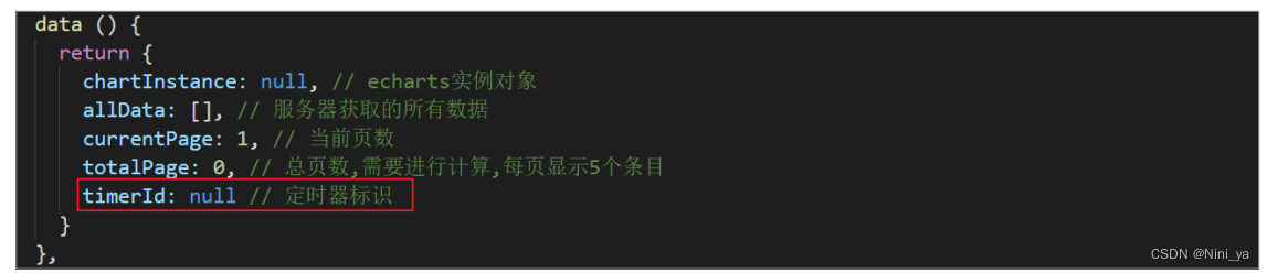
分页动画的实现
1.使每页显示五个,然后设置定时器使每3s更换一次
2.使鼠标移上去时销毁定时器,移开时开启定时器
数据的处理
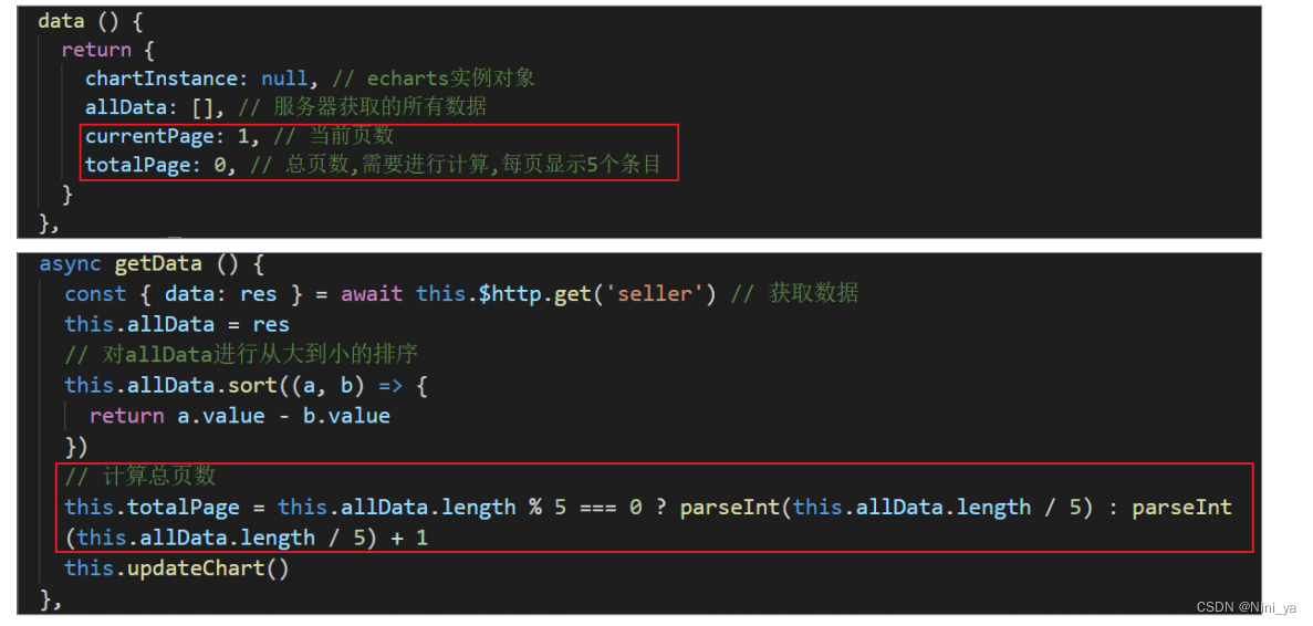
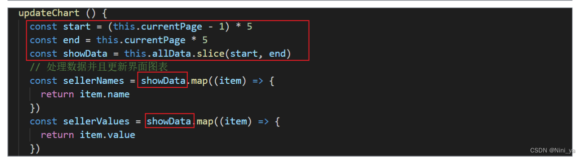
动画的启动与停止
鼠标事件的添加
ui效果的调整
//标题的设置
title: {
          text: '|商家销售统计',
          left: "9%",
          top: 10
        },
//坐标轴的设置
grid: {
          top:"16%",
          width: "80%",
          height: "80%",
        },
//工具提示和背景
tooltip: {
          trigger: 'axis',
          axisPointer: {
            type: 'line',
            z: 0,
            lineStyle: {
              color: '#2D3443'
            }
          }
        },
//文字显示和位置
series: [
          {
            type: 'bar',
            label:{
              show:true,
              position:'right',
              textStyle:{
                color:'#fff'
              }
            },
            //柱颜色渐变的实现
            itemStyle:{
              // 指明颜色渐变的方向
              // 指明不同百分比之下颜色的值
              color: new this.$echarts.graphic.LinearGradient(0, 0, 1, 0, [
                // 百分之0状态之下的颜色值
                {
                  offset: 0,
                  color: '#5052EE'
                },
                // 百分之100状态之下的颜色值
                {
                  offset: 1,
                  color: '#AB6EE5'
                }
              ])
            }
          }
        ]
分辨率适配
// 当浏览器的大小发生变化的时候, 会调用的方法, 来完成屏幕的适配
    screenAdapter () {
      // console.log(this.$refs.seller_ref.offsetWidth)
      const titleFontSize = this.$refs.seller_ref.offsetWidth / 100 * 3.6
      // 和分辨率大小相关的配置项
      const adapterOption = {
        title: {
          textStyle: {
            fontSize: titleFontSize
          }
        },
        tooltip: {
          axisPointer: {
            lineStyle: {
              width: titleFontSize
            }
          }
        },
        series: [
          {
            barWidth: titleFontSize,
            itemStyle: {
              barBorderRadius: [0, titleFontSize / 2, titleFontSize / 2, 0]
            }
          }
        ]
      }
      this.chartInstance.setOption(adapterOption)
      // 手动的调用图表对象的resize 才能产生效果
      this.chartInstance.resize()
    }
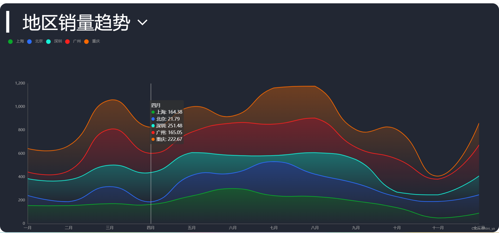
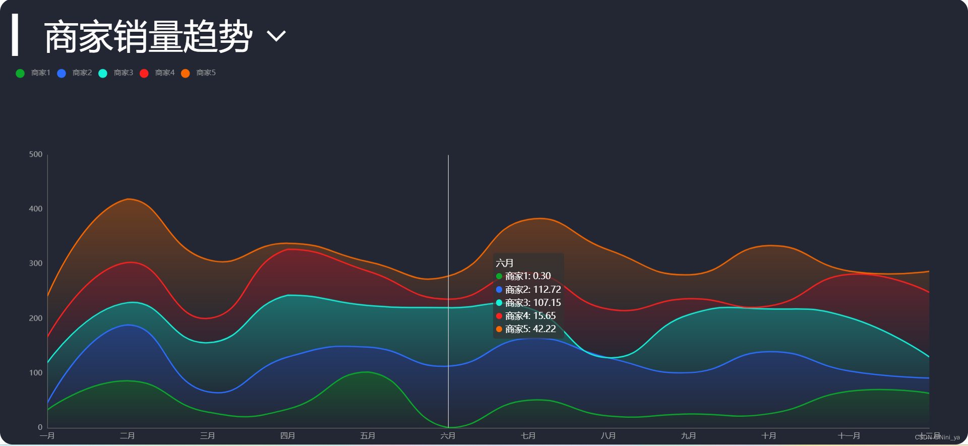
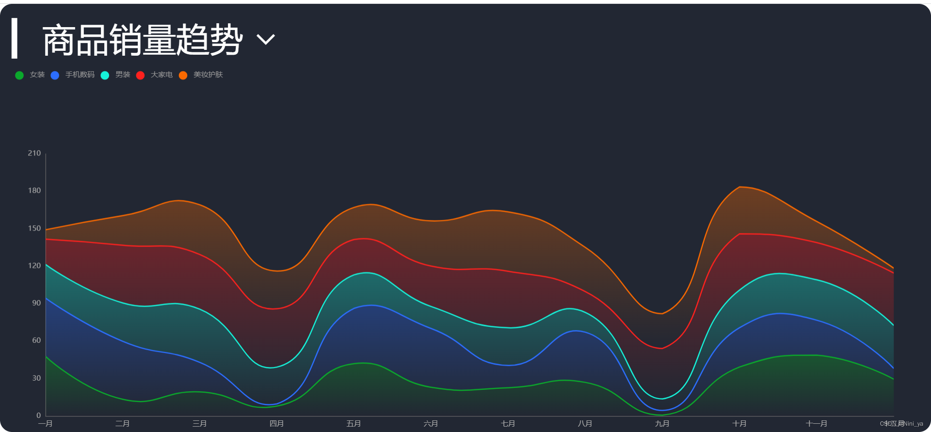
销量趋势分析图(折线图)
最终效果展示图
点击标题可以切换到不同的图

图表基本功能的实现
数据的获取和处理
async getData () {
// 获取服务器的数据, 对this.allData进行赋值之后, 调用updateChart方法更新图表
const { data: ret } = await this.$http.get('trend')
this.allData = ret
this.updateChart()
}
updateChart () {
// x轴的数据
const timeArrs = this.allData.common.month
// y轴的数据, 暂时先取出map这个节点的数据
// map代表地区销量趋势
// seller代表商家销量趋势
// commodity代表商品销量趋势
const valueArrs = this.allData.map.data
// 图表数据, 一个图表中显示5条折线图
const seriesArr = valueArrs.map((item, index) => {
return {
type: 'line', // 折线图
name: item.name,
data: item.data,
}
})
const dataOption = {
xAxis: {
data: timeArrs
},
legend: {
data: legendArr
},
series: seriesArr
}
this.chartInstance.setOption(dataOption)
}
初始化配置
const initOption = {
	xAxis: {
	type: 'category',
	boundaryGap: false //x坐标轴两边不留白
	},
	yAxis: {
	type: 'value'
	}
}
堆叠图效果和图例实现
要实现堆叠图的效果, series下的每个对象都需要配置上相同的stack属性
updateChart () {
	const timeArrs = this.allData.common.month
	const valueArrs = this.allData.map.data
	const seriesArr = valueArrs.map((item, index) => {
		return {
			type: 'line',
			name: item.name,
			data: item.data,
			stack: 'map' // stack值相同, 可以形成堆叠图效果
		}
	})
	// 准备图例数据, 它需要和series下的每个对象的name属性保持一致
	const legendArr = valueArrs.map(item => {
		return item.name
	})
	const dataOption = {
	......
		legend: {
		data: legendArr
		}
	}
}
UI效果的调整
坐标轴和工具提示
const initOption = {
	grid: {
		top: '35%',
		left: '3%',
		right: '4%',
		bottom: '1%',
		containLabel: true
	},
	tooltip: {
		trigger: 'axis'
	},
	legend: { //图例大小和位置的设置
		top: '15%',
		icon: 'circle',
		left: 20
	},
}
区域面积的颜色渐变的设置
区域面积只需要给series的每一个对象增加一个 areaStyle 即可,颜色渐变可以通过 LinearGradient 进行设置, 颜色渐变的方向从上往下
      const seriesArr = valueArr.map((item, index) => {
        return {
          name: item.name,
          type: 'line',
          data: item.data,
          stack: map,
          areaStyle: {
            color: new this.$echarts.graphic.LinearGradient(0, 0, 0, 1, [
              {
                offset: 0,
                color: colorArr1[index]
              }, // %0的颜色值
              {
                offset: 1,
                color: colorArr2[index]
              } // 100%的颜色值
            ])
          }
        }
      })
使用计算属性控制标题的内容和标题的可选择项
export default {
	data () {
		return {
			chartInstance: null,
			allData: null,
			dataType: 'map' // 这项数据代表目前选择的数据类型, 可选值有map seller commodity
		}
	},
	computed: {
		selectTypes () {
			if (!this.allData || ! this.allData.type) {
				return []
			} else {
				return this.allData.type.filter(item => {
				return item.key !== this.dataType
			})}
		},
		title () {
			if (!this.allData) {
				return ''
			} else {
				return this.allData[this.dataType].title
			}
		}
	},
ps:记得将 updateChart 中, 之前写死的map变成 dataType,还有一些细节我就不细说了
商家地图分布(地图+散点图)
最终效果展示图
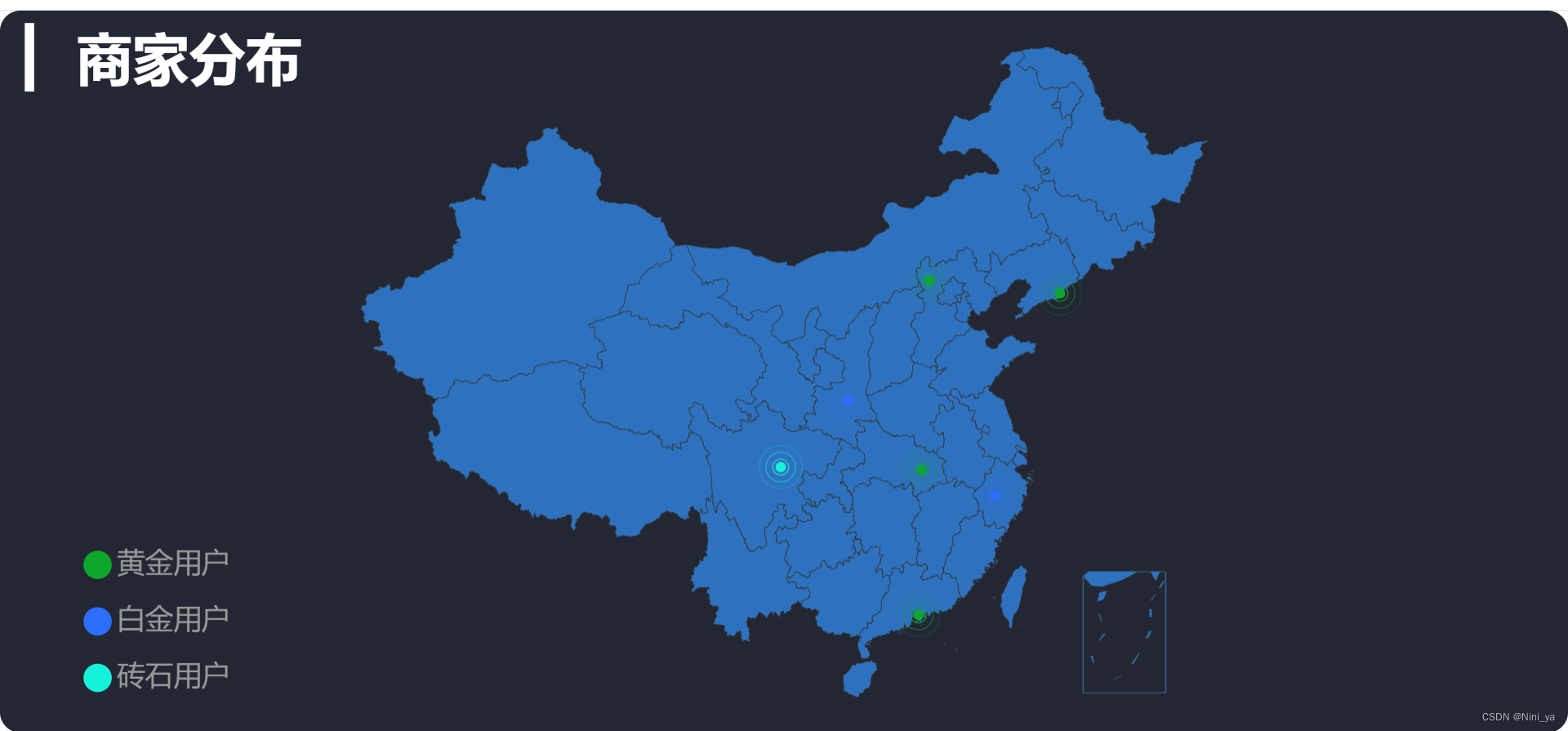
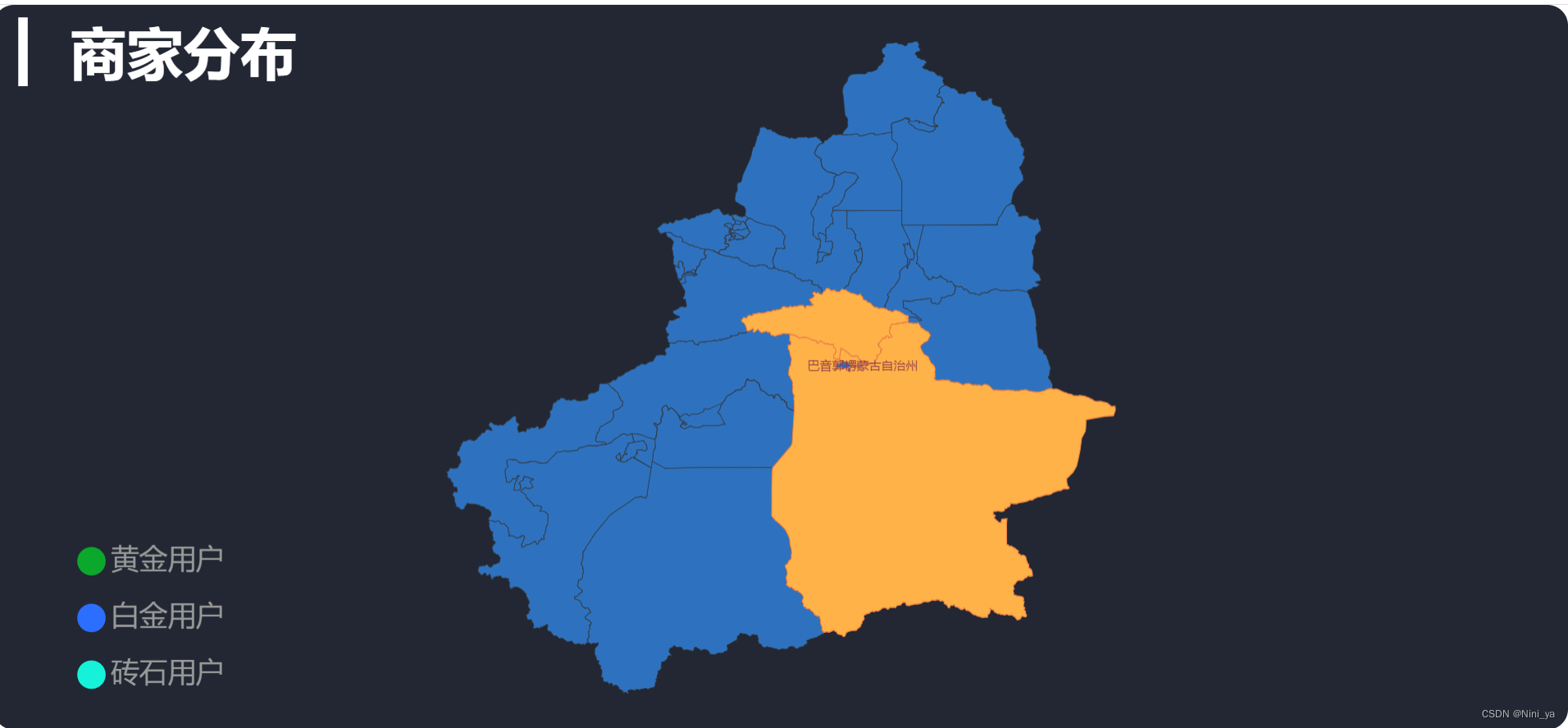
地图的显示
基础的组件和路由配置以及初始化配置我不多提,直接写关键代码
在public/static/map下有对应地图的json资料
- 获取中国地图矢量数据
- 注册地图数据到 全局echarts对象 中
- 配置 geo
// 获取的是Vue环境之下的数据, 而不是我们后台的数据
import axios from 'axios'
export default {
	......
	methods: {
		async initChart () {
			this.chartInstance = this.$echarts.init(this.$refs.map_ref)
			const { data: mapData } = await
			axios.get('http://127.0.0.1:8999/static/map/china.json')
			this.$echarts.registerMap('china', mapData)
			const initOption = {
				geo: {
				type: 'map',
				map: 'china'
				}
			}
			this.chartInstance.setOption(initOption)
	},
}
散点图的显示
- 获取散点数据
async getScatterData () {
	// 获取服务器的数据, 对this.allData进行赋值之后, 调用updateChart方法更新图表
	const { data: ret} = await this.$http.get('map')
	this.allData = ret
	this.updateChart()
}
- 更新图表
updateChart () {
	// 处理图表需要的数据
	// 图例数据
	const legendData = this.allData.map(item => {
		return item.name
	})
	// 散点数据
	const seriesArr = this.allData.map(item => {
		return {
			type: 'effectScatter',
			coordinateSystem: 'geo',
			name: item.name,
			data: item.children
		}
	})
	const dataOption = {
		legend: {
			data: legendData
		},
		series: seriesArr
	}
	this.chartInstance.setOption(dataOption)
},
UI效果的调整
标题显示
const initOption = {
	title: {
		text: '▎ 商家分布',
		left: 20,
		top: 20
},
地图位置和颜色
const initOption = {
	......
	geo: {
		type: 'map',
		map: 'china',
		top: '5%',
		bottom: '5%',
		itemStyle: {
			areaColor: '#2E72BF',
			borderColor: '#333'
		}
	}
}
图例控制
const initOption = {
	......
	legend: {
		left: '5%',
		bottom: '5%',
		orient: 'vertical'
	}
}
涟漪效果
updateChart () {
	......
	const seriesArr = this.allData.map(item => {
	return {
		type: 'effectScatter',
		rippleEffect: {
		scale: 5,
		brushType: 'stroke'
	},
	......
	}
})
地图点击事件
点击查看省份地图
响应图表的点击事件, 并获取点击项相关的数据,得到地图所点击项的拼音和地图矢量数据的路径
<script>
// 获取的是Vue环境之下的数据, 而不是我们后台的数据
import axios from 'axios'
import { getProvinceMapInfo } from '@/utils/map_utils'
export default {
	......
	methods: {
		async initChart () {
		......
		this.chartInstance.setOption(initOption)
		this.chartInstance.on('click', async arg => {
		// arg.name 就是所点击的省份名称, 是中文
			const provinceInfo = getProvinceMapInfo(arg.name)
			const { data: ret } = await axios.get('http://127.0.0.1:8999' +provinceInfo.path)
			this.$echarts.registerMap(provinceInfo.key, ret)
			this.chartInstance.setOption({
				geo: {
					map: provinceInfo.key
				}
			})
		})
		this.getScatterData()
		}
	}
}
</script>
双击回到中国地图
<template>
	<div class='com-container' @dblclick="revertMap"> //绑定双击事件
	<div class='com-chart' ref='map_ref'></div>
</div>
</template>
<script>
export default {
	......
	methods: {
	......
		revertMap () {
			this.chartInstance.setOption({
				geo: {
					map: 'china'
				}
			})
		}
	}
}
</script>
热销商品占比(饼图)
最终效果展示图
一共三张图,可以使用左右箭头进行切换
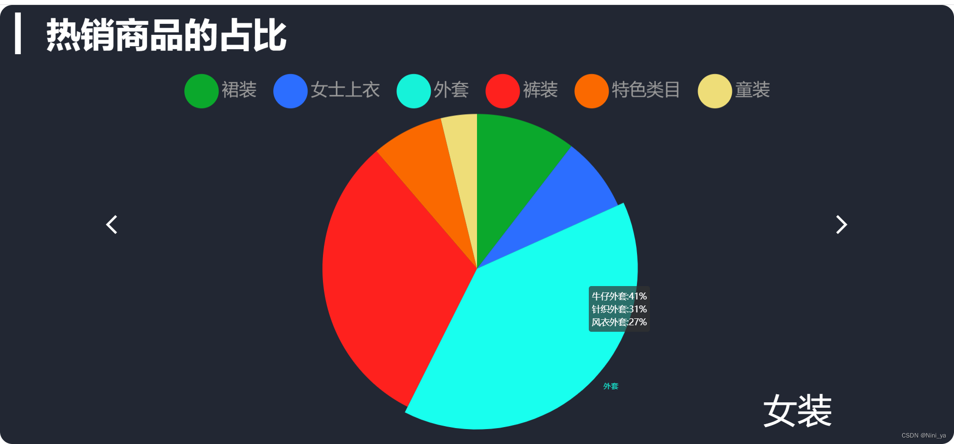
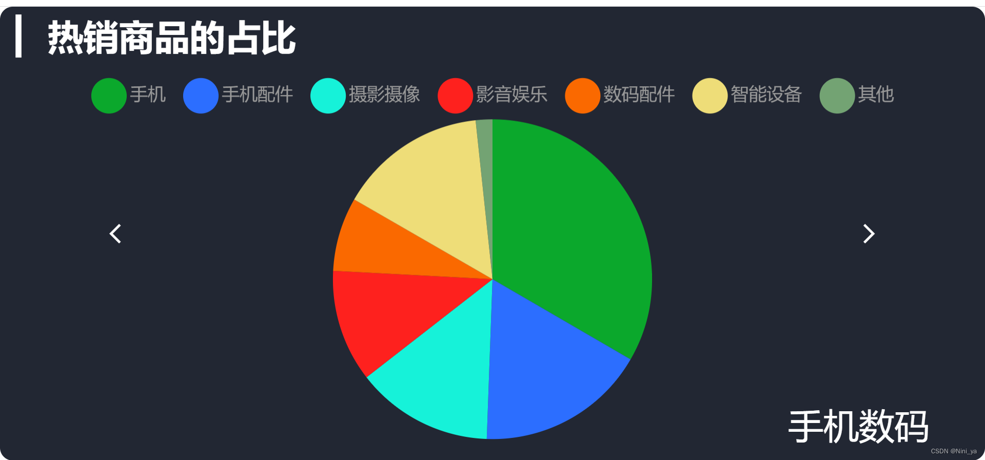
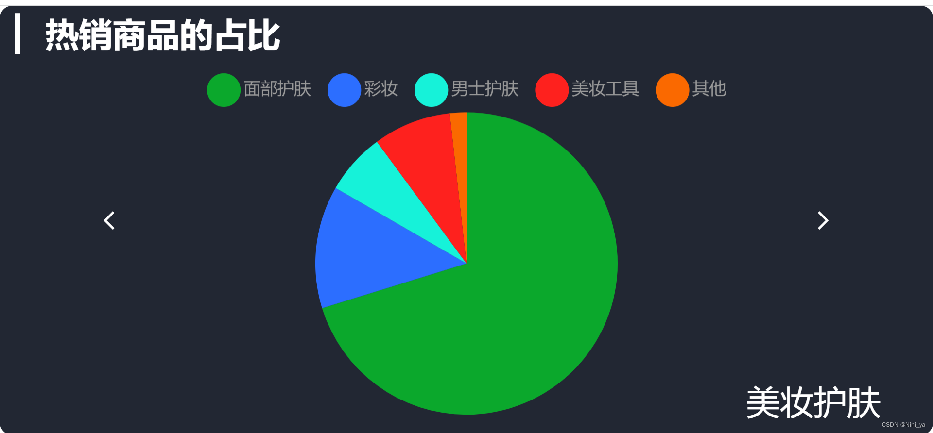
基本功能的实现
数据的处理
增加 currentIndex 索引代表当前显示的数据索引, 后期通过左右箭头改变 currentIndex 的值
<script>
export default {
	data () {
		return {
			chartInstance: null,
			allData: null,
			currentIndex: 0
		}
	},
	......
	updateChart () {
	// 处理图表需要的数据
	// 饼图数据
		const seriesData = this.allData[this.currentIndex].children.map(item=> {
			return {
				value: item.value,
				name: item.name
			}
		})
		// 图例数据
		const legendData = this.allData[this.currentIndex].children.map(item=> {
			return item.name
		})
		const dataOption = {
			legend: {
				data: legendData
			},
			series: [{data: seriesData}]
		}
		this.chartInstance.setOption(dataOption)
	},
初始化配置
methods: {
	initChart () {
		this.chartInstance = this.$echarts.init(this.$refs.hot_ref)
		const initOption = {
			title: {
				text: '▎ 热销商品销售金额占比统计',
				left: 20,
				top: 20
			},
			series: [
				{
					type: 'pie'
				}
			]
		}
		this.chartInstance.setOption(initOption)
},
切换数据的实现
点击事件
<span class="iconfont arr_left" @click="toLeft"></span>
<span class="iconfont arr_right" @click="toRight"></span>
methods: {
toLeft () {
this.currentIndex--
if (this.currentIndex < 0) {
this.currentIndex = this.allData.length - 1 //若当前为0则点击左跳到最大值那
}
this.updateChart()
},
toRight () {
this.currentIndex++
if (this.currentIndex > this.allData.length - 1) {
this.currentIndex = 0
}
this.updateChart()
}
}
名称的改变
增加计算属性 catTitle
<!-- 热销商品图表 -->
<template>
	<div class='com-container'>
	......
		<span class="cat_name">{{ catTitle }}</span>
	</div>
</template>


computed: {
	catTitle () {
		if (!this.allData) {
		return ''
		}
		return this.allData[this.currentIndex].name
	}
},
UI效果调整
高亮效果
默认隐藏文字, 高亮显示文字,就是说鼠标移动到上面才会显示标签
methods: {
	initChart () {
	this.chartInstance = this.$echarts.init(this.$refs.hot_ref, 'chalk')
	const initOption = {
		......
		series: [
			{
				type: 'pie',
				label: { // 隐藏文字
					show: false
				},
				labelLine: { // 隐藏线
					show: false
				},
				emphasis: {
					label: { // 高亮显示文字
						show: true
					}
				}
			}
		]
	}
	this.chartInstance.setOption(initOption)
},
图例形状和位置
legend: {
	top: '5%',
	icon: 'circle'
},
工具提示
当鼠标移入某个扇区的时候, 需要将该二级分类之下的三级分类数据进行展示
增加 series 下饼图每一个扇区的数据
updateChart () {
// 处理图表需要的数据
	const seriesData = this.allData[this.currentIndex].children.map(item =>
	{
		return {
		......
		children: item.children
		}
	})
显示 tooltip ,并控制显示内容
methods: {
	initChart () {
		this.chartInstance = this.$echarts.init(this.$refs.hot_ref, 'chalk')
	const initOption = {
	......
		tooltip: {
			trigger: 'item',
			formatter: function(params) {
			let tipArray = []
			params.data.children.forEach(function(item) {
			let childStr = `
			${item.name}
			${parseInt((item.value / params.value) * 100) + '%'}
			`
			tipArray.push(childStr)
			})
			return tipArray.join('<br/>')
		}
	},


 1万+
1万+

 被折叠的 条评论
为什么被折叠?
被折叠的 条评论
为什么被折叠?
 到【灌水乐园】发言


