


在浏览器中我们可以通过<a>标签与url实现不同页面之间的跳转,利用浏览器的返回按钮返回之前浏览的页面,但是在React Native中却没有集成内嵌的全局栈来实现这个界面的跳转,因此需要使用第三方库来实现这个功能。React Navigation就是这样一个源于ReactNative社区的用于实现界面导航的js库。通过如下方法安装react navigation到你的项目中:
yarn add react-navigation
# 或者通过npm安装:
# npm install --save react-navigation
React Navigation常用有三个组件,其中StackNavigator用于实现页面跳转,TabNavigation用于标签页之间切换,DrawerNavigation用于实现抽屉式侧边栏。使用前需要先引入组件:
import {DrawerNavigator,TabNavigator,StackNavigator} from 'react-navigation'
1、StackNavigator
StackNavigator组件用于实现在不同的页面之间的跳转,并且对页面历史进行管理,就像浏览器那样,用一个栈保存浏览页面。当你打开一个新页面时,将页面压入栈顶,当你需要返回时,从栈顶弹出页面。不同的是,通过React Navigation可以在移动设备上获得更加真实的用户体验,比如利用屏幕手势操作,以及更加逼真的动画切换效果。
1.1、定义路由
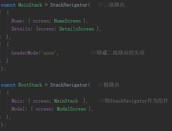
总体上看StackNavigator()接收两个参数,分别是需要跳转管理的路由模块以及Navigator的基本设置,返回一个React Component组件。因此可以将你的所有页面作为路由模块放在StackNavigator中形成根路由RootStack,然后将其作为ReactNative的入口导出。
在每个路由模块中通过screen关键字定义对应渲染的ReactNative组件
const RootStack = StackNavigator(
  {//定义路由
    Home: {                       //定义Home对应HomeScreen组件
      screen: HomeScreen,
    },
    Details: {
      screen: DetailsScreen,
    },
  },
  {//定义配置
    initialRouteName: 'Home',     //设置初始路由为Home
  }
);

export default class App extends Component {
  render() {                            //将Navigation作为根路径导出
    return <RootStack />;
  }
}
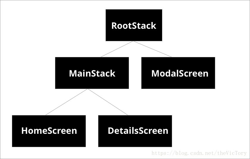
嵌套路由:由于StackNavigator返回一个React组件,因此它也可以作为子组件添加到另一个StackNavigator路由中,形成层叠路由结构。例如Home Screen与DetailScreen构成MainStack,MainStack与ModalScreen构成RootStack:
1.2、路由跳转
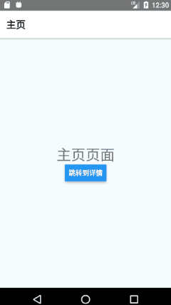
StackNavigator会为每个注册的路由组件传递参数navigation属性,通过this.props.navigation的navigate方法可以实现页面间的跳转,其参数为StackNavigator中已定义的路由,例如从主页跳转到详情页Details:
<Button title='跳转到详情' onPress={()=>this.props.navigation.navigate('Details')} />
返回:每个界面的头部导航栏左边默认设置了一个返回按钮,通过它可以返回到之前一个页面,如果你希望手动触发返回,可以调用this.props.navigation.goBack()。
路由跳转实际上就是新打开一个页面并将路由压入一个栈中,点击返回时,从栈顶弹出一个页面。与浏览器不同的是,当给navigate传递的参数是本页面时,它依旧会压入栈内,点击返回时会弹出本页面,而浏览器会辨别这是本页面,不会再压入栈顶。
1.3、参数传递
当页面跳转时,可以把需要传递的数据作为参数放在navigate方法的第二个参数中,例如:
<Button title='跳转到详情'
        onPress={()=>this.props.navigation.navigate('Details',{
          userName:'Tory',
          userInfo:'Hello'
        })}
/>
在路由页面内,通过 this.props.navigation.state.params可以得到上一个页面传入的参数,例如在Details页面获取上面的数据:
class DetailsScreen extends Component {
  render() {
    const data=this.props.navigation.state.params;
    return (
      <View style={styles.container}>
        <Text>你好,{data.userName}!</Text>
      </View>
    );
  }
}
1.4、导航栏设置
通过对组件内的静态常量 navigationOptions可以对组件的导航栏进行设置。 1.4.1、设置与修改
静态对象:navigationOptions可以直接接收一个对象,例如设置详情页导航栏的标题
class DetailsScreen extends Component {
  static navigationOptions = {
    title: '详情页'
  };
}
函数返回:由于上面通过static设置的静态常量,它不是组件的一个实例,无法通过this.props访问到navigation.state.params。但如果通过函数的方式返回navigationOptions对象,React Navigation在调用函数时会函数默认传入参数props,就可以拿到params。例如:
static navigationOptions=((props)=>{
  return {
    title:props.navigation.state.params.title
  }
});
修改navigationOptions:通过this.props.navigation.setParams()方法可以对params进行修改,例如修改标题:
<Button title='修改标题'
        onPress={()=>{
          this.props.navigation.setParams({title:'修改后的标题'})
        }}
/>
1.4.2、navigationOptions属性
static navigationOptions={
  title:'详情页',
  header:HeaderComponent,                       //自定义头部组件
  headerTitle:TitleComponent,                   //自定义标题组件
  headerLeft:LeftComponent,                     //自定义左边组件,会替换掉默认返回按钮
  headerRight:<Text>右边元素</Text>,            //自定义右边元素,注意这里不可以放组件
  headerBackImage:{uri:'mipmap/ic_launcher'},   //自定义返回按钮的图片
  headerStyle:{                                 //导航栏样式设置
    backgroundColor:'#8bc9ff',
  },
  headerTintColor:'#fff',                       //按钮、标题颜色设置
  headerTitleStyle:{                            //标题字体样式设置
    fontWeight:'bold',
  },
  headerTransparent:true,                       //使头部背景透明
  gesturesEnabled:true,                         //开启手势操作
  gestureDirection:'inverted',            //修改返回手势操作方向为从右到左,默认为从左到右
  gestureResponseDistance:{               //定义手势响应距离屏幕边界的距离
    horizontal:100,
    vertical:50
  }
};
如果在组件内部定义navigationOptions,它只会对当前页面起作用,如果希望对所有组件设置通用options,可以把navigationOptions对象放在前面的1.1提到的路由定义中。页面内的navigationOptions比通用设置具有更高的优先级。
注意自定义组件返回的是JSX元素,而不是React Component类。
const RootStack = StackNavigator(
  {//定义路由
    Home: {screen: HomeScreen},
    Details:{screen: DetailsScreen},
  },
  {//定义配置
    initialRouteName: 'Home',
    navigationOptions:{           //导航栏通用设置
      headerStyle:{
        backgroundColor:'#7276ff'
      }
    }
  }
);
1.5、头部与组件通信
在navigationOptions中设置的组件无法通过this访问到页面组件DetailsScreen,如果希望二者之间进行通信,则需要借助navigation.params。例如:
class DetailsScreen extends React.Component {
  state={count:0};
  static navigationOptions = (props) => {
    const params = props.navigation.state.params;
    return {
      headerRight: (                        //通过params为按钮绑定increase方法
        <Button onPress={params.increase} title="+1" />
      ),
    };
  };

  componentWillMount() {                    //通过setParams将increase方法绑定到_increase
    this.props.navigation.setParams({ increase: this._increase });
  }
  _increase=()=>{                           //设置state.count+1
    this.setState(preState=>{return {count:preState.count+1}});
  };
  render() {
    return (
      <View style={styles.container}>
        <Text>计数为:{this.state.count}</Text>
      </View>
    );
  }
}
在navigationOptions中的<Button>想要修改DetailsScreen的state.count,是无法通过this的,需要先给按钮绑定params.increase方法,然后在组件挂载前通过setParams将increase绑定到DetailsScree的内部方法this._increase,才可以访问修改state.count。
2、TabNavigator
React Navigation提供了TabNavigator来实现不同标签页之间的跳转。安卓的标签栏默认显示在头部,IOS在底部。
2.1、定义路由组件
同StackNavigator一样,使用TabNavigator首先需要定义每个路由页面以及其对应的组件,Tabnavigator方法的第一个参数就是所有标签页的路由,第二个为设置选项,最后返回一个React Component,因此可以把它返回当作index.js的入口
//默认导出TabNavigator组件给index.js
export default TabNavigator (
  {
    Home:{screen:HomeScreen},       //标签页Home对应HomeScreen组件
    Message:{screen:MessageScreen}
  },
  {
    //TabNavigator的设置
  }
)
//index.js中引入TabNavigator并定义为入口
import { AppRegistry } from 'react-native';
import TabNavigator from './TabNavigation';

AppRegistry.registerComponent('Navigation', () => TabNavigator);
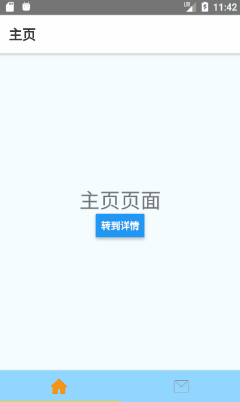
TabNavigator可以与StackNavigator嵌套使用,比如进入App后有两个标签页Home与Message,点击Home中的按钮从Home跳转到详情页Detail,因此HomeScreen与DetailScreen通过StackNavigator构成了一个HomeStack,然后与MessageScreen一起又构成了TabNavigator:
const HomeStack=StackNavigator(
  {
    Home:{screen:HomeScreen},
    Detail:{screen:DetailScreen}
  }
);

export default TabNavigator (
  {
    Home:{screen:HomeStack},       //标签页Home对应HomeScreen组件
    Message:{screen:MessageScreen}
  }
)
2.2、TabNavigator的设置
在 TabNavigator()的第二个参数可以对标签栏进行详细的配置export default TabNavigator ( { Home:{screen:HomeStack}, //标签页Home对应HomeScreen组件 Message:{screen:MessageScreen} }, { tabBarComponent: TabBarBottom, //自定义标签栏组件 tabBarPosition: 'bottom', //设置标签栏位置 animationEnabled: true, //开启标签页切换动画 swipeEnabled: true, //允许标签页之间滑动切换 initialRouteName:'Home', //初始路由 tabBarOptions:{ //标签栏的样式设置如下↓ style:{ //整体标签栏样式设置 backgroundColor:'#49a9ff', }, tabStyle:{ //每个标签的样式 width:150 }, labelStyle:{ //标签文字样式 fontSize:16 }, iconStyle:{ //标签图标样式 width:20, }, activeTintColor:'blue', //标签激活时的前景色 activeBackgroundColor:'white', //标签激活时的背景色 inactiveTintColor:'white', //标签未激活时的前景色 inactiveBackgroundColor:'blue', //标签未激活时的背景色 pressColor:'#9dbbff', //标签被点击时的颜色(仅安卓) showLabel:false, //将文字标签隐藏,默认为true开启 showIcon:true, //显示图标,默认为false隐藏 } } )
在每个路由可以分别通过navigationOptions对tabBar标签进行其他设置:
Find:{
  screen:FindScreen,                        //定义路由对应的组件
  navigationOptions:{
    title:'消息',                          //设置标题
    tabBarVisible:false,                  //隐藏标签栏,默认为true显示
    swipeEnabled:true,                    //是否允许滑动切换标签页,默认接收TabNavigator中的设置
    tabBarIcon:(tab)=>renderIcon(tab,'message'),           //定义渲染Icon的方法
    tabBarLabel:'消息页',             //定义标签文字或者渲染方法,如不设置默认渲染title
    tabBarOnPress:(obj)=>tapTab(obj)                       //标签被点击时触发的方法
  }
},
渲染标签的icon:首先需要在之前的TabNavigator()设置中开启显示icon,之后通过tabBarIcon属性对应的方法来渲染icon,默认传入参数{ focused: boolean, tintColor: string }(我将它命名为tab),其中focused表示当前标签是否被选中,tintColor为前景色。我定义了renderIcon方法来实现Icon的渲染,并传入另外一个参数component代表不同组件,用于匹配对应的icon,例如当传入'message'且未激活时,iconSrc为'tabbar_message':
function renderIcon(tab,component){
  console.log('ictest');
  let iconSrc='';
  if (tab.focused){                       //标签激活状态下icon的路径
    iconSrc=component+'_highlighted';
  }else{                                  //未激活状态下的icon
    iconSrc='tabbar_'+component;
  }
  return <Image source={{uri:'mipmap/'+iconSrc}} style={{width:30,height:30}} />
}
标签页跳转: 除了通过左右滑动切换标签页之外,还可以通过 this.props.navigation.navigate('组件名')手动跳转。
3、DrawerNavigator
DrawerNavigator用于实现屏幕侧边栏拉出的导航效果,效果如下:
3.1、定义路由组件
在DrawerNavigator的各个路由之间实现跳转,首先需要定义路由组件,其路由定义方式同以上两种导航方式相同。DrawerNavigator()方法接收两个参数,第一个为路由组件,第二个为参数设置,之后返回一个React组件,将它暴露给index.js,作为程序的默认入口。
3.2、打开侧边栏
除了通过在屏幕边缘滑动外,还可以通过函数手动打开侧边栏:
this.props.navigation.navigate('DrawerOpen'); // 打开侧边栏
this.props.navigation.navigate('DrawerClose'); // 关闭侧边栏
this.props.navigation.navigate('DrawerToggle');//切换侧边栏打开/关闭
3.3、DrawerNavigator个性化设置
在其构造方法的第二个参数可以对组件进行一些常用的设置如下:
export default DrawerNavigator(
  {
    Home: {  screen: HomeScreen },
    Notifications: { screen: NotificationsScreen },
  },
  {
    drawerWidth:200,            //侧边栏的宽度
    drawerPosition:'right',     //定义侧边栏位置右边,默认left左边
    contentComponent:CustomDrawer,            //自定义侧边栏组件
    drawerBackgroundColor:'#c8eaff',          //侧边栏背景色
    contentOptions:{                          //对侧边栏中的标签详细设置如下↓
      activeTintColor:'#936eff',                 //标签激活时的前景色
      activeBackgroundColor:'#8fc3ff',           //标签激活时的背景色
      inactiveTintColor:'#598dff',               //标签未激活时的前景色
      inactiveBackgroundColor:'#c1e1ff',         //标签未激活时的背景色
      itemsContainerStyle:{                      //侧边栏整体样式
        borderTopWidth:2,borderTopColor:'#5153ff'
      },
      itemStyle:{                                //单个标签样式
        borderBottomWidth:2,borderBottomColor:'#41a6ff'
      },
      labelStyle:{                               //标签文字样式
        fontSize:16
      },
      iconContainerStyle:styles.icon,            //标签icon样式
    }
  }
);
在每个组件内对侧边栏标签的label、icon进行设置:
class HomeScreen extends React.Component {
  static navigationOptions = {
    drawerLabel: '主页',                          //设置标签label文字
    drawerIcon: ({focused, tintColor}) => (       //设置标签的icon
      <Image
        source={{uri: 'mipmap/tabbar_home'}}
        style={[styles.icon, {tintColor: tintColor}]}
      />
    ),
  };
}
3.4、自定义侧边栏
通过上面的contentComponent来自定义DrawerNavigator组件为CustomDrawer:
class CustomDrawer extends Component{
  constructor(props){
    super(props);                       //通过super传入上层调用的props
  }
  render(){
    return (
      <ScrollView>
        <SafeAreaView style={styles.container} forceInset={{ top: 'always', horizontal: 'never' }}>
          {/*自定义区域*/}
          <View style={{flex:1,alignItems:'center'}}>
            <Image source={{uri:'mipmap/user_icon'}} style={styles.userPic} />
          </View>
          <DrawerItems {...this.props} />
        </SafeAreaView>
      </ScrollView>
    );
  }
}
其中<SafeAreaView><DrawerItems>组件需要引入:
import {DrawerItems, SafeAreaView} from 'react-navigation'
把自定义的侧边栏内容放在<SafeAreaView>中。
如果希望保留导航标签可以通过<DrawerItem>绘制出标签列表,其中传入props参数数组,并用操作符"..."展开。
代码的GitHub链接如下:
https://github.com/SuperTory/ReactNativeNavigation


 扫一扫
扫一扫


 被折叠的 条评论
为什么被折叠?
被折叠的 条评论
为什么被折叠?
 到【灌水乐园】发言


