


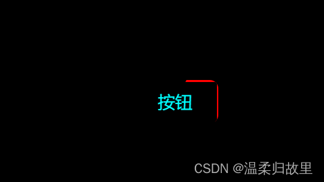
效果图:
CSS
<style>
		* {
			margin: 0;
			padding: 0;
			background-color: black;
		}

		button {
			color: aqua;
			font-size: 20px;
			background-color: black;
			border: none;
			outline: none;
			z-index: 1;
			border-radius: 10px;
			/* outline: 4px solid white; */
			width: 100px;
			height: 50px;
			position: relative;
			overflow: hidden;
			margin-top: 200px;
			margin-left: 45%;
		}

		button::before {
			content: '';
			position: absolute;
			background-color: red;
			width: 200%;
			height: 200%;
			z-index: -2;
			left: 50%;
			top: 50%;
			transform-origin: 0 0;
			animation: rotate 3s infinite linear;
		}

		button::after {
			content: '';
			position: absolute;
			background-color: black;
			z-index: -1;
			width: calc(100% - 4px);
			height: calc(100% - 4px);
			left: 2px;
			top: 2px;
			border: 10px;
		}

		@keyframes rotate {
			to {
				transform: rotate(1turn);
			}
		}
	</style>
HTML:
<body>
	<p>按钮边框旋转效果</p>
	<button>按钮</button>
</body>


 1027
1027


 被折叠的 条评论
为什么被折叠?
被折叠的 条评论
为什么被折叠?
 到【灌水乐园】发言


