


目的
简单记录下学习的过程
参考vue5.com教程【我比较喜欢这种短小的教程】
WPF入门
什么是XAML
简单语法
一种标记语言,专门写UI.
XAML标签必须有结尾,结尾用斜杠或者结束标签,控件的属性也是区分大小写的,可以通过用标签来指定控件的属性内容, 标签名为点号连接控件名和属性名:
<Button></Button>

<Button />

<Button FontWeight="Bold" Content="A button" />

<Button.FontWeight>Bold</Button.FontWeight>
事件
类似以前的Winform,XAML可以很方便的定义控件的事件(MouseUp这里就是定义事件)
<Window x:Class="WpfTutorialSamples.XAML.EventsSample"
        xmlns="http://schemas.microsoft.com/winfx/2006/xaml/presentation"
        xmlns:x="http://schemas.microsoft.com/winfx/2006/xaml"
        Title="EventsSample" Height="300" Width="300">
	<Grid Name="pnlMainGrid" MouseUp="pnlMainGrid_MouseUp" Background="LightBlue">

    </Grid>
</Window>
WPF应用程序
WPF项目结构包含:
- 描述UI的XAML文件(其中包含窗体的XAML和应用相关的XAML)
- 描述逻辑的C#文件
窗体XAML
<Window x:Class="WpfApplication1.Window1"
    xmlns="http://schemas.microsoft.com/winfx/2006/xaml/presentation"
    xmlns:x="http://schemas.microsoft.com/winfx/2006/xaml"
    Title="Window1" Height="300" Width="300">
    <Grid>
    </Grid>
</Window>
x:class属性告诉 XAML 文件使用哪个类(Window1),
对应到C#这边,就可以找到对应控件的逻辑
using System;
using System.Windows;
using System.Windows.Controls;
//…more using statements
namespace WpfApplication1
{
    /// <summary>
    /// Interaction logic for Window1.xaml
    /// </summary>
    public partial class Window1 : Window
    {
        public Window1()
        {
            InitializeComponent();
        }
    }
}
窗体属性
Icon
允许你定义窗口的图标,该图标通常显示在窗口标题之前的左上角。
ResizeMode
这可以控制最终用户是否以及如何调整窗口大小。默认是CanResize,允许用户像任何其他窗口一样调整窗口大小,使用最大化/最小化按钮或拖动其中一个边缘。CanMinimize将允许用户最小化窗口,但不能最大化它或拖动它更大或更小。NoResize是最严格的,最大化和最小化按钮被移除,窗口不能被拖得更大或更小。
ShowInTaskbar
默认值为true,但如果将其设置为false,则窗口将不会在Windows任务栏中显示。适用于非主窗口或应尽量减少托盘的应用程序。
SizeToContent
决定Window是否应调整自身大小以自动适应其内容。默认是Manual, 这意味着窗口不会自动调整大小。其他选项有Width,Height和WidthAndHeight,分别对应自动调整宽度,高度或同时调整两者。
Topmost
默认是false, 但如果设置为true,除非最小化,否则您的窗口将保持在其他窗口之上。仅适用于特殊情况。
WindowStartupLocation
控制窗口的初始位置。默认是Manual, 表示窗口最初将根据窗口的Top和Left属性进行定位。其他选项是CenterOwner,它将窗口定位在其所有者窗口的中心,以及CenterScreen,它将窗口定位在屏幕的中心。
WindowState
控制初始窗口状态。它可以是Normal,Maximized或Minimized。默认值为Normal,除非您希望窗口最大化或最小化,否则应该使用它。
App.xaml
App.xaml是你的应用程序定义的起点,App.xaml.cs 继承自Application类,在WPF Windows应用程序中是一个中心类.
App.xaml文件最常被用到的功能之一,是定义全域性资源,而那些资源可能会被用在整个应用程式中,用来取代全域风格
一个新的App.xaml内容如下
<Application x:Class="WpfTutorialSamples.App"
             xmlns="http://schemas.microsoft.com/winfx/2006/xaml/presentation"
             xmlns:x="http://schemas.microsoft.com/winfx/2006/xaml"
             StartupUri="MainWindow.xaml">
    <Application.Resources>
    </Application.Resources>
</Application>
StartupUri属性,指定了当应用程序启动时应该被加载的Window或Page。在这个例子中,MainWindow.xaml会被启动,如果想使用另外一个window作为启动入口点,只需要修改一下这个属性.
StartupUri属性那里也可以换成Startup,这样就变成指定一个事件了,例如Startup=“Application_Startup”,指定了Application_Startup事件
<Application x:Class="WpfTutorialSamples.App"
             xmlns="http://schemas.microsoft.com/winfx/2006/xaml/presentation"
             xmlns:x="http://schemas.microsoft.com/winfx/2006/xaml"
			 Startup="Application_Startup">
    <Application.Resources></Application.Resources>
</Application>
对应的C#代码中
using System;
using System.Collections.Generic;
using System.Windows;
namespace WpfTutorialSamples
{
	public partial class App : Application
	{
		private void Application_Startup(object sender, StartupEventArgs e)
		{
			// Create the startup window
			MainWindow wnd = new MainWindow();
			// Do stuff here, e.g. to the window
			wnd.Title = "Something else";
			// Show the window
			wnd.Show();
		}
	}
}
StartupEventArgs 包含有输入参数的属性,当需要以命令行方式运行程序时,便可以从这拿到传入命令的信息
资源
静态资源
XAML可以在UI部分就直接申请静态资源。
<Window x:Class="WpfTutorialSamples.WPF_Application.ResourceSample"
        xmlns="http://schemas.microsoft.com/winfx/2006/xaml/presentation"
        xmlns:x="http://schemas.microsoft.com/winfx/2006/xaml"
        xmlns:sys="clr-namespace:System;assembly=mscorlib"
        Title="ResourceSample" Height="150" Width="350">
    <Window.Resources>
        <sys:String x:Key="strHelloWorld">Hello, world!</sys:String>
    </Window.Resources>
    <StackPanel Margin="10">
        <TextBlock Text="{StaticResource strHelloWorld}" FontSize="56" />
        <TextBlock>Just another "<TextBlock Text="{StaticResource strHelloWorld}" />" example, but with resources!</TextBlock>
    </StackPanel>
</Window>
xmlns:sys=“clr-namespace:System;assembly=mscorlib” 好像一定要加这一句才可以
x:Key="strHelloWorld"类似于给静态变量命名,通过这个名字可以访问到这个静态资源
动态资源
实际使用的时候需要设置值。当资源改变的时候再次设置值。而静态资源在XAML载入的时候会设置一次,如果之后资源发生改变,改变的部分不会反映到调用资源的地方。
使用范围
将资源定义在特定的控件(Panel等)范围内而非顶层XAML中的,使用范围仅在控件范围内。
在C#代码中可以通过对应控件的FindResource方法找对应的资源出来
using System;
using System.Windows;
namespace WpfTutorialSamples.WPF_Application
{
	public partial class ResourcesFromCodeBehindSample : Window
	{
		public ResourcesFromCodeBehindSample()
		{
			InitializeComponent();
		}
		private void btnClickMe_Click(object sender, RoutedEventArgs e)
		{
			lbResult.Items.Add(pnlMain.FindResource("strPanel").ToString());
			lbResult.Items.Add(this.FindResource("strWindow").ToString());
			lbResult.Items.Add(Application.Current.FindResource("strApp").ToString());
		}
	}
}
异常处理
WPF可以协助C#处理C#部分没有处理的异常
DispatcherUnhandledException=“Application_DispatcherUnhandledException”
StartupUri=“WPF Application/ExceptionHandlingSample.xaml”>
以上这两句指定了异常处理的事件
<Application x:Class="WpfTutorialSamples.App"
             xmlns="http://schemas.microsoft.com/winfx/2006/xaml/presentation"
             xmlns:x="http://schemas.microsoft.com/winfx/2006/xaml"
             DispatcherUnhandledException="Application_DispatcherUnhandledException"
             StartupUri="WPF Application/ExceptionHandlingSample.xaml">
    <Application.Resources>
    </Application.Resources>
</Application>
using System;
using System.Windows;
namespace WpfTutorialSamples
{
	public partial class App : Application
	{
		private void Application_DispatcherUnhandledException(object sender, System.Windows.Threading.DispatcherUnhandledExceptionEventArgs e)
		{
			MessageBox.Show("An unhandled exception just occurred: " + e.Exception.Message, "Exception Sample", MessageBoxButton.OK, MessageBoxImage.Warning);
			e.Handled = true;
		}
	}
}
组件
TextBlock
作用就是显示文本
多行文本显示
- LinkBreak标签,手动指定就可以换行
- TextTrimming属性并设为CharacterEllipsis,效果是没有足够空间就显示…
- TextTrimming属性并设为WordEllipsis,当空间不足的时候,以最后一个单字为单位显示,就不会有单字只显示一部分,然后…的问题发生。
- TextWrapping 属性并设为Wrap,在没有足够空间显示时自动换行。
<Window x:Class="WpfTutorialSamples.Basic_controls.TextBlockSample"
        xmlns="http://schemas.microsoft.com/winfx/2006/xaml/presentation"
        xmlns:x="http://schemas.microsoft.com/winfx/2006/xaml"
        Title="TextBlockSample" Height="200" Width="250">
    <StackPanel>
		<TextBlock Margin="10" Foreground="Red">
			This is a TextBlock control<LineBreak />
			with multiple lines of text.
		</TextBlock>
		<TextBlock Margin="10" TextTrimming="CharacterEllipsis" Foreground="Green">
			This is a TextBlock control with text that may not be rendered completely, which will be indicated with an ellipsis.
		</TextBlock>
		<TextBlock Margin="10" TextWrapping="Wrap" Foreground="Blue">
			This is a TextBlock control with automatically wrapped text, using the TextWrapping property.
		</TextBlock>
	</StackPanel>
</Window>
内联格式
就是直接在文本内部就把格式整清楚了,希望那部分有格式就可以做.
<Bold>xxx</Bold>
<Italic>xxx</Italic>
<Underline>xxx</Underline>
<Window x:Class="WpfTutorialSamples.Basic_controls.TextBlockInlineSample"
        xmlns="http://schemas.microsoft.com/winfx/2006/xaml/presentation"
        xmlns:x="http://schemas.microsoft.com/winfx/2006/xaml"
        Title="TextBlockInlineSample" Height="100" Width="300">
    <Grid>
		<TextBlock Margin="10" TextWrapping="Wrap">
			TextBlock with <Bold>bold</Bold>, <Italic>italic</Italic> and <Underline>underlined</Underline> text.
		</TextBlock>
    </Grid>
</Window>
Span标签
Span元素可以包含任何的行内元素,很方便的就可以做出复杂的样式
<Window x:Class="WpfTutorialSamples.Basic_controls.TextBlockSpanSample"
        xmlns="http://schemas.microsoft.com/winfx/2006/xaml/presentation"
        xmlns:x="http://schemas.microsoft.com/winfx/2006/xaml"
        Title="TextBlockSpanSample" Height="100" Width="300">
    <Grid>
		<TextBlock Margin="10" TextWrapping="Wrap">
			This <Span FontWeight="Bold">is</Span> a
			<Span Background="Silver" Foreground="Maroon">TextBlock</Span>
			with <Span TextDecorations="Underline">several</Span>
			<Span FontStyle="Italic">Span</Span> elements,
			<Span Foreground="Blue">
				using a <Bold>variety</Bold> of <Italic>styles</Italic>
			</Span>.
		</TextBlock>
	</Grid>
</Window>
Label标签
基础用法是显示字,但是还可以做更多的事情.
- 设置边界
- 加入其他控件
- 模板化
- 使用访问键聚焦到相关控件
Label访问键和助记符
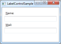
<Window x:Class="WpfTutorialSamples.Basic_controls.LabelControlSample"
        xmlns="http://schemas.microsoft.com/winfx/2006/xaml/presentation"
        xmlns:x="http://schemas.microsoft.com/winfx/2006/xaml"
        Title="LabelControlSample" Height="180" Width="250">
	<StackPanel Margin="10">
		<Label Content="_Name:" Target="{Binding ElementName=txtName}" />
		<TextBox Name="txtName" />
		<Label Content="_Mail:" Target="{Binding ElementName=txtMail}" />
		<TextBox Name="txtMail" />
	</StackPanel>
</Window>

<Label Content="_Name:" Target="{Binding ElementName=txtName}" />
<TextBox Name="txtName" />
这两句就是实现助记符功能的代码
使用控件作为Label的内容
让Label包含更多的内容
<Window x:Class="WpfTutorialSamples.Basic_controls.LabelControlAdvancedSample"
        xmlns="http://schemas.microsoft.com/winfx/2006/xaml/presentation"
        xmlns:x="http://schemas.microsoft.com/winfx/2006/xaml"
        Title="LabelControlAdvancedSample" Height="180" Width="250">
	<StackPanel Margin="10">
		<Label Target="{Binding ElementName=txtName}">
			<StackPanel Orientation="Horizontal">
				<Image Source="http://cdn1.iconfinder.com/data/icons/fatcow/16/bullet_green.png" />
				<AccessText Text="_Name:" />
			</StackPanel>
		</Label>
		<TextBox Name="txtName" />
		<Label Target="{Binding ElementName=txtMail}">
			<StackPanel Orientation="Horizontal">
				<Image Source="http://cdn1.iconfinder.com/data/icons/fatcow/16/bullet_blue.png" />
				<AccessText Text="_Mail:" />
			</StackPanel>
		</Label>
		<TextBox Name="txtMail" />
	</StackPanel>
</Window>
TextBox控件
用于输入文本
支持多行输入
加入AcceptsReturn和TextWrapping属性
<Window x:Class="WpfTutorialSamples.Basic_controls.TextBoxSample"
        xmlns="http://schemas.microsoft.com/winfx/2006/xaml/presentation"
        xmlns:x="http://schemas.microsoft.com/winfx/2006/xaml"
        Title="TextBoxSample" Height="160" Width="280">
    <Grid Margin="10">
		<TextBox AcceptsReturn="True" TextWrapping="Wrap" SpellCheck.IsEnabled="True" Language="en-US" />
	</Grid>
</Window>
选择文本的属性
SelectionChanged="TextBox_SelectionChanged"指定文本选择事件
<Window x:Class="WpfTutorialSamples.Basic_controls.TextBoxSelectionSample"
        xmlns="http://schemas.microsoft.com/winfx/2006/xaml/presentation"
        xmlns:x="http://schemas.microsoft.com/winfx/2006/xaml"
        Title="TextBoxSelectionSample" Height="150" Width="300">
	<DockPanel Margin="10">
		<TextBox SelectionChanged="TextBox_SelectionChanged" DockPanel.Dock="Top" />
		<TextBox Name="txtStatus" AcceptsReturn="True" TextWrapping="Wrap" IsReadOnly="True" />
	</DockPanel>
</Window>
在C#里
SelectionStart,它给出了当前光标位置或是否有选择:它从什么位置开始。
SelectionLength,它给出了当前选择的长度,如果有的话。 否则它将返回0。
SelectedText,如果有选择,它会给我们当前选择的字符串。 否则返回一个空字符串。
		private void TextBox_SelectionChanged(object sender, RoutedEventArgs e)
		{
			TextBox textBox = sender as TextBox;
			txtStatus.Text = "Selection starts at character #" + textBox.SelectionStart + Environment.NewLine;
			txtStatus.Text += "Selection is " + textBox.SelectionLength + " character(s) long" + Environment.NewLine;
			txtStatus.Text += "Selected text: '" + textBox.SelectedText + "'";
		}
Button
带图片的按钮
这个在WPF里很容易实现,只需要在button里包含image控件就可以了
另外,按钮与边框之间可以加一些间距,padding属性可以实现边距。
<Button Padding="5">
    <StackPanel Orientation="Horizontal">
    <Image Source="/xxx.png/>
    <TextBlock Margin="5,0">Help</TextBlock>
    </StackPanel>
</Button>
CheckBox
也是类似于Button,可以包含其他的控件
IsChecked可以控制checkbox是不是默认选中
IsThreeState可以控制checkbox是不是启动真与假的第三种状态
		<CheckBox IsChecked="True" IsThreeState="True">
			<WrapPanel>
				<TextBlock>
					Enable feature <Run FontWeight="Bold">XYZ</Run>
				</TextBlock>
				<Image Source="/xxx.png"/>
			</WrapPanel>
		</CheckBox>
RadioButton
类似于CheckBox
但是多了一个RadioButton组的功能,就是每一组button有自己的独立的选中项,这时候需要带上GroupName。
如果没有这个属性,所有的RadioButton就只能有一个选中.
	<StackPanel Margin="10">
		<Label FontWeight="Bold">Are you ready?</Label>
		<RadioButton GroupName="ready">Yes</RadioButton>
		<RadioButton GroupName="ready">No</RadioButton>
		<RadioButton GroupName="ready" IsChecked="True">Maybe</RadioButton>
		<Label FontWeight="Bold">Male or female?</Label>
		<RadioButton GroupName="sex">Male</RadioButton>
		<RadioButton GroupName="sex">Female</RadioButton>
		<RadioButton GroupName="sex" IsChecked="True">Not sure</RadioButton>
	</StackPanel>
PasswordBox
指定密码符号
一般都是*,但是可以自己指定。
<PasswordBox PasswordChar="X" />
密码长度限定
<PasswordBox MaxLength="6" />
Image控件
Source属性
Source属性可以指定在Image控件中应该显示哪个图片,图片既可以在云端,也可以在本地
<Image Source="xxx.png" />
<Image Source="http://www.xxx.com/xxx.png" />
利用uri在后台可以指定图片,配合UriKind.Relative可以将路径指定为相对路径
    Uri fileUri = new Uri(路径);
    imgDynamic.Source = new BitmapImage(fileUri);
Stretch属性
设置
<Image Source="http://www.xxx.com/xxx.png" Stretch="Fill"/>
Uniform
这是默认模式。 图片将自动缩放,以便它适合图片区域。 将保留图片的宽高比。
UniformToFill
图片将被缩放,以便完全填充图片区域。 将保留图片的宽高比。
Fill
图片将缩放以适合图片控件的区域。 可能无法保留宽高比,因为图片的高度和宽度是独立缩放的。
None
如果图片小于图片控件,则不执行任何操作。 如果它比图片控件大,则会裁剪图片以适合图片控件,这意味着只有部分图片可见。
ToolTip控件
实现鼠标选停在控件上出现提示信息。
<Button ToolTip="Click here and something will happen!">Click here!</Button>
显示的信息也可以多样化,也是包含其他控件。
Tab顺序
WPF的控件自带有Tab功能了,但是它还支持定义Tab 的顺序和Tab的跳过功能
TabIndex用于定义顺序,而IsTabStop将强制WPF在窗口按Tab时跳过这个控件
  <TextBox TabIndex="5" />
  <TextBox IsTabStop="True" />
定义访问键
访问键就是按住Alt键之后,按钮对应的首字母将变为下划线+大写,可以通过直接按对应的字符直接执行对应的操作。
<Button Content="_New"></Button>
按住Alt键的同时,您现在可以按其中一个访问键(例如N,O或S)来激活特定按钮。 它会像用鼠标点击一样反应。
哪些字符应该用作访问键?
选择一个未被其他控件使用的字符,使用第一个单词的第一个字符
Boarder控件
边框控件,可以把控件塞到里面,与其他控件分隔。
除非为Boarder定义一个 **背景(Background)**或者 **边界刷(BorderBrush)**和 边界宽度(BorderThickness),不然边界时看不到的。
指定了边界宽度,背景和边界刷
<Border Background="GhostWhite" BorderBrush="Gainsboro" BorderThickness="1"></Border>
有些时候,希望边界能够有圆角而不是直角,这时候只需要加上CornerRadius属性
<Border Background="GhostWhite" BorderBrush="Silver" BorderThickness="1" CornerRadius="8,8,3,3"></Border>
Slider
滑动条
没有刻度的滑动条
<Slider Maximum="100" />

有刻度的滑动条
<Slider Maximum="100" TickPlacement="BottomRight" TickFrequency="5" />

带刻度吸附的滑动条
<Slider Maximum="100" TickPlacement="BottomRight" TickFrequency="10" IsSnapToTickEnabled="True" />

滑动条的值与TextBox绑定
<TextBox Text="{Binding ElementName=slValue, Path=Value, UpdateSourceTrigger=PropertyChanged}" />
<Slider Maximum="255" TickPlacement="BottomRight" TickFrequency="5" IsSnapToTickEnabled="True" Name="slValue"/>
ProgressBar
进度条
指定进度的进度条
<ProgressBar Minimum="0" Maximum="100" Value="75" />

不确定时间的进度条
<ProgressBar Minimum="0" Maximum="100" Name="pbStatus" IsIndeterminate="True" />

带进度值显示的进度条(巧妙使用TextBlock)
<ProgressBar Minimum="0" Maximum="100" Value="75" Name="pbStatus" />
<TextBlock Text="{Binding ElementName=pbStatus, Path=Value, StringFormat={}{0:0}%}" HorizontalAlignment="Center" VerticalAlignment="Center" />
要做出进度条在不断跑进度,其他UI又不受影响的效果,需要让进度条单独运行在另外一个现场
例如教程上写的BackgroundWorker
	private void Window_ContentRendered(object sender, EventArgs e)
	{
		BackgroundWorker worker = new BackgroundWorker();
		worker.WorkerReportsProgress = true;
		worker.DoWork += worker_DoWork;
		worker.ProgressChanged += worker_ProgressChanged;
		worker.RunWorkerAsync();
	}
	void worker_DoWork(object sender, DoWorkEventArgs e)
	{
		for(int i = 0; i < 100; i++)
		{
			(sender as BackgroundWorker).ReportProgress(i);
			Thread.Sleep(100);
		}
	}
	void worker_ProgressChanged(object sender, ProgressChangedEventArgs e)
	{
		pbStatus.Value = e.ProgressPercentage;
	}
组合框
简单说就是,可以附带控件的Boarder
带标题的组合框
<GroupBox Header="GroupBox Sample"></GroupBox>

带复杂控件的组合框
    <GroupBox Header="GroupBox Sample" Margin="10" Padding="10">
        <StackPanel>
        <TextBlock>First name:</TextBlock>
        <TextBox />
        <TextBlock>Last name:</TextBlock>
        <TextBox />
        <Button Margin="0,20">Add User</Button>
        </StackPanel>
    </GroupBox>
itemControl
数据列表项
字符型的数据列表项
	<ItemsControl>
		<system:String>ItemsControl Item #1</system:String>
		<system:String>ItemsControl Item #2</system:String>
		<system:String>ItemsControl Item #3</system:String>
		<system:String>ItemsControl Item #4</system:String>
		<system:String>ItemsControl Item #5</system:String>
	</ItemsControl>
注意以上XMAL需要添加 xmlns:system="clr-namespace:System;assembly=mscorlib"引用
ItemsControl默认情况下将所有项放到垂直对齐的StackPanel中,如果不希望这样,可以指定放置的面板类型
指定ItemsControl使用WrapPanel作为其模板,方法是在ItemsPanelTemplate属性中声明一个WrapPanel
itemControl的数据展示为对应字符串的Button
<ItemsControl>
	<ItemsControl.ItemsPanel>
		<ItemsPanelTemplate>
			<WrapPanel />
		</ItemsPanelTemplate>
	</ItemsControl.ItemsPanel>
	<ItemsControl.ItemTemplate>
		<DataTemplate>
			<Button Content="{Binding}" Margin="0,0,5,5" />
		</DataTemplate>
	</ItemsControl.ItemTemplate>
	<system:String>Item #1</system:String>
	<system:String>Item #2</system:String>
	<system:String>Item #3</system:String>
	<system:String>Item #4</system:String>
	<system:String>Item #5</system:String>
</ItemsControl>
如果itemControl在窗口上显示不完全,可以把itemControl放到ScrollViewer里,使itemControl具有滚动条的功能
		<ScrollViewer VerticalScrollBarVisibility="Auto" HorizontalScrollBarVisibility="Auto">
			<ItemsControl>
				<system:String>ItemsControl Item #1</system:String>
				<system:String>ItemsControl Item #2</system:String>
				<system:String>ItemsControl Item #3</system:String>
				<system:String>ItemsControl Item #4</system:String>
				<system:String>ItemsControl Item #5</system:String>
			</ItemsControl>
		</ScrollViewer>
ListBox
简单说就是带有选中功能的数据列表项
类似于其他的控件,它也可以通过包含其他控件变化出很多的样式
普通的ListBox
	<ListBox>
		<ListBoxItem>ListBox Item #1</ListBoxItem>
		<ListBoxItem>ListBox Item #2</ListBoxItem>
		<ListBoxItem>ListBox Item #3</ListBoxItem>
	</ListBox>

复合ListBox
	<ListBoxItem>
		<StackPanel Orientation="Horizontal">
			<Image Source="/xxx.png" />
			<TextBlock>ListBox Item #3</TextBlock>
		</StackPanel>
	</ListBoxItem>
ComboBox组合框
普通的组合框
        <ComboBox>
            <ComboBoxItem>ComboBox Item #1</ComboBoxItem>
            <ComboBoxItem IsSelected="True">ComboBox Item #2</ComboBoxItem>
            <ComboBoxItem>ComboBox Item #3</ComboBoxItem>
        </ComboBox>
IsSelected属性配置默认是否选中

复杂的组合框
        <ComboBox>
            <ComboBoxItem>
                <StackPanel Orientation="Horizontal">
                    <Image Source="/xxx.png" />
                    <TextBlock Foreground="Red">Red</TextBlock>
                </StackPanel>
            </ComboBoxItem>
            <ComboBoxItem>
                <StackPanel Orientation="Horizontal">
                    <Image Source="/yyy.png" />
                    <TextBlock Foreground="Green">Green</TextBlock>
                </StackPanel>
            </ComboBoxItem>
            <ComboBoxItem>
                <StackPanel Orientation="Horizontal">
                    <Image Source="/zzz.png" />
                    <TextBlock Foreground="Blue">Blue</TextBlock>
                </StackPanel>
            </ComboBoxItem>
        </ComboBox>
可编辑的组合框
       <ComboBox IsEditable="True">
           <ComboBoxItem>ComboBox Item #1</ComboBoxItem>
           <ComboBoxItem>ComboBox Item #2</ComboBoxItem>
           <ComboBoxItem>ComboBox Item #3</ComboBoxItem>
       </ComboBox>
绑定
例子解读
感谢这位老哥(CSDN的皮皮君)的解读,我把他的解读整理了下

接着补充绑定的语法
如果在XMAL里面直接绑定其内部写的控件,用ElementName写,它指定了绑定源的名字
{Binding Path=Text, ElementName=txtValue}
DataContext
默认的绑定源都是NULL,它是可以被层层继承下去的。如果把顶层windows的DataContext改了,那么绑定源就可以在其下任意的子控件生效,就类似于全局变量的感觉,不用一个个的绑定。
在C#代码中包含这句
	this.DataContext = this;
当然,也可以在层次关系中修改原来的DataContext,让某一层次下的DataContext与前一级的不同。
IValueConverter
数据绑定中可能存在需要双向转换数据类型的场景,在这种场景下需要实现IValueConverter接口,实现Convert()和ConvertBack()方法。
我的VS的目标框架要设置为Net Core5.0才可以跑
绑定的时候需要这样写
加上这句,用于告诉XMAL转换类的名称
<local:YesNoToBooleanConverter x:Key=“YesNoToBooleanConverter” />
需要绑定的控件里加上这段,告诉控件转换类型的类的名称
Converter={StaticResource YesNoToBooleanConverter}}"
	<Window.Resources>
		<local:YesNoToBooleanConverter x:Key="YesNoToBooleanConverter" />
	</Window.Resources>
	<StackPanel Margin="10">
		<TextBox Name="txtValue" />
		<WrapPanel Margin="0,10">
			<TextBlock Text="Current value is: " />
			<TextBlock Text="{Binding ElementName=txtValue, Path=Text, Converter={StaticResource YesNoToBooleanConverter}}"></TextBlock>
		</WrapPanel>
		<CheckBox IsChecked="{Binding ElementName=txtValue, Path=Text, Converter={StaticResource YesNoToBooleanConverter}}" Content="是" />
	</StackPanel>
在CS代码里,实现双向转换接口
	public class YesNoToBooleanConverter : IValueConverter
	{
		public object Convert(object value, Type targetType, object parameter, System.Globalization.CultureInfo culture)
		{
			switch (value.ToString().ToLower())
			{
				case "是":
					return true;
				case "否":
					return false;
			}
			return false;
		}
		public object ConvertBack(object value, Type targetType, object parameter, System.Globalization.CultureInfo culture)
		{
			if (value is bool)
			{
				if ((bool)value == true)
					return "是";
				else
					return "否";
			}
			return "否";
		}
	}
StringFormat
绑定的数值转换有时候觉得太麻烦了,可能不需要那么复杂的功能,那么就可以考虑StringFormat
<TextBlock Text="{Binding Source={x:Static system:DateTime.Now}, StringFormat=Time: {0:HH:mm}}" />
StringFormat的用法可以参照C#中string.Format的用法
x:Static system:DateTime.Now是调用system库的函数


 1万+
1万+


 被折叠的 条评论
为什么被折叠?
被折叠的 条评论
为什么被折叠?
 到【灌水乐园】发言


