


目的
花了一周时间跟着B站的教学视频学习了如何用WPF制作一个生产管理平台上位机软件,学习完了,在此总结涉及到的相关知识.
MVVM工程模板

| 文件夹 | 描述 |
|---|---|
| Assets | 工程相关的资源文件(字体/图片…) |
| Base | 放实现上位机所需要的自定义控件/Models(模型)的定义/实现MVVM需要的操作组件 |
| ViewModels | 放的就是上位机所需要的Model(模型)相关的初始化和声明 |
| Views | 放的是上位机界面(也就是用户看到的皮)的实现(XAML/C#)实现 |
如何寻找图标这种资源
原来我以为的图标资源只有ico,png这种,但是教程告诉我,还可以通过字体实现,它提供了一个找图标的网站,阿里巴巴图标库,在里面注册好,便可以将希望使用的图标打包成一个字体文件,通过特殊的字体代码来调用,而且图标是可以放大不失真的,这就很方便了。

如何使用字体文件中的图标资源
例如某个TextBlock,希望使用某个字体图标,使用字体代码设置好内容,还需要设置FontFamily
并且要将字体文件设置为资源
<TextBlock Foreground="#55FFFFFF" Text="" FontFamily="../Assets/Fonts/#iconfont" FontSize="30"></TextBlock>

如何将原生的窗口标题栏隐藏,并自己重新绘制按钮
首先在窗体xaml设置
    <!--设置边框,让边框不显示,仅剩下按钮-->
    <WindowChrome.WindowChrome>
        <WindowChrome GlassFrameThickness="-1"></WindowChrome>
    </WindowChrome.WindowChrome>
如果还需要窗体居中,可以设置
WindowStartupLocation="CenterScreen"
之后,摆好Grid,在右上角的位置放一个透明的border把原来的按钮那部分区域遮挡住,之后再在透明的border上放好需要的按钮
<!--这个boarder的作用是用来遮挡原来的按钮-->
<Border HorizontalAlignment="Right" WindowChrome.IsHitTestVisibleInChrome="True" Background="Transparent" Width="200">
<StackPanel Orientation="Horizontal" HorizontalAlignment="Right" >
<Button Content="" Style="{StaticResource ControlButtonStyle}" />
<Button Content="" Style="{StaticResource ControlButtonStyle}"/>
<Button Content="" Style="{StaticResource ControlButtonStyle}" Background="DarkRed" Click="Button_Click"/>
</StackPanel>
</Border>
分割线的绘制

就是这种似乎是一条条斜线绘制出来的分割线,教程里使用的visualbrush画出来的
用一个border承载这个分割线
                <!--处理分割线,用visualbrush刷线-->
                <Border Margin="0,0,0,0">
                    <Border.Background>
                        <!--处理填充的模式-->
                        <VisualBrush TileMode="Tile" Viewport="0,0,5,5" ViewportUnits="Absolute">
                            <VisualBrush.Visual>
                                <Grid Width="20" Height="20">
                                    <Line X1="0" Y1="10" X2="10" Y2="0" Stroke="Gray" StrokeThickness="1"/>
                                </Grid>
                            </VisualBrush.Visual>
                        </VisualBrush>
                    </Border.Background>
                </Border>
为按钮添加样式模板并实现触发器功能,滑过按钮,触发阴影效果
例如定义一个button的模板
        <Style TargetType="Button" x:Key="ControlButtonStyle">
            <Setter Property="Width" Value="40"/>
            <Setter Property="Background" Value="#11FFFFFF"/>
            <Setter Property="Foreground" Value="White"/>
            <Setter Property="FontFamily" Value="Assets/Fonts/#iconfont"/>
            <Setter Property="FontSize" Value="20"/>
            <Setter Property="Template">
                <Setter.Value>
                    <ControlTemplate TargetType="Button">
                        <!--这里的controlTemplate中的绑定Background,在控件那里,设置了这个模板,在外部设置的值会影响
                        到里面所绑定的属性(Background),模板中的设置同样也会影响到外部控件的值-->
                        <Grid Background="{TemplateBinding Background}">
                            <!--这里再做一个效果,就是鼠标放上去,颜色不一样-->
                            <Border Name="root">
                                <ContentPresenter VerticalAlignment="Center" HorizontalAlignment="Center"/>
                            </Border>

                        </Grid>
                        <!--触发器,IsMouseOver事件 放上去颜色会不一样-->
                        <ControlTemplate.Triggers>
                            <Trigger Property="IsMouseOver" Value="True">
                                <Setter TargetName="root" Property="Background" Value="#33FFFFFF"/>
                            </Trigger>
                        </ControlTemplate.Triggers>
                    </ControlTemplate>
                </Setter.Value>
            </Setter>
        </Style>
界面xaml中只要设置了这个style的就可以使用定义好的样式了
<Button Content="" Style="{StaticResource ControlButtonStyle}" />
如何设置Grid的背景色为中间淡,边缘深的那种
        <Grid.Background>
            <!--背景,中间淡,边缘深-->
            <RadialGradientBrush>
                <GradientStop Color="#FF1EC0E9" Offset="0"/>
                <GradientStop Color="#FF1EC0E9" Offset="0.3"/>
                <GradientStop Color="#FF1EC0E9" Offset="1"/>
            </RadialGradientBrush>
        </Grid.Background>
指定当前元素和绑定源的位置关系
通过RelativeSource 和 AncestorType来告诉编译器要去哪里找绑定资源
例如下面的例子是让TextBlock的文字绑定窗口的标题,让绑定源去窗体找
                    <!--指当前元素和绑定源的位置关系。
                    AncestorType指定绑定源为某个父元素-->
                    <TextBlock
                        Foreground="White"
                        Text="{Binding Title,RelativeSource={RelativeSource AncestorType=Window}}">
                    </TextBlock>
或者通过希望绑定的元素的名字来告诉编译器去哪里找
                    <TextBlock
                        Foreground="White"
                        Text="{Binding Title,ElementName=Window}">
                    </TextBlock>
或者希望绑定自身的其他属性的值
<TextBox Text="{Binding Path=Background, Mode=TwoWay,RelativeSource={RelativeSource Self}}" />
绑定文字的时候希望做些格式处理
StringFormat这个属性可以对绑定的属性做些格式上的处理
<TextBlock FontSize="10" Text="{Binding Len,StringFormat=时长{0}秒}" Grid.Column="5" VerticalAlignment="Center" Foreground="White" HorizontalAlignment="Center"/>
Model/ViewModel/View的互通
教程中介绍了
- 继承INotifyPropertyChanged实现的通知接口类,实现了一个设置属性的泛型接口SetProperty
- 继承ICommand实现的动作执行类,实现了对触发动作和其传递参数的封装
继承INotifyPropertyChanged实现的通知接口类
    /// <summary>
    /// 通知接口类
    /// </summary>
    internal class NotifyBase : INotifyPropertyChanged
    {
        public event PropertyChangedEventHandler? PropertyChanged;

        /// <summary>
        /// 设置属性,并且触发事件
        /// </summary>
        /// <typeparam name="T"></typeparam>
        /// <param name="field"></param>
        /// <param name="value"></param>
        /// <param name="propName"></param>
        public void SetProperty<T>(ref T field,T value, [CallerMemberName] string propName="")
        {
            field = value;
            PropertyChanged?.Invoke(this, new PropertyChangedEventArgs(propName));
        }
    }
用法是在希望实现这种通知式传递数据的Model中对应的属性的set方法中调用SetProperty
        private string _badCount;
        public string BadCount
        {
            get { return _badCount; }
            set { SetProperty(ref _badCount, value); }
        }
继承ICommand实现的动作执行类
    public class Command : ICommand
    {
        public event EventHandler? CanExecuteChanged;

        public bool CanExecute(object? parameter)
        {
            return true;
        }

        public void Execute(object? parameter)
        {
             DoExexcute?.Invoke(parameter);
        }

        //使用委托传递外部希望执行的动作
        public Action<object> DoExexcute { get; set; }
        public Command(Action<object> action)
        {
            DoExexcute = action;
        }
    }
用法是定义对应的Command类变量属性字段
public Command DetailCommand { get; set; }

//然后初始化它,传递需要执行的回调和参数
 DetailCommand = new Command(DoDetailCommand);
之后对应要使用的xaml使用command属性设置好对应的Command名字
                            <!--这里使用command绑定一个Base中的类,注意要使用相对范围才找得到-->
                            <Button Grid.Row="0"
                                    Margin="10,-20,-17,0"
                                    HorizontalAlignment="Right"
                                    VerticalAlignment="Center"
                                    Content="[ 详情 ]"
                                    Style="{StaticResource DetailButton}"
                                    BorderThickness="0" Width="80" Height="30" FontSize="15"
                                    Command="{Binding DetailCommand,RelativeSource={RelativeSource AncestorType=Window}}"
                                    CommandParameter="{Binding}"
                                    >
                            </Button>
Itemcontrol集合的使用
                    <ItemsControl ItemsSource="{Binding Enviroment}" Margin="5">
                        <ItemsControl.ItemsPanel>
                            <ItemsPanelTemplate>
                                <!--数据集合划分为4列-->
                                <UniformGrid Columns="4"/>
                            </ItemsPanelTemplate>
                        </ItemsControl.ItemsPanel>

                        <!--数据集合绑定数据源的元素-->
                        <ItemsControl.ItemTemplate>
                            <DataTemplate>
                                <StackPanel VerticalAlignment="Center" HorizontalAlignment="Center">
                                    <TextBlock Margin="0,10,0,0" Text="{Binding Value}" FontSize="15" Foreground="GhostWhite" HorizontalAlignment="Center" FontWeight="Bold"/>
                                    <TextBlock Text="{Binding Header}" FontSize="10" Foreground="FloralWhite" HorizontalAlignment="Center"/>
                                </StackPanel>

                            </DataTemplate>
                        </ItemsControl.ItemTemplate>
                    </ItemsControl>
首先定义ItemsControl,需要指定需要绑定的数据源,也就是ItemsSource
ItemsControl.ItemsPanel这个是集合的载体(我是这样理解的),如果不修改,那么这个载体就是默认的载体
ItemsControl.ItemTemplate和DataTemplate是这个是集合的模板,也就是希望生成的每一个集合的样子,内部包含的控件,数据绑定等等
当然这个ItemTemplate可以在外部写,写成资源,给其他需要的itemcontrol用
外部写个资源
                <StackPanel.Resources>
                    <DataTemplate x:Key="dataTemp">
                        <Border Width="15" Background="#99FFFFFF" Margin="2,0">
                            <TextBlock Text="{Binding}" VerticalAlignment="Center" HorizontalAlignment="Center" Foreground="White" FontSize="15" FontWeight="Bold"/>
                        </Border>
                    </DataTemplate>
                </StackPanel.Resources>
其他itemcontrol调用一下
                <ItemsControl ItemsSource="{Binding BadCount}"  ItemTemplate="{StaticResource dataTemp}">
                    <ItemsControl.ItemsPanel>
                        <ItemsPanelTemplate>
                            <VirtualizingStackPanel Orientation="Horizontal">
                            </VirtualizingStackPanel>
                        </ItemsPanelTemplate>
                    </ItemsControl.ItemsPanel>

                </ItemsControl>
自定义GroupBox模板,实现漂亮的控件框

        <Style TargetType="GroupBox">
            <Setter Property="Margin" Value="10,5"/>
            <Setter Property="Template">
                <Setter.Value>
                    <ControlTemplate TargetType="GroupBox">
                        <!--GroupBox的边框-->
                        <!--用折线,园,边框画出复杂的边框-->
                        <Grid>
                            <Polyline Points="0 30,0 10,10 0,30 0" Stroke="White" StrokeThickness="1" VerticalAlignment="Top" HorizontalAlignment="Left"/>
                            <Ellipse Width="4" Height="4" VerticalAlignment="Top" HorizontalAlignment="Left" Fill="White" Margin="27,-2,0,0"/>
                            <Ellipse Width="4" Height="4" VerticalAlignment="Top" HorizontalAlignment="Left" Fill="White" Margin="-2,27,0,0"/>
                            <Path Data="M0 0,3 3,30 3,33 0,68 0,73 7,78 7,78 10M8 0,25 0" Stroke="White" StrokeThickness="1" VerticalAlignment="Top" HorizontalAlignment="Right"/>
                            <Polyline Points="0,0 0,15 10,15" Stroke="White" StrokeThickness="1" VerticalAlignment="Bottom" HorizontalAlignment="Left"/>
                            <Polyline Points="10,0 0,10" Stroke="White" StrokeThickness="1" VerticalAlignment="Bottom" HorizontalAlignment="Right"/>
                            <Polygon Points="0,7 7 7 7 0" Fill="White" VerticalAlignment="Bottom" HorizontalAlignment="Right"/>
                            <Border BorderBrush="White" BorderThickness="0,1,0,0" VerticalAlignment="Top" Margin="30,-0.5,78,0"/>
                            <Border BorderBrush="White" BorderThickness="0,0,1,0" HorizontalAlignment="Right" Margin="0,10"/>
                            <Border BorderBrush="White" BorderThickness="0,1,0,0" VerticalAlignment="Bottom" Margin="10,0"/>
                            <Border BorderBrush="White" BorderThickness="0,0,1,0" HorizontalAlignment="Left" Margin="-0.5,15"/>
                            <!--自动绑定Header属性-->
                            <TextBlock Text="{TemplateBinding Header}" Foreground="White" VerticalAlignment="Top" HorizontalAlignment="Left" Margin="5"/>
                            <!--还需要放置其用于放置内容的区域controlpresenter-->
                            <ContentPresenter>

                            </ContentPresenter>
                        </Grid>
                    </ControlTemplate>
                </Setter.Value>
            </Setter>
        </Style>
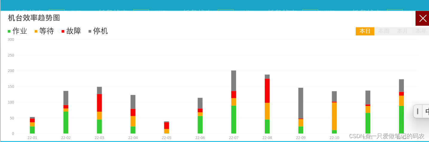
livechart图标库的使用
这个直接搜其他人的教程算了,这个都可以单独写一篇了
确实很不错,做出来的效果
顺带一提,这个图例的小方块使用border做的
                    <StackPanel Margin="0,5,15,0" Orientation="Horizontal" VerticalAlignment="Top" HorizontalAlignment="Right">
                            <Border Width="5" Height="5" Background="Red" Margin="5,0"></Border>
                            <TextBlock Text="不良计数" Foreground="Red" FontSize="15"></TextBlock>
                            <Border Width="5" Height="5" Background="Green" Margin="5,0"></Border>
                            <TextBlock Text="生产计数" Foreground="Green" FontSize="15"></TextBlock>
                        </StackPanel>

                        <lvc:CartesianChart Margin="5,30,0,0">
                        <lvc:CartesianChart.Series>
                            <lvc:ColumnSeries
                                Values="300,400,500,345,200,250,400,500"
                                MaxColumnWidth="10"
                                Title="生产计数"
                                >
                                <lvc:ColumnSeries.Fill>
                                    <LinearGradientBrush StartPoint="0,0" EndPoint="0,1">
                                        <GradientStop Color="GreenYellow" Offset="0.5"/>
                                        <GradientStop Color="LawnGreen" Offset="0.1"/>
                                    </LinearGradientBrush>
                                </lvc:ColumnSeries.Fill>
                            </lvc:ColumnSeries>

                            <lvc:ColumnSeries Values="150,200,80,506,708,203,155,123"
                             MaxColumnWidth="10"
                             Title="不良计数" >
                                <lvc:ColumnSeries.Fill>
                                    <LinearGradientBrush StartPoint="0,0" EndPoint="0,1">
                                        <GradientStop Color="OrangeRed" Offset="0.5"/>
                                        <GradientStop Color="IndianRed" Offset="0.1"/>
                                    </LinearGradientBrush>
                                </lvc:ColumnSeries.Fill>
                            </lvc:ColumnSeries>
                        </lvc:CartesianChart.Series>

                        <lvc:CartesianChart.AxisX >
                            <lvc:Axis Labels="1:00,2:00,3:00,4:00,5:00,6:00,7:00,8:00" Foreground="White">
                                <lvc:Axis.Separator>
                                    <lvc:Separator Step="1" StrokeThickness="0"/>
                                </lvc:Axis.Separator>
                            </lvc:Axis>
                        </lvc:CartesianChart.AxisX>

                        <lvc:CartesianChart.AxisY>
                            <lvc:Axis MinValue="0" MaxValue="1000" Foreground="White">
                                <lvc:Axis.Separator>
                                    <lvc:Separator Step="200" StrokeThickness="0.5" Stroke="White"/>
                                </lvc:Axis.Separator>
                            </lvc:Axis>
                        </lvc:CartesianChart.AxisY>

                    </lvc:CartesianChart>
标签式的单选按钮组

也是用样式做的
        <!--单选框的样式-->
        <Style TargetType="RadioButton">
            <Setter Property="Width" Value="50"/>
            <Setter Property="Foreground" Value="#ddd"/>
            <Setter Property="Height" Value="22"/>
            <Setter Property="Background" Value="#eee"/>
            <Setter Property="FontSize" Value="15"/>
            <Setter Property="Template">
                <Setter.Value>
                    <ControlTemplate TargetType="RadioButton">
                        <Border Background="{TemplateBinding Background}">
                            <ContentPresenter VerticalAlignment="Center" HorizontalAlignment="Center"/>
                        </Border>
                    </ControlTemplate>
                </Setter.Value>

            </Setter>
            <Style.Triggers>
                <Trigger Property="IsChecked" Value="True">
                    <Setter Property="Background" Value="Orange"/>
                    <Setter Property="Foreground" Value="White"/>
                </Trigger>
            </Style.Triggers>
        </Style>
不同窗体之间的切换
这种切换是整个切换,不是弹出另一个窗体的那种
做的时候得有个树状结构的思想
从主窗口,切换到下属的窗体,然后再切回来
例如要从主窗体mainViewModel切换到workshopView
那么只需要再对应的回调函数里
            WorkshopView workshopView = new WorkshopView();
            mainViewModel.PageContent = workshopView;
切换窗体的动画
这种主要是添加用户体验,注意切入窗口和切出的时候动画触发的时机
切入
            WorkshopView workshopView = new WorkshopView();
            mainViewModel.PageContent = workshopView;


            //动画处理

            //透明度
            ThicknessAnimation thicknessAnimation = new ThicknessAnimation(
                new Thickness(0,50,0,-50), new Thickness(0, 0, 0, 0),
                new TimeSpan(0,0,0,0,400));
            //位移
            DoubleAnimation doubleAnimation = new DoubleAnimation(0, 1, new TimeSpan(0, 0, 0, 0, 400));

            //绑定对象和属性
            Storyboard.SetTarget(doubleAnimation, workshopView);
            Storyboard.SetTarget(thicknessAnimation, workshopView);
            Storyboard.SetTargetProperty(thicknessAnimation, new PropertyPath("Margin"));
            Storyboard.SetTargetProperty(doubleAnimation, new PropertyPath("Opacity"));

            //录入动画
            Storyboard storyboard = new Storyboard();
            storyboard.Children.Add(thicknessAnimation);
            storyboard.Children.Add(doubleAnimation);
            storyboard.Begin();
切出回到主窗体
            MonitorView monitorView = new MonitorView();
            mainViewModel.PageContent = monitorView;

            //透明度
            ThicknessAnimation thicknessAnimation = new ThicknessAnimation(
                new Thickness(0, 50, 0, -50), new Thickness(0, 0, 0, 0),
                new TimeSpan(0, 0, 0, 0, 400));

            //动画处理

            //绑定对象和属性

            Storyboard.SetTarget(thicknessAnimation, monitorView);
            Storyboard.SetTargetProperty(thicknessAnimation, new PropertyPath("Margin"));


            //录入动画
            Storyboard storyboard = new Storyboard();
            storyboard.Children.Add(thicknessAnimation);
            storyboard.Begin();
自定义控件的做法
这个也是个复杂的专题,可以单独写一篇
简单写下我的理解,剩下的后面用到再查教程算了
自定义控件和画窗体是差不多的
先画好xaml前端
难点在后端数据和前端xaml的互动
后端设计好需要前后端传递的属性字段,前后端做好绑定
在VS里打打prodp,快速打出属性绑定一条龙语句,非常方便,原来不知道,设置好对应的回调函数,
设置好构造函数,设置好其他希望的事件函数(例如很重要的刷新重绘函数)
在用的xaml文件上写好类型C#的using引用(xmlns巴拉巴拉那堆玩意)
然后就可以愉快的调用你的自定义控件了
页面滚动的效果
把需要滚动的内容填里面
然后顺带把滚动的侧边隐藏了
<ScrollViewer VerticalScrollBarVisibility="Hidden" Grid.Row="1" Margin="10,5"/>
页面内再弹出一个小页面显示
这种效果是用board遮住,原来的内容,然后再在新的border上整活,就是注意用控件做一个command触发它弹出,关闭,动画效果和本文中那个类似,也是做好动画触发的时机,Visibility="Collapsed"控制好。
<Border Background="#22000000" Grid.RowSpan="2" Name="detail" Visibility="Collapsed">

</Border>
单选侧边栏
这种其实是单选框的变体,重写写了个样式,用border封了个边。
        <Style TargetType="RadioButton" x:Key="NavButtonStyle">
            <Setter Property="Background" Value="Transparent"/>
            <Setter Property="FontSize" Value="15"/>
            <Setter Property="Template">
                <Setter.Value>
                    <ControlTemplate TargetType="RadioButton">
                        <Grid Background="Transparent" >
                            <Border Background="{TemplateBinding Background}" Height="30" >
                                <ContentPresenter VerticalAlignment="Center" HorizontalAlignment="Left" Margin="5,0,0,0"/>
                            </Border>
                        </Grid>
                    </ControlTemplate>
                </Setter.Value>
            </Setter>

            <Style.Triggers>
                <Trigger Property="IsChecked" Value="True">
                    <Setter Property="Background" Value="Orange"/>
                    <Setter Property="Foreground" Value="White"/>
                </Trigger>
            </Style.Triggers>
        </Style>
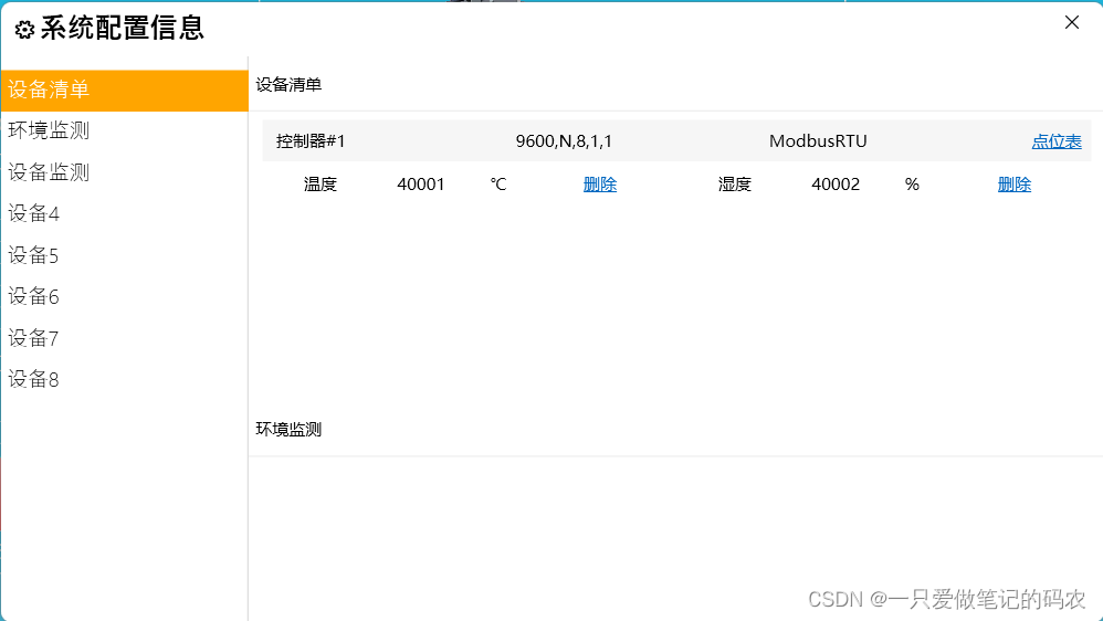
并且这个教程实现了一个单击侧边按钮,可以跳转到指定的内容那个位置
这个的做法是给每一个内容顶部的标题编写了不同的名字,用的是Tag属性
        <StackPanel Margin="0,10" Grid.Row="1">
            <RadioButton Style="{StaticResource NavButtonStyle}" Content="设备清单" Click="RadioButton_Click"  Tag="s1" IsChecked="True"/>
            <RadioButton Style="{StaticResource NavButtonStyle}"  Content="环境监测" Click="RadioButton_Click"  Tag="s2" IsChecked="True"/>
            <RadioButton Style="{StaticResource NavButtonStyle}"  Content="设备监测" Click="RadioButton_Click"  Tag="s3" IsChecked="True"/>
            <RadioButton Style="{StaticResource NavButtonStyle}"  Content="设备4" Click="RadioButton_Click"     Tag="s4" IsChecked="True"/>
            <RadioButton Style="{StaticResource NavButtonStyle}"  Content="设备5" Click="RadioButton_Click"     Tag="s5" IsChecked="True"/>
            <RadioButton Style="{StaticResource NavButtonStyle}"  Content="设备6" Click="RadioButton_Click"     Tag="s6" IsChecked="True"/>
            <RadioButton Style="{StaticResource NavButtonStyle}"  Content="设备7" Click="RadioButton_Click"     Tag="s7" IsChecked="True"/>
            <RadioButton Style="{StaticResource NavButtonStyle}"  Content="设备8" Click="RadioButton_Click"     Tag="s8" IsChecked="True"/>

        </StackPanel>
然后在单选按钮单击的时候触发事件跳转到指定Page的对应的Tag的位置
        private void RadioButton_Click(object sender, RoutedEventArgs e)
        {
            //页面内部滚动导航到指定位置的方法
            //其实就是对每一个需要导航的Grid做了编码
            this.frame.Navigate(
                new Uri(
                    "pack://application:,,,/Wpf_Automatic_Core;component/Views/SettingsPage.xaml#" +
                    (sender as RadioButton).Tag.ToString(), UriKind.RelativeOrAbsolute));
        }
Page的xaml
    <Grid>
        <Grid.RowDefinitions>
            <RowDefinition Height="40"/>
            <RowDefinition Height="Auto"/>

            <RowDefinition Height="40"/>
            <RowDefinition Height="Auto"/>

            <RowDefinition Height="40"/>
            <RowDefinition Height="Auto"/>

            <RowDefinition Height="40"/>
            <RowDefinition Height="Auto"/>

            <RowDefinition Height="40"/>
            <RowDefinition Height="Auto"/>

            <RowDefinition Height="40"/>
            <RowDefinition Height="Auto"/>

            <RowDefinition Height="40"/>
            <RowDefinition Height="Auto"/>

            <RowDefinition Height="40"/>
            <RowDefinition Height="Auto"/>

        </Grid.RowDefinitions>

        <Border BorderBrush="#eee" BorderThickness="0,0,0,1"/>
        <Border BorderBrush="#eee" BorderThickness="0,0,0,1" Grid.Row="2"/>
        <Border BorderBrush="#eee" BorderThickness="0,0,0,1" Grid.Row="4"/>
        <Border BorderBrush="#eee" BorderThickness="0,0,0,1" Grid.Row="6"/>
        <Border BorderBrush="#eee" BorderThickness="0,0,0,1" Grid.Row="8"/>
        <Border BorderBrush="#eee" BorderThickness="0,0,0,1" Grid.Row="10"/>
        <Border BorderBrush="#eee" BorderThickness="0,0,0,1" Grid.Row="12"/>
        <Border BorderBrush="#eee" BorderThickness="0,0,0,1" Grid.Row="14"/>

        <Label Content="设备清单" Name="s1" VerticalContentAlignment="Center"             />
        <Label Content="环境监测" Name="s2" VerticalContentAlignment="Center" Grid.Row="2"/>
        <Label Content="设备监测" Name="s3" VerticalContentAlignment="Center" Grid.Row="4"/>
        <Label Content="设备4"    Name="s4" VerticalContentAlignment="Center" Grid.Row="6"/>
        <Label Content="设备5"    Name="s5" VerticalContentAlignment="Center" Grid.Row="8"/>
        <Label Content="设备6"    Name="s6" VerticalContentAlignment="Center" Grid.Row="10"/>
        <Label Content="设备7"    Name="s7" VerticalContentAlignment="Center" Grid.Row="12"/>
        <Label Content="设备8"    Name="s8" VerticalContentAlignment="Center" Grid.Row="14"/>

        <Grid Height="200" Grid.Row="1" Margin="10,5">
            <StackPanel>
                <Grid Height="30" Background="#09000000" Margin="0,1">
                    <Grid.ColumnDefinitions>
                        <ColumnDefinition/>
                        <ColumnDefinition/>
                        <ColumnDefinition/>
                        <ColumnDefinition Width="50"/>

                    </Grid.ColumnDefinitions>

                    <TextBlock Text="控制器#1" VerticalAlignment="Center" Margin="10,0"/>
                    <TextBlock Text="9600,N,8,1,1" Grid.Column="1" VerticalAlignment="Center"/>
                    <TextBlock Text="ModbusRTU" Grid.Column="2" VerticalAlignment="Center"/>
                    <TextBlock Grid.Column="3" VerticalAlignment="Center" HorizontalAlignment="Center">
                        <Hyperlink >点位表</Hyperlink>
                    </TextBlock>


                </Grid>
                <UniformGrid Columns="2">
                    <Grid Height="30" Margin="30,0,0,0">
                        <Grid.ColumnDefinitions>
                            <ColumnDefinition/>
                            <ColumnDefinition/>
                            <ColumnDefinition/>
                            <ColumnDefinition/>
                        </Grid.ColumnDefinitions>
                        <TextBlock Text="温度" VerticalAlignment="Center"/>
                        <TextBlock Text="40001" Grid.Column="1" VerticalAlignment="Center"/>
                        <TextBlock Text="℃" Grid.Column="2" VerticalAlignment="Center"/>
                        <TextBlock Grid.Column="3" VerticalAlignment="Center">
                                <Hyperlink>删除</Hyperlink>
                        </TextBlock>
                    </Grid>

                    <Grid Height="30" Margin="30,0,0,0">
                        <Grid.ColumnDefinitions>
                            <ColumnDefinition/>
                            <ColumnDefinition/>
                            <ColumnDefinition/>
                            <ColumnDefinition/>
                        </Grid.ColumnDefinitions>
                        <TextBlock Text="湿度" VerticalAlignment="Center"/>
                        <TextBlock Text="40002" Grid.Column="1" VerticalAlignment="Center"/>
                        <TextBlock Text="%" Grid.Column="2" VerticalAlignment="Center"/>
                        <TextBlock Grid.Column="3" VerticalAlignment="Center">
                                <Hyperlink>删除</Hyperlink>
                        </TextBlock>
                    </Grid>
                </UniformGrid>
            </StackPanel>
        </Grid>
        <Grid Height="200" Grid.Row="3"></Grid>
        <Grid Height="200" Grid.Row="5"></Grid>
        <Grid Height="200" Grid.Row="7"></Grid>
        <Grid Height="200" Grid.Row="9"></Grid>
        <Grid Height="200" Grid.Row="11"></Grid>
        <Grid Height="200" Grid.Row="13"></Grid>
        <Grid Height="200" Grid.Row="15"></Grid>

    </Grid>


 862
862


 被折叠的 条评论
为什么被折叠?
被折叠的 条评论
为什么被折叠?
 到【灌水乐园】发言


