install
npm install vee-validate --save
npm install @vee-validate/rules
src/includes/validation.js
import {
  required,
  min,
  max,
  alpha_spaces as alphaSpaces,
  email,
  min_value as minValue,
  max_value as maxValue,
  confirmed,
  not_one_of as excluded
} from '@vee-validate/rules'

import {
  Form as VeeForm,
  Field as VeeField,
  defineRule,
  ErrorMessage,
  configure
} from 'vee-validate'

export default {
  // define rules
  install(app) {
    app.component('VeeForm', VeeForm)
    app.component('VeeField', VeeField)
    app.component('ErrorMessage', ErrorMessage)
    defineRule('required', required)
    defineRule('tos', required)
    defineRule('min', min)
    defineRule('max', max)
    defineRule('alpha_spaces', alphaSpaces)
    defineRule('email', email)
    defineRule('min_value', minValue)
    defineRule('max_value', maxValue)
    defineRule('password_mismatch', confirmed)
    defineRule('excluded', excluded)
    defineRule('country_excluded', excluded)

    configure({
      // custome error messages
      generateMessage: (ctx) => {
        const messages = {
          required: `The field ${ctx.field} is required.`,
          min: `The field ${ctx.field} is too short.`,
          max: `The field ${ctx.field} is too long.`,
          alpha_spaces: `The field ${ctx.field} can only contain alphabetical characters and spaces.`,
          email: `The field ${ctx.field} must be a valid email.`,
          min_value: `The field ${ctx.field} is too low.`,
          max_value: `The field ${ctx.field} is too high.`,
          excluded: `You are no allowed to use this value for the field ${ctx.field} .`,
          country_excluded: `Due to restrictions,we do not accept users from this location.`,
          password_mismatch: `The password don't match`,
          tos: `You must accept the Terms of Services.`
        }
        const message = messages[ctx.rule.name]
          ? messages[ctx.rule.name]
          : `The field ${ctx.field} is invalid.`

        return message
      },
      // validation triggers
      validateOnBlur: true,
      validateOnChange: true,
      validateOnInput: false,
      validateOnModelUpdate: true
    })
  }
}
src/main.js
import VeeValidatePlugin from './includes/validation'
app.use(VeeValidatePlugin)
src/components/Auth.vue
<template>
<div class="fixed z-10 inset-0 overflow-y-auto" id="modal" :class="hiddenClass">
<div
class="flex items-end justify-center min-h-screen pt-4 px-4 pb-20 text-center sm:block sm:p-0"
>
<div class="fixed inset-0 transition-opacity">
<div class="absolute inset-0 bg-gray-800 opacity-75"></div>
</div>
<!-- This element is to trick the browser into centering the modal contents. -->
<span class="hidden sm:inline-block sm:align-middle sm:h-screen">​</span>
<div
class="inline-block align-bottom bg-white rounded-lg text-left overflow-hidden shadow-xl transform transition-all sm:my-8 sm:align-middle sm:max-w-lg sm:w-full"
>
<!-- Add margin if you want to see some of the overlay behind the modal-->
<div class="py-4 text-left px-6">
<!--Title-->
<div class="flex justify-between items-center pb-4">
<p class="text-2xl font-bold">Your Account</p>
<!-- Modal Close Button -->
<div class="modal-close cursor-pointer z-50" @click.prevent="modalVisibility = false">
<i class="fas fa-times"></i>
</div>
</div>
<!-- Tabs -->
<ul class="flex flex-wrap mb-4">
<li class="flex-auto text-center">
<a
class="block rounded py-3 px-4 transition"
href="#"
@click.prevent="tab = 'login'"
:class="{
'hover:text-white text-white bg-blue-600': tab === 'login'
}"
>Login</a
>
</li>
<li class="flex-auto text-center">
<a
class="block rounded py-3 px-4 transition"
href="#"
@click.prevent="tab = 'register'"
:class="{
'hover:text-white text-white bg-blue-600': tab === 'register'
}"
>Register</a
>
</li>
</ul>
<!-- Login form -->
<app-login-form v-if="tab === 'login'" />
<!-- Registration form -->
<app-register-form v-else />
</div>
</div>
</div>
</div>
</template>
<script>
import { mapState, mapWritableState } from 'pinia'
import useModalStore from '@/stores/modal'
import AppLoginForm from './LoginForm.vue'
import AppRegisterForm from './RegisterForm.vue'
export default {
name: 'Auth',
data() {
return {
tab: 'login'
}
},
// pinia
computed: {
...mapState(useModalStore, ['hiddenClass']),
...mapWritableState(useModalStore, {
modalVisibility: 'isOpen'
})
},
components: {
AppLoginForm,
AppRegisterForm
},
methods: {}
}
</script>
/src/components/LoginForm.vue
<template>
  <!-- validate the form -->
  <div
    class="text-white text-center font-bold p-4 rounded mb-4"
    v-if="login_show_alert"
    :class="login_alert_variant"
  >
    {{ login_alert_msg }}
  </div>
  <vee-form :validation-schema="loginSchema" @submit="login">
    <!-- Email -->
    <div class="mb-3">
      <label class="inline-block mb-2">Email</label>
      <vee-field
        name="email"
        type="email"
        class="block w-full py-1.5 px-3 text-gray-800 border border-gray-300 transition duration-500 focus:outline-none focus:border-black rounded"
        placeholder="Enter Email"
      />
      <ErrorMessage class="text-red-600" name="email" />
    </div>
    <!-- Password -->
    <div class="mb-3">
      <label class="inline-block mb-2">Password</label>
      <vee-field
        name="password"
        type="password"
        class="block w-full py-1.5 px-3 text-gray-800 border border-gray-300 transition duration-500 focus:outline-none focus:border-black rounded"
        placeholder="Password"
      />
      <ErrorMessage class="text-red-600" name="password" />
    </div>
    <button
      type="submit"
      class="block w-full bg-purple-600 text-white py-1.5 px-3 rounded transition hover:bg-purple-700"
      :disabled="login_in_submission"
    >
      Submit
    </button>
  </vee-form>
</template>

<script>
import { ErrorMessage } from 'vee-validate'
export default {
  name: 'LoginForm',
  data() {
    return {
      //apply rules
      loginSchema: {
        email: 'required|email',
        password: 'required|min:9|max:100'
      },
      // showing alerts for frequent submit
      login_in_submission: false, //disable the submit button
      login_show_alert: false, //toggle the alert visibility
      login_alert_variant: 'bg-blue-500', //change the color of the alert
      login_alert_msg: 'Please wait! Your are logging in.' //message inside the alert
    }
  },
  components: {
    ErrorMessage
  },
  methods: {
    // validate the form
    login(values) {
      this.login_show_alert = true
      this.login_in_submission = true
      this.login_alert_variant = 'bg-blue-500'
      this.login_alert_msg = 'Please wait! Your are logging in.'

      this.login_alert_variant = 'bg-green-500'
      this.login_alert_msg = 'Success! You are now logged in.'
      console.log(values)
    }
  }
}
</script>
src/components/RegisterForm.vue
<template>
  <div
    class="text-white text-center font-bold p-4 rounded mb-4"
    v-if="reg_show_alert"
    :class="reg_alert_variant"
  >
    {{ reg_alert_msg }}
  </div>
  <vee-form :validation-schema="schema" @submit="register" :initial-values="userDate">
    <!-- Name -->
    <div class="mb-3">
      <label class="inline-block mb-2">Name</label>
      <vee-field
        name="name"
        type="text"
        class="block w-full py-1.5 px-3 text-gray-800 border border-gray-300 transition duration-500 focus:outline-none focus:border-black rounded"
        placeholder="Enter Name"
      />
      <ErrorMessage class="text-red-600" name="name" />
    </div>
    <!-- Email -->
    <div class="mb-3">
      <label class="inline-block mb-2">Email</label>
      <vee-field
        name="email"
        type="email"
        class="block w-full py-1.5 px-3 text-gray-800 border border-gray-300 transition duration-500 focus:outline-none focus:border-black rounded"
        placeholder="Enter Email"
      />
      <ErrorMessage class="text-red-600" name="email" />
    </div>
    <div class="mb-3">
      <label class="inline-block mb-2">Age</label>
      <vee-field
        name="age"
        type="number"
        class="block w-full py-1.5 px-3 text-gray-800 border border-gray-300 transition duration-500 focus:outline-none focus:border-black rounded"
      />
      <ErrorMessage class="text-red-600" name="age" />
    </div>
    <!-- Password -->
    <div class="mb-3">
      <!-- https://vee-validate.logaretm.com/v4/api/field/ -->
      <label class="inline-block mb-2">Password</label>
      <!-- render multiple error message -->
      <!-- you bind the field object to your input element/input, the field object contains all the common attributes and listeners required for the field to be validated, this is done automatically if you are using the as prop. -->
      <!-- :bails="false" Continues validating although a rule fails the validation -->
      <!-- v-bind:bails,bails need the boolean value,but the string passed in,using v-bind can only pass in the false which is boolean type,ignoring the "" -->
      <vee-field :bails="false" v-slot="{ field, errors }" name="password">
        <input
          type="password"
          class="block w-full py-1.5 px-3 text-gray-800 border border-gray-300 transition duration-500 focus:outline-none focus:border-black rounded"
          placeholder="Password"
          v-bind="field"
        />
        <div class="text-red-600" v-for="error in errors" :key="error">{{ error }}</div>
      </vee-field>
    </div>
    <!-- Confirm Password -->
    <div class="mb-3">
      <label class="inline-block mb-2">Confirm Password</label>
      <vee-field
        name="confirm_password"
        type="password"
        class="block w-full py-1.5 px-3 text-gray-800 border border-gray-300 transition duration-500 focus:outline-none focus:border-black rounded"
        placeholder="Confirm Password"
      />
      <ErrorMessage class="text-red-600" name="confirm_password" />
    </div>
    <!-- Country -->
    <div class="mb-3">
      <label class="inline-block mb-2">Country</label>
      <!-- The as prop tells the Field component which tag to render in its place, you can pass any additional attributes,defaults to input -->
      <vee-field
        as="select"
        name="country"
        class="block w-full py-1.5 px-3 text-gray-800 border border-gray-300 transition duration-500 focus:outline-none focus:border-black rounded"
      >
        <option value="USA">USA</option>
        <option value="Mexico">Mexico</option>
        <option value="Germany">Germany</option>
        <option value="Antarctica">Antarctica</option>
      </vee-field>
      <ErrorMessage class="text-red-600" name="country" />
    </div>
    <!-- TOS -->
    <div class="mb-3 pl-6">
      <vee-field
        name="tos"
        value="1"
        type="checkbox"
        class="w-4 h-4 float-left -ml-6 mt-1 rounded"
      />
      <label class="inline-block">Accept terms of service</label>
      <ErrorMessage class="text-red-600 block" name="tos" />
    </div>
    <button
      type="submit"
      class="block w-full bg-purple-600 text-white py-1.5 px-3 rounded transition hover:bg-purple-700"
      :disabled="reg_in_submission"
    >
      Submit
    </button>
  </vee-form>
</template>

<script>
import { ErrorMessage } from 'vee-validate'
export default {
  name: 'RegisterForm',
  data() {
    return {
      //apply rules
      schema: {
        name: 'required|min:3|max:100|alpha_spaces',
        email: 'required|min:3|max:100|email',
        age: 'required|min_value:18|max_value:100',
        password: 'required|min:9|max:100|excluded:password',
        confirm_password: 'password_mismatch:@password',
        country: 'required|country_excluded:Antarctica',
        tos: 'tos'
      },
      // default values
      userDate: {
        country: 'USA'
      },
      // showing alerts for frequent submit
      reg_in_submission: false, //disable the submit button
      reg_show_alert: false, //toggle the alert visibility
      reg_alert_variant: 'bg-blue-500', //change the color of the alert
      reg_alert_msg: 'Please wait! Your account is being created.' //message inside the alert
    }
  },
  component: {
    ErrorMessage
  },
  methods: {
    // validate the form
    register(values) {
      this.reg_show_alert = true
      this.reg_in_submission = true
      this.reg_alert_variant = 'bg-blue-500'
      this.reg_alert_msg = 'Please wait! Your account is being created.'

      this.reg_alert_variant = 'bg-green-500'
      this.reg_alert_msg = 'Success! Your account has been created.'
      console.log(values)
    }
  }
}
</script>
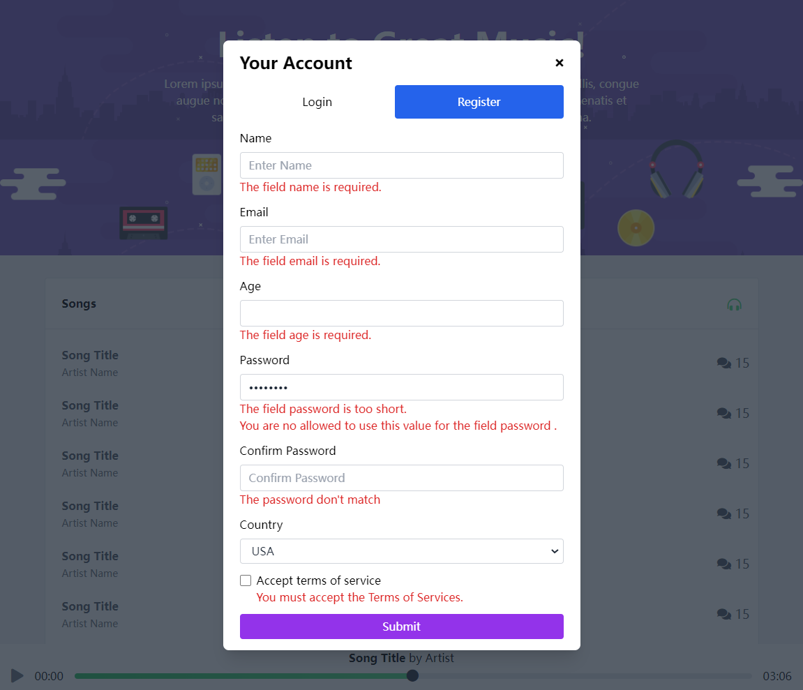
效果图


 该文章展示了一个Vue.js应用中使用vee-validate库进行表单验证的例子。它涵盖了安装vee-validate和相关规则,定义自定义错误消息,以及在组件中如何使用验证规则来创建登录和注册表单。同时,文章还涉及到了pinia状态管理库在处理表单状态中的应用。


 扫一扫
扫一扫


 1219
1219

 被折叠的 条评论
为什么被折叠?
被折叠的 条评论
为什么被折叠?
 到【灌水乐园】发言


