


在自定义View时,我们通常会去重写onDraw()方法来绘制View的显示内容。如果该View还需要使用wrap_content属性,那么还必须重写onMeasure()方法。另外,通过自定义attrs属性,还可以设置新的属性配置值。
在View中通常有一些比较重要的回调方法。
- onFinishInflate():从XML加载组件后回调。
- onSizeChanged(;:组件大小改变时。
- onMeasure():回调该方法来进行测量。
- onLayout():回调该方法来确定显示的位置。
- onTouchEvent():监听到触摸事件时回调。
当然,创建自定义View的时候,并不需要重写所有的方法,只需要重写特定条件的回调方法即可。这也是Android控件架构灵活性的体现。
通常情况下,有以下三种方法来实现自定义的控件。
- 对现有控件进行拓展
- 通过组合来实现新的控件
- 重写View来实现全新的控件
对现有控件进行拓展
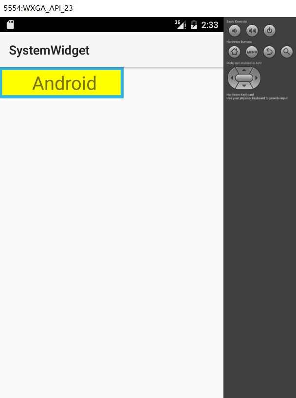
该方法可以在原生控件的基础上进行拓展,增加新的功能、修改显示的UI等。一般来说,我们可以在onDraw()方法中对原生控件行为进行拓展。
比如让一个TextView的背景更加丰富,给其多绘制几层背景,如下图所示:
代码如下:
package com.example.huangfei.myapplication;
import android.content.Context;
import android.graphics.Canvas;
import android.graphics.Color;
import android.graphics.Paint;
import android.util.AttributeSet;
import android.widget.TextView;
/**
* Created by huangfeihong on 2016/5/12.
* 背景更加丰富的TextView
*/
public class MyTextView extends TextView {
private Paint mPaint1, mPaint2;
public MyTextView(Context context) {
super(context);
initView();
}
public MyTextView(Context context, AttributeSet attrs) {
super(context, attrs);
initView();
}
public MyTextView(Context context, AttributeSet attrs, int defStyleAttr) {
super(context, attrs, defStyleAttr);
initView();
}
private void initView() {
//初始化画笔
mPaint1 = new Paint();
mPaint1.setStyle(Paint.Style.FILL);
mPaint1.setColor(getResources().getColor(android.R.color.holo_blue_light));
mPaint2 = new Paint();
mPaint2.setStyle(Paint.Style.FILL);
mPaint2.setColor(Color.YELLOW);
}
@Override
protected void onDraw(Canvas canvas) {
//在回调父类方法前,实现自己的逻辑,对TextView来说即是在绘制文本内容前
// 绘制外层矩形
canvas.drawRect(0, 0, getMeasuredWidth(), getMeasuredHeight(), mPaint1);
// 绘制内层矩形
canvas.drawRect(10, 10, getMeasuredWidth() - 10, getMeasuredHeight() - 10, mPaint2);
super.onDraw(canvas);//回调父类方法,即绘制文本
//在回调父类方法后,实现自己的逻辑,对TextView来说即是在绘制文本内容后
}
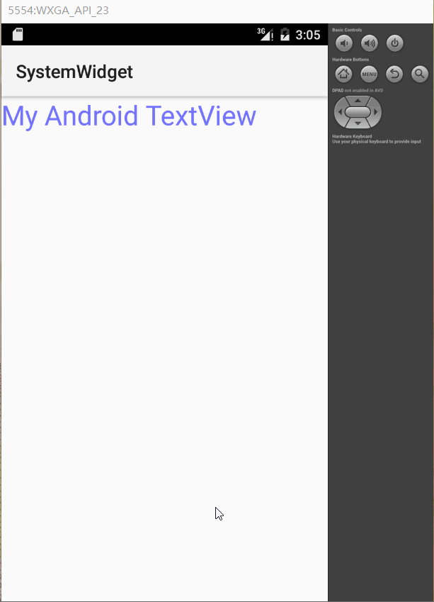
}再比如利用LinearGradient Shader和Matrix来实现一个动态的文字闪动效果,效果如下:
代码如下:
package com.example.huangfei.myapplication;

import android.content.Context;
import android.graphics.Canvas;
import android.graphics.Color;
import android.graphics.LinearGradient;
import android.graphics.Matrix;
import android.graphics.Paint;
import android.graphics.Shader;
import android.util.AttributeSet;
import android.widget.TextView;

/**
 * Created by huangfeihong on 2016/5/14.
 * 动态的文字闪动效果
 * 要想实现这一个效果,可以充分利用Android中Paint对象的Shader渲染器。通过设置一个不断变化的LinearGradient,
 * 并使用带有该属性的Paint对象来绘制要显示的文字。
 */
public class ShineTextView extends TextView {

    private Paint mPaint;
    private LinearGradient mLinearGradient;
    private Matrix mGradientMatrix;
    private int mViewWidth;
    private int mTranslate;

    public ShineTextView(Context context, AttributeSet attrs) {
        super(context, attrs);
    }

    /**
     * 在该方法中进行一些对象的初始化工作,并根据View的宽带设置一个LinearGradient渐变渲染器
     *
     * @param w
     * @param h
     * @param oldw
     * @param oldh
     */
    @Override
    protected void onSizeChanged(int w, int h, int oldw, int oldh) {
        super.onSizeChanged(w, h, oldw, oldh);
        if (mViewWidth == 0) {
            mViewWidth = getMeasuredWidth();
            if (mViewWidth > 0) {
                mPaint = getPaint();//获取当前绘制TextView的Paint对象
                mLinearGradient = new LinearGradient(0, 0, mViewWidth, 0,
                        new int[]{Color.BLUE, 0xffffff, Color.BLUE},
                        null, Shader.TileMode.CLAMP);
                mPaint.setShader(mLinearGradient);//设置原生TextView没有的LinearGradient属性
                mGradientMatrix = new Matrix();
            }
        }
    }

    /**
     * 在该方法中,通过矩阵的方式不断平移渐变效果,从而在绘制文字时,产生动态的闪动效果
     *
     * @param canvas
     */
    @Override
    protected void onDraw(Canvas canvas) {
        super.onDraw(canvas);
        if (mGradientMatrix != null) {
            mTranslate += mViewWidth / 5;
            if (mTranslate > 2 * mViewWidth)
                mTranslate = -mViewWidth;
            mGradientMatrix.setTranslate(mTranslate, 0);
            mLinearGradient.setLocalMatrix(mGradientMatrix);
            postInvalidateDelayed(100);
        }
    }
}
创建复合控件
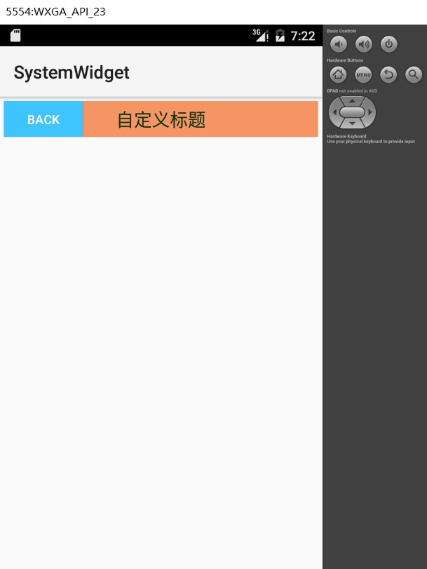
创建复合控件可以很好的创建出具有重用功能的控件集合。这种方式通常需要继承一个合适的ViewGroup,再给它添加指定功能的控件,从而组合成新的复合控件。通过这种方式创建的控件,我们一般会给它指定一些可配置的属性,让其具有更强的拓展性。比如创建一个TopBar的公共标题栏,效果如下:
如何创建一个这样的公共UI模板。首先,模板应该具有通用性与可定制性。也就是说,我们需要给调用者以丰富的接口,让他们可以更该模板中的文字、颜色、行为等信息,而不是所有的模板都一样,那样就失去了模板的意义。
定义属性
为一个View提供可自定义的属性非常简单,只需要在res资源目录的values目录下创建一个attrs.xml的属性定义文件,并在该文件中定义相应的属性即可。
<?xml version="1.0" encoding="utf-8"?>
<resources>
    <!--有些属性可以是颜色属性,也可以是引用属性。比如按钮的背景,可以把它指定为具体的颜色,也可以把它指定为
    一张图片,所以用“|”来分隔不同的属性——reference|color-->
    <declare-styleable name="TopBar">
        <attr name="barTitle" format="string"/>
        <attr name="barTitleTextSize" format="dimension"/>
        <attr name="barTitleTextColor" format="color"/>
        <attr name="leftTextColor" format="color"/>
        <attr name="leftBackground" format="reference|color"/>
        <attr name="leftText" format="string"/>
        <attr name="rightTextColor" format="color"/>
        <attr name="rightBackground" format="reference|color"/>
        <attr name="rightText" format="string"/>
    </declare-styleable>
</resources>
组合控件
UI模板TopBar实际上由三个控件组成,即左边的点击按钮mLeftButton,右边的点击按钮mRightButton和中间的标题栏mTitleView。通过动态添加控件的方式,使用addView()方法将这三个控件加入到定义的TopBar模板中,并给它们设置我们获取到的具体的属性值,代码如下。
package com.example.huangfei.myapplication;

import android.content.Context;
import android.content.res.TypedArray;
import android.graphics.drawable.Drawable;
import android.util.AttributeSet;
import android.view.Gravity;
import android.view.View;
import android.widget.Button;
import android.widget.RelativeLayout;
import android.widget.TextView;

/**
 * Created by huangfeihong on 2016/5/14.
 * TopBar的公共标题栏
 */
public class TopBar extends RelativeLayout {

    // 包含topbar上的元素:左按钮、右按钮、标题
    private Button mLeftButton, mRightButton;
    private TextView mTitleView;

    // 布局属性,用来控制组件元素在ViewGroup中的位置
    private LayoutParams mLeftParams, mTitleParams, mRightParams;

    // 左按钮的属性值,即我们在attrs.xml文件中定义的属性
    private int mLeftTextColor;
    private Drawable mLeftBackground;
    private String mLeftText;
    // 右按钮的属性值,即我们在attrs.xml文件中定义的属性
    private int mRightTextColor;
    private Drawable mRightBackground;
    private String mRightText;
    // 标题的属性值,即我们在attrs.xml文件中定义的属性
    private float mTitleTextSize;
    private int mTitleTextColor;
    private String mTitle;

    // 映射传入的接口对象
    private OnTopBarClickListener mListener;

    public TopBar(Context context) {
        super(context);
    }

    public TopBar(Context context, AttributeSet attrs) {
        super(context, attrs);
        // 设置topbar的背景
        setBackgroundColor(0xFFF59563);
        // 通过这个方法,将你在attrs.xml中定义的declare-styleable的所有属性的值存储到TypedArray中
        TypedArray ta = context.obtainStyledAttributes(attrs, R.styleable.TopBar);
        // 从TypedArray中取出对应的值来为要设置的属性赋值
        mLeftTextColor = ta.getColor(R.styleable.TopBar_leftTextColor, 0);
        mLeftBackground = ta.getDrawable(R.styleable.TopBar_leftBackground);
        mLeftText = ta.getString(R.styleable.TopBar_leftText);

        mRightTextColor = ta.getColor(R.styleable.TopBar_rightTextColor, 0);
        mRightBackground = ta.getDrawable(R.styleable.TopBar_rightBackground);
        mRightText = ta.getString(R.styleable.TopBar_rightText);

        mTitleTextSize = ta.getDimension(R.styleable.TopBar_barTitleTextSize, 10);
        mTitleTextColor = ta.getColor(R.styleable.TopBar_barTitleTextColor, 0);
        mTitle = ta.getString(R.styleable.TopBar_barTitle);

        // 获取完TypedArray的值后,一般要调用recycle方法来完成资源的回收,避免重新创建的时候的错误
        ta.recycle();

        mLeftButton = new Button(context);
        mRightButton = new Button(context);
        mTitleView = new TextView(context);

        // 为创建的组件元素赋值,值就来源于我们在引用的xml文件中给对应属性的赋值
        mLeftButton.setTextColor(mLeftTextColor);
        mLeftButton.setBackgroundDrawable(mLeftBackground);
        mLeftButton.setText(mLeftText);

        mRightButton.setTextColor(mRightTextColor);
        mRightButton.setBackgroundDrawable(mRightBackground);
        mRightButton.setText(mRightText);

        mTitleView.setText(mTitle);
        mTitleView.setTextColor(mTitleTextColor);
        mTitleView.setTextSize(mTitleTextSize);
        mTitleView.setGravity(Gravity.CENTER);

        // 为组件元素设置相应的布局元素
        mLeftParams = new LayoutParams(LayoutParams.WRAP_CONTENT, LayoutParams.MATCH_PARENT);
        mLeftParams.addRule(RelativeLayout.ALIGN_PARENT_LEFT, TRUE);
        // 添加到ViewGroup
        addView(mLeftButton, mLeftParams);

        mRightParams = new LayoutParams(LayoutParams.WRAP_CONTENT, LayoutParams.MATCH_PARENT);
        mRightParams.addRule(RelativeLayout.ALIGN_PARENT_RIGHT, TRUE);
        addView(mRightButton, mRightParams);

        mTitleParams = new LayoutParams(LayoutParams.WRAP_CONTENT, LayoutParams.MATCH_PARENT);
        mTitleParams.addRule(RelativeLayout.CENTER_IN_PARENT, TRUE);
        addView(mTitleView, mTitleParams);

        // 按钮的点击事件,不需要具体的实现,
        // 只需调用接口的方法,回调的时候,会有具体的实现
        mRightButton.setOnClickListener(new OnClickListener() {

            @Override
            public void onClick(View v) {
                mListener.onRightClick();
            }
        });

        mLeftButton.setOnClickListener(new OnClickListener() {

            @Override
            public void onClick(View v) {
                mListener.onLeftClick();
            }
        });
    }

    public TopBar(Context context, AttributeSet attrs, int defStyleAttr) {
        super(context, attrs, defStyleAttr);
    }

    /**
     * 设置按钮的显示与否 通过id区分按钮,flag区分是否显示
     *
     * @param id   id
     * @param flag 是否显示
     */
    public void setButtonVisable(int id, boolean flag) {
        if (flag) {
            if (id == 0) {
                mLeftButton.setVisibility(View.VISIBLE);
            } else {
                mRightButton.setVisibility(View.VISIBLE);
            }
        } else {
            if (id == 0) {
                mLeftButton.setVisibility(View.GONE);
            } else {
                mRightButton.setVisibility(View.GONE);
            }
        }
    }


    // 暴露一个方法给调用者来注册接口回调
    // 通过接口来获得回调者对接口方法的实现
    public void setOnTopbarClickListener(OnTopBarClickListener mListener) {
        this.mListener = mListener;
    }

    // 接口对象,实现回调机制,在回调方法中
    // 通过映射的接口对象调用接口中的方法
    // 而不用去考虑如何实现,具体的实现由调用者去创建
    public interface OnTopBarClickListener {
        // 左按钮点击事件
        void onLeftClick();

        // 右按钮点击事件
        void onRightClick();
    }
}
引用UI模板
如果要使用自定义的属性,那么就需要创建自己的命名空间,在Android Studio中,第三方的控件都使用如下代码来引入命名空间。
xmlns:custom="http://schemas.android.com/apk/res-auto"我们将引入的第三方控件的命名空间取名为custom,之后在XML文件中使用自定义的属性时,就可以通过这个命名空间来引用,代码如下:
<RelativeLayout xmlns:android="http://schemas.android.com/apk/res/android"
    xmlns:custom="http://schemas.android.com/apk/res-auto"
    android:layout_width="match_parent"
    android:layout_height="match_parent"
    android:padding="5dp">

     <com.example.huangfei.myapplication.TopBar
        android:id="@+id/topBar"
        android:layout_width="match_parent"
        android:layout_height="40dp"
        custom:leftBackground="@drawable/blue_button"
        custom:leftText="Back"
        custom:leftTextColor="#FFFFFF"
        custom:rightBackground="@drawable/blue_button"
        custom:rightText="More"
        custom:rightTextColor="#FFFFFF"
        custom:barTitle="自定义标题"
        custom:barTitleTextColor="#123412"
        custom:barTitleTextSize="10sp"/>

</RelativeLayout>
重写View来实现全新的控件
创建一个自定义View,难点在于绘制控件和实现交互,这也是评价一个自定义View优劣的标准之一。通常需要继承View类,并重写它的onDraw()、onMeasure()等方法来实现绘制逻辑,同时通过重写onTouchEvent()等触控事件来实现交互逻辑。当然,也可以引入自定义属性,丰富自定义View的可定制性。
弧线展示图
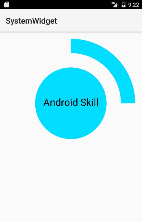
如何创建一个自定义View实现如上图的效果,很明显,我们需要分别去绘制中间的圆形、中间的文字和外圈的弧线,代码如下。
package com.example.huangfei.myapplication;

import android.content.Context;
import android.graphics.Canvas;
import android.graphics.Paint;
import android.graphics.RectF;
import android.util.AttributeSet;
import android.util.Log;
import android.view.View;

/**
 * Created by huangfeihong on 2016/5/14.
 * 弧线展示图
 */
public class CircleProgressView extends View {

    private int mMeasureHeigth;
    private int mMeasureWidth;

    private Paint mCirclePaint;
    private float mCircleXY;
    private float mRadius;

    private Paint mArcPaint;
    private RectF mArcRectF;
    private float mSweepAngle;
    private float mSweepValue = 25;

    private Paint mTextPaint;
    private String mShowText;
    private float mShowTextSize;

    public CircleProgressView(Context context, AttributeSet attrs, int defStyleAttr) {
        super(context, attrs, defStyleAttr);
    }

    public CircleProgressView(Context context) {
        super(context);
    }

    public CircleProgressView(Context context, AttributeSet attrs) {
        super(context, attrs);

    }

    @Override
    protected void onMeasure(int widthMeasureSpec, int heightMeasureSpec) {
        super.onMeasure(widthMeasureSpec, heightMeasureSpec);
        Log.e("CircleProgressView", "onMeasure");
        mMeasureWidth = getMeasuredWidth();
        mMeasureHeigth = getMeasuredHeight();
        Log.e("getMeasuredWidth", mMeasureWidth + "");
        Log.e("getMeasuredHeight", mMeasureHeigth + "");
        Log.e("getWidth", getWidth() + "");
        Log.e("getHeight", getHeight() + "");

    }

    private void initView() {
        float length = 0;
        if (mMeasureHeigth >= mMeasureWidth) {
            length = mMeasureWidth;
        } else {
            length = mMeasureHeigth;
        }

        //绘制圆的参数
        mCircleXY = length / 2;
        mRadius =  length / 4.0f;
        mCirclePaint = new Paint();
        mCirclePaint.setAntiAlias(true);
        mCirclePaint.setColor(getResources().getColor(android.R.color.holo_blue_bright));

        //绘制弧线,需要指定其椭圆的外接矩形
        mArcRectF = new RectF(length * 0.1f, length * 0.1f, length * 0.9f, length * 0.9f);
        mSweepAngle = (mSweepValue / 100f) * 360f;
        mArcPaint = new Paint();
        mArcPaint.setAntiAlias(true);
        mArcPaint.setColor(getResources().getColor(android.R.color.holo_blue_bright));
        mArcPaint.setStrokeWidth(length * 0.1f);
        mArcPaint.setStyle(Paint.Style.STROKE);

        //绘制文字的参数
        mShowText = "Android Skill";
        mShowTextSize = 50;
        mTextPaint = new Paint();
        mTextPaint.setTextSize(mShowTextSize);
        mTextPaint.setTextAlign(Paint.Align.CENTER);
    }

    @Override
    protected void onDraw(Canvas canvas) {
        super.onDraw(canvas);
        Log.e("CircleProgressView", "onDraw");
        // 绘制圆
        canvas.drawCircle(mCircleXY, mCircleXY, mRadius, mCirclePaint);
        // 绘制弧线
        canvas.drawArc(mArcRectF, 0, mSweepAngle, false, mArcPaint);
        // 绘制文字
        canvas.drawText(mShowText, mCircleXY, mCircleXY + (mShowTextSize / 4), mTextPaint);
    }

    @Override
    protected void onLayout(boolean changed, int left, int top, int right, int bottom) {
        super.onLayout(changed, left, top, right, bottom);
        Log.e("CircleProgressView", "onLayout");
    }

    @Override
    protected void onSizeChanged(int w, int h, int oldw, int oldh) {
        super.onSizeChanged(w, h, oldw, oldh);
        Log.e("CircleProgressView", "onSizeChanged");
        initView();
    }

    @Override
    protected void onFinishInflate() {
        super.onFinishInflate();
        Log.e("CircleProgressView", "onFinishInflate");
    }

    /**
     * 设置不同的比例值0——100
     * @param sweepValue
     */
    public void setSweepValue(float sweepValue) {
        if (sweepValue > 0) {
            mSweepValue = sweepValue;
        } else {
            mSweepValue = 25;
        }
        this.invalidate();
    }
}
音频条形图
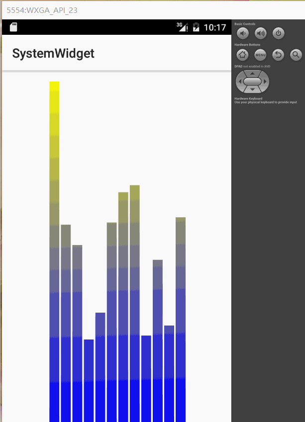
要想实现上图的效果,难点就在于绘制的坐标计算和动画效果上,代码如下:
package com.example.huangfei.myapplication;

import android.content.Context;
import android.graphics.Canvas;
import android.graphics.Color;
import android.graphics.LinearGradient;
import android.graphics.Paint;
import android.graphics.Shader;
import android.util.AttributeSet;
import android.util.Log;
import android.view.View;

/**
 * Created by huangfeihong on 2016/5/14.
 * 音频条形图
 */
public class VolumeView extends View {

    private Paint mPaint;
    private int mRectCount;//音频条形数
    private int mWidth;
    private int mHeight;
    private int mRectWidth;
    private int offset = 5;
    private double mRandom;
    private LinearGradient mLinearGradient;

    public VolumeView(Context context) {
        super(context);
        initView();
    }

    public VolumeView(Context context, AttributeSet attrs) {
        super(context, attrs);
        initView();
    }

    public VolumeView(Context context, AttributeSet attrs, int defStyleAttr) {
        super(context, attrs, defStyleAttr);
        initView();
    }

    private void initView() {
        mPaint = new Paint();
        mPaint.setColor(Color.BLUE);
        mPaint.setStyle(Paint.Style.FILL);
        mRectCount = 12;
    }

    @Override
    protected void onSizeChanged(int w, int h, int oldw, int oldh) {
        super.onSizeChanged(w, h, oldw, oldh);
        Log.e("CircleProgressView", "onSizeChanged");
        mWidth = getWidth();
        mHeight = getHeight();
        mRectWidth = (int) (mWidth * 0.6 / mRectCount);
        //给音频条形图增加渐变效果
        mLinearGradient = new LinearGradient(0, 0, mWidth, mHeight, Color.YELLOW, Color.BLUE, Shader.TileMode.CLAMP);
        mPaint.setShader(mLinearGradient);
    }

    @Override
    protected void onDraw(Canvas canvas) {
        super.onDraw(canvas);
        for (int i = 0; i < mRectCount; i++) {
            //让每个小矩形的高度随机变化
            mRandom = Math.random();
            float currentHeight = (float) (mRandom * mHeight);
            canvas.drawRect(mWidth * 0.4f / 2 + mRectWidth * i + offset,
                    currentHeight,
                    mWidth * 0.4f / 2 + mRectWidth * (i + 1),
                    mHeight,
                    mPaint);
        }
        //每300毫秒刷新一次View
        postInvalidateDelayed(300);
    }
}


 800
800


 被折叠的 条评论
为什么被折叠?
被折叠的 条评论
为什么被折叠?
 到【灌水乐园】发言


