


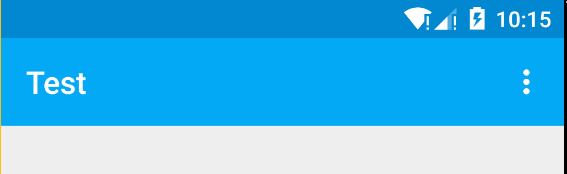
最近学习了一下md设计风格和相对应的控件觉得挺棒的,真希望以后能做安卓设计风格的app,只是心有鱼而力不足,虽身为安卓程序员但由于公司设计成本却每天做着iOS风格的app,这感觉真是(此处省略一万字)…,既然公司的项目没法过把瘾,那就自己做的玩,本篇博客要实现的效果如下,由于上传图片大小2m的限制效果非常不好但是效果基本显示了

要完成如上效果需要掌握的新控件
1.Toolbar
2.CollapsingToolbarLayout
3.AppBarLayout
4.CoordinatorLayout
5.DrawerLayout
6.NavigationView
7.ActionBarDrawerToggle
8.Recyclerview
9.CardView
看来要想实现需要掌握的东西挺多的,不过别担心下面我会一一介绍每个控件的使用并逐步实现该效果
万里长征第一步开始啦
1.Toolbar
用toolbar之前首先要将主题改为md风格的
Material Design的Theme
md的主题有:
•@Android:style/Theme.Material (dark version)
•@android:style/Theme.Material.Light (light version)
•@android:style/Theme.Material.Light.DarkActionBar
与之对应的Compat Theme:
•Theme.AppCompat
•Theme.AppCompat.Light
•Theme.AppCompat.Light.DarkActionBar
当然为了兼容低版本我们使用compat theme
先在res/values/styles.xml 中增加一个名为AppThemeBase的style
<style name="AppThemeBase" parent="Theme.AppCompat.Light">
        <!-- 去掉actionbar-->
        <item name="windowActionBar">false</item>
        <item name="windowNoTitle">true</item>
        <!-- 状态栏颜色-->
        <item name="colorPrimaryDark">@color/colorPrimaryDark</item>
        <!-- actionbar颜色-->
        <item name="colorPrimary">@color/colorPrimary</item>

    </style>
- 1
- 2
- 3
- 4
- 5
- 6
- 7
- 8
- 9
- 10

- 1
- 2
- 3
- 4
- 5
- 6
- 7
- 8
- 9
- 10
既然要使用toolbar就得隐藏actionbar
<item name="windowActionBar">false</item>
<item name="windowNoTitle">true</item>
- 1
- 2
- 3
- 1
- 2
- 3
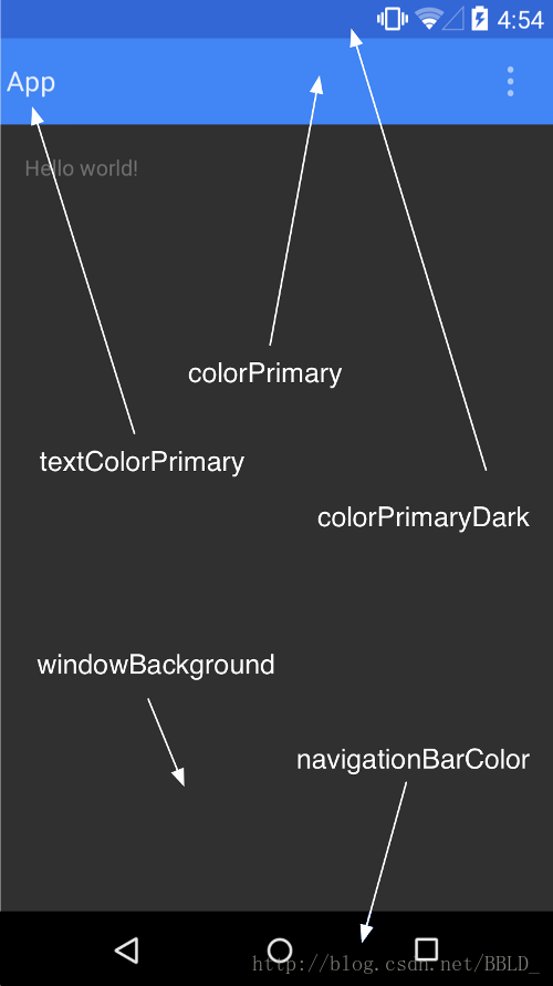
颜色设置对应下图
然后将原本 AppTheme 的 parent 属性 改为上面的AppThemeBase,完整代码如下:
<resources>

    <!-- Base application theme. -->
    <style name="AppTheme" parent="AppThemeBase">
    </style>

    <style name="AppThemeBase" parent="Theme.AppCompat.Light">
        <!-- 去掉actionbar-->
        <item name="windowActionBar">false</item>
        <item name="windowNoTitle">true</item>
        <!-- 状态栏颜色-->
        <item name="colorPrimaryDark">@color/colorPrimaryDark</item>
        <!-- actionbar颜色-->
        <item name="colorPrimary">@color/colorPrimary</item>

    </style>

</resources>
- 1
- 2
- 3
- 4
- 5
- 6
- 7
- 8
- 9
- 10
- 11
- 12
- 13
- 14
- 15
- 16
- 17
- 18
- 1
- 2
- 3
- 4
- 5
- 6
- 7
- 8
- 9
- 10
- 11
- 12
- 13
- 14
- 15
- 16
- 17
- 18
使用的颜色文件如下
<?xml version="1.0" encoding="utf-8"?>
<resources>
    <color name="colorPrimaryDark">#0288D1</color>
    <color name="colorPrimary">#03A9F4</color>
    <color name="colorAccent">#03A9F4</color>
    <color name="primaryText">#212121</color>
    <color name="secondaryText">#727272</color>
    <color name="dividerColor">#B6B6B6</color>
</resources>
- 1
- 2
- 3
- 4
- 5
- 6
- 7
- 8
- 9
- 10
- 1
- 2
- 3
- 4
- 5
- 6
- 7
- 8
- 9
- 10
布局中添加layout
<?xml version="1.0" encoding="utf-8"?>
<LinearLayout xmlns:android="http://schemas.android.com/apk/res/android"
    xmlns:tools="http://schemas.android.com/tools"
    android:layout_width="match_parent"
    android:layout_height="match_parent"
    tools:context="com.byzk.www.test.MainActivity">

    <android.support.v7.widget.Toolbar
        android:id="@+id/toolbar"
        android:layout_width="match_parent"
        android:layout_height="?attr/actionBarSize"
        android:background="?attr/colorPrimary"
        />

</LinearLayout>
- 1
- 2
- 3
- 4
- 5
- 6
- 7
- 8
- 9
- 10
- 11
- 12
- 13
- 14
- 15
- 16
- 1
- 2
- 3
- 4
- 5
- 6
- 7
- 8
- 9
- 10
- 11
- 12
- 13
- 14
- 15
- 16
这里说明一下?attr/代表引用当前主题的属性
?attr/actionBarSize -> 当前主题下actionbar高度系统自带的
?attr/colorPrimary -> 当前主题下colorPrimary颜色
并且toolbar为v7包的
再来activity代码
package com.byzk.www.test;

import android.support.v7.app.AppCompatActivity;
import android.os.Bundle;
import android.support.v7.widget.Toolbar;

public class MainActivity extends AppCompatActivity {

    private Toolbar toolbar;

    @Override
    protected void onCreate(Bundle savedInstanceState) {
        super.onCreate(savedInstanceState);
        setContentView(R.layout.activity_main);
        findView();
        init();
    }

    private void findView() {
        toolbar = (Toolbar) findViewById(R.id.toolbar);
    }

    private void init() {
        setSupportActionBar(toolbar);
    }
}
- 1
- 2
- 3
- 4
- 5
- 6
- 7
- 8
- 9
- 10
- 11
- 12
- 13
- 14
- 15
- 16
- 17
- 18
- 19
- 20
- 21
- 22
- 23
- 24
- 25
- 26
- 27
- 1
- 2
- 3
- 4
- 5
- 6
- 7
- 8
- 9
- 10
- 11
- 12
- 13
- 14
- 15
- 16
- 17
- 18
- 19
- 20
- 21
- 22
- 23
- 24
- 25
- 26
- 27
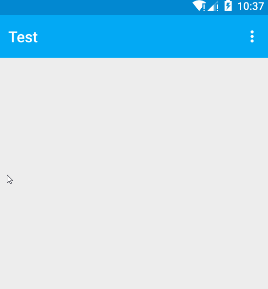
实现非常简单就两步
1.toolbar = (Toolbar) findViewById(R.id.toolbar);
2.setSupportActionBar(toolbar);
但是有点要注意要想使用toolbar并且兼容低版本,activity必须继承AppCompatActivity
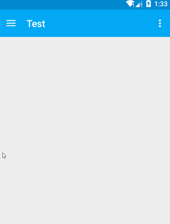
到这一步实现效果如下
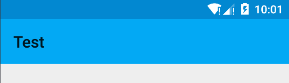
距离我们最终要完成toolbar的效果左边还差ActionBarDrawerToggle右边还差overflow menu,
先来加上menu
创建res/menu/menu_main.xml
<?xml version="1.0" encoding="utf-8"?>
<menu xmlns:android="http://schemas.android.com/apk/res/android"
    xmlns:app="http://schemas.android.com/apk/res-auto">
    <item
        android:id="@+id/option_1"
        app:showAsAction="never"
        android:title="选项一" />
    <item
        android:id="@+id/option_2"
        app:showAsAction="never"
        android:title="选项二" />
    <item
        android:id="@+id/option_3"
        app:showAsAction="never"
        android:title="选项三" />
</menu>
- 1
- 2
- 3
- 4
- 5
- 6
- 7
- 8
- 9
- 10
- 11
- 12
- 13
- 14
- 15
- 16
- 1
- 2
- 3
- 4
- 5
- 6
- 7
- 8
- 9
- 10
- 11
- 12
- 13
- 14
- 15
- 16
activity中添加代码如下
@Override
    public boolean onCreateOptionsMenu(Menu menu) {
        getMenuInflater().inflate(R.menu.menu_main, menu);
        return true;
    }

    @Override
    public boolean onOptionsItemSelected(MenuItem item) {
        switch (item.getItemId()){
            case R.id.option_1:
                Toast.makeText(MainActivity.this,"option_1",Toast.LENGTH_SHORT).show();
                break;
            case R.id.option_2:
                Toast.makeText(MainActivity.this,"option_2",Toast.LENGTH_SHORT).show();
                break;
            case R.id.option_3:
                Toast.makeText(MainActivity.this,"option_3",Toast.LENGTH_SHORT).show();
                break;
        }
        return true;
    }
- 1
- 2
- 3
- 4
- 5
- 6
- 7
- 8
- 9
- 10
- 11
- 12
- 13
- 14
- 15
- 16
- 17
- 18
- 19
- 20
- 21
- 1
- 2
- 3
- 4
- 5
- 6
- 7
- 8
- 9
- 10
- 11
- 12
- 13
- 14
- 15
- 16
- 17
- 18
- 19
- 20
- 21
运行效果如下
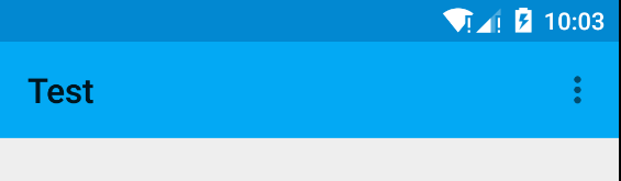
文字和右边按钮显现出来了..那么最让我头疼的问题来了如何设置他的颜色我也是查了很久试了好多方法都有缺陷最后在stackoverflow找到了解决办法
<android.support.v7.widget.Toolbar
        android:id="@+id/toolbar"
        android:layout_width="match_parent"
        android:layout_height="?attr/actionBarSize"
        android:background="?attr/colorPrimary"
        app:theme="@style/ThemeOverlay.AppCompat.Dark.ActionBar"
        app:popupTheme="@style/ThemeOverlay.AppCompat.Light"
        />
- 1
- 2
- 3
- 4
- 5
- 6
- 7
- 8
- 1
- 2
- 3
- 4
- 5
- 6
- 7
- 8
app:theme=”@style/ThemeOverlay.AppCompat.Dark.ActionBar”->给toolbar设置单独的主题
app:popupTheme=”@style/ThemeOverlay.AppCompat.Light”->给弹出窗设置主题
虽然设置成功了但是对于style和theme我所知道的还是太少,如果有对于style和theme非常了解的同学欢迎交流
那么到这一步了效果如下
还有些图标标题设置比较简单我直接贴对应方法了不做演示了
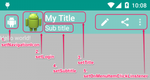
setNavigationIcon
即设定 up button 的图标,因为 Material 的介面,在 Toolbar这里的 up button样式也就有別于过去的 ActionBar 哦。
setLogo
APP 的图标。
setTitle
主标题。
setSubtitle
副标题。
setOnMenuItemClickListener
设定菜单各按鈕的动作。
2.DrawerLayout+NavigationView+ActionBarDrawerToggle
toolbar这里搭建完成了再来加上侧滑效果
DrawerLayout
drawerLayout就是一个布局控件并且带有滑动的功能。只要按照drawerLayout的规定布局方式写完布局,就能有侧滑的效果。
布局代码如下
<?xml version="1.0" encoding="utf-8"?>
<android.support.v4.widget.DrawerLayout xmlns:android="http://schemas.android.com/apk/res/android"
    xmlns:app="http://schemas.android.com/apk/res-auto"
    xmlns:tools="http://schemas.android.com/tools"
    android:layout_width="match_parent"
    android:layout_height="match_parent"
    tools:context="com.byzk.www.test.MainActivity">

    <!-- 主布局-->
    <LinearLayout
        android:layout_width="match_parent"
        android:layout_height="match_parent"
        android:orientation="vertical"
        >
        <android.support.v7.widget.Toolbar
            android:id="@+id/toolbar"
            android:layout_width="match_parent"
            android:layout_height="?attr/actionBarSize"
            android:background="?attr/colorPrimary"
            app:popupTheme="@style/ThemeOverlay.AppCompat.Light"
            app:theme="@style/ThemeOverlay.AppCompat.Dark.ActionBar" />

        <FrameLayout
            android:layout_width="match_parent"
            android:layout_height="match_parent"/>

    </LinearLayout>

    <!-- 侧边菜单-->
    <FrameLayout
        android:layout_width="200dp"
        android:layout_height="match_parent"
        android:background="@color/colorPrimary"
        android:layout_gravity="start"/>


</android.support.v4.widget.DrawerLayout>
- 1
- 2
- 3
- 4
- 5
- 6
- 7
- 8
- 9
- 10
- 11
- 12
- 13
- 14
- 15
- 16
- 17
- 18
- 19
- 20
- 21
- 22
- 23
- 24
- 25
- 26
- 27
- 28
- 29
- 30
- 31
- 32
- 33
- 34
- 35
- 36
- 37
- 38
- 1
- 2
- 3
- 4
- 5
- 6
- 7
- 8
- 9
- 10
- 11
- 12
- 13
- 14
- 15
- 16
- 17
- 18
- 19
- 20
- 21
- 22
- 23
- 24
- 25
- 26
- 27
- 28
- 29
- 30
- 31
- 32
- 33
- 34
- 35
- 36
- 37
- 38
这里有两点要注意:
1.主内容区的布局代码要放在侧滑菜单布局的前面,
2.侧滑菜单的部分的布局需要设置android:layout_gravity=”start”属性,他表示侧滑菜单是在左边还是右边。
start表示左边 end表示右边
效果如下
drawerlayout开关可用如下方法控制
drawerLayout.openDrawer();
drawerLayout.closeDrawer();
- 1
- 2
- 1
- 2
ActionBarDrawerToggle
drawerLayout左侧菜单(或者右侧)的展开与隐藏可以被DrawerLayout.DrawerListener的实现监听到,不过还是建议用ActionBarDrawerToggle来监听,ActionBarDrawerToggle实现了DrawerListener,所以他能做DrawerListener可以做的任何事情,同时他还能将drawerLayout的展开和隐藏与actionbar的app 图标关联起来,当展开与隐藏的时候图标有一定的平移效果,点击图标的时候还能展开或者隐藏菜单。
activity代码添加代码如下
ActionBarDrawerToggle actionBarDrawerToggle = new ActionBarDrawerToggle(
                this,
                drawerLayout,
                toolbar,
                R.string.drawer_open,
                R.string.drawer_close
        ){
            @Override
            public void onDrawerOpened(View drawerView) {
                super.onDrawerOpened(drawerView);
                //打开
            }

            @Override
            public void onDrawerClosed(View drawerView) {
                super.onDrawerClosed(drawerView);
                //关闭
            }
        };
        drawerLayout.setDrawerListener(actionBarDrawerToggle);
        actionBarDrawerToggle.syncState();
- 1
- 2
- 3
- 4
- 5
- 6
- 7
- 8
- 9
- 10
- 11
- 12
- 13
- 14
- 15
- 16
- 17
- 18
- 19
- 20
- 21
- 1
- 2
- 3
- 4
- 5
- 6
- 7
- 8
- 9
- 10
- 11
- 12
- 13
- 14
- 15
- 16
- 17
- 18
- 19
- 20
- 21
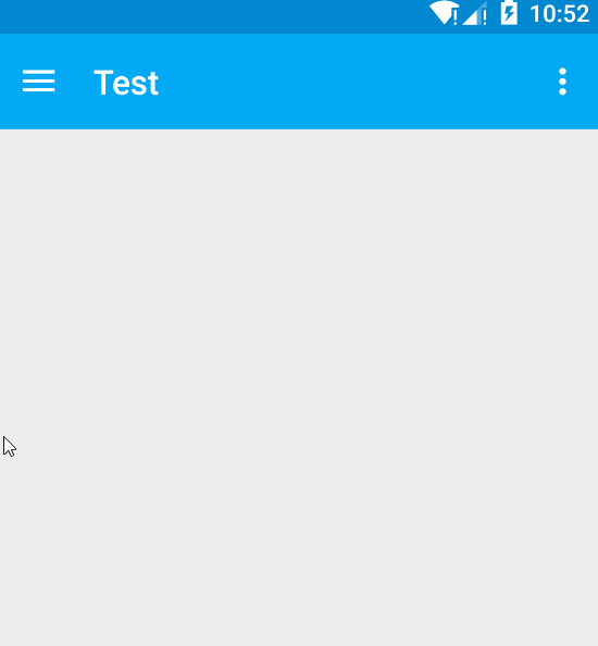
添加后效果如下
NavigationView
左侧与drawerlayout关联的按钮已经显现来了,那么现在在为侧滑菜单添加内容,其实侧滑菜单内容使用啥控件都可以,只是我这里准备使用com.android.support:design包的控件navigationView所以记得添加依赖
布局代码如下
<?xml version="1.0" encoding="utf-8"?>
<android.support.v4.widget.DrawerLayout xmlns:android="http://schemas.android.com/apk/res/android"
    android:id="@+id/drawerlayout"
    xmlns:app="http://schemas.android.com/apk/res-auto"
    xmlns:tools="http://schemas.android.com/tools"
    android:layout_width="match_parent"
    android:layout_height="match_parent"
    tools:context="com.byzk.www.test.MainActivity">

    <!-- 主布局-->
    <LinearLayout
        android:layout_width="match_parent"
        android:layout_height="match_parent"
        android:orientation="vertical"
        >
        <android.support.v7.widget.Toolbar
            android:id="@+id/toolbar"
            android:layout_width="match_parent"
            android:layout_height="?attr/actionBarSize"
            android:background="?attr/colorPrimary"
            app:popupTheme="@style/ThemeOverlay.AppCompat.Light"
            app:theme="@style/ThemeOverlay.AppCompat.Dark.ActionBar" />

        <FrameLayout
            android:layout_width="match_parent"
            android:layout_height="match_parent"/>

    </LinearLayout>

    <!-- 侧边菜单-->
    <android.support.design.widget.NavigationView
        android:id="@+id/navigation_view"
        android:layout_width="200dp"
        android:layout_height="match_parent"
        android:layout_gravity="start"
        app:headerLayout="@layout/drawer_header"
        app:menu="@menu/menu_drawer"/>


</android.support.v4.widget.DrawerLayout>
- 1
- 2
- 3
- 4
- 5
- 6
- 7
- 8
- 9
- 10
- 11
- 12
- 13
- 14
- 15
- 16
- 17
- 18
- 19
- 20
- 21
- 22
- 23
- 24
- 25
- 26
- 27
- 28
- 29
- 30
- 31
- 32
- 33
- 34
- 35
- 36
- 37
- 38
- 39
- 40
- 41
- 1
- 2
- 3
- 4
- 5
- 6
- 7
- 8
- 9
- 10
- 11
- 12
- 13
- 14
- 15
- 16
- 17
- 18
- 19
- 20
- 21
- 22
- 23
- 24
- 25
- 26
- 27
- 28
- 29
- 30
- 31
- 32
- 33
- 34
- 35
- 36
- 37
- 38
- 39
- 40
- 41
这里最主要的两个属性分别是:
1.app:headerLayout: 给NavigationView添加头部布局
2.app:menu:给NavigationView添加menu菜单布局
drawer_header.xml如下
<?xml version="1.0" encoding="utf-8"?>
<LinearLayout xmlns:android="http://schemas.android.com/apk/res/android"
    android:layout_width="match_parent"
    android:layout_height="200dp"
    android:background="?attr/colorPrimary"
    android:gravity="center"
    android:orientation="vertical">

    <ImageView
        android:id="@+id/iv_icon"
        android:layout_width="80dp"
        android:layout_height="80dp"
        android:src="@mipmap/icon" />

    <TextView
        android:layout_width="wrap_content"
        android:layout_height="wrap_content"
        android:layout_marginTop="10dp"
        android:text="帅也是错吗"
        android:textColor="#fff"
        android:textSize="16sp" />
</LinearLayout>
- 1
- 2
- 3
- 4
- 5
- 6
- 7
- 8
- 9
- 10
- 11
- 12
- 13
- 14
- 15
- 16
- 17
- 18
- 19
- 20
- 21
- 22
- 1
- 2
- 3
- 4
- 5
- 6
- 7
- 8
- 9
- 10
- 11
- 12
- 13
- 14
- 15
- 16
- 17
- 18
- 19
- 20
- 21
- 22
menu_drawer.xml如下
<?xml version="1.0" encoding="utf-8"?>
<menu xmlns:android="http://schemas.android.com/apk/res/android">
    <group android:checkableBehavior="single">
        <item
            android:id="@+id/nav_blog"
            android:title="我的博客" />
        <item
            android:id="@+id/nav_about"
            android:title="关于我" />

        <item
            android:id="@+id/nav_version"
            android:title="版本信息" />
    </group>

    <item android:title="Sub Title">
        <menu>
            <item
                android:id="@+id/nav_sub1"
                android:title="副标题1"
                android:checkable="true"/>
            <item
                android:id="@+id/nav_sub2"
                android:title="副标题2"
                android:checkable="true"/>
        </menu>
    </item>
</menu>
- 1
- 2
- 3
- 4
- 5
- 6
- 7
- 8
- 9
- 10
- 11
- 12
- 13
- 14
- 15
- 16
- 17
- 18
- 19
- 20
- 21
- 22
- 23
- 24
- 25
- 26
- 27
- 28
- 1
- 2
- 3
- 4
- 5
- 6
- 7
- 8
- 9
- 10
- 11
- 12
- 13
- 14
- 15
- 16
- 17
- 18
- 19
- 20
- 21
- 22
- 23
- 24
- 25
- 26
- 27
- 28
Activity中控制NavigationView代码如下
navigationView.setNavigationItemSelectedListener(new MyNavigationListener());

private class MyNavigationListener implements NavigationView.OnNavigationItemSelectedListener {

        @Override
        public boolean onNavigationItemSelected(MenuItem item) {
            drawerLayout.closeDrawer(GravityCompat.START);
            switch (item.getItemId()) {
                case R.id.nav_blog:
                    break;
                case R.id.nav_about:
                    break;
                case R.id.nav_version:
                    break;
                case R.id.nav_sub1:
                    break;
                case R.id.nav_sub2:
                    break;
            }
            return true;
        }
    }
- 1
- 2
- 3
- 4
- 5
- 6
- 7
- 8
- 9
- 10
- 11
- 12
- 13
- 14
- 15
- 16
- 17
- 18
- 19
- 20
- 21
- 22
- 1
- 2
- 3
- 4
- 5
- 6
- 7
- 8
- 9
- 10
- 11
- 12
- 13
- 14
- 15
- 16
- 17
- 18
- 19
- 20
- 21
- 22
显示效果如下
正如actionbar一样NavigationView用起来是非常方便但是这个控件也有很多弊病,尤其是在文字图标自定义方面,如果你有这个需求那么侧滑布局用listview或者framelayout+fragment实现更好这里不多介绍了
3.CoordinatorLayout+AppBarLayout+CollapsingToolbarLayout+RecyclerView+CardView
AppBarLayout
终于距离目标越来越近了.接下来完成的是toolbar上面那个折叠效果
AppBarLayout 是继承LinerLayout实现的一个ViewGroup容器组件,它是为了Material Design设计的App Bar,支持手势滑动操作。它的作用是把AppBarLayout包裹的内容都作为AppBar
注意: AppBarLayout必须作为Toolbar的父布局容器
AppBarLayout是支持手势滑动效果的,不过得跟CoordinatorLayout配合使用,相关代码在后面一起贴出
CoordinatorLayout
CoordinatorLayout是一个增强型的FrameLayout。它的作用有两个
1.作为一个布局的根布局
2.作为各个子类协调手势操作的一个协调布局(从它的名字就可以看出来)
布局代码
<?xml version="1.0" encoding="utf-8"?>
<android.support.v4.widget.DrawerLayout xmlns:android="http://schemas.android.com/apk/res/android"
    xmlns:app="http://schemas.android.com/apk/res-auto"
    xmlns:tools="http://schemas.android.com/tools"
    android:id="@+id/drawerlayout"
    android:layout_width="match_parent"
    android:layout_height="match_parent"
    tools:context="com.byzk.www.test.MainActivity">

    <!-- 主布局-->
    <android.support.design.widget.CoordinatorLayout
        android:layout_width="match_parent"
        android:layout_height="match_parent"
        >

        <android.support.design.widget.AppBarLayout
            android:layout_width="match_parent"
            android:layout_height="180dp">

            <ImageView
                android:layout_width="match_parent"
                android:layout_height="120dp"
                android:background="@drawable/bg"
                app:layout_scrollFlags="scroll|enterAlways"
                />

            <android.support.v7.widget.Toolbar
                android:id="@+id/toolbar"
                android:layout_width="match_parent"
                android:layout_height="?attr/actionBarSize"
                android:background="?attr/colorPrimary"
                app:popupTheme="@style/ThemeOverlay.AppCompat.Light"
                app:theme="@style/ThemeOverlay.AppCompat.Dark.ActionBar" />
        </android.support.design.widget.AppBarLayout>

        <android.support.v7.widget.RecyclerView
            android:id="@+id/rv"
            android:layout_width="match_parent"
            android:layout_height="match_parent"
            app:layout_behavior="@string/appbar_scrolling_view_behavior" />

    </android.support.design.widget.CoordinatorLayout>

    <!-- 侧边菜单-->
    <android.support.design.widget.NavigationView
        android:id="@+id/navigation_view"
        android:layout_width="200dp"
        android:layout_height="match_parent"
        android:layout_gravity="start"
        app:headerLayout="@layout/drawer_header"
        app:menu="@menu/menu_drawer" />


</android.support.v4.widget.DrawerLayout>
- 1
- 2
- 3
- 4
- 5
- 6
- 7
- 8
- 9
- 10
- 11
- 12
- 13
- 14
- 15
- 16
- 17
- 18
- 19
- 20
- 21
- 22
- 23
- 24
- 25
- 26
- 27
- 28
- 29
- 30
- 31
- 32
- 33
- 34
- 35
- 36
- 37
- 38
- 39
- 40
- 41
- 42
- 43
- 44
- 45
- 46
- 47
- 48
- 49
- 50
- 51
- 52
- 53
- 54
- 55
- 1
- 2
- 3
- 4
- 5
- 6
- 7
- 8
- 9
- 10
- 11
- 12
- 13
- 14
- 15
- 16
- 17
- 18
- 19
- 20
- 21
- 22
- 23
- 24
- 25
- 26
- 27
- 28
- 29
- 30
- 31
- 32
- 33
- 34
- 35
- 36
- 37
- 38
- 39
- 40
- 41
- 42
- 43
- 44
- 45
- 46
- 47
- 48
- 49
- 50
- 51
- 52
- 53
- 54
- 55
activity并没添加什么代码只是给recycleview添加了些数据
效果如下

从布局上面可以看到CoordinatorLayout包裹了Appbar和可以滑动的布局
为了达到上面效果图的手势动画效果,我们必须做如下设置
1.通过app:layout_scrollFlags=”scroll|enterAlways” 属性来确定哪个组件是可滑动的并且如何滑动
layout_scrollFlags有如下几种选项:
•scroll: 所有想滚动出屏幕的view都需要设置这个flag
•enterAlways: 这个flag让任意向下的滚动都会导致该view变为可见,启用快速“返回模式”。
•enterAlwaysCollapsed: 当你的视图已经设置minHeight属性又使用此标志时,你的视图只能已最小高度进入,只有当滚动视图到达顶部时才扩大到完整高度。(还没研究明白)
•exitUntilCollapsed: 只有滑动到最顶端在向下滚动会导致该view变为可见
我们上面的布局中 给ImageView设置了app:layout_scrollFlags属性,因此,ImageView是可以滚动出屏幕,且向下滚动就可以出现。
2.我们必须还得有个条件,就是CoordinatorLayout布局下包裹一个可以滑动的布局,比如 RecyclerView,NestedScrollView(经过测试,ListView,ScrollView不支持)具有滑动效果的组件。并且给这些组件设置如下属性来告诉CoordinatorLayout,该组件是带有滑动行为的组件,然后CoordinatorLayout在接受到滑动时会通知AppBarLayout 中可滑动的Imageview可以滑出屏幕了。
app:layout_behavior="@string/appbar_scrolling_view_behavior"
- 1
- 1
总结一下:
1.要使用CoordinatorLayout作为父布局
2.相应滑动事件的控件需要添加app:layout_scrollFlags=”scroll|enterAlways”属性。
3.包裹的滑动控件需要添加app:layout_behavior=”@string/appbar_scrolling_view_behavior”属性
CollapsingToolbarLayout
如果想制造toolbar的折叠效果,我们必须把Toolbar放在CollapsingToolbarLayout中,它一般作为AppBarLayout的子布局:
布局代码如下
<?xml version="1.0" encoding="utf-8"?>
<android.support.v4.widget.DrawerLayout xmlns:android="http://schemas.android.com/apk/res/android"
    xmlns:app="http://schemas.android.com/apk/res-auto"
    xmlns:tools="http://schemas.android.com/tools"
    android:id="@+id/drawerlayout"
    android:layout_width="match_parent"
    android:layout_height="match_parent"
    tools:context="com.byzk.www.test.MainActivity">

    <!-- 主布局-->
    <android.support.design.widget.CoordinatorLayout
        android:layout_width="match_parent"
        android:layout_height="match_parent">

        <android.support.design.widget.AppBarLayout
            android:layout_width="match_parent"
            android:layout_height="180dp"
            app:theme="@style/ThemeOverlay.AppCompat.Dark.ActionBar">

            <android.support.design.widget.CollapsingToolbarLayout
                android:id="@+id/collapsingToolBarLayout"
                android:layout_width="match_parent"
                android:layout_height="match_parent"
                app:contentScrim="?attr/colorPrimary"
                app:layout_scrollFlags="scroll|exitUntilCollapsed">


                <ImageView
                    android:layout_width="match_parent"
                    android:layout_height="match_parent"
                    android:background="@drawable/bg"
                    app:layout_collapseMode="parallax"
                    app:layout_collapseParallaxMultiplier="0.6" />

                <android.support.v7.widget.Toolbar
                    android:id="@+id/toolbar"
                    android:layout_width="match_parent"
                    android:layout_height="?attr/actionBarSize"
                    app:layout_collapseMode="pin"
                    app:popupTheme="@style/ThemeOverlay.AppCompat.Light" />
            </android.support.design.widget.CollapsingToolbarLayout>
        </android.support.design.widget.AppBarLayout>

        <android.support.v7.widget.RecyclerView
            android:id="@+id/rv"
            android:layout_width="match_parent"
            android:layout_height="match_parent"
            app:layout_behavior="@string/appbar_scrolling_view_behavior" />

    </android.support.design.widget.CoordinatorLayout>

    <!-- 侧边菜单-->
    <android.support.design.widget.NavigationView
        android:id="@+id/navigation_view"
        android:layout_width="200dp"
        android:layout_height="match_parent"
        android:layout_gravity="start"
        app:headerLayout="@layout/drawer_header"
        app:menu="@menu/menu_drawer" />


</android.support.v4.widget.DrawerLayout>
- 1
- 2
- 3
- 4
- 5
- 6
- 7
- 8
- 9
- 10
- 11
- 12
- 13
- 14
- 15
- 16
- 17
- 18
- 19
- 20
- 21
- 22
- 23
- 24
- 25
- 26
- 27
- 28
- 29
- 30
- 31
- 32
- 33
- 34
- 35
- 36
- 37
- 38
- 39
- 40
- 41
- 42
- 43
- 44
- 45
- 46
- 47
- 48
- 49
- 50
- 51
- 52
- 53
- 54
- 55
- 56
- 57
- 58
- 59
- 60
- 61
- 62
- 63
CollapsingToolbarLayout 提供以下属性和方法是用:
1.Collapsing title:ToolBar的标题,当CollapsingToolbarLayout全屏没有折叠时,title显示的是大字体,在折叠的过程中,title不断变小到一定大小的效果。你可以调用setTitle(CharSequence)方法设置title。通常,我们我们都是设置Toolbar的title,而现在,我们需要把title设置在CollapsingToolBarLayout上,而不是Toolbar。
2.Content scrim:ToolBar被折叠到顶部固定时候的背景,你可以调用setContentScrim(Drawable)方法改变背景或者 在属性中使用 app:contentScrim=”?attr/colorPrimary”来改变背景,这里需要注意toolbar不能有背景不然toolbar背景会始终显示在顶部.
3.Parallax scrolling children:CollapsingToolbarLayout滑动时,子视图的视觉差,可以通过属性app:layout_collapseParallaxMultiplier=”0.6”改变。(感觉没啥用)
4.CollapseMode :子视图的折叠模式,有两种“pin”:固定模式,在折叠的时候最后固定在顶端;“parallax”:视差模式,在折叠的时候会有个视差折叠的效果。我们可以在布局中使用属性app:layout_collapseMode=”parallax”来改变。
经过我个人的测试ImageView只能放在ToolBar的上面才会有效果,还不明白为啥
CollapsingToolbarLayout主要是提供一个可折叠的Toolbar容器,对容器中的不同View设置layout_collapseMode折叠模式,来达到不同的折叠效果。
效果

RecyclerView+CardView大部分同学应该都用过了这里不过多介绍,我也写过一篇关于他的封装有兴趣的可以看看http://blog.csdn.net/tyk9999tyk/article/details/64906661
这里附上demo源码http://download.csdn.net/detail/zly921112/9443511
顺便推荐一个MD的配色网站http://www.materialpalette.com/blue/light-blue简单实用
support design剩下的控件将在Material Design控件总结(二)进行学习
到这里终于写完了,累死宝宝了


 3万+
3万+


 被折叠的 条评论
为什么被折叠?
被折叠的 条评论
为什么被折叠?
 到【灌水乐园】发言


