


一、Styling Your App
The examples in the previous section used Dash HTML Components to build a simple app layout, but you can style your app to look more professional. This section will give a brief overview of the multiple tools that you can use to enhance the layout style of a Dash app:
- HTML and CSS
- Dash Design kit (DDK)
- Dash Bootstrap Components
- Dash Mantine Components
二、HTML and CSS
HTML and CSS are the lowest level of interface for rendering content on the web. The HTML is a set of components, and CSS is a set of styles applied to those components. CSS styles can be applied within components via the style property, or they can be defined as a separate CSS file in reference with the className property.
# Import packages
from dash import Dash, html, dash_table, dcc, callback, Output, Input
import pandas as pd
import plotly.express as px
# Incorporate data
df = pd.read_csv('https://raw.githubusercontent.com/plotly/datasets/master/gapminder2007.csv')
# Initialize th app - incorporate css
external_stylesheets = ['https://codepen.io/chriddyp/pen/bWLwgP.css']
app = Dash(external_stylesheets=external_stylesheets)
# App layout
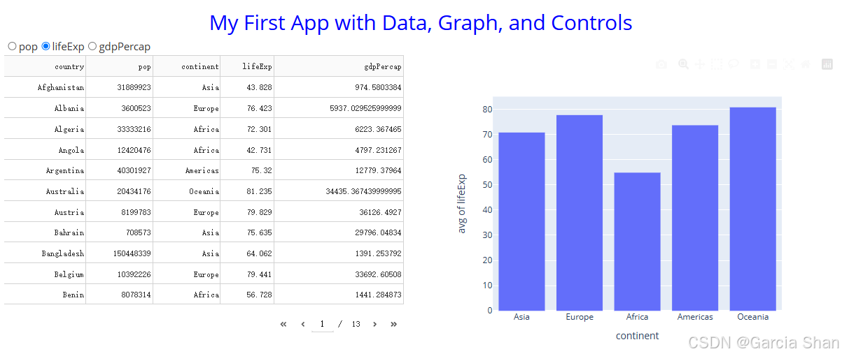
app.layout = html.Div([
html.Div(className='row', children='My First App with Data, Graph, and Controls',
style={'textAlign': 'center', 'color': 'blue', 'fontSize': 30}),
html.Div(className='row', children=[
dcc.RadioItems(options=['pop', 'lifeExp', 'gdpPercap'],
value='lifeExp',
inline=True,
id='my-radio-buttons-final')
]),
html.Div(className='row', children=[
html.Div(className='six columns', children=[
dash_table.DataTable(data=df.to_dict('records'),
page_size=11,
style_table={'overflowX': 'auto'})
]),
html.Div(className='six columns', children=[
dcc.Graph(figure={}, id='histo-chart-final')
])
])
])
# Add controls to build the interaction
@callback(
Output(component_id='histo-chart-final', component_property='figure'),
Input(component_id='my-radio-buttons-final', component_property='value')
)
def update_graph(col_chosen):
fig = px.histogram(df, x='continent', y=col_chosen, histfunc='avg')
return fig
# Run the app
if __name__ == '__main__':
app.run(debug=True)
三、解读
# Import packages
from dash import Dash, html, dash_table, dcc, callback, Output, Input
import pandas as pd
import plotly.express as px
- 导入所需 Python 包。 Dash 用于创建 Web 应用,pandas 用于数据处理,plotly.express 用于快速生成图表。
# Incorporate data
df =
pd.read_csv('https://raw.githubusercontent.com/plotly/datasets/master/gapminder2007.csv')
- 使用 pandas 的 read_csv 函数读取URL的csv数据文件,加载到 DataFrame df。
# Initialize the app - incorporate css
external_stylesheets = ['https://codepen.io/chriddyp/pen/bWLwgP.css']
app = Dash(external_stylesheets=external_stylesheets)
- 初始化 Dash 应用,并提供一个外部 CSS 文件的链接,该 CSS 将被用于应用的样式。
# App layout
app.layout = html.Div([
    # ..... Layout components
])
- 设置应用的布局,使用 html.Div 作为根容器。
html.Div(className='row', children='My First App with Data, Graph, and controls',
        style={'textAlign': 'center', 'color': 'blue', 'fontSize': 30}),
- 创建一个包含文本的 div 容器,使用 className 指定一个 CSS 类,使用 style 属性直接设置样式。(文本居中,蓝色,字体大小30)
html.Div(className='row', children=[
    dcc.RadioItems(options=['pop', 'lifeExp', 'gdpPercap'],
                    value='lefeExp',
                    inline=True,
                    id='my-radio-buttons-final')
]),
- 创建一个包含单选按钮的 div 容器(dcc.RadioItems())。
- 使用 className 指定 CSS 类,children 包含 dcc.RadioItems 组件。
- className='row' : 给 dvi 元素添加一个或多个 CSS 类。这些类通常在 CSS 央视表中定义,用于控制元素的布局和外观。这里表示子元素水平排列。
- children=[...]:是一个列表,包含要放在 dvi 容器内的组件,在 Dash 中,children 参数可以是单个组件或组件列表,用于定义组件的嵌套结构。
- options=['pop', 'lifeExp', 'gdpPercap']:包含单选按钮组的选项,每个字符串代表一个选项的标签,用户可以从中选择。
- value='leftExp' : 指定单选按钮组的初始值。
- inline=True:这个布尔值参数决定单选按钮是否应该内联显示(即水平排列)。如果设置为 True 则按钮会水平排列;如果为 False 或省略则按钮会垂直排列。
- id='my-radio-buttons-final':是组件的唯一标识符,用于在应用的布局和回调函数中引用和这个组件,ID 在 Dash 应用中是必须的,用于控制交互和动态更新。
html.Div(className='row', children=[
    html.Div(className='six columns', children=[
        dash_table.DataTable(data=df.to_dict('records'), page_size=11, style_table={'overflowX': 'auto'})
    ]),

    html.Div(className='six columns', children=[
        dcc.Graph(figure={}, id='histo-char-final')
    ])
])
- 创建一个包含两列的 div 容器,通常用于构建栅格布局,每列由 html.Div 组件表示,并且各自包含不同的组件。
- 一个是 dash_table.DataTable 组件,用于显示数据表
- 另一个是 dcc.Graph 组件,用于显示图表。
外层 html.Div 参数 html.Div(className='row', children=[...])
- className='row':指定 CSS 类名,用于定义这个 div 容器的样式。在很多前段框架中(如 Bootstrap 或 Foundation),'row' 类用于创建一个行容器,其子元素将水平排列。
- children=[...] 列表:包含要放在当前 div 容器内的子组件。这里包含两个子组件 html.Div。
子组件 html.Div 参数:
html.Div(className='six columns', children=[
    dash_table.DataTable(data=df.to_dict('records'), page_size=11,
                        style_table={'overflowX': 'auto'})
]),
- 第一个子组件
- className='six columns':指定 CSS 类名,通常用于定义这个 div 容器占据的栅格列数。在栅格系统中,这可能表示该容器占据六列,具体解释取决于 CSS 框架或自定义样式的定义。
- children:包含一个 dash_table.DataTable 组件,用于显示数据表。
html.Div(className='six columns', children=[
    dcc.Graph(figure={}, id='histo-chart-final')
])
- 第二个子组件
- className='six columns':同上,表示这个 div 容器占据六列。
- children:包含一个 dcc.Graph 组件,用于显示图表。
dash_table.DataTable 参数:
- data=df.to_dict('records'):指定要显示在数据表中的数据,这里使用 pandas DataFrame 的 to_dict('records') 方法将数据转换为字典列表。
- page_size=11:指定数据表每页显示的行数。
- style_table={'overflowX': 'auto'}:指定表格的内联格式。这里设置 overflowX 为 'auto',意味着如果表格内容超出容器宽度,将显示水平滚动条。
dcc.Graph 参数:
- figure={}:指定图表的数据和配置。这里设置为空字典,意味着图表初始时没有数据。
- id='histo-chart-final' :指定图表的唯一标识符,用在回调函数中引用这个图表组件。
# Add controls to build the interacion
@callback(
    Output(component_id='histo-chart-final', component_property='figuure'),
    Input(component_id='my-radio-buttons-final', component_property='value')
)
def update_graph(col_chosen):
    fig = px.histogram(df, x='continent', y=col_chosen, histfunc='avg')
    return fig
)
- 定义一个回调函数 update_graph,根据 dcc.RadioItems 组件的选中值动态更新 dcc.Graph 组件的图表。
- @callback 是一个装饰器,用于注册一个回调函数,定义应用中的交互逻辑。
- def update_graph(col_chosen):这一行定义了回调函数本身,update_graph 是函数名,col_chosen是函数的参数名,代表从 Input 属性传递回调函数的值。
- fig = px.historgram(...):使用 plotly.express 的 px.histogram 创建一个直方图。
- 从回调函数中返回对象 fig,Dash 将使用这个对象更新图表组件。
# Run the app
if __name__ == '__main__':
    app.run(debug=True)
- 启动 Dash 应用服务,并开启调试模式。


 639
639

 被折叠的 条评论
为什么被折叠?
被折叠的 条评论
为什么被折叠?
 到【灌水乐园】发言


