


目录
饼图(Pie Chart)是一种非常非常常用的数据可视化图表,用于表示各部分占整体的比例。它通过一个圆形将数据划分为多个扇形区域,区域的角度或面积反映每部分数据的大小,占比越大,扇形面积越大。
虽然饼图非常常见,功能相对简单,但是用好了也有奇效,参考“动态可选择型饼图”!
1. 饼图的特点
- 直观性:非常适合展示数据的组成部分及其比例。
- 有限性:通常用于数据类别较少(5-8个以下)的场景。
- 单一维度:饼图一般只展示一个维度的数值占比,且无法显示多维信息(多维度可以用旭日图)。
2. 饼图的构成
- 圆形:表示数据的整体。
- 扇形部分:每个扇形代表数据的一部分,其角度或面积与数据大小成正比。
- 数据标签(可选):标注每个扇形的具体数值或百分比。
- 颜色:不同颜色区分各个扇形部分。
3. 饼图的适用场景
饼图适用于以下情况:
- 展示组成结构:例如市场份额、预算分配、人口比例等。
- 强调占比关系:当某一部分占比特别突出时,饼图可以很好地强调。
- 对比少量类别:例如收入来源(产品A vs 产品B vs 产品C)。
4. 饼图的代码实现
4.1 传统饼图的 Python 代码实现
import dash
from dash import html, dcc
import plotly.graph_objects as go
import dash_bootstrap_components as dbc
import numpy as np


def create_advanced_charts():
    """
    创建高级图表示例
    返回一个包含多个图表的列表
    """
    # 4. 简单的饼图
    pie_labels = ['产品A', '产品B', '产品C', '产品D']
    pie_values = [30, 25, 20, 25]
    pie_fig = go.Figure(data=[
        go.Pie(
            labels=pie_labels,
            values=pie_values,
            hole=.3
        )
    ])
    pie_fig.update_layout(
        title='饼图示例',
        template='plotly_white'
    )

    # 4. 增强的饼图
    pie_labels = ['产品A', '产品B', '产品C', '产品D']
    pie_values = [30, 25, 20, 25]
    pie_colors = ['#FF9999', '#66B3FF', '#99FF99', '#FFCC99']

    pie_advanced_fig = go.Figure(data=[
        go.Pie(
            labels=pie_labels,
            values=pie_values,
            hole=.3,
            marker=dict(colors=pie_colors),
            hoverinfo='label+percent+value',  # 显示标签、百分比和值
            textinfo='percent',  # 在图上显示百分比
            insidetextorientation='radial'  # 文字方向
        )
    ])
    pie_advanced_fig.update_traces(
        pull=[0.1, 0, 0, 0],  # 将第一个部分稍微拉出
        textfont_size=14  # 设置文字大小
    )
    pie_advanced_fig.update_layout(
        title='增强的饼图示例',
        template='plotly_white',
        showlegend=True,  # 显示图例
        legend=dict(
            orientation="h",  # 水平显示图例
            x=0.5,
            xanchor="center",
            y=-0.2
        ),
        transition=dict(duration=500)  # 添加动画效果
    )
    return([pie_fig,pie_advanced_fig])

app = dash.Dash(__name__)

app.layout = html.Div([
    html.H3("饼图展示", className="text-center mt-4 mb-3"),
    dbc.Row([
        dbc.Col(dcc.Graph(figure=create_advanced_charts()[0]), width=6),
        dbc.Col(dcc.Graph(figure=create_advanced_charts()[1]), width=6)
    ])
])


if __name__ == "__main__":
    app.run_server(debug=True, port=8051)
4.2 传统饼图的效果展示

 4.3 动态可选择型饼图的 Python 代码实现
import dash
from dash import html, dcc, Input, Output
import plotly.graph_objects as go
import dash_bootstrap_components as dbc
import numpy as np
app = dash.Dash(__name__, external_stylesheets=[dbc.themes.BOOTSTRAP])
# 初始数据
initial_labels = ['产品A', '产品B', '产品C', '产品D']
initial_values = [30, 25, 20, 25]
initial_colors = ['#FF9999', '#66B3FF', '#99FF99', '#FFCC99']
def create_pie_chart(labels, values, colors):
return go.Figure(data=[
go.Pie(
labels=labels,
values=values,
hole=.3,
marker=dict(colors=colors),
hoverinfo='label+percent+value',
textinfo='percent',
insidetextorientation='radial'
)
]).update_layout(
title='动态饼图示例',
template='plotly_white',
showlegend=True,
legend=dict(
orientation="h",
x=0.5,
xanchor="center",
y=-0.2
),
transition=dict(duration=300),
margin=dict(l=20, r=20, t=40, b=20)
)
app.layout = html.Div([
html.H3("动态饼图展示", className="text-center mt-4 mb-3"),
dbc.Row([
dbc.Col(dcc.Graph(id='dynamic-pie-chart'), width=6),
dbc.Col([
html.Label("选择产品:"),
dcc.Checklist(
id='product-checklist',
options=[{'label': label, 'value': label} for label in initial_labels],
value=initial_labels,
inline=True
)
], width=6)
])
])
@app.callback(
Output('dynamic-pie-chart', 'figure'),
[Input('product-checklist', 'value')]
)
def update_pie_chart(selected_labels):
# 根据选择更新数据
selected_values = [initial_values[initial_labels.index(label)] for label in selected_labels]
selected_colors = [initial_colors[initial_labels.index(label)] for label in selected_labels]
return create_pie_chart(selected_labels, selected_values, selected_colors)
if __name__ == "__main__":
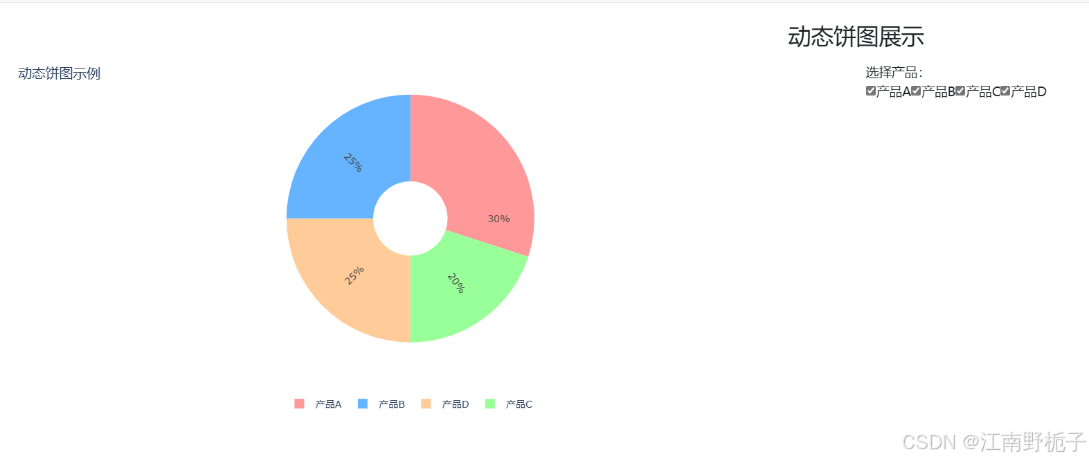
app.run_server(debug=True, port=8051)4.4 动态可选择型饼图的效果


 2823
2823

 被折叠的 条评论
为什么被折叠?
被折叠的 条评论
为什么被折叠?
 到【灌水乐园】发言


