


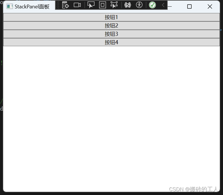
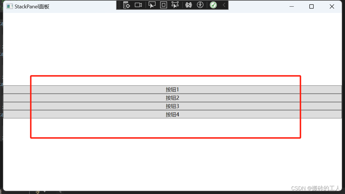
StackPanel 堆叠面板
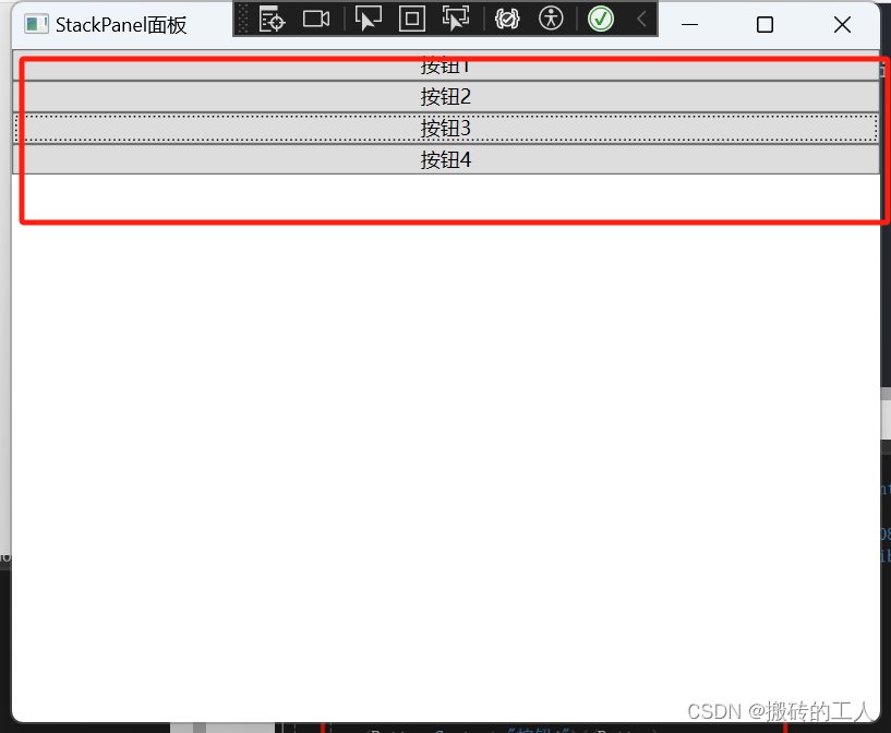
- StackPanel 是一种常用的布局控件,可以水平或垂直排列其子元素,但不会换行。当子元素添加到 StackPanel 中时,它们将按照添加的顺序依次排列。默认情况下,StackPanel 的排列方向是垂直的,也就是说子元素将从上到下依次排列。可以使用 Orientation 属性更改排列方向。可以设置两种排列方式:横排(Horizontal)和竖排(Vertical,默认)。水平排列时,每个元素都与面板一样高;垂直排列时,每个元素都与面板一样宽。
Orientation 属性
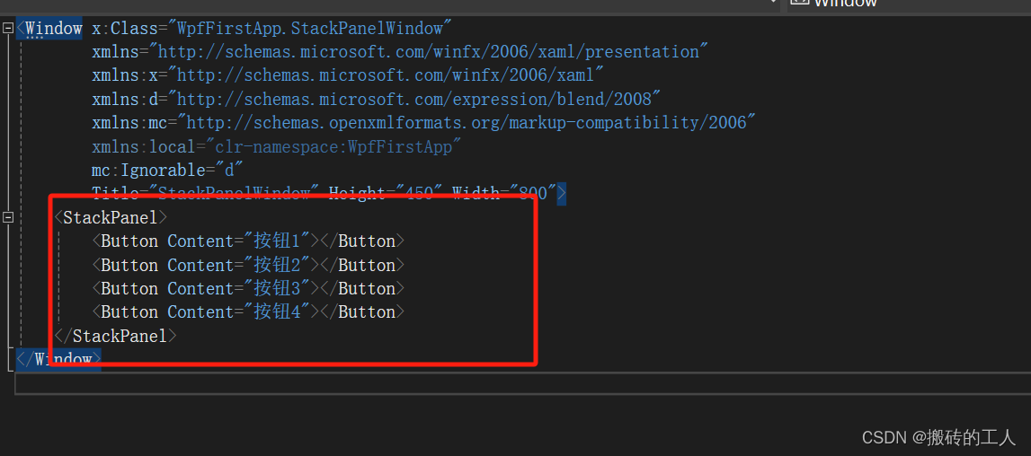
// StackPanel 里添加了4个按钮,默认布局,Orientation 默认垂直排列
<Window x:Class="WpfFirstApp.StackPanelWindow"
        xmlns="http://schemas.microsoft.com/winfx/2006/xaml/presentation"
        xmlns:x="http://schemas.microsoft.com/winfx/2006/xaml"
        xmlns:d="http://schemas.microsoft.com/expression/blend/2008"
        xmlns:mc="http://schemas.openxmlformats.org/markup-compatibility/2006"
        xmlns:local="clr-namespace:WpfFirstApp"
        mc:Ignorable="d"
        Title="StackPanelWindow" Height="450" Width="800">
    <StackPanel>
        <Button Content="按钮1"></Button>
        <Button Content="按钮2"></Button>
        <Button Content="按钮3"></Button>
        <Button Content="按钮4"></Button>
    </StackPanel>
</Window>
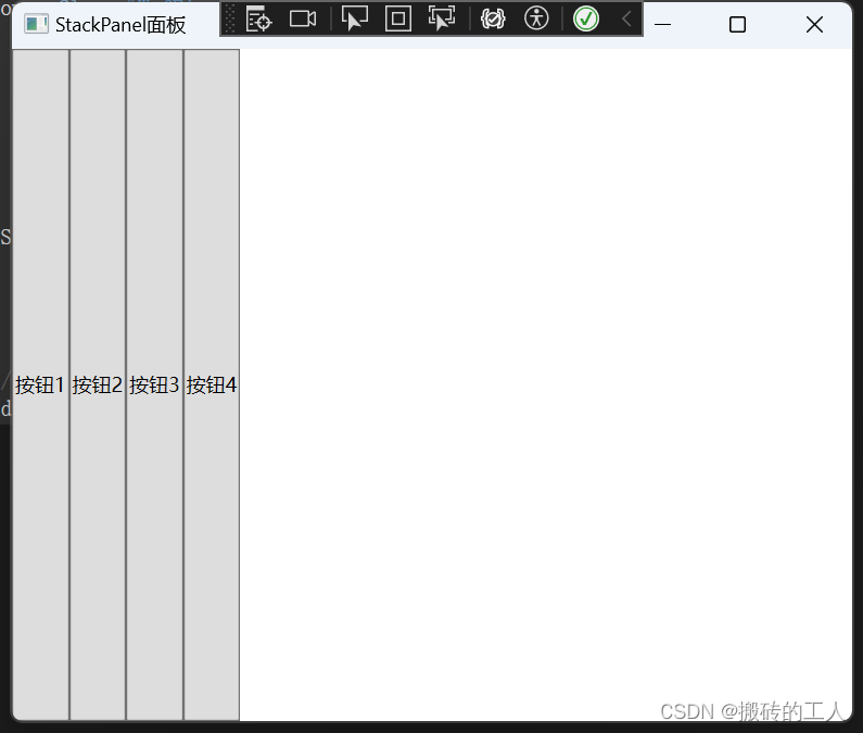
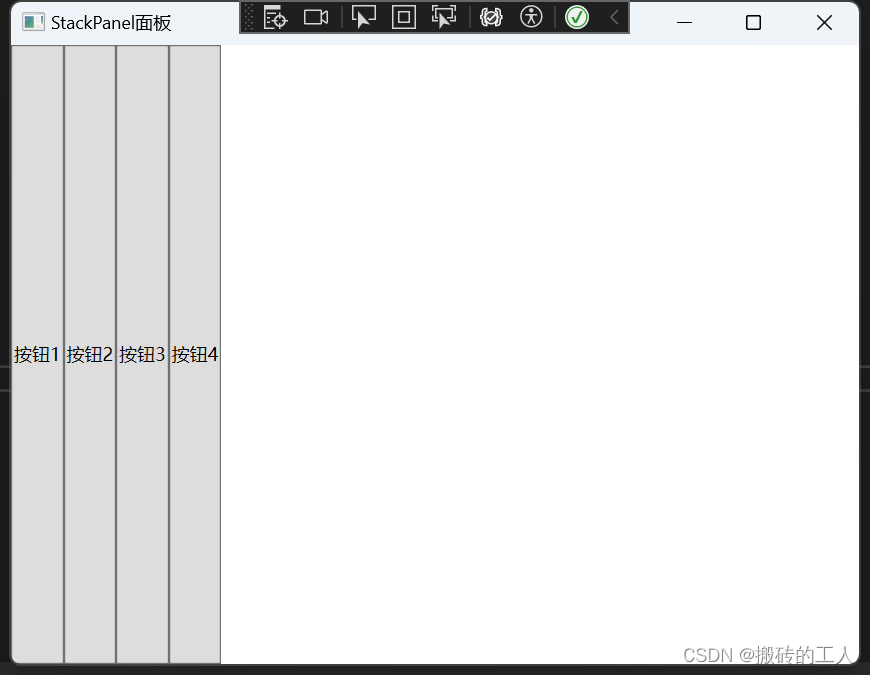
- 然后设置StackPanel的Orientation为横向(Horizontal)排列
// 设置 Orientation 属性(Horizontal)
<Window x:Class="WpfFirstApp.StackPanelWindow"
        xmlns="http://schemas.microsoft.com/winfx/2006/xaml/presentation"
        xmlns:x="http://schemas.microsoft.com/winfx/2006/xaml"
        xmlns:d="http://schemas.microsoft.com/expression/blend/2008"
        xmlns:mc="http://schemas.openxmlformats.org/markup-compatibility/2006"
        xmlns:local="clr-namespace:WpfFirstApp"
        mc:Ignorable="d"
        Title="StackPanelWindow" Height="450" Width="800">
    <StackPanel Orientation="Horizontal">
        <Button Content="按钮1"></Button>
        <Button Content="按钮2"></Button>
        <Button Content="按钮3"></Button>
        <Button Content="按钮4"></Button>
    </StackPanel>
</Window>

- 如果不在XAML里添加控件,也可以直接在c#代码里实现上面的效果
// 使用C# 代码直接实现
using System;
using System.Collections.Generic;
using System.Linq;
using System.Text;
using System.Threading.Tasks;
using System.Windows;
using System.Windows.Controls;
using System.Windows.Data;
using System.Windows.Documents;
using System.Windows.Input;
using System.Windows.Media;
using System.Windows.Media.Imaging;
using System.Windows.Shapes;
namespace WpfFirstApp
{
/// <summary>
/// StackPanelWindow.xaml 的交互逻辑
/// </summary>
public partial class StackPanelWindow : Window
{
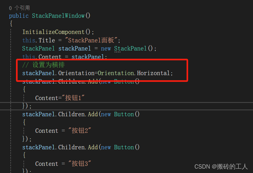
public StackPanelWindow()
{
InitializeComponent();
this.Title = "StackPanel面板";
// StackPanel 默认排列
StackPanel stackPanel = new StackPanel();
this.Content = stackPanel;
stackPanel.Children.Add(new Button()
{
Content="按钮1"
});
stackPanel.Children.Add(new Button()
{
Content = "按钮2"
});
stackPanel.Children.Add(new Button()
{
Content = "按钮3"
});
stackPanel.Children.Add(new Button()
{
Content = "按钮4"
});
}
}
}
- C# 代码里设置 stackPanel.Orientation=Orientation.Horizontal;
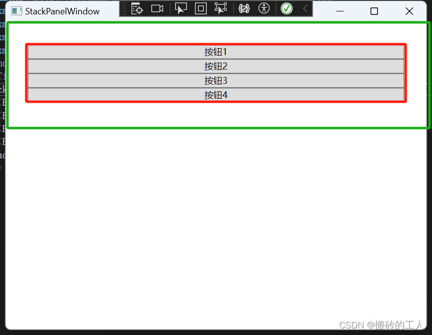
Margin属性
- 用于在子元素周围添加空白空间。Margin是System.Windows.Thickness结构的属性,可以设置上、下、左、右四个方向的外边距。通过调整Margin属性,可以控制子元素之间的间隔以及子元素与StackPanel边缘之间的距离。这对于调整布局的外观和组织元素非常有用。
- 例如设置StackPanel外边距上下左右都为30
// xaml中直接设置属性Margin="30"  当值设置一个值时,wpf 会默认填充上下左右边距为30
// 或 Margin="30 30 30 30 "  设置 左 上 右 下边距都为30
<Window x:Class="WpfFirstApp.StackPanelWindow"
        xmlns="http://schemas.microsoft.com/winfx/2006/xaml/presentation"
        xmlns:x="http://schemas.microsoft.com/winfx/2006/xaml"
        xmlns:d="http://schemas.microsoft.com/expression/blend/2008"
        xmlns:mc="http://schemas.openxmlformats.org/markup-compatibility/2006"
        xmlns:local="clr-namespace:WpfFirstApp"
        mc:Ignorable="d"
        Title="StackPanelWindow" Height="450" Width="800">
    <StackPanel Orientation="Vertical" Margin="30">
        <Button Content="按钮1"></Button>
        <Button Content="按钮2"></Button>
        <Button Content="按钮3"></Button>
        <Button Content="按钮4"></Button>
    </StackPanel>
</Window>
// 使用c# 代码实现设置外边距 30 ,stackPanel.Margin = new Thickness(30)
// 或 stackPanel.Margin = new Thickness(30,30,30,30); 左上右下 设置为30
using System;
using System.Collections.Generic;
using System.Linq;
using System.Text;
using System.Threading.Tasks;
using System.Windows;
using System.Windows.Controls;
using System.Windows.Data;
using System.Windows.Documents;
using System.Windows.Input;
using System.Windows.Media;
using System.Windows.Media.Imaging;
using System.Windows.Shapes;

namespace WpfFirstApp
{
    /// <summary>
    /// StackPanelWindow.xaml 的交互逻辑
    /// </summary>
    public partial class StackPanelWindow : Window
    {
        public StackPanelWindow()
        {
            InitializeComponent();
            this.Title = "StackPanel面板";
            StackPanel stackPanel = new StackPanel();
            this.Content = stackPanel;
            // 设置为横排
            stackPanel.Orientation = Orientation.Vertical;
			 // 设置外边距 30
			 stackPanel.Margin = new Thickness(30);
			 //或 设置外边距
			 //stackPanel.Margin = new Thickness(30,30,30,30);

            stackPanel.Children.Add(new Button()
            {
                Content = "按钮1"
            });
            stackPanel.Children.Add(new Button()
            {
                Content = "按钮2"
            });
            stackPanel.Children.Add(new Button()
            {
                Content = "按钮3"
            });
            stackPanel.Children.Add(new Button()
            {
                Content = "按钮4"
            });
        }
    }
}
Width和Height 属性
- 用来设置控件的宽度和高度,当指定宽度和高度时则会取消自动的宽度和高度。
HorizontalAlignment和VerticalAlignment 属性
- 于设置元素在容器中的水平和垂直对齐方式。对齐方式值有 Left, Right, Center, 和 Stretch,当容器的尺寸改变时,Stretch 值将使元素扩展以填充可用空间,而其他值将使元素保持其原始大小并在指定的对齐边缘进行定位。
- 例如设置StackPanel的内容垂直排列并居中
	// 设置Orientation="Vertical"  VerticalAlignment="Center"
	<Window x:Class="WpfFirstApp.StackPanelWindow"
        xmlns="http://schemas.microsoft.com/winfx/2006/xaml/presentation"
        xmlns:x="http://schemas.microsoft.com/winfx/2006/xaml"
        xmlns:d="http://schemas.microsoft.com/expression/blend/2008"
        xmlns:mc="http://schemas.openxmlformats.org/markup-compatibility/2006"
        xmlns:local="clr-namespace:WpfFirstApp"
        mc:Ignorable="d"
        Title="StackPanelWindow" Height="450" Width="800">
    <StackPanel Orientation="Vertical"  VerticalAlignment="Center">
        <Button Content="按钮1"></Button>
        <Button Content="按钮2"></Button>
        <Button Content="按钮3"></Button>
        <Button Content="按钮4"></Button>
    </StackPanel>

</Window>
using System;
using System.Collections.Generic;
using System.Linq;
using System.Text;
using System.Threading.Tasks;
using System.Windows;
using System.Windows.Controls;
using System.Windows.Data;
using System.Windows.Documents;
using System.Windows.Input;
using System.Windows.Media;
using System.Windows.Media.Imaging;
using System.Windows.Shapes;

namespace WpfFirstApp
{
    /// <summary>
    /// StackPanelWindow.xaml 的交互逻辑
    /// </summary>
    public partial class StackPanelWindow : Window
    {
        public StackPanelWindow()
        {
            InitializeComponent();
            this.Title = "StackPanel面板";
            StackPanel stackPanel = new StackPanel();
            this.Content = stackPanel;
            // 设置为竖排
            stackPanel.Orientation = Orientation.Vertical;
            stackPanel.VerticalAlignment = VerticalAlignment.Center;

            stackPanel.Children.Add(new Button()
            {
                Content = "按钮1"
            });
            stackPanel.Children.Add(new Button()
            {
                Content = "按钮2"
            });
            stackPanel.Children.Add(new Button()
            {
                Content = "按钮3"
            });
            stackPanel.Children.Add(new Button()
            {
                Content = "按钮4"
            });
        }
    }
}
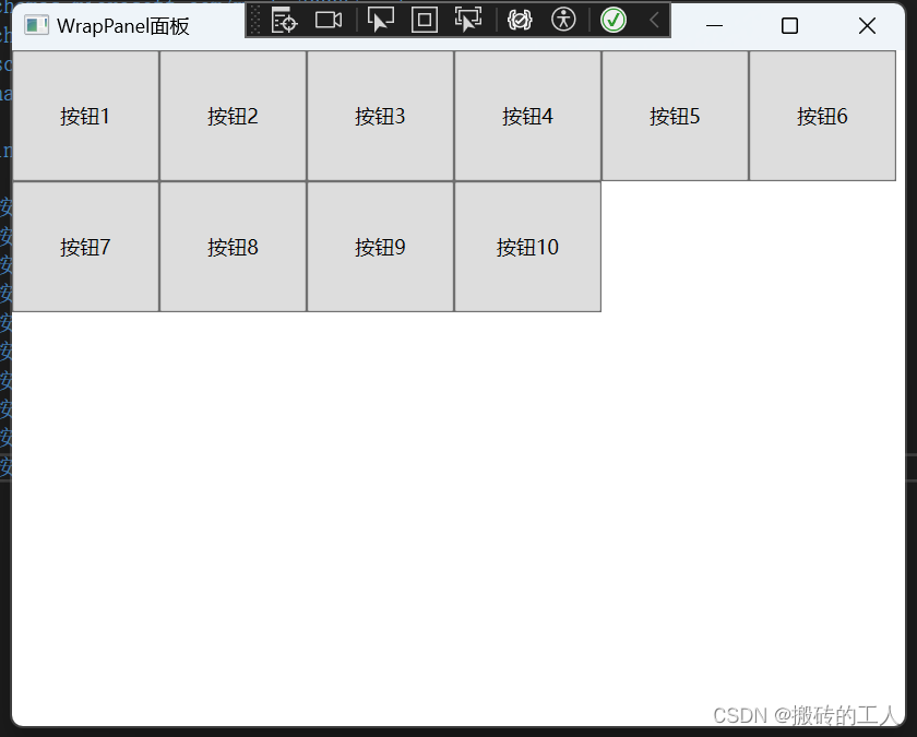
WrapPanel 面板
-
用于将子元素排列在一行或一列中,当没有足够的空间时,它会将元素移动到下一行或列。与 StackPanel 不同,WrapPanel 会自动处理元素的对齐和换行。它也可以使用 Orientation 属性更改排列方向。Orientation 属性和StackPanel 一样,唯一的区别就是 排列 默认不同,WrapPanel 排列方式 横排(Horizontal,默认)和竖排(Vertical)
-
例如: 横排(Horizontal,默认)
// 默认排列方式
<Window x:Class="WpfFirstApp.WrapPanelWindow"
        xmlns="http://schemas.microsoft.com/winfx/2006/xaml/presentation"
        xmlns:x="http://schemas.microsoft.com/winfx/2006/xaml"
        xmlns:d="http://schemas.microsoft.com/expression/blend/2008"
        xmlns:mc="http://schemas.openxmlformats.org/markup-compatibility/2006"
        xmlns:local="clr-namespace:WpfFirstApp"
        mc:Ignorable="d"
        Title="WrapPanelWindow" Height="450" Width="800">
    <WrapPanel>
        <Button Content="按钮1" Height="80" Width="90"></Button>
        <Button Content="按钮2" Height="80" Width="90"></Button>
        <Button Content="按钮3" Height="80" Width="90"></Button>
        <Button Content="按钮4" Height="80" Width="90"></Button>
        <Button Content="按钮5" Height="80" Width="90"></Button>
        <Button Content="按钮6" Height="80" Width="90"></Button>
        <Button Content="按钮7" Height="80" Width="90"></Button>
        <Button Content="按钮8" Height="80" Width="90"></Button>
        <Button Content="按钮9" Height="80" Width="90"></Button>
        <Button Content="按钮10" Height="80" Width="90"></Button>
    </WrapPanel>
</Window>
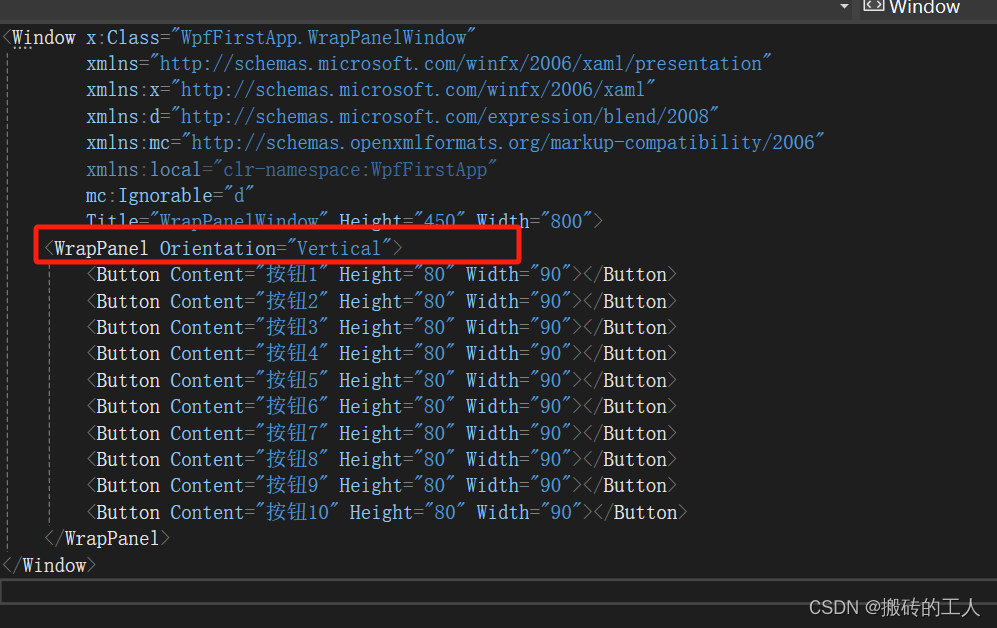
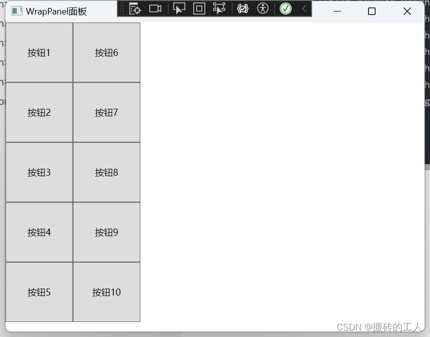
- 设置 Orientation 属性为Vertical,垂直排列方式
// 设置  Orientation="Vertical" 属性
<Window x:Class="WpfFirstApp.WrapPanelWindow"
        xmlns="http://schemas.microsoft.com/winfx/2006/xaml/presentation"
        xmlns:x="http://schemas.microsoft.com/winfx/2006/xaml"
        xmlns:d="http://schemas.microsoft.com/expression/blend/2008"
        xmlns:mc="http://schemas.openxmlformats.org/markup-compatibility/2006"
        xmlns:local="clr-namespace:WpfFirstApp"
        mc:Ignorable="d"
        Title="WrapPanelWindow" Height="450" Width="800">
    <WrapPanel Orientation="Vertical">
        <Button Content="按钮1" Height="80" Width="90"></Button>
        <Button Content="按钮2" Height="80" Width="90"></Button>
        <Button Content="按钮3" Height="80" Width="90"></Button>
        <Button Content="按钮4" Height="80" Width="90"></Button>
        <Button Content="按钮5" Height="80" Width="90"></Button>
        <Button Content="按钮6" Height="80" Width="90"></Button>
        <Button Content="按钮7" Height="80" Width="90"></Button>
        <Button Content="按钮8" Height="80" Width="90"></Button>
        <Button Content="按钮9" Height="80" Width="90"></Button>
        <Button Content="按钮10" Height="80" Width="90"></Button>
    </WrapPanel>
</Window>
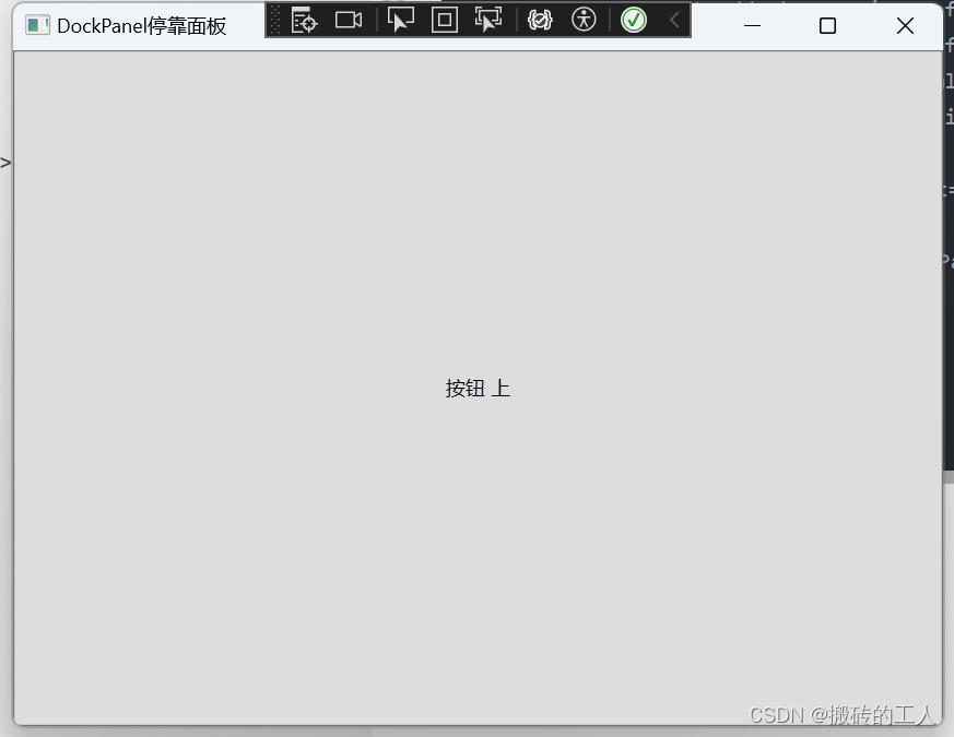
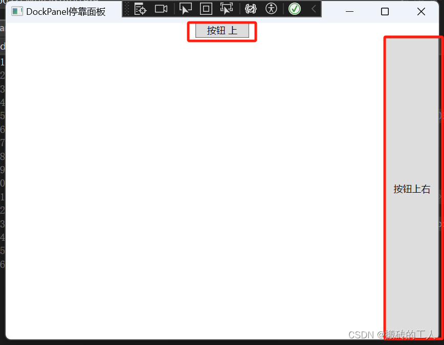
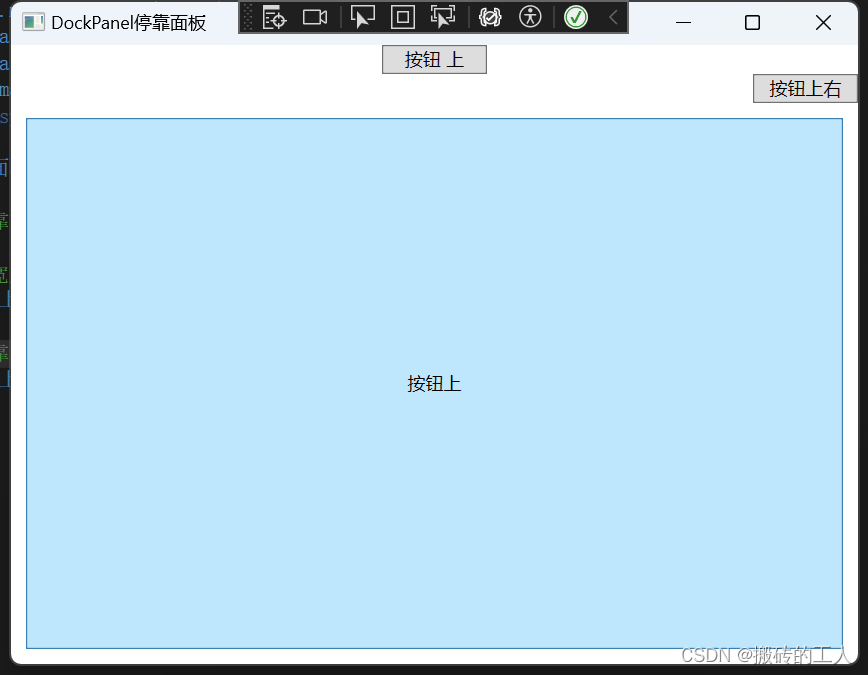
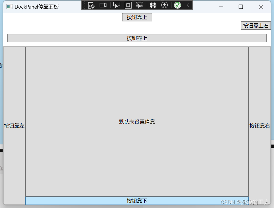
DockPanel 停靠面板
- 用来控制UI元素在视窗中的位置就是停靠。DockPanel定义了一个Dock附加属性,其类型为Dock,是枚举类型,可取Left、Right、Top和Bottom四个值。注意Dock并没有一个Fi或Center的值,当LastChildFill属性设为True时,DockPanel用最后一个加入的UI元素填充所有剩下的地方。
// 当只有个按钮时,不控制宽高度时,默认填充所有的地方
// 增加一个按钮,第一个默认高度,并设置宽度为70,第二个高度会填充满然后看效果
// 可以依次添加停靠位置,并查看对应的效果
<Window x:Class="WpfFirstApp.DockPanelWindow"
        xmlns="http://schemas.microsoft.com/winfx/2006/xaml/presentation"
        xmlns:x="http://schemas.microsoft.com/winfx/2006/xaml"
        xmlns:d="http://schemas.microsoft.com/expression/blend/2008"
        xmlns:mc="http://schemas.openxmlformats.org/markup-compatibility/2006"
        xmlns:local="clr-namespace:WpfFirstApp"
        mc:Ignorable="d"
        Title="DockPanel停靠面板" Height="450" Width="800">
    <DockPanel>
         <!--设置宽度为70,停靠方向为上-->
		 <Button Content="按钮靠上" Width="70"  DockPanel.Dock="Top"></Button>
		 <!--增加一个按钮设置宽度为70,停靠方向为上,并设置右对齐-->
		 <Button Content="按钮靠上右" Width="70" HorizontalAlignment="Right" DockPanel.Dock="Top"></Button>

		 <!--第三个按钮设置停靠上,并设置外边距10-->
		 <Button Content="按钮靠上" Margin="10" DockPanel.Dock="Top"></Button>

		 <!--第四个按钮设置靠左-->
		 <Button  Content="按钮靠左" DockPanel.Dock="Left" ></Button>

		 <!--第五个按钮设置靠右-->
		 <Button Content="按钮靠右" DockPanel.Dock="Right"></Button>

		 <!--第六个按钮设置靠下-->
		 <Button Content="按钮靠下" DockPanel.Dock="Bottom"></Button>
		 <!--第七个按钮默认未设置停靠-->
		 <Button Content="默认未设置停靠"></Button>
    </DockPanel>
</Window>
Grid 控制面板
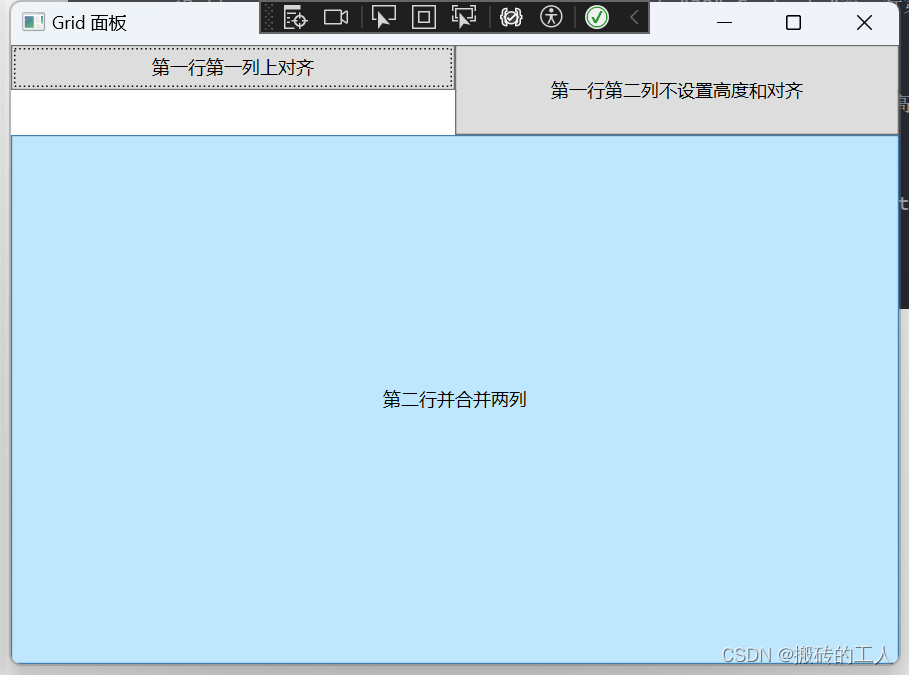
- Grid控制面板是WPP中最常用的控制面板,以表格形式布局元素,可以创建复杂的二维布局。Grid的子控件被放置在一个个预先定义好的小格子中,这些格子称为单元格。每个单元格都有一个行和列的标识符,用于确定控件在该网格中的位置。当用Visual Studio创建WPF程序时Visual Studio会自动在XAML中添加标记。Grid排版和HTML表格排版是一样的,类似于 HTML 中的 table td 中的 row
span 和 colspan 。 - WPF 中的 Grid 的每一个单元格中可以放置多个控件,但控件可能会层叠在一起, 支持单元格的合并。
- Grid 中的行和列可以自定义高度(Height)和宽度(Width),设置高度和宽度时可以采用两种写法:
- Height=”60”:不加“星号”表示固定的高度
- Height=”60*”:加“星号”表示“加权”的高度,在调整窗体大小时,高度或宽度会按窗体大小改变的比例进行缩
// Grid定义两行两列布局
<Window x:Class="WpfFirstApp.GridWindow"
        xmlns="http://schemas.microsoft.com/winfx/2006/xaml/presentation"
        xmlns:x="http://schemas.microsoft.com/winfx/2006/xaml"
        xmlns:d="http://schemas.microsoft.com/expression/blend/2008"
        xmlns:mc="http://schemas.openxmlformats.org/markup-compatibility/2006"
        xmlns:local="clr-namespace:WpfFirstApp"
        mc:Ignorable="d"
        Title="Grid 面板" Height="450" Width="800">
    <Grid>
        <!--定义两行,两列-->
        <Grid.RowDefinitions>
            <RowDefinition Height="60"></RowDefinition>
            <RowDefinition Height="200*"></RowDefinition>
        </Grid.RowDefinitions>
        <Grid.ColumnDefinitions>
            <ColumnDefinition></ColumnDefinition>
            <ColumnDefinition></ColumnDefinition>
        </Grid.ColumnDefinitions>
         <!--设置第一行第一列,并设置为上对齐,为了看效果设置为高度的一半30-->
        <Button Grid.Column="0" Grid.Row="0" Height="30" Content="第一行第一列上对齐" VerticalAlignment="Top"></Button>
        <!--设置第一行第二列,并设置为下对齐,为了看效果设置为高度的一半30-->
        <Button Grid.Column="1" Grid.Row="0" Height="30" Content="第一行第二列下对齐" VerticalAlignment="Bottom"></Button>

         <!--演示Grid内容为层叠,再增加一个按钮,会盖住上一个第二列按钮-->
        <Button Grid.Column="1" Grid.Row="0" Content="第一行第二列不设置高度和对齐"></Button>

        <!--设置第二行-->
        <Button Grid.Column="0" Grid.Row="1" Grid.ColumnSpan="2" Content="第二行并合并两列"></Button>
    </Grid>
</Window>
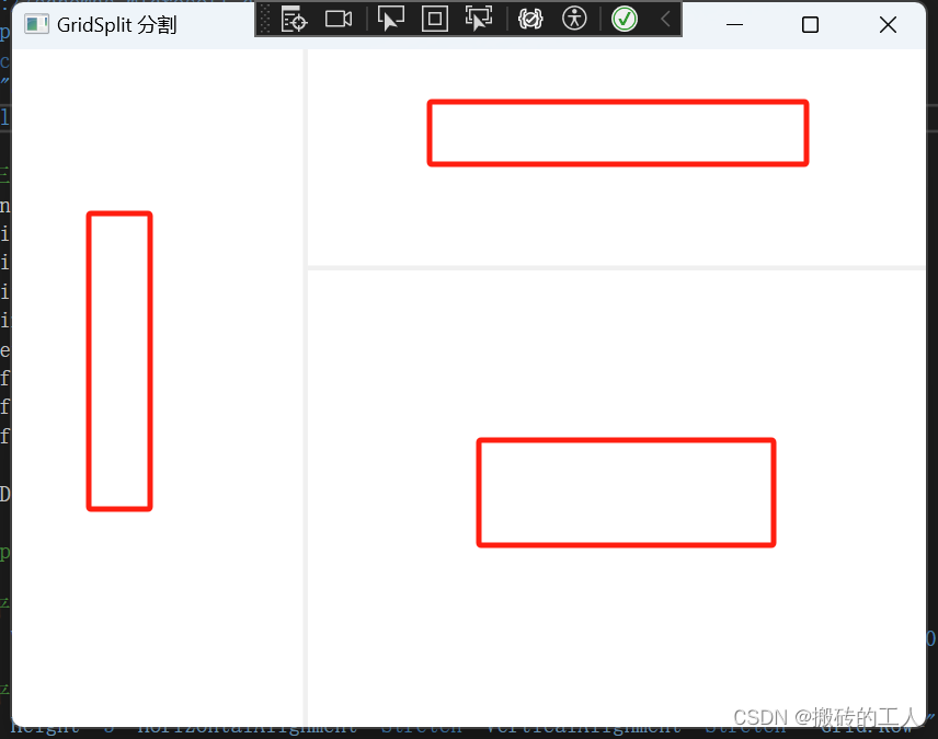
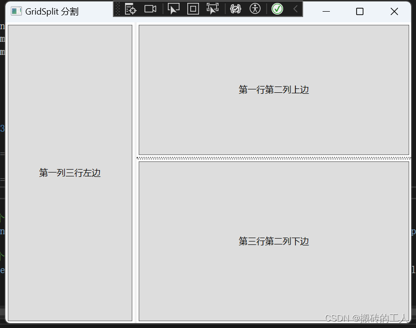
- 用 GridSplit 控件结合 Grid 控件实现类似于 Windows 应用程序中 SplitContai
ner 的功能,实现可以左右拖动,改变宽度,以上下拖动,改变高度
// 定义 3*3 的表格,其中放置分割线的列和行的宽度和高度设置为 Auto

<Window x:Class="WpfFirstApp.GridSplitWindow"
        xmlns="http://schemas.microsoft.com/winfx/2006/xaml/presentation"
        xmlns:x="http://schemas.microsoft.com/winfx/2006/xaml"
        xmlns:d="http://schemas.microsoft.com/expression/blend/2008"
        xmlns:mc="http://schemas.openxmlformats.org/markup-compatibility/2006"
        xmlns:local="clr-namespace:WpfFirstApp"
        mc:Ignorable="d"
        Title="GridSplit 分割" Height="450" Width="800">
    <Grid>
        <!--定义三行三列-->
        <Grid.RowDefinitions>
            <RowDefinition Height="90*"></RowDefinition>
            <RowDefinition Height="Auto"></RowDefinition>
            <RowDefinition Height="190*"></RowDefinition>
        </Grid.RowDefinitions>
        <Grid.ColumnDefinitions>
            <ColumnDefinition Width="80*"></ColumnDefinition>
            <ColumnDefinition Width="Auto"></ColumnDefinition>
            <ColumnDefinition Width="170*"></ColumnDefinition>

        </Grid.ColumnDefinitions>

        <!--这里可以增加Grid列内容,不添加Button,则只会显示GridSplitter分割线-->
        <!--第一列三行左边,并设置外边距3-->
        <Button Content="第一列三行左边" Margin="3" Grid.Row="0" Grid.Column="0" Grid.RowSpan="3" />

        <Button Content="第一行第二列上边" Margin="3" Grid.Row="0" Grid.Column="2"  />

        <Button Content="第三行第二列下边" Margin="3" Grid.Row="2" Grid.Column="2"  />

        <!--添加GridSplitter 分割-->
        <!--设置在水平和垂直方向上都拉伸以填充整个空间,设置为第一列。并三行合并-->
        <GridSplitter Width="3" HorizontalAlignment="Stretch" VerticalAlignment="Stretch"  Grid.Row="0" Grid.Column="1" Grid.RowSpan="3"></GridSplitter>

        <!--设置在水平和垂直方向上都拉伸以填充整个空间,设置为第二行,为两列-->
        <GridSplitter Height="3" HorizontalAlignment="Stretch" VerticalAlignment="Stretch"  Grid.Row="1" Grid.Column="2"></GridSplitter>

    </Grid>
</Window>
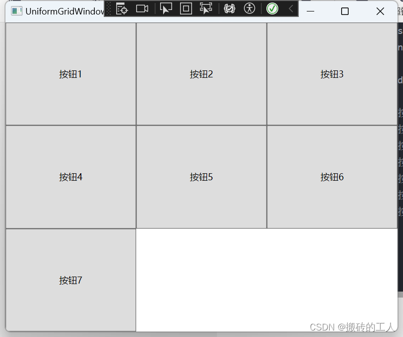
UniformGrid 控制面板
- 用于简化的网格布局。当控件添加到 UniformGrid 时,它们会排列在一个网格模式中,该网格模式会自动调整以使控件之间的距离保持均匀。单元格的数目将进行调整,以适应控件的数目。UniformGrid总是把行数和列数设为相等,每个单元只含有一个子元素。
//  UniformGrid添加7个按钮它会自动排列
<Window x:Class="WpfFirstApp.UniformGridWindow"
        xmlns="http://schemas.microsoft.com/winfx/2006/xaml/presentation"
        xmlns:x="http://schemas.microsoft.com/winfx/2006/xaml"
        xmlns:d="http://schemas.microsoft.com/expression/blend/2008"
        xmlns:mc="http://schemas.openxmlformats.org/markup-compatibility/2006"
        xmlns:local="clr-namespace:WpfFirstApp"
        mc:Ignorable="d"
        Title="UniformGridWindow" Height="450" Width="800">
    <UniformGrid>
        <Button Content="按钮1"></Button>
        <Button Content="按钮2"></Button>
        <Button Content="按钮3"></Button>
        <Button Content="按钮4"></Button>
        <Button Content="按钮5"></Button>
        <Button Content="按钮6"></Button>
        <Button Content="按钮7"></Button>
    </UniformGrid>
</Window>
公众号“点滴分享技术猿”


 扫一扫
扫一扫


 1万+
1万+

 被折叠的 条评论
为什么被折叠?
被折叠的 条评论
为什么被折叠?
 到【灌水乐园】发言


