示例:WPF中推荐一个支持折叠展开的GridSpliter自定义控件GridSplitterBox

一、目的:推荐一个支持折叠展开的GridSpliter自定义控件GridSplitterBox


二、效果

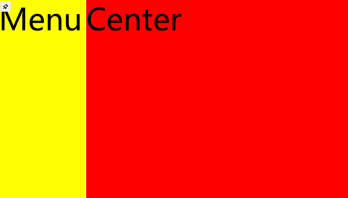
实现功能:设置菜单显示位置,最小宽度,最大宽度,位置持久化保存 

三、环境


VS2022 Net7

四、使用方式

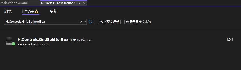
1、安装nuget包:H.Controls.FilterColumnDataGrid

2、添加控件

            <h:GridSplitterBox>
                <Border>
                    <Grid Background="Red">
                        <TextBlock FontSize="100" Text="Center" />
                    </Grid>
                </Border>
                <h:GridSplitterBox.MenuContent>
                    <Border Background="Yellow">
                        <TextBlock FontSize="100" Text="Menu" />
                    </Border>
                </h:GridSplitterBox.MenuContent>
            </h:GridSplitterBox>      

其他样式

Style="{DynamicResource {x:Static h:GridSplitterBox.RightKey}}"

Style="{DynamicResource {x:Static h:GridSplitterBox.TopKey}}"

Style="{DynamicResource {x:Static h:GridSplitterBox.BottomKey}}"

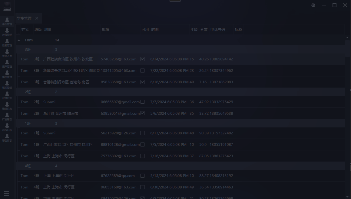
基于此控件做的左侧菜单SlideMenu效果演示

五、需要了解的知识点

GridSplitter 类 (System.Windows.Controls) | Microsoft Learn

System.Windows.Controls 命名空间 | Microsoft Learn

六、源码地址

GitHub - HeBianGu/WPF-ControlDemo: 示例

GitHub - HeBianGu/WPF-ControlBase: Wpf封装的自定义控件资源库

GitHub - HeBianGu/WPF-Control: WPF轻量控件和皮肤库

七、了解更多

System.Windows.Controls 命名空间 | Microsoft Learn

https://github.com/HeBianGu

HeBianGu的个人空间-HeBianGu个人主页-哔哩哔哩视频

  • 6
    点赞
  • 9
    收藏
    觉得还不错? 一键收藏
  • 1
    评论
以下是一个基本的WPF TreeView控件示例,它可以展开折叠节点,同时具有自定义样式: ```xml <Window x:Class="WpfApp1.MainWindow" xmlns="http://schemas.microsoft.com/winfx/2006/xaml/presentation" xmlns:x="http://schemas.microsoft.com/winfx/2006/xaml" Title="TreeView Example" Height="450" Width="800"> <Window.Resources> <!--定义树形节点模板--> <HierarchicalDataTemplate x:Key="NodeTemplate" ItemsSource="{Binding Children}"> <StackPanel Orientation="Horizontal" VerticalAlignment="Center"> <Image Source="/Images/folder.png" Width="16" Height="16" Margin="0,0,5,0"/> <TextBlock Text="{Binding Name}"/> </StackPanel> </HierarchicalDataTemplate> <!--定义树形节点样式--> <Style TargetType="{x:Type TreeViewItem}"> <Setter Property="IsExpanded" Value="{Binding IsExpanded, Mode=TwoWay}" /> <Setter Property="IsSelected" Value="{Binding IsSelected, Mode=TwoWay}" /> <Setter Property="Background" Value="Transparent" /> <Setter Property="HorizontalContentAlignment" Value="Left" /> <Setter Property="VerticalContentAlignment" Value="Center" /> <Setter Property="Template"> <Setter.Value> <ControlTemplate TargetType="{x:Type TreeViewItem}"> <Grid> <Grid.ColumnDefinitions> <ColumnDefinition Width="Auto" MinWidth="19"/> <ColumnDefinition Width="*"/> </Grid.ColumnDefinitions> <Grid.RowDefinitions> <RowDefinition Height="Auto"/> <RowDefinition/> </Grid.RowDefinitions> <!--树形节点图标--> <ToggleButton x:Name="Expander" ClickMode="Press" IsChecked="{Binding IsExpanded, RelativeSource={RelativeSource TemplatedParent}}" Style="{StaticResource ExpandCollapseToggleStyle}" /> <Border x:Name="Bd" Grid.Column="1" Background="{TemplateBinding Background}" BorderBrush="{TemplateBinding BorderBrush}" BorderThickness="{TemplateBinding BorderThickness}" Padding="{TemplateBinding Padding}"> <ContentPresenter x:Name="PART_Header" ContentSource="Header" HorizontalAlignment="{TemplateBinding HorizontalContentAlignment}" /> </Border> <!--树形节点内容--> <ItemsPresenter x:Name="ItemsHost" Grid.Row="1" Grid.Column="1" Visibility="Collapsed"/> </Grid> <ControlTemplate.Triggers> <Trigger Property="IsExpanded" Value="false"> <Setter TargetName="ItemsHost" Property="Visibility" Value="Collapsed"/> </Trigger> <Trigger Property="HasItems" Value="false"> <Setter TargetName="Expander" Property="Visibility" Value="Hidden"/> </Trigger> <MultiTrigger> <MultiTrigger.Conditions> <Condition Property="HasHeader" Value="false"/> <Condition Property="Width" Value="Auto"/> </MultiTrigger.Conditions> <Setter TargetName="PART_Header" Property="MinWidth" Value="75"/> </MultiTrigger> <MultiTrigger> <MultiTrigger.Conditions> <Condition Property="HasHeader" Value="false"/> <Condition Property="Height" Value="Auto"/> </MultiTrigger.Conditions> <Setter TargetName="PART_Header" Property="MinHeight" Value="19"/> </MultiTrigger> <Trigger Property="IsSelected" Value="true"> <Setter TargetName="Bd" Property="Background" Value="{DynamicResource {x:Static SystemColors.HighlightBrushKey}}"/> <Setter Property="Foreground" Value="{DynamicResource {x:Static SystemColors.HighlightTextBrushKey}}"/> </Trigger> <MultiTrigger> <MultiTrigger.Conditions> <Condition Property="IsSelected" Value="true"/> <Condition Property="IsSelectionActive" Value="false"/> </MultiTrigger.Conditions> <Setter TargetName="Bd" Property="Background" Value="{DynamicResource {x:Static SystemColors.ControlBrushKey}}"/> <Setter Property="Foreground" Value="{DynamicResource {x:Static SystemColors.ControlTextBrushKey}}"/> </MultiTrigger> </ControlTemplate.Triggers> </ControlTemplate> </Setter.Value> </Setter> </Style> </Window.Resources> <!--定义树形节点数据源--> <TreeView ItemsSource="{Binding}" ItemTemplate="{StaticResource NodeTemplate}"> <TreeView.ItemContainerStyle> <Style TargetType="{x:Type TreeViewItem}"> <Setter Property="IsExpanded" Value="{Binding IsExpanded, Mode=TwoWay}" /> <Setter Property="IsSelected" Value="{Binding IsSelected, Mode=TwoWay}" /> </Style> </TreeView.ItemContainerStyle> </TreeView> </Window> ``` 这个示例使用了一个递归的数据结构来表示树形结构,每个节点都有一个名字和一个子节点列表。TreeView控件使用NodeTemplate作为节点的模板,其包括一个图标和节点名称。TreeViewItem样式定义了树形节点的外观和交互行为,包括展开/折叠按钮、节点内容和子节点容器。您可以根据需要对样式进行自定义,以实现更好的外观和交互效果。

“相关推荐”对你有帮助么?

  • 非常没帮助
  • 没帮助
  • 一般
  • 有帮助
  • 非常有帮助
提交
评论 1
添加红包

请填写红包祝福语或标题

红包个数最小为10个

红包金额最低5元

当前余额3.43前往充值 >
需支付:10.00
成就一亿技术人!
领取后你会自动成为博主和红包主的粉丝 规则
hope_wisdom
发出的红包
实付
使用余额支付
点击重新获取
扫码支付
钱包余额 0

抵扣说明:

1.余额是钱包充值的虚拟货币,按照1:1的比例进行支付金额的抵扣。
2.余额无法直接购买下载,可以购买VIP、付费专栏及课程。

余额充值