


本人也是初出茅庐的Android新手,首次换用Android Studio进行开发,如有纰漏之处,欢迎诸位指正!
控件是界面中必不可少的元素,包括常用的文本框,输入框,按钮,图片按钮,图片,单选框,复选框,进度条,拖动条等。通过系统自带的控件以及我们自定义的控件,可以写出简单的或者复杂的,华丽的或者简约的画面。接下来就一起学习下基本控件的常用属性吧。
一、文本框 TextView
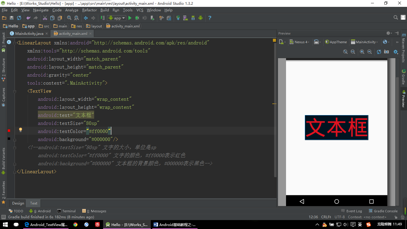
【TextView示例】
<LinearLayout xmlns:android="http://schemas.android.com/apk/res/android"
    xmlns:tools="http://schemas.android.com/tools"
    android:layout_width="match_parent"
    android:layout_height="match_parent"
    android:gravity="center"
    tools:context=".MainActivity">
    <TextView
        android:layout_width="wrap_content"
        android:layout_height="wrap_content"
        android:text="文本框"
        android:textSize="80sp"
        android:textColor="#ff0000"
        android:background="#000000"/>
    <!--android:textSize="80sp" 文字的大小,单位是sp
        android:textColor="#ff0000" 文字的颜色,#ff0000表示红色
        android:background="#000000" 文本框的背景颜色,#000000表示黑色-->
</LinearLayout>
TextView常用属性:
- android:textSize=”80sp” 设置文字的大小,单位是sp;
- android:textStyle=“bold” 设置字形为粗体,以及别的属性;
- android:textColor=”#ff0000” 设置文字的颜色,#ff0000表示红色;
- android:background=”#000000” 设置文本框的背景颜色,#000000表示黑色,当然背景不只是可以设置颜色,也可以设置为图片以及drawble的一些内容;
- android:ems=“5” 设置TextView的宽度为5个字符的宽度;
- android:lines=“5” 设置文本的行数为5行;
- android:singleLine=“true” 设置单行显示;
- android:lineSpacingExtra =“10dp”设置行间距为10dp;
- android:lineSpacingMultiplier =“1.2”设置行间距的倍数为1.2;
- android:gravity=“”设置文本位置,用法同布局中的用法;
- android:drawableLeft=“drawable的引用”在text的左边输出一个drawable,如图片等,类似用法还有drawableBottom,drawableTop,drawableRight。
其他属性请根据需要自行查找;
二、输入框 EditText
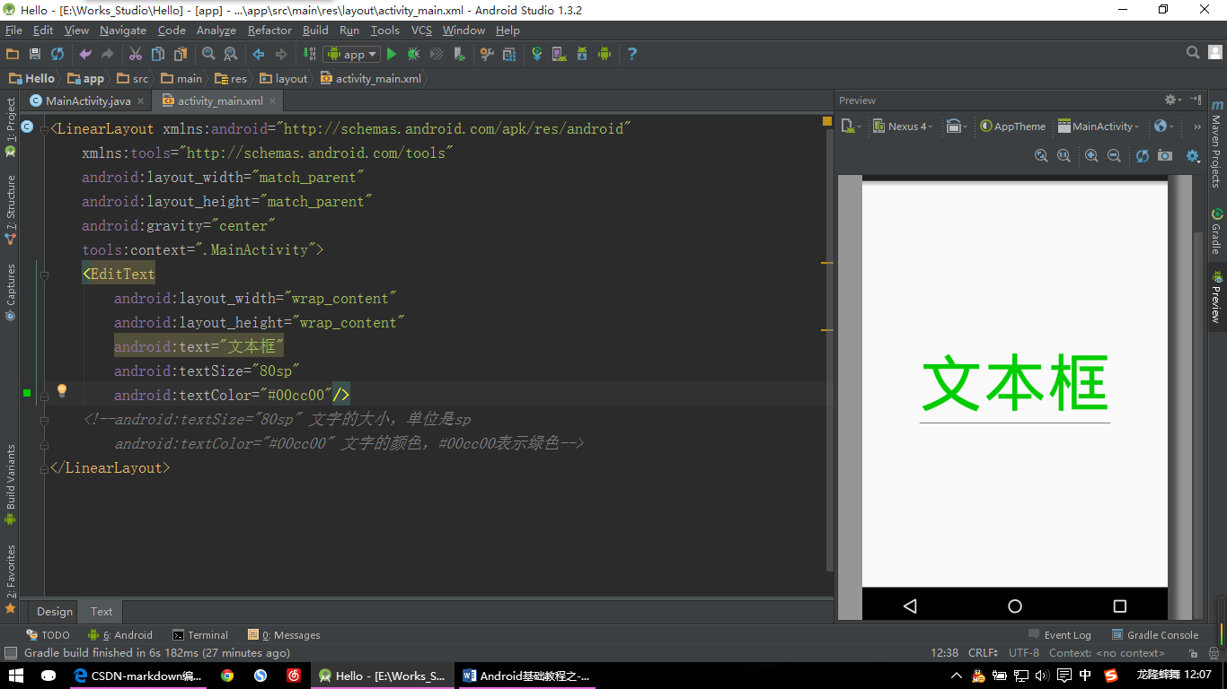
【EditText示例】
<LinearLayout xmlns:android="http://schemas.android.com/apk/res/android"
    xmlns:tools="http://schemas.android.com/tools"
    android:layout_width="match_parent"
    android:layout_height="match_parent"
    android:gravity="center"
    tools:context=".MainActivity">
    <EditText
        android:layout_width="wrap_content"
        android:layout_height="wrap_content"
        android:text="文本框"
        android:textSize="80sp"
        android:textColor="#00cc00"/>
    <!--android:textSize="80sp" 文字的大小,单位是sp
        android:textColor="#00cc00" 文字的颜色,#00cc00表示绿色-->
</LinearLayout>
EditText常用属性:
EditText继承自TextView,所以TextView的属性EditText大部分也可使用;
- android:hint=”提示信息!” 设置显示在控件上的提示信息,如果text里面没有文字,那么就会显hint里面的提示内容;
- android:password=“true”以密码的小点”.”格式显示文本;
- android:phoneNumber=“true”设置为电话号码的输入方式;
其他属性请根据需要自行查找;
三、图片 ImageView
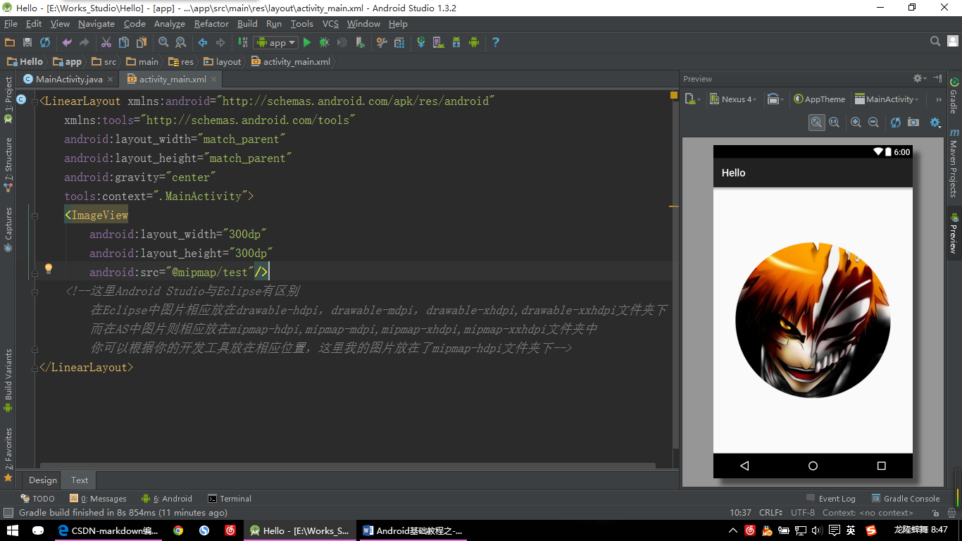
【ImageView示例:图片一】
ImageView这里Android Studio与Eclipse有一丢丢的区别:
在Eclipse中图片相应放在drawable-hdpi,drawable-mdpi,drawable-xhdpi,drawable-xxhdpi文件夹下;
而在AS中图片则相应放在mipmap-hdpi,mipmap-mdpi,mipmap-xhdpi,mipmap-xxhdpi文件夹中;
你可以根据你自己的开发工具选择相应的位置来放置图片,在AS中引用图片是@mipmap/图片名,在Eclipse中是@drawable/图片名;
<LinearLayout xmlns:android="http://schemas.android.com/apk/res/android"
    xmlns:tools="http://schemas.android.com/tools"
    android:layout_width="match_parent"
    android:layout_height="match_parent"
    android:gravity="center"
    tools:context=".MainActivity">
    <ImageView
        android:layout_width="350dp"
        android:layout_height="350dp"
        android:src="@mipmap/test"/>
    <!--这里Android Studio与Eclipse有区别
        在Eclipse中图片相应放在drawable-hdpi,drawable-mdpi,drawable-xhdpi,drawable-xxhdpi文件夹下
        而在AS中图片则相应放在mipmap-hdpi,mipmap-mdpi,mipmap-xhdpi,mipmap-xxhdpi文件夹中
        你可以根据你的开发工具放在相应位置,这里我的图片放在了mipmap-hdpi文件夹下-->
</LinearLayout>
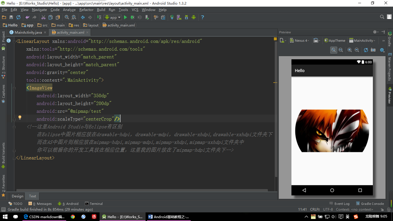
【ImageView示例:图片二】
上图为:修改ImageView的高度为200dp,然后设置android:scaleType=”centerCrop” 的效果;
修改的图片代码为:
<ImageView
        android:layout_width="350dp"
        android:layout_height="200dp"
        android:src="@mipmap/test"
        android:scaleType="centerCrop"/>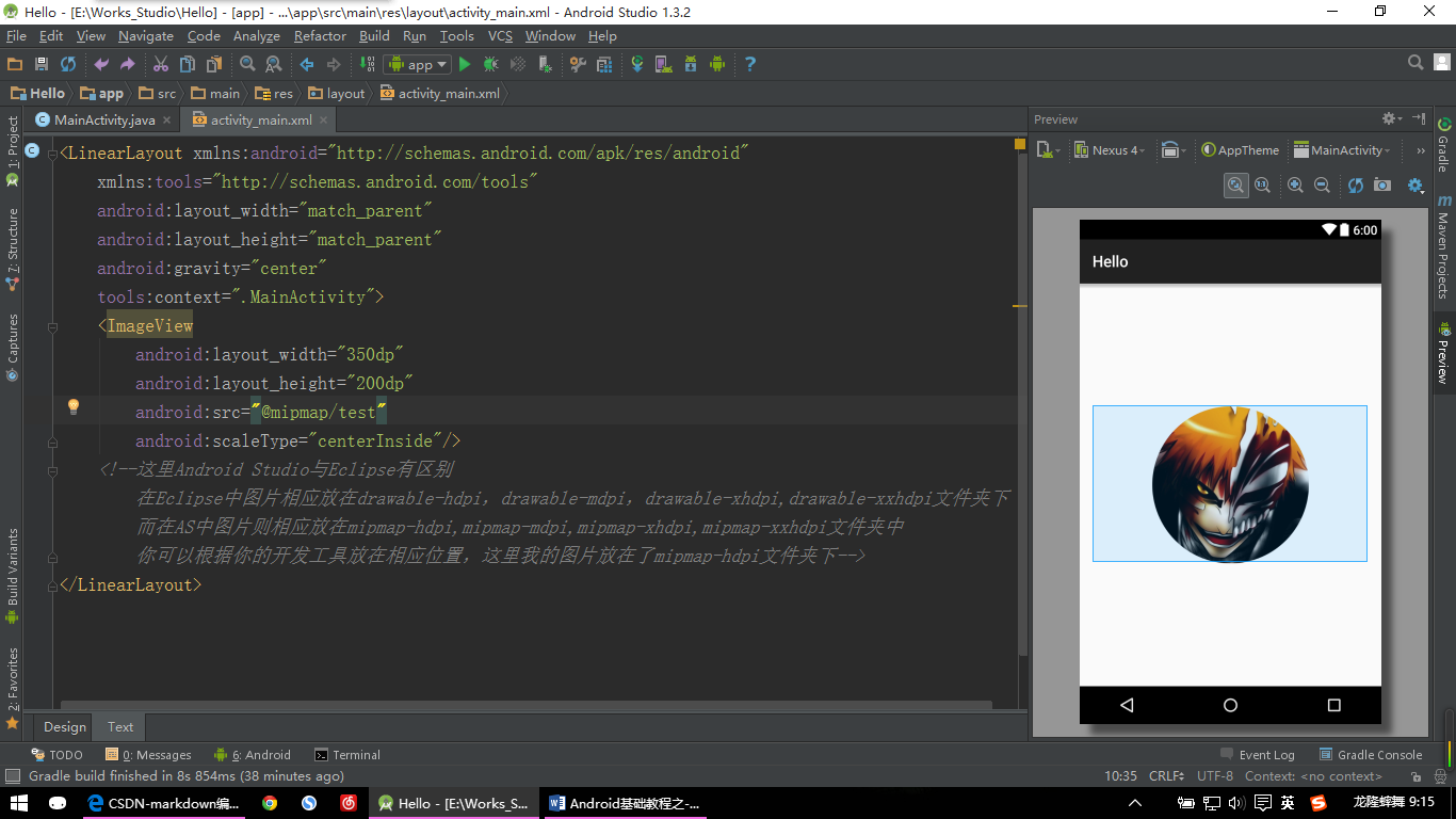
【ImageView示例:图片三】
上图为:在图片二的基础上设置android:scaleType=”centerInside” 的效果;
修改的图片代码为:
<ImageView
        android:layout_width="350dp"
        android:layout_height="200dp"
        android:src="@mipmap/test"
        android:scaleType="centerInside"/>
ImageView常用属性:
- android:src=”” 设置引用的图片(也可以是颜色等);
- android:scaleType=”center” (保持图像原始大小)设置图片大小为原始大小,如果图片大小大于ImageView控件,则截取图片中间部分,若小于,则直接将图片居中显示;
- android:scaleType=”centerCrop” (保持图像原始比例)设置将图片等比例缩放,缩放后截取中间部分进行显示,如上面ImageView章节中的第二章图片所示,可以看到与第一张图片的区别;
- android:scaleType=”centerInside”(保持图像原始比例)设置图片等比缩放,缩放后使得图片可以完整显示出来;
其他的一些属性会修改图片的长宽比例,本人实践中用的也不多,有需要的请自行查看相关资料;
四、按钮 Button
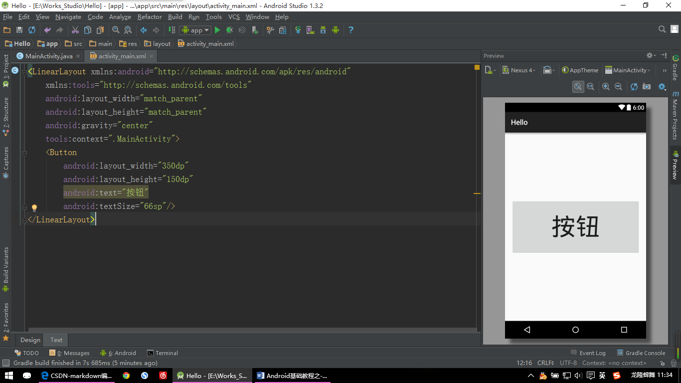
【Button示例:图片一】
<LinearLayout xmlns:android="http://schemas.android.com/apk/res/android"
    xmlns:tools="http://schemas.android.com/tools"
    android:layout_width="match_parent"
    android:layout_height="match_parent"
    android:gravity="center"
    tools:context=".MainActivity">
    <Button
        android:layout_width="350dp"
        android:layout_height="150dp"
        android:text="按钮"
        android:textSize="66sp"/>
</LinearLayout>
其实这里是最简单的系统自带的按钮效果,但是我们开发的时候并不会使用这么简单的效果,一般都会自定义一下这些按钮来使其更加的漂亮。
【Button示例:图片二】
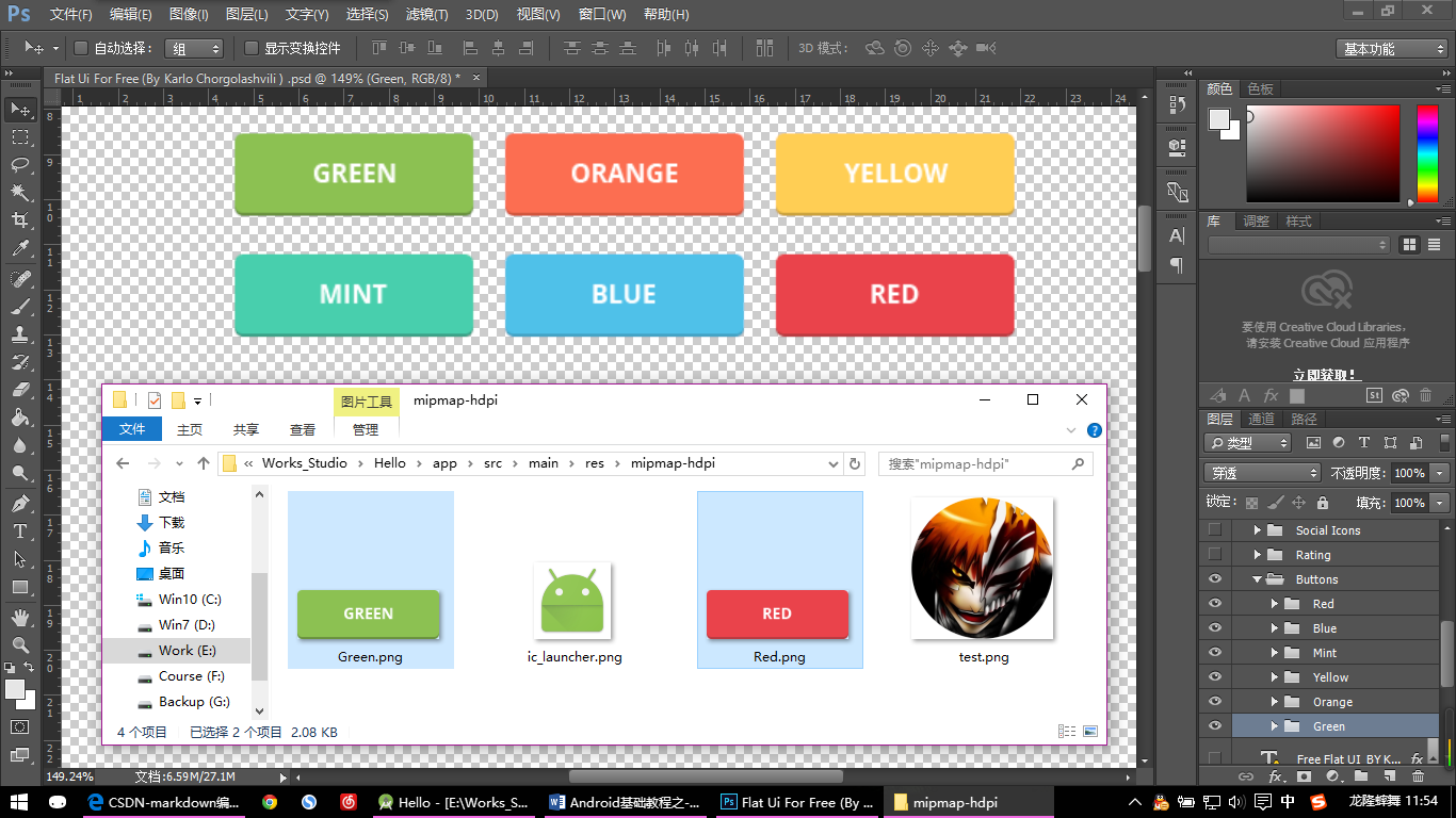
这里我用了素材中的Green按钮和Red按钮,并把它们放在了AS的mipmap-hdpi文件夹下,因为平常显示需要一种状态,点击后需要一种状态,所以准备了两张按钮的图片作演示。
但是注意,在AS中我按钮的图片是名字以首字母为大写开头的,这里并不会报错。但是在Eclipse中就会报错,所以为了部分使用Eclipse开发的读者,下文中我分别将红绿按钮重命名为了btn_green,btn_red。
下面进入自定义的正题:
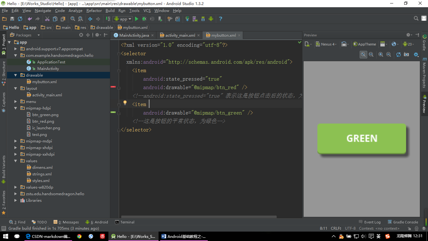
【Button示例:图片三】
首先需要在AS的drawable文件下建立一个mybutton.xml的文件。这个文件是一个Selector(选择器),Selector主要是用来改变ListView和Button控件的默认点击效果。使用Eclipse的读者可能并没有drawable文件夹,需要自己命名一个drawable文件夹,然后再里面新建选择器xml文件即可。
mybutton.xml代码如下:
<?xml version="1.0" encoding="utf-8"?>
<selector
  xmlns:android="http://schemas.android.com/apk/res/android">
    <item
        android:state_pressed="true"
        android:drawable="@mipmap/btn_red" />
    <!--android:state_pressed="true" 表示这是按钮点击后的状态,为绿色-->
    <item
        android:drawable="@mipmap/btn_green" />
    <!--这是按钮的平常状态,为绿色-->
</selector>
选择器设置好后,再回到原来的activity_main.xml界面,然后修改Button控件的代码,代码如下:
<LinearLayout xmlns:android="http://schemas.android.com/apk/res/android"
    xmlns:tools="http://schemas.android.com/tools"
    android:layout_width="match_parent"
    android:layout_height="match_parent"
    android:gravity="center"
    tools:context=".MainActivity">
    <Button
        android:layout_width="300dp"
        android:layout_height="100dp"
        android:background="@drawable/mybutton"/>
    <!--这里就要调用我们刚才自定义的按钮了,宽高也根据图片的宽高进行了调整-->
</LinearLayout>
接下来看看效果吧(这里需要运行来展示效果了,我用的模拟器为海马玩模拟器,你可以选择AS或者Eclipse自带的模拟器等,也可以选择我用的这款模拟器。因为海马玩模拟器比前面所说的模拟器要快很多):
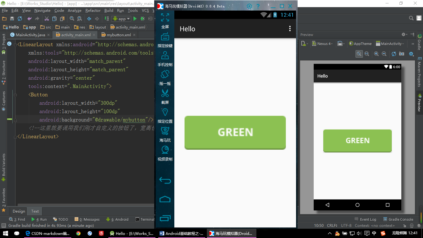
【Button示例:点击按钮前】
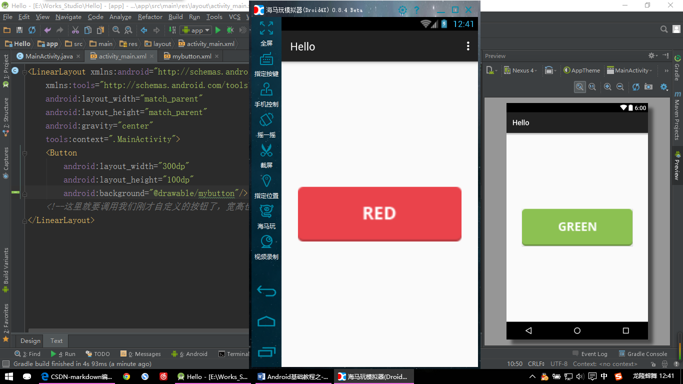
【Button示例:点击按钮后】
五、图片按钮 ImageButton
ImageButton继承于ImageView,而Button继承于TextView;
所以ImageView有的属性ImageButton可以使用,TextView有的属性Button也可以使用。
你可以在Button上用text属性写字,但是在ImageButton上就没有text属性,则不可以写字;
Button设置图片是用background。ImageButton设置图片是用src,但其也有background属性。
六、单选按钮 RadioButton
就是只能选择一个按钮的情况,比如常见的性别选择,只能选择男要不就是女。
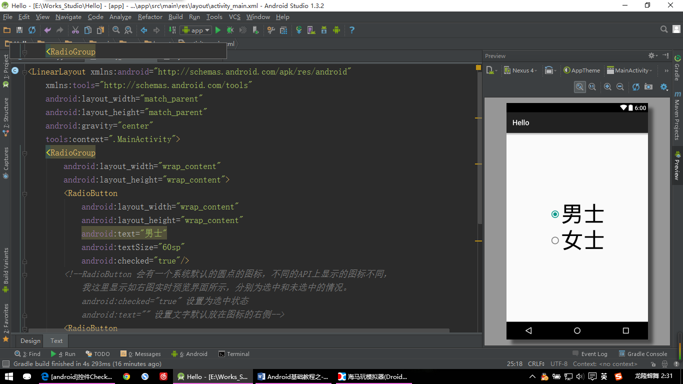
【RadioButton示例:图片一】
<LinearLayout xmlns:android="http://schemas.android.com/apk/res/android"
    xmlns:tools="http://schemas.android.com/tools"
    android:layout_width="match_parent"
    android:layout_height="match_parent"
    android:gravity="center"
    tools:context=".MainActivity">
    <RadioGroup
        android:layout_width="wrap_content"
        android:layout_height="wrap_content">
        <RadioButton
            android:layout_width="wrap_content"
            android:layout_height="wrap_content"
            android:text="男士"
            android:textSize="60sp"
            android:checked="true"/>
        <!--RadioButton 会有一个系统默认的圆点的图标,不同的API上显示的图标不同,
            我这里显示如右图实时预览界面所示,分别为选中和未选中的情况。
            android:checked="true" 设置为选中状态
            android:text="" 设置文字默认放在图标的右侧-->
        <RadioButton
            android:layout_width="wrap_content"
            android:layout_height="wrap_content"
            android:text="女士"
            android:textSize="60sp" />
    </RadioGroup>
    <!--RadioGroup 是盛放 多个RadioButton的容器,在这个容器中的RadioButton互斥
        即在该容器中只能选择一个按钮选项,比如在选择性别时只能选择男士或女士一个选项-->
</LinearLayout>
这里呢我们实际开发的时候有时也是需要自定义的,跟按钮的自定义类似,也需要一个选择器,同样在drawable文件夹下建立个myradiobutton.xml文件,同时也要准备单选框的选中时和未选中时的两张图片放到mipmap-hdpi文件夹下。
myradiobutton.xml代码如下:
<?xml version="1.0" encoding="utf-8"?>
<selector
  xmlns:android="http://schemas.android.com/apk/res/android">
    <item
        android:state_checked="true"
        android:drawable="@mipmap/radiobutton_select" />
    <!--android:state_checked="true" 这是单选按钮被选中的状态-->
    <item
        android:state_checked="false"
        android:drawable="@mipmap/radiobutton_noselect" />
    <!--android:state_checked="false"这是单选按钮未被选中的状态-->
</selector>
然后给原来的RadioButton添加属性:
android:button="@drawable/myradiobutton"这样就自定义完毕了,看看效果吧:
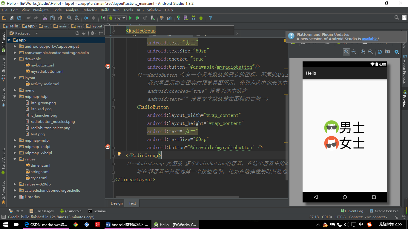
【RadioButton示例:图片二】
七、复选框 CheckBox
这个就是可以选择多个的按钮了,比如选择个人爱好等,可以同时选择多个爱好。
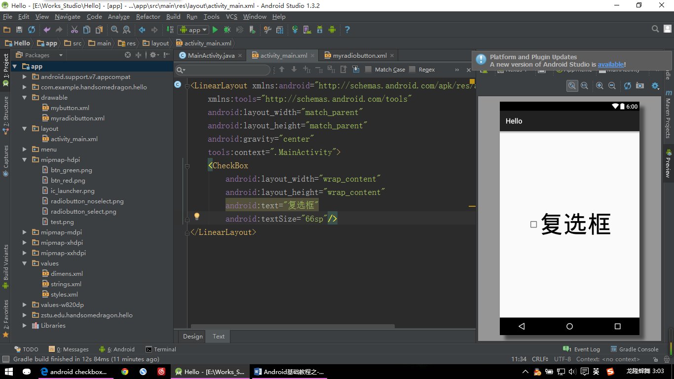
【CheckBox示例:图片一】
<LinearLayout xmlns:android="http://schemas.android.com/apk/res/android"
    xmlns:tools="http://schemas.android.com/tools"
    android:layout_width="match_parent"
    android:layout_height="match_parent"
    android:gravity="center"
    tools:context=".MainActivity">
    <CheckBox
        android:layout_width="wrap_content"
        android:layout_height="wrap_content"
        android:text="复选框"
        android:textSize="66sp"/>
</LinearLayout>
Checkbox的自定义同上面的RadioButton一样,这里我们直接拿上面写好的选择器文件myradiobutton.xm文件来用,在Checkbox中添加代码:
android:button="@drawable/myradiobutton"好了,看效果吧:
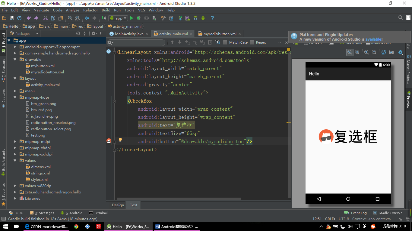
【CheckBox示例:图片二】
八、进度条 ProgressBar
进度条一般有两大种:一种横的,一种圆形的,这里我们主要说一下横的进度条。
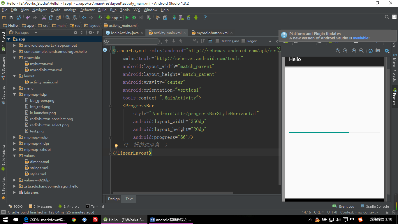
【ProgressBar示例:图片一】
<LinearLayout xmlns:android="http://schemas.android.com/apk/res/android"
    xmlns:tools="http://schemas.android.com/tools"
    android:layout_width="match_parent"
    android:layout_height="match_parent"
    android:gravity="center"
    android:orientation="vertical"
    tools:context=".MainActivity">
    <ProgressBar
        style="?android:attr/progressBarStyleHorizontal"
        android:layout_width="350dp"
        android:layout_height="20dp"
        android:progress="66"/>
    <!--横的进度条-->
</LinearLayout>
style=”?android:attr/progressBarStyleHorizontal” 就是系统自带的这种横的进度条样式,视API版本的不同其美观程度也不同。我这个版本的样子看起来还是不错的。那要是低版本的进度条不美观怎么办呢?下面我们就来简单自定义一下进度条:
同样需要在drawable文件夹下建立一个名为myprogressbar.xml文件,代码如下:
<?xml version="1.0" encoding="UTF-8"?>
<layer-list xmlns:android="http://schemas.android.com/apk/res/android">
    <item android:id="@android:id/background">
        <shape>
            <corners android:radius="8.0dip" />
            <solid android:color="#ABE600"/>
        </shape>
    </item>
    <!--定义进度条的背景,这里定义为:
    颜色#ABE600 青色
    形状的圆角半径为8.0dip,当然0dip就是没有圆角了-->
    <item android:id="@android:id/progress">
        <clip>
            <shape>
                <corners android:radius="8.0dip" />
                <solid android:color="#00CD02"/>
            </shape>
        </clip>
    </item>
    <!--定义进度条的进度背景,这里定义为:
    颜色#00CD02 绿色
    形状的圆角半径为8.0dip,当然要与之前的圆角设置一样-->
</layer-list>
然后在前面的ProgressBar中添加一条属性:
android:progressDrawable="@drawable/myprogressbar"好了大功告成,欣赏下简单的成果吧:
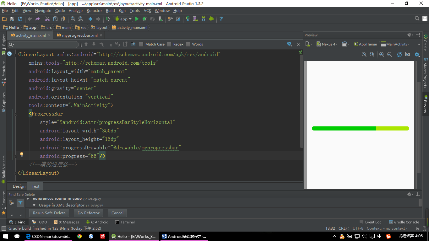
【ProgressBar示例:图片二】
九、拖动条 SeekBar
拖动条,可以用于实现音量的调节,视频播放的进度显示等。
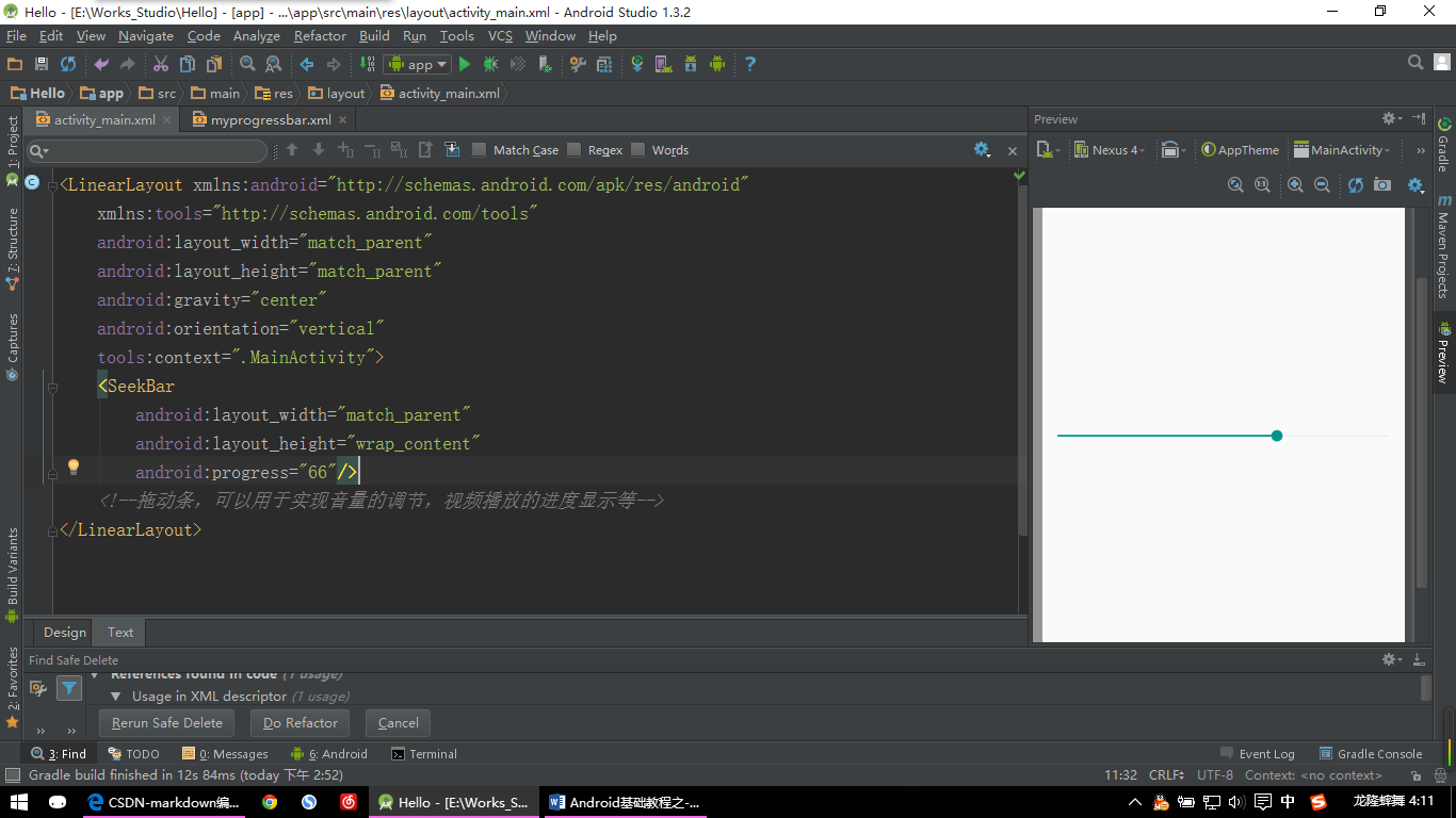
【SeekBar示例:图片一】
<LinearLayout xmlns:android="http://schemas.android.com/apk/res/android"
    xmlns:tools="http://schemas.android.com/tools"
    android:layout_width="match_parent"
    android:layout_height="match_parent"
    android:gravity="center"
    android:orientation="vertical"
    tools:context=".MainActivity">
    <SeekBar
        android:layout_width="match_parent"
        android:layout_height="wrap_content"
        android:progress="66"/>
    <!--拖动条,可以用于实现音量的调节,视频播放的进度显示等-->
</LinearLayout>
好的,马上开始自定义:
其实SeekBar比ProgressBar多了一个按钮,可以用来拖动,其他的基本是一样的,我们可以直接拿ProgressBar自定义的myprogressbar.xml文件简单修改下即可。然后其实要定义的就那个按钮了,说到按钮是不是我们之前讲过按钮的自定义呢。对的,跟我们之前做的按钮自定义是一样的。这里我只找了一张按钮的图片,没有区别平常状态和按下的状态了。诸位需要的话可以自行制作。
贴上自定义的拖动条的代码:
myseekbar.xml:
<?xml version="1.0" encoding="UTF-8"?>
<layer-list xmlns:android="http://schemas.android.com/apk/res/android">
    <item android:id="@android:id/background"
        android:height="8dp"
        android:gravity="center_vertical">
        <shape>
            <corners android:radius="8.0dip" />
            <solid android:color="#EEEEEE"/>
        </shape>
    </item>
    <!--在Item中我们定义了这个拖动条的高度,然后这个条还要居中显示
        因为如果不这样设的话拖动条的高度会和按钮的高度一样高,这样就很难看了
        读者可以尝试去掉
        android:height="8dp"
        android:gravity="center_vertical"
        这两句代码看看什么效果,做下对比-->
    <item android:id="@android:id/progress"
        android:height="8dp"
        android:gravity="center_vertical">
        <clip>
            <shape>
                <corners android:radius="8.0dip" />
                <solid android:color="#2EA6FF"/>
            </shape>
        </clip>
    </item>
    <!--这里也要相应的设置
        android:height="8dp"
        android:gravity="center_vertical"-->
</layer-list>
myseekbar_button.xml:
<?xml version="1.0" encoding="utf-8"?>
<selector
  xmlns:android="http://schemas.android.com/apk/res/android">
    <item
        android:state_pressed="true"
        android:drawable="@mipmap/seekbar_button" />
    <!--android:state_pressed="true" 表示这是按钮点击后的状态-->
    <item
        android:drawable="@mipmap/seekbar_button" />
    <!--这是按钮的平常状态-->
</selector>
接下来给SeekBar添加属性:
android:progressDrawable="@drawable/myseekbar"
android:thumb="@drawable/myseekbar_button"
搞定,看效果喽:
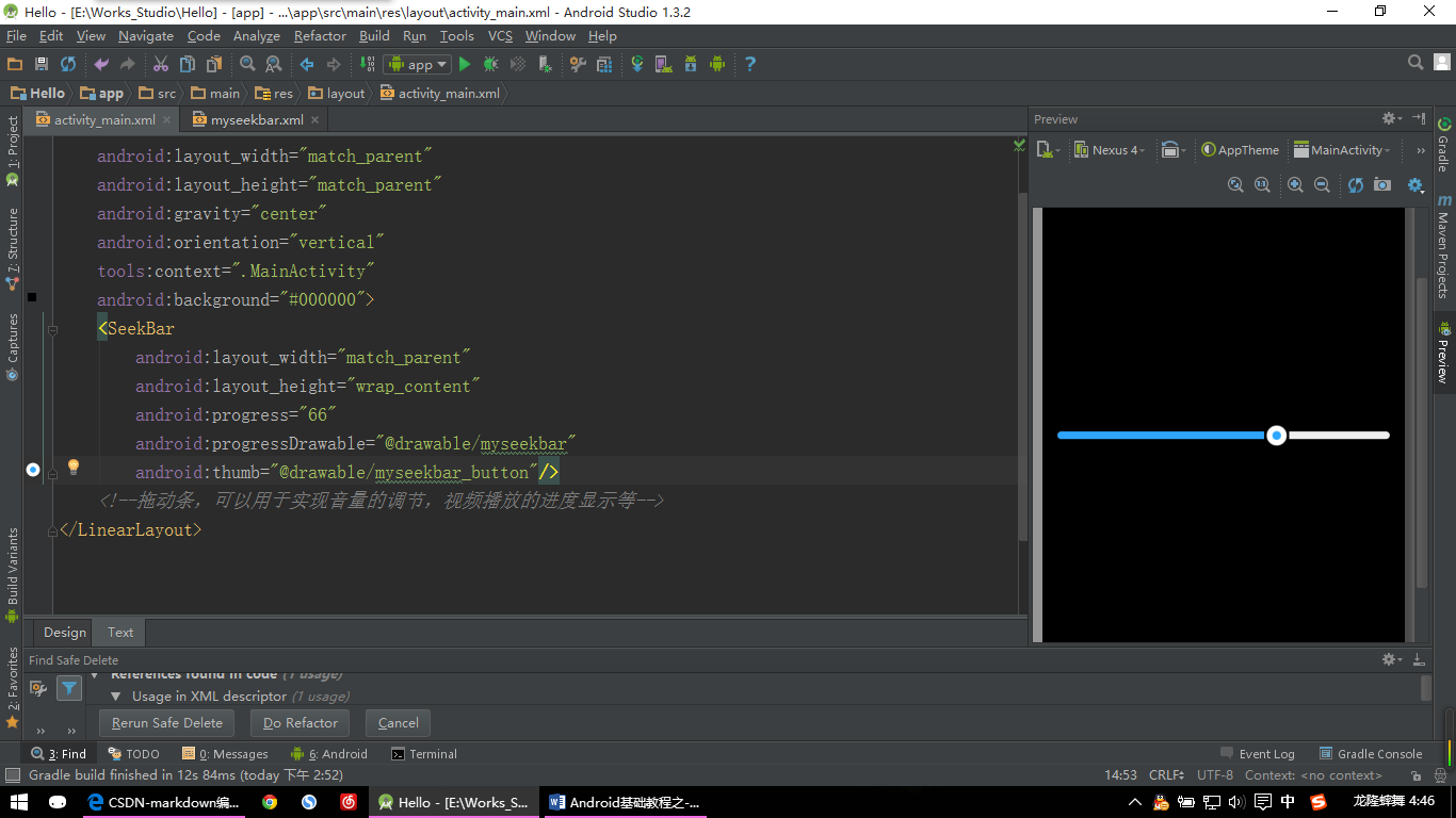
【SeekBar示例:图片二】
对了,为了使效果更直观我给最外面的LinearLayout背景设为黑色了,至于怎么设置我就不说了吧。


 扫一扫
扫一扫
 327
327

 被折叠的 条评论
为什么被折叠?
被折叠的 条评论
为什么被折叠?
 到【灌水乐园】发言


