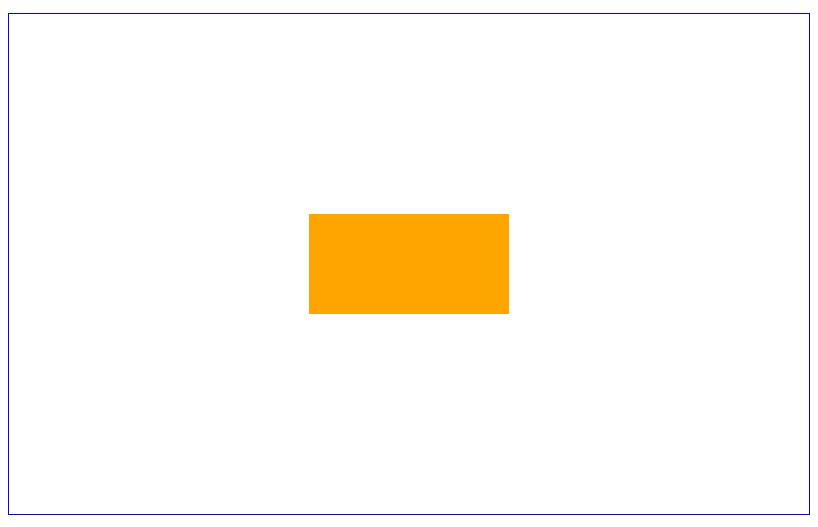
块级元素 水平垂直居中
<div class="wrap">
    <div class="box">fdsa</div>
</div>
1.方法一
.wrap {
    width: 800px;
    height: 500px;
    border: 1px solid blue;
    position: relative;
}

.box {
    width: 200px;
    height: 100px;
    background: orange;
    position: absolute;
    top: 50%;
    left: 50%;
    margin-top: -50px;
    margin-left: -100px;
}
2.方法二
.wrap {
    width: 800px;
    height: 500px;
    border: 1px solid blue;
}

.box {
    width: 200px;
    height: 100px;
    background: orange;
    margin: 200px auto;
}
3.方法三
.wrap {
    width: 800px;
    height: 500px;
    border: 1px solid blue;
    position: relative;
}

.box {
    width: 200px;
    height: 100px;
    background: orange;
    position: absolute;
    top: 50%;
    left: 50%;
    -webkit-transform: translate(-50%,-50%);
}
4.方法四
.wrap {
    width: 800px;
    height: 500px;
    border: 1px solid blue;
    display: flex;
    align-items: center;
}

.box {
    width: 200px;
    height: 100px;
    background: orange;
    margin: 0 auto;
}
5.方法五
.wrap {
    width: 800px;
    height: 500px;
    border: 1px solid blue;
    display: -webkit-box;
    -webkit-box-pack: center;
    -webkit-box-align: center;
}

.box {
    width: 200px;
    height: 100px;
    background: orange;
}
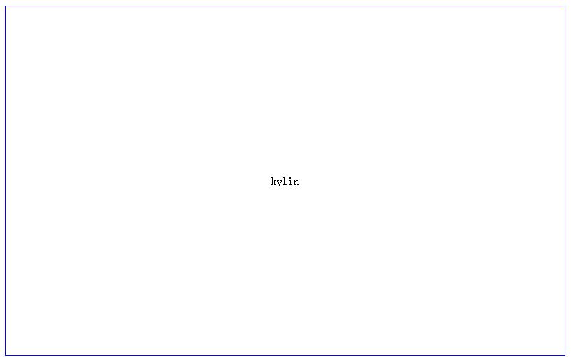
行内元素 水平垂直居中
<div class="wrap">
    kylin
</div>
1.方法一
.wrap {
    width: 800px;
    height: 500px;
    border: 1px solid blue;
    display: table-cell;
    vertical-align: middle;
    text-align: center;
}
2.方法二
.wrap {
    width: 800px;
    height: 500px;
    border: 1px solid blue;
    line-height: 500px;
    text-align: center;
}
3.方法三
.wrap {
    width: 800px;
    height: 500px;
    border: 1px solid blue;
    display: -webkit-box;
    -webkit-box-pack: center;
    -webkit-box-align: center;
}


 扫一扫
扫一扫
 306
306

 被折叠的 条评论
为什么被折叠?
被折叠的 条评论
为什么被折叠?
 到【灌水乐园】发言


