


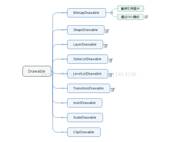
Drawable有很多种,它们都表示一种图像的概念,但是它们又不全是图片,通过颜色也可以构造出各式各样的图像的效果。在实际开发中,Drawable常被用来作为View的背景使用。Drawable一般都是通过XML来定义的,当然我们也可以通过代码来创建具体的Drawable对象,只是用代码创建会稍显复杂。在Android的设计中,Drawable是一个抽象类,它是所有Drawable对象的基类,每个具体的Drawable都是它的子类,比如ShapeDrawable、BitmapDrawable等。
<?xml version="1.0" encoding="utf-8"?>
<bitmap xmlns:android="http://schemas.android.com/apk/res/android"
android:src="@drawable/ic_launcher"
android:antialias="true|false"
android:dither="true"
android:filter="true"
android:gravity="bottom"
android:tileMode="disabled"
>
</bitmap>
下面对各属性分析:
src: 图片的资源ID
antialias: 是否开启图片的抗锯齿功能。开启后会让图片变得平滑,同时也会在一定程度上降低图片的清晰度,但是这个降低的幅度较低以至于可以忽略,因此抗锯齿功能应该开启。
dither: 是否开启抖动效果,该功能最好开启。
filter: 是否开启过滤效果。当图片尺寸被拉伸或者压缩时,开启过滤效果可以保持较好的显示效果,因此此项也应该开启。
gravity: 当图片小于容器的尺寸时,设置此选项可以对图片进行定位。这个属性的可选项比较多,不同的选项可以通过“|”来组合使用,
gravity属性的可选项
tileMode: 平铺模式。有如下四个值:disable表示关闭平铺模式,这也是默认值,当开启平铺模式后,gravity属性会被忽略。repeat表示最简单的在竖直和水平方向平铺效果。mirror表示在水平和竖直方向上的镜像投影效果。clamp表示图片的四周的像素会扩展到周围区域。
二、ShapeDrawable
<?xml version="1.0" encoding="utf-8"?>
<shape
xmlns:android="http://schemas.android.com/apk/res/android"
android:shape=["rectangle" | "oval" | "line" | "ring"] >
<corners
android:radius="integer"
android:topLeftRadius="integer"
android:topRightRadius="integer"
android:bottomLeftRadius="integer"
android:bottomRightRadius="integer" />
<gradient
android:angle="integer"
android:centerX="integer"
android:centerY="integer"
android:centerColor="color"
android:endColor="color"
android:gradientRadius="integer"
android:startColor="color"
android:type=["linear" | "radial" | "sweep"]
android:usesLevel=["true" | "false"] />
<padding
android:left="integer"
android:top="integer"
android:right="integer"
android:bottom="integer" />
<size
android:width="integer"
android:height="integer" />
<solid
android:color="color" />
<stroke
android:width="integer"
android:color="color"
android:dashWidth="integer"
android:dashGap="integer" />
</shape>
ShapeDrawable 是一种很常见的Drawable,可以理解为通过颜色来构造的图形,它既可以是纯色的图形,也可以是具有渐变效果的图形。
android:shape 表示图形的形状,有四个选项:rectangle(矩形)、oval(椭圆)、line(横线)和ring(圆环)。默认值是矩形,另外line和ring这两个选项必须要通过<stroke>标签来指定线的宽度和颜色等信息,否则将无法达到预期的显示效果。
<corners>
表示 shape的四个角的角度。它只适用于矩形 shape,这里的角度是指圆角的程度,用 px来表示,它有5个属性:
android:radius="integer" 为四个角同时设定相同的角度,优先级较低,会被其他四个属性覆盖;
android:topLeftRadius="integer" 设定左上角的角度
android:topRightRadius="integer" 设定右上角的角度
android:bottomLeftRadius="integer" 设定左下角的角度
android:bottomRightRadius="integer" 设定右下角的角度
<gradient>
它与<solid>标签是互相排斥的,其中 solid表示纯色填充,而 gradinet则表示渐变效果, gradinet有如下几个属性:
android:angle="integer"——渐变的角度,默认为0,其值必须为45的倍数,0表示从左到右,90表示从下到上,具体的效果需要自行体验,总之角度会影响渐变的方向;
android:centerX="integer"——渐变的中心点的横坐标;
android:centerY="integer"——渐变的中心点的纵坐标,渐变中心点会影响渐变的具体效果;
android:startColor="color"——渐变的起始色
android:centerColor="color"——渐变的中间色
android:endColor="color"——渐变的结束色
android:gradientRadius="integer"——渐变半径,仅当android:type="radial"是有效
android:type=["linear" | "radial" | "sweep"]——渐变的类型,linear(线性渐变)、radial(径向渐变)、sweep(扫描线渐变),默认为线性渐变
android:usesLevel=["true" | "false"]——一般为false,当Drawable作为StateListDrawable使用时为true;
<solid> 这个标签标示纯色填充,通过android:color即可指定shape中填充颜色。
<stroke> Shape的描边,有如下属性:
android:width="integer"——描边的宽度,越大则shape 的边缘线就会看起来越粗;
android:color="color"——描边的颜色;
android:dashWidth="integer"——组成虚线的线段的宽度;
android:dashGap="integer"——组成虚线的线段之间的间隔,间隔越大则看起来空隙就越大。
注意:android:dashWidth和android:dashGap任何一个值为0,虚线效果就不会有。
<padding> 这个表示空白,但是它表示的不是 shape的空白,而是包含它的VIew的空白。
<size> Shape的大小。
三、LayerDrawable
一个 layer-list中可以包含多个 item,每个 item表示一个 Drawable。
四、StateListDrawable
StateListDrawable 对应于<selector>标签,它也是表示Drawable集合,每个Drawable都对应着View的一种状态,这样系统就会根据View 的状态选择合适的Drawable。StateListDrawable主要用于设置可单击的View背景,最常见的是Button。
语法如下:
<?xml version="1.0" encoding="utf-8"?>
<selector xmlns:android="http://schemas.android.com/apk/res/android"
android:constantSize=["true" | "false"]
android:dither=["true" | "false"]
android:variablePadding=["true" | "false"] >
<item
android:drawable="@[package:]drawable/drawable_resource"
android:state_pressed=["true" | "false"]
android:state_focused=["true" | "false"]
android:state_hovered=["true" | "false"]
android:state_selected=["true" | "false"]
android:state_checkable=["true" | "false"]
android:state_checked=["true" | "false"]
android:state_enabled=["true" | "false"]
android:state_activated=["true" | "false"]
android:state_window_focused=["true" | "false"] />
</selector>
元素:
<selector>:必须的,必须最为根元素,包含一个或多个<item>元素
属性:
xmlns:android
字符串。 必须的。定义命名空间,必须是 "http://schemas.android.com/apk/res/android"。
android:constantSize
布尔值。内部大小(所有状态中最大的那个)改变时是否报道。默认为false
android:dither
布尔值。如果位图与屏幕的像素配置不同时,是否允许抖动.(例如:一个位图的像素设置是 ARGB 8888,但屏幕的设置是RGB 565)
android:variablePadding
布尔值。默认为false,是否要进行绘图填充。(不明白)
<item>
为某个状态定义一个drawable,必须作为<selector>的子元素。
属性:
android:drawable
必须的,指向一个drawable资源
android:state_pressed
Boolean。是否按下
android:state_focused
Boolean。是否获得获得焦点
android:state_hovered
Boolean。鼠标在上面滑动的状态。通常和state_focused使用同样的drawable
api14后新增的
android:state_selected
Boolean。是否选中
android:state_checkable
Boolean。是否可以被勾选(checkable)。只能用在可以勾选的控件上
android:state_checked
Boolean。是否被勾选上
android:state_enabled
Boolean。是否可用
android:state_activated
Boolean。是否被激活并持久的选择
api11后新增
android:state_window_focused
Boolean。当前应用程序是否获得焦点
注意:Android系统将会选中第一条符合当前状态的item。。因此,如果第一项列表中包含了所有的状态属性,那么它是每次就只用他。这就是为什么你的默认值应该放在最后面。
五、LevelListDrawable
LevelListDrawable 对应于<level-list>标签,它表示一个Drawable集合,集合中的每个Drawable都有一个等级(level)的概念。根据不同的等级,LevelListDrawable
会切换为对应的Drawable,语法如下:
语法:
<?xml version="1.0" encoding="utf-8"?>
<level-list
xmlns:android="http://schemas.android.com/apk/res/android" >
<item
android:drawable="@drawable/drawable_resource"
android:maxLevel="integer"
android:minLevel="integer" />
</level-list>
当应用于一个View的背景时,可以使用setLevel()方法来设置不同的等级从而切换具体的Drawable。如果它被用来作为ImageView的前景色,还可以用setImageLevel()方法来改变level。等级范围为0~10000,最小等级为0,这也是默认值,最大等级是10000。


 扫一扫
扫一扫
 3601
3601

 被折叠的 条评论
为什么被折叠?
被折叠的 条评论
为什么被折叠?
 到【灌水乐园】发言


