


在最近的一个项目中,使用到了一个显示完成进度的控件。刚开始是想随便找一个第三方的实现就成了。在github上找了一会儿,都不是我合意的。不是这些项目不够好,只是我只需要一个控件,却要集成一大堆东西。想了想还是自己动手实现一个吧。趁着现在有空,分享给大家。
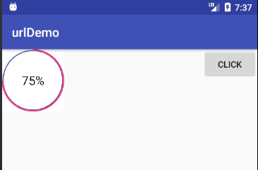
先贴一张图:
实现的步骤:
1. 继承View 重写相关构造方法。
2. 实现 onMeasure()方法。注意wrap_content问题
3. 实现 onDraw()方法。绘制需要的图形和文字。
4.实现动画效果。
5.自定义属性。
6.提供给外部使用的方法。
1. 继承View 重写相关构造方法
继承View 重写三个构造参数:
    public PercentCircle(Context context) {
        this(context, null);
    }
    public PercentCircle(Context context, AttributeSet attrs) {
        this(context, attrs, 0);
    }
    public PercentCircle(Context context, AttributeSet attrs, int defStyleAttr) {
        super(context, attrs, defStyleAttr);
        init(context, attrs);
    }
我们在含有三个参数的构造方法中做初始化。初始化三个Paint(画笔),分别对应的是圆圈Paint,弧线Paint和字体Paint。
paint = new Paint();
        paint.setColor(circleColor);
        paint.setStrokeWidth(cirStrokeWidth);
        paint.setAntiAlias(false);
        paint.setStyle(Paint.Style.STROKE);

        arcPaint = new Paint();
        arcPaint.setColor(percentColor);
        arcPaint.setStrokeWidth(perStrokeWidth);
        arcPaint.setAntiAlias(false);
        arcPaint.setStyle(Paint.Style.STROKE);

        textPaint = new Paint();
        textPaint.setColor(textColor);
        textPaint.setTextSize(perTextSize);
        textPaint.setStyle(Paint.Style.FILL);
        textPaint.setAntiAlias(false);
        textPaint.setTextAlign(Paint.Align.CENTER);
2. 实现 onMeasure()方法
这个方法是为了测量一个控件的宽度和高度。关系到这个控件宽高的因素有,父布局的MeasureSpec和自身的LayoutParams。
想了解相关支持的同学请点击 这里 。在这个方法中我们需要处理的是,当控件设置为wrap_content情况。在未处理的情况下会出现:不管控件的width 和 height 为 wrap_content 还是 match_parent 显示都是一样的。
解决的方法:当检测到width 或 height 为wrap_content 时,给它一个默认的值。
@Override
    protected void onMeasure(int widthMeasureSpec, int heightMeasureSpec) {

        int widthMode = MeasureSpec.getMode(widthMeasureSpec);
        int widthSize = MeasureSpec.getSize(widthMeasureSpec);
        int heightMode = MeasureSpec.getMode(heightMeasureSpec);
        int heightSize = MeasureSpec.getSize(heightMeasureSpec);

        if (widthMode == MeasureSpec.AT_MOST) {
            widthSize = mWidthDefault;
        }

        if (heightMode == MeasureSpec.AT_MOST) {
            heightSize = mHeightDefault;

        }
        setMeasuredDimension(widthSize, heightSize);
    }
分别获取父类期待子view的模式和长度。判断width 或 height的模式为 MeasureSpec.AT_MOST 时给它一个默认值,否则就用父类期待子view的长度。最后测量子view 的宽高。
3. 实现 onDraw()方法
根据需求我们需要绘制一个圆形,弧线和在控件的中间绘制文字。
@Override
    protected void onDraw(Canvas canvas) {
        super.onDraw(canvas);
        canvas.drawColor(Color.WHITE);
        int widthMeasure = getMeasuredWidth();
        int heightMeasure = getMeasuredHeight();
        int halfWidth = widthMeasure / 2;
        int halfHeight = heightMeasure / 2;
        canvas.drawCircle(halfWidth, halfHeight, Math.max(widthMeasure, heightMeasure) / 2 - 5, paint);

        rectF.left = 2;
        rectF.top = 2;
        rectF.right = widthMeasure - 2;
        rectF.bottom = heightMeasure - 2;
        Log.e("tag_angle", sweepAngle + "");
        canvas.drawArc(rectF, START_ANGLE, sweepAngle, false, arcPaint);


        Paint.FontMetrics fontMetrics = textPaint.getFontMetrics();
        float top = fontMetrics.top;//为基线到字体上边框的距离,即上图中的top
        float bottom = fontMetrics.bottom;//为基线到字体下边框的距离,即上图中的bottom

        int baseLineY = (int) (rectF.centerY() - top / 2 - bottom / 2);//基线中间点的y轴计算公式
        canvas.drawText(readPercent + "%", rectF.centerX(), baseLineY, textPaint);
    }
绘制圆形:3.1 获取 view 测量的宽和高。宽和高分别除以2,所得之数为圆心坐标。3.2 width 和 height比较 ,最小那个除以2 减去 5 所得之数为圆的半径。减去五是我想让画出的圆往内收一点。 canvas.drawCircle()方法绘制圆形。
绘制弧线:3.3 设置RectF 。左,上 都为2 ;右,下 都减去2 也是为了弧线往内收一点。canvas.drawArc()中,我们设置开始角度是 -90°,然后设置扫过的角度。
绘制文字:
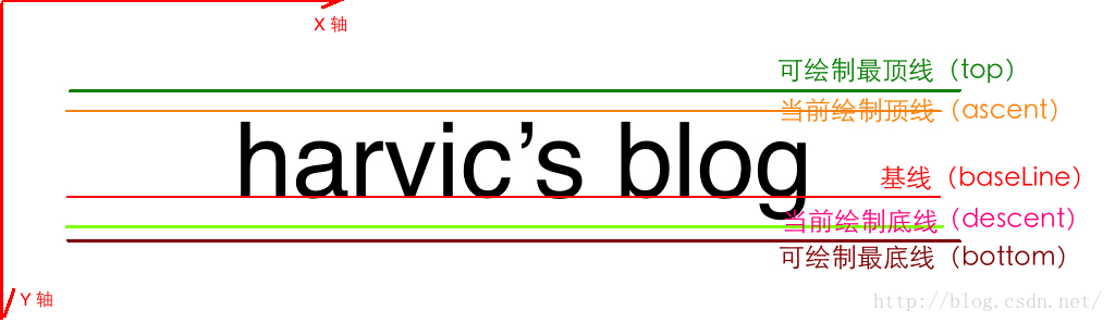
根据Paint画笔,获取top和bottom值。用RectF的高减去top的一半和bottom的一半就是基线的位置。
想要了解这方面知识的同学请点击 这里
4.实现动画效果。
private void anim(final int percents) {
        new Thread(new Runnable() {
            @Override
            public void run() {
                int startPoi = 1;
                while (!isStop) {
                    if (startPoi >= percents) {
                        isStop = true;
                        startPoi = 1;
                    } else {
                        isStop = false;
                        startPoi++;
                        try {
                            Thread.sleep(10);
                        } catch (InterruptedException e) {
                            e.printStackTrace();
                        }
                        readPercent = (int) (startPoi / 3.6);
                        sweepAngle = startPoi;
                    }
                    postInvalidate();
                }

            }
        }).start();
    }
通常自定义控件需要动画的时候有三种方式:属性动画,布局改变方式,还有就是线程循环。
5.自定义属性。
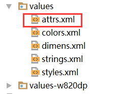
5.1 创建attrs.xml 文件
5.2 自定义属性名称
<?xml version="1.0" encoding="utf-8"?>
<resources>
    <declare-styleable name="PercentCircle">
        <attr name="circle_color" format="color"/>
        <attr name="percent_color" format="color"/>
        <attr name="text_color" format="color"/>
        <attr name="cir_stroke_width"  format="dimension"/>
        <attr name="per_stroke_width"  format="dimension"/>
        <attr name="text_size" format="dimension"/>
        <attr name="sweep_percent" format="integer"/>
    </declare-styleable>
</resources>
format 是确定属性的类型: 大家可以参考这里
5.3 在xml中使用自定义属性
使用Android studio 后,使用自定义属性就很方便了,只要输入自定义的属性名,系统就会自动设置命名空间了。
<LinearLayout
        android:layout_width="100dp"
        android:layout_height="100dp"
        android:orientation="vertical">
        <com.example.user.urldemo.PercentCircle
            android:id="@+id/percent"
            android:layout_width="match_parent"
            android:layout_height="match_parent"
            app:circle_color="#dddddd"
            app:percent_color="@color/colorAccent"
            app:text_color="@android:color/background_dark"
            app:cir_stroke_width="4px"
            app:per_stroke_width="6px"
            app:text_size="20sp"
            app:sweep_percent="50" />
    </LinearLayout>
5.4 在自定义控件中使用 自定义属性

使用 构造方法中的参数AttributeSet ,和TypedArray类获取属性。注意我图片中画红圈的地方,相比于自定义属性的名字就多出了“PercentCircle”,这个字符串是系统自动拼接上去的。是自定义属性时declare-styleable的名称。
还有一个需要注意的是:使用完TypedArray 后,及时回收。
6.提供外部使用的方法
/*
    设置圆圈颜色
     */
    public PercentCircle setCircleColor(int circleColor) {
        this.circleColor = circleColor;
        return this;
    }

    /*
    设置弧线颜色
    */
    public PercentCircle setPercentColor(int perColor) {
        this.percentColor = perColor;
        return this;
    }

    /*
    设置字体颜色
    */
    public PercentCircle setTextColor(int textColor) {
        this.textColor = textColor;
        return this;
    }

    /*
   设置圆圈线宽
   */
    public PercentCircle setCirStrokeWidth(int strokeWidth) {
        this.cirStrokeWidth = strokeWidth;
        return this;
    }

    /*
      设置弧线线宽
      */
    public PercentCircle setPerStrokeWidth(int strokeWidth) {
        this.perStrokeWidth = strokeWidth;
        return this;
    }

    /*
    设置字体大小
     */
    public PercentCircle setTextSize(int textSize) {
        this.perTextSize = textSize;
        return this;
    }

    /*
    是否有动画效果
     */
    public PercentCircle setIsAnim(boolean isAnim) {
        this.isAnim = isAnim;
        return this;
    }

    /*
   设置百分比
    */
    public PercentCircle setPercent(int percent) {
        this.sweepAngle = getAngle(percent);
        readPercent = percent;
        return this;
    }

    public void start() {
        if (!isAnim) {
            postInvalidate();
        } else {
            anim(sweepAngle);
        }
    }
外部使用:
public  void  click(View view){
        percentCircle.setTextColor(Color.BLUE)
                .setCirStrokeWidth(4)
                .setPercent(75)
                .setIsAnim(true)
                .start();
    }
这个控件还有一些小问题:
(1)未处理view的padding问题。
(2)在xml中设置动画问题。
有什么不同建议的,请多多指教!!!


 371
371

 被折叠的 条评论
为什么被折叠?
被折叠的 条评论
为什么被折叠?
 到【灌水乐园】发言


