


本教程描述如何使用Qt Creator(使用版本:QT 5.2.1)执行Qt状态(states)和转换(transitions)。
使用示例code创建一个应用程序显示一个QT logo,并随着我们点击界面上的矩形时移动显示logo。

创建工程
1.选择 “文件”->“新建文件或项目”->“Qt Quick Application”->"选择"

2.输入名称 例如:“Transitions”
3.选择工程的存放路径,例如此处选择了D:\QT\QtExamples

4.点击“下一步”,默认是“Qt Quick 2.0”->"下一步"
注意:该示例中的QML类型也支持Qt Quick 1.1。若运行该程序的平台是运行QT 4 的,则选择Qt Quick 1.1。
5.选择kits(可默认)->"下一步"

6.7. 默认操作
8.按Ctrl+R组合键运行程序

Qt Crearor 自动生成一个QML(qml)文件夹,你可以
可以修改来创建应用程序的主要视图。
第二步:创建主要视图
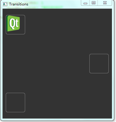
该应用程序的主要视图是在屏幕的左上角展示一个Qt logo以及两个空的矩形。
为了在工程中使用state.png图片,你必须要把它copy到该工程目录中的OML文件夹下。例如此处我将该图片放至D:\QT\QtExamples\Transitions\qml\Transitions路径下
Qt Creator将自动生成一个文件夹,用来存放该类文件;同时在“设计”中的资源面板下也会产生相对于的文件。


1.在“项目”窗口下打开 main.qml文件(用于后期的code编写)
2.点击打开“设计”

3.在“导航”面板下,选择“Text”,并删除它
4.选择“Rectangle”,编辑它的属性(右侧)

1.在 id 一栏 输入 “page”,使得之后能够从其它地方引用矩形
2.在Color一栏,设置颜色为 #343434
3.在code编辑区,删除 Qt.quit()命令行


5.在“库”面板下的“资源”选项中,选中state.png图片并将它拖到画布中

1.在 Id 一栏中,输入“icon”
2.在 Position 一栏中,设置X为10,Y为20
6.在“库”面板中的“QML Type”选项下,选中“Rectangle”,拖到画布中,并编辑其属性

1.在 Id 一栏中,输入“topLeftRect”
2.在 Size一栏中,设置W和H位64,矩形的大小正好匹配图片的大小
3.在Color一栏中,点击
![]() 透明按钮
透明按钮
![]()
 ,使得矩形变为透明。
,使得矩形变为透明。
4.在Border一栏中,设置边界颜色为#808080
5.在Rectangle一栏中,设置Border为1
6.在
在Rectangle一栏中,设置Radius为6(创建圆角矩形)
7.点开Layout选项,点击表示顶部和坐标的锚点按钮,将矩形定在页面的左上角
8.分别为顶部锚点设置Margin为20,左边锚点设置Margin为10

7.在导航面板中,将Mouse Area拖到topLeftRect中,使得它只应用于矩形范围,而不是整个页面中。(将page下的内容关系重新调整了之后(拖动相应内容即可实现))
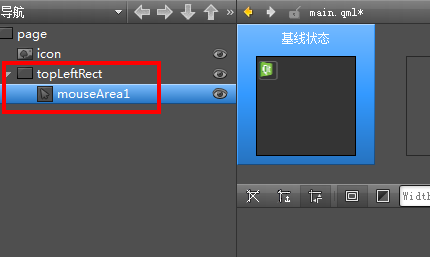
8.编辑 Mouse Area属性:
1.点开 Laypout,点击
![]()
![]()
 (Fill to Parent)按钮,为矩形设置鼠标范围锚点
(Fill to Parent)按钮,为矩形设置鼠标范围锚点
2.在code编辑区(main.qml文件中),编辑鼠标区域点击事件:
main.qml文件内容如下:
import
QtQuick
2.0
Rectangle {
id: page
width: 360
height: 360
color: "#343434"
Image {
id: icon
x: 10
y: 20
source: "state.png"
}
Rectangle {
id: topLeftRect
x: 10
y: 20
width: 64
height: 64
color: "#00000000"
radius: 6
anchors.left: parent.left
anchors.leftMargin: 10
anchors.top: parent.top
anchors.topMargin: 20
border.width: 1
border.color: "#808080"
MouseArea {
id: mouseArea1
anchors.fill: parent
onClicked:page.state = ''
}
}
}
9.在导航面板中,在page下,复制粘贴两份 topLeftRect, Qt Creator 会自动为它们重命名为topLeftRect1和 topLeftRect2.
10.选中
topLeftRect1,编辑其属性
1.在Id一栏中,输入 middleRightRect
2.在Layout中,选择垂直居中和右边锚按钮,来锚定中间右边的矩形位置
3.在Margin一栏中,为右边锚点设置距离为10,垂直锚点设置为0(假如在该栏中不能同时设定两处锚定距离,则直接在code中编写实现)
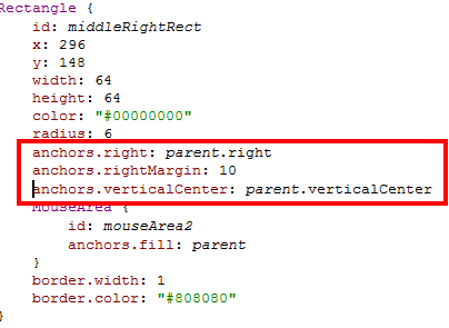
4.在code编辑区,Mouse Area中添加如下内容: onClicked: paper.state = 'state1' (我们将在之后创建state1)
11.选择
topLeftRect2,并编进其属性(与middleRightRect的操作相似)
1.在Id一栏中,输入bottomLeftRect
2.在Layout中,选择底部和左边锚按钮,来锚定底部左边的矩形位置
3.在Margin一栏中,为底部锚点设置距离为20,左边锚点设置为10(假如在该栏中不能同时设定两处锚定距离,则直接在code中编写实现)
4.在code编辑区,Mouse Area中添加如下内容: onClicked: paper.state = 'state2'
此时 main.qml文件内容如下:
import QtQuick 2.0
Rectangle {
id: page
width: 360
height: 360
color: "#343434"
Image {
id: icon
x: 10
y: 20
source: "state.png"
}
Rectangle {
id: topLeftRect
x: 10
y: 20
width: 64
height: 64
color: "#00000000"
radius: 6
anchors.left: parent.left
anchors.leftMargin: 10
anchors.top: parent.top
anchors.topMargin: 20
border.width: 1
border.color: "#808080"
MouseArea {
id: mouseArea1
anchors.fill: parent
onClicked:page.state = ''
}
}
Rectangle {
id: middleRightRect
x: 296
y: 148
width: 64
height: 64
color: "#00000000"
radius: 6
anchors.right: parent.right
anchors.rightMargin: 10
anchors.verticalCenter: parent.verticalCenter
MouseArea {
id: mouseArea2
anchors.fill: parent
onClicked:page.state = 'State1' //注意此处大小写
}
border.width: 1
border.color: "#808080"
}
Rectangle {
id: bottomLeftRect
y: 10
width: 64
height: 64
color: "#00000000"
radius: 6
anchors.left: parent.left
anchors.leftMargin: 10
anchors.bottom: parent.bottom
anchors.bottomMargin: 20
MouseArea {
id: mouseArea3
anchors.fill: parent
onClicked:page.state = 'State2'
}
border.width: 1
border.color: "#808080"
}
}
12.按Ctrl+S保存
13.按Ctrl+R运行
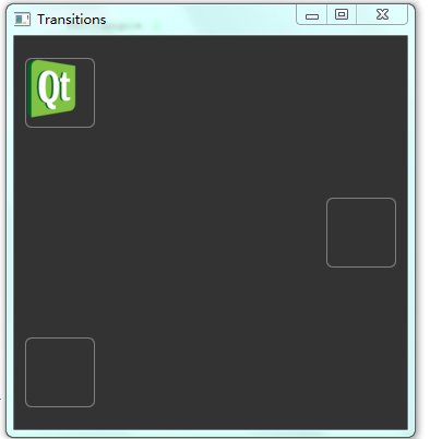
你将看到在做上端的矩形中有个Qt logo,然后是在中心右端、底部左端分别有一个矩形
现在,你可以添加额外的状态为整个应用程序添加视图
添加视图
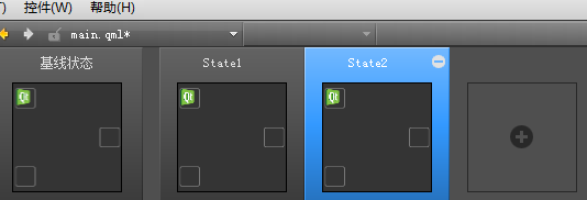
在main.qml文件中,已经创建了两个状态:state1和state2
1.在状态面板中点击空白区域,创建状态state1
2.同理创建state2
3.在code编辑器中,为矩形绑定Qt logo的位置,确保图标随着矩形能被显示在不同大小屏幕的视图中。
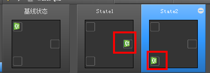
4.按Ctrl+R运行:


任意点击某个矩形,该矩形上随之显示logo图片。
添加动画视觉
添加转换定义当Qt logo在状态之间转换时属性的更改。该转换将动画应用到logo中。例如,当Qt logo移动到middleRightRect中时发生反弹,更易进入bottomLeftRect。
1.在code编辑器中,添加如下代码来特定当改变到状态1时。Qt logo的x和y的坐标线性改变持续1秒。
Transition {
from: "*"; to: "State1"
NumberAnimation {
properties: "x,y";
duration: 1000
}
},
2.也可以使用Qt Quick 工具栏。从liner到OutBounce改变曲线类型
1.点击 NumberAnimation,显示
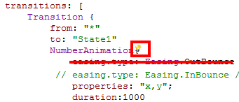
点击小灯按钮,打开工具栏如下:
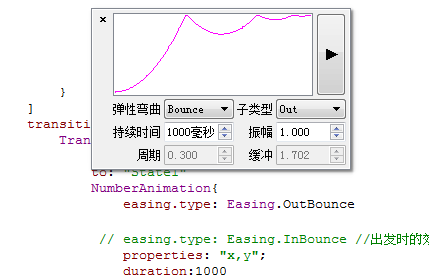
2.在弹性弯曲一栏中,选择Bounce
3.在子类型一栏中,选择Out
3.同理为转变到状态2时特定移动动画,持续2秒,此处使用了一个InOutQuad弹性函数。
Transition {
from: "*"; to: "State2"
NumberAnimation {
properties: "x,y";
easing.type: Easing.InOutQuad;
duration: 2000
}
},
4.为其他状态的特定动画,持续时间为200毫秒
Transition {
NumberAnimation {
properties: "x,y";
duration: 200
}
}
]
5.按Ctrl+R运行程序
完成以上所有步骤后,main.qml文件中内容如下:
import QtQuick 2.0
Rectangle {
id: page
width: 360
height: 360
color: "#343434"
Image {
id: icon
x: 10
y: 20
source: "state.png"
}
Rectangle {
id: topLeftRect
x: 10
y: 20
width: 64
height: 64
color: "#00000000"
radius: 6
anchors.left: parent.left
anchors.leftMargin: 10
anchors.top: parent.top
anchors.topMargin: 20
border.width: 1
border.color: "#808080"
MouseArea {
id: mouseArea1
anchors.fill: parent
onClicked:page.state = ''
}
}
Rectangle {
id: middleRightRect
x: 296
y: 148
width: 64
height: 64
color: "#00000000"
radius: 6
anchors.right: parent.right
anchors.rightMargin: 10
anchors.verticalCenter: parent.verticalCenter
MouseArea {
id: mouseArea2
anchors.fill: parent
onClicked:page.state = 'State1'
}
border.width: 1
border.color: "#808080"
}
Rectangle {
id: bottomLeftRect
y: 10
width: 64
height: 64
color: "#00000000"
radius: 6
anchors.left: parent.left
anchors.leftMargin: 10
anchors.bottom: parent.bottom
anchors.bottomMargin: 20
MouseArea {
id: mouseArea3
anchors.fill: parent
onClicked:page.state = 'State2'
}
border.width: 1
border.color: "#808080"
}
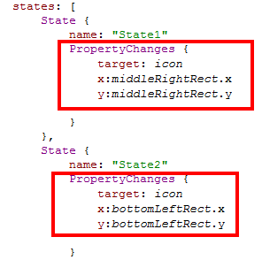
states: [
State {
name: "State1"
PropertyChanges {
target: icon
x:middleRightRect.x
y:middleRightRect.y
}
},
State {
name: "State2"
PropertyChanges {
target: icon
x:bottomLeftRect.x
y:bottomLeftRect.y
}
}
]
transitions: [
Transition {
from: "*"
to: "State1"
NumberAnimation{
easing.type: Easing.OutBounce
// easing.type: Easing.InBounce //出发时的效果
properties: "x,y";
duration:1000
//进入状态1的动画设置(动画持续时间1秒、进入时含弹跳效果)
}
},
Transition {
from: "*"
to: "State2"
NumberAnimation{
properties: "x,y";
easing.type:Easing.InOutQuad
// easing.type:Easing.InOutBounce //出发进入时的动画效果
duration: 2000
//进入状态2的动画设置(动画持续时间2秒)
}
},
Transition {
NumberAnimation{
properties: "x,y";
duration: 200
//进入第一个矩形的动画效果(动画持续时间200毫秒)
}
}
]
}


 扫一扫
扫一扫


 2662
2662

 被折叠的 条评论
为什么被折叠?
被折叠的 条评论
为什么被折叠?
 到【灌水乐园】发言


