


目录
1.例如在RGB颜色中Background="#30FF0000"。
2.在WPF中,可以使用StreamGeometry和Geometry,
6.在AduSkin框架中,遇到set时(这是用了MvvmLight)
8.在iconfont中,看到好看的图标,可以使用path。
13.ICO图标,窗口使用ResizeMode="NoResize"
1.例如在RGB颜色中Background="#30FF0000"。
前面2位30表示控件颜色的透明度。
<Grid.Background>
    <RadialGradientBrush Center="0.5,0.7" GradientOrigin="0.5,0.7" RadiusY="0.8" RadiusX="0.8">
        <GradientStop Color="#FFA4B3D3"/>
        <GradientStop Color="Blue" Offset="0.952"/>
        <GradientStop Color="#FF96AAD4" Offset="0.162"/>
    </RadialGradientBrush>
</Grid.Background>
2.在WPF中,可以使用StreamGeometry和Geometry,
画出对应的图标,此方法比一般加载图片的效率高。StreamGeometry是Geometry的子类。使用Blend画图
3.继承INotifyPropertyChanged类,
实现数据变化时,通知客户端,在封装字段set方法中,使用nameof()方法,可以解决字段类型的问题,从而简化代码。
4.绝对路径
pack URI:"pack://application:,,,/ResourceFile.xaml"先建立资源,再引用。
资源中带文件夹的路径:
<ResourceDictionary Source="pack://application:,,,/WpfApp1;component/Resource/Dictionary1.xaml"></ResourceDictionary>资源中不带文件夹的路径:
<ResourceDictionary Source="pack://application:,,,/WpfApp1;component/Dictionary1.xaml"></ResourceDictionary>5.相对路径
pack URL:"/Subfolder/ResourceFile.xaml"6.在AduSkin框架中,遇到set时(这是用了MvvmLight)

可以修改成如下代码

7.在MVVM中,m层,v层,vm层三层中。
m层一般只写字段的属性,如果某一个字段有变化通知,那么就要对这个字段进行继承通知属性。例如:名称,备注,评分,类型这些,在v层中变化不需要通知,那么就不需要 RaisePropertyChanged。而选择IsChecked,在界面会有通知,那么就需要RaisePropertyChanged。一句话,凡是字段属性遇到需要通知的,就要用RaisePropertyChanged,数据集合遇到需要通知的,就要用ObservableCollection。

8.在iconfont中,看到好看的图标,可以使用path。
查看方法如下,使用的时候,复制path即可。

9.配置App.config 文件时,使用

  <appSettings>
    <add key="A" value="1" />
  </appSettings>
代码中使用
 ConfigurationManager.AppSettings["A"];
  ConfigurationManager.AppSettings.Set("A","123");
10.CheckBox选择框是圆角
原生
圆角
代码:
            <CheckBox.Resources>
                <Style TargetType="{x:Type Border}">
                    <Setter Property="CornerRadius" Value="3"/><!--圆角的度数-->
                    <Setter Property="BorderBrush" Value="#272A2F"/>
                </Style>
            </CheckBox.Resources>
11.prism中使用自动关联View和ViewModel
在view界面需要增加2句
xmlns:prism="http://prismlibrary.com/"
prism:ViewModelLocator.AutoWireViewModel="True"
ViewModels文件夹
ViewAViewModel
Views文件夹
ViewA
前缀一样即可,会自动匹配
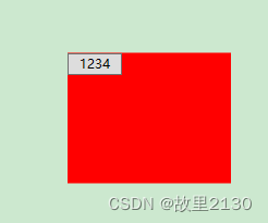
12.WPF镶嵌代码
把一个控件镶嵌到另一个控件中。先拿到控件,再从窗体中移除,再重新绑定到新的控件中
XAML
 <Grid x:Name="grid">
        <Button x:Name="b" Width="50" Height="20" Content="1234" VerticalAlignment="Top"/>
        <StackPanel x:Name="s" Width="150" Height="120" Background="Red"  />
    </Grid>
CS
            var content = b;
            grid.Children.Remove(b);   //移除
            Binding binding = new Binding("Button");
            binding.Source = content;

            s.SetBinding(Button.ContentProperty, binding);
            s.Children.Add(b);
            s.Orientation = Orientation.Horizontal;      //控制方向
效果
13.ICO图标,窗口使用ResizeMode="NoResize"
https://www.onlinewebfonts.com
http://remixicon.com
https://ikonate.com
https://tablericons.com
https://iconduck.com
https://www.toicon.com
https://www.iconfinder.com
https://icons8.com
https://www.icofont.com
https://www.iconbros.com/
https://www.iconninja.com
WindowStyle="None" AllowsTransparency="True" Background="Transparent" ShowInTaskbar="False" ResizeMode="NoResize"
14.prism中使用命令传递多个参数
有时候,我们需要一个按钮下面,传递多个参数。
1.首先创建一个ObjectConvert类
   public class ObjectConvert : IMultiValueConverter
    {
        #region IMultiValueConverter Members

        public static object ConverterObject;

        public object Convert(object[] values, Type targetType,
          object parameter, System.Globalization.CultureInfo culture)
        {
            ConverterObject = values;
            string str = values.GetType().ToString();
            return values.ToArray();
        }

        public object[] ConvertBack(object value, Type[] targetTypes,
          object parameter, System.Globalization.CultureInfo culture)
        {
            throw new NotImplementedException();
        }

        #endregion
    }
2.在使用的界面中引用
    <UserControl.Resources>
        <local1:ObjectConvert x:Key="objectConverter"/>
    </UserControl.Resources>
3.在view中的按钮下面调用
                    <Button
                        Command="{Binding ExecuteCommand}"
                        Content="登录">
                        <Button.CommandParameter>
                            <MultiBinding Converter="{StaticResource
                                ResourceKey=objectConverter}" Mode="TwoWay">
                                <MultiBinding.Bindings>
                                    <Binding Source="Login"/>
                                    <Binding ElementName="Code"  Path="Tag"/>
                                </MultiBinding.Bindings>
                            </MultiBinding>
                        </Button.CommandParameter>
                    </Button>
4.viewmodel中调用,其中数组中的1就是控件Code中的Tag值
ExecuteCommand = new DelegateCommand<object>(Execute); 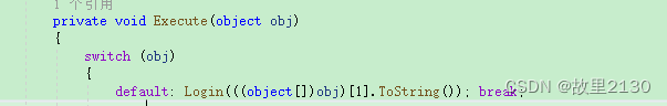
15. wpf中内存加载图片,可删除图片
        public static System.Windows.Media.Imaging.BitmapImage GetBitmapImage(string fileName)
        {
            if (File.Exists(fileName) == false) return null;

            FileStream fileStream = new FileStream(fileName, FileMode.Open, FileAccess.Read);
            var image = System.Drawing.Image.FromStream(fileStream);

            MemoryStream memory = new MemoryStream();
            image.Save(memory, ImageFormat.Jpeg);
            memory.Position = 0;
            System.Windows.Media.Imaging.BitmapImage bitmapimage = new System.Windows.Media.Imaging.BitmapImage();
            bitmapimage.BeginInit();
            bitmapimage.StreamSource = memory;
            bitmapimage.CacheOption = System.Windows.Media.Imaging.BitmapCacheOption.OnLoad;
            bitmapimage.EndInit();
            bitmapimage.Freeze();
            fileStream.Close();
            fileStream.Dispose();
            return bitmapimage;
        }
调用,grid是name
            ImageBrush image = new ImageBrush();
            image.ImageSource = GetBitmapImage(AppDomain.CurrentDomain.BaseDirectory + @"\img\2.jpg");
            grid.Background = image;
绑定图片使用,内存不会增加,增加的原因是因为,不停的new的ImageBrush,导致内存上升,可以绑定成静态的资源去规避问题。
<ImageBrush ImageSource="../a/1.jpg">16.wpf鼠标滑动有提示功能和BasedOn
比如鼠标在某一个控件上面滑动,会出现文字提示的功能
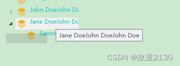
只需要对控件增加ToolTip即可
  <TreeView Name="trvPersons" Width="150" Height="200"  Foreground="#FF05C7CB" BorderBrush="#00ACACAC" Background="#004682B4" >
                <TreeView.ItemTemplate>
                    <HierarchicalDataTemplate ItemsSource="{Binding Children}">
                        <StackPanel Orientation="Horizontal" ToolTip="{Binding Name,NotifyOnSourceUpdated=True}">
                            <Image Source="/TreeView;component/Images/1.png" Margin="0,0,5,0" />
                            <TextBlock Text="{Binding Name}" Margin="0,0,4,0" Foreground='#FF05C7CB' />
                        </StackPanel>
                    </HierarchicalDataTemplate>
                </TreeView.ItemTemplate>
                <TreeView.ItemContainerStyle>
                    <Style TargetType="TreeViewItem">
                        <Setter Property="IsSelected" Value="{Binding IsSelected}" />
                        <Setter Property="IsExpanded" Value="{Binding IsExpanded}" />
                    </Style>
                </TreeView.ItemContainerStyle>
            </TreeView>
BasedOn继承默认的值
           <DataGridTextColumn Header="姓名" Binding="{Binding Name}"  Width="*">
                    <DataGridTextColumn.CellStyle>
                        <Style TargetType="DataGridCell" BasedOn="{ StaticResource ResourceKey={x:Type DataGridCell}  }">
                            <Setter Property="ToolTip" Value="{Binding Name}"/>
                        </Style>
                    </DataGridTextColumn.CellStyle>
                </DataGridTextColumn>
当数据为空的时候,不显示。
1.先引用
xmlns:sys="clr-namespace:System;assembly=mscorlib"2.资源样式
            <DataGrid.Resources>
                <Style TargetType="ToolTip">
                    <Style.Triggers>
                        <Trigger Property="Content" Value="{x:Static sys:String.Empty}">
                            <Setter Property="Visibility" Value="Collapsed" />
                        </Trigger>
                    </Style.Triggers>
                </Style>
            </DataGrid.Resources>
3.具体使用
<DataGridTextColumn Header="学校" Binding="{Binding School}">
<DataGridTextColumn.CellStyle>
<Style TargetType="DataGridCell">
<Setter Property="ToolTipService.ToolTip" Value="{Binding School}" />
</Style>
</DataGridTextColumn.CellStyle>
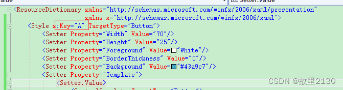
</DataGridTextColumn>17.wpf全局使用样式的设置,点击空白处选择
有时候,我们需要一个样式,全局使用,按照以下方式配置,使用button举例
<ResourceDictionary xmlns="http://schemas.microsoft.com/winfx/2006/xaml/presentation"
                    xmlns:x="http://schemas.microsoft.com/winfx/2006/xaml">
    <Style TargetType="Button">
        <Setter Property="Width" Value="70"/>
        <Setter Property="Height" Value="25"/>
        <Setter Property="Foreground" Value="White"/>
        <Setter Property="BorderThickness" Value="0"/>
        <Setter Property="Background" Value="#43a9c7"/>
        <Setter Property="Template">
            <Setter.Value>
                <ControlTemplate TargetType="Button">
                    <Border x:Name="border" Background="{TemplateBinding Background}" BorderBrush="{TemplateBinding BorderBrush}" BorderThickness="{TemplateBinding BorderThickness}" SnapsToDevicePixels="True">
                        <TextBlock Text="{TemplateBinding Content}" Foreground="{TemplateBinding Foreground}" VerticalAlignment="Center" HorizontalAlignment="Center"/>
                    </Border>
                    <ControlTemplate.Triggers>
                        <Trigger Property="IsMouseOver" Value="True">
                            <Setter TargetName="border" Property="Background" Value="#2f96b4"/>
                        </Trigger>
                        <Trigger Property="IsPressed" Value="True">
                            <Setter TargetName="border" Property="Background" Value="#2a89a4"/>
                        </Trigger>
                    </ControlTemplate.Triggers>
                </ControlTemplate>
            </Setter.Value>
        </Setter>
    </Style>
</ResourceDictionary>
引用
<Application x:Class="DataGrid.App"
             xmlns="http://schemas.microsoft.com/winfx/2006/xaml/presentation"
             xmlns:x="http://schemas.microsoft.com/winfx/2006/xaml"
             xmlns:local="clr-namespace:DataGrid"
             StartupUri="MainWindow.xaml">
    <Application.Resources>
        <ResourceDictionary>
            <ResourceDictionary.MergedDictionaries>
                <ResourceDictionary Source="pack://application:,,,/DataGrid;component/Button.xaml"/>
            </ResourceDictionary.MergedDictionaries>
        </ResourceDictionary>
    </Application.Resources>
</Application>
如果单个界面使用,那么需要加上key
引用不变
在使用的界面中加入下面代码
    <Window.Resources>
        <Style TargetType="Button" BasedOn="{ StaticResource A  }"></Style>
    </Window.Resources>
如果是在某一个控件上面使用,只需要把 <Window.Resources>删除掉,其他一样,再在对应的控件上面加上下面代码
 <Button x:Name="BtnAction" Content="确定" Height="34" Style="{StaticResource A}"
                                    Width="80" FontSize="20"    HorizontalAlignment="Center" VerticalAlignment="Center">
                                </Button>
点击空白处选择
Background="Transparent" 18.wpf中Dispatcher使用
其实Dispatcher就是一个前台的线程,更新前台界面控件的内容时使用,也可以使用Task等其他方式代替Dispatcher。其中Invoke是同步,BeginInvoke是异步,里面传递参数可以选择。如果需要暂停,使用户操作,或者让用户选择OK/Cancel对话框,使用Invoke,BeginInvoke有返回参数,异步里面不需要增加睡眠,这样正常,但是不合理。
xaml界面
<Window x:Class="Dispatcher.MainWindow"
        xmlns="http://schemas.microsoft.com/winfx/2006/xaml/presentation"
        xmlns:x="http://schemas.microsoft.com/winfx/2006/xaml"
        xmlns:d="http://schemas.microsoft.com/expression/blend/2008"
        xmlns:mc="http://schemas.openxmlformats.org/markup-compatibility/2006"
        xmlns:local="clr-namespace:Dispatcher"
        mc:Ignorable="d"
        Title="MainWindow" Height="450" Width="800">
    <Grid>
        <StackPanel>
            <Label x:Name="lblHello">欢迎你光临WPF的世界!</Label>
            <Button Name="btnThd" Click="btnThd_Click" >多线程同步调用</Button>
            <Button Name="btnAppBeginInvoke" Click="btnAppBeginInvoke_Click" >BeginInvoke 异步调用</Button>
        </StackPanel>
    </Grid>
</Window>
cs文件
using System;
using System.Collections.Generic;
using System.Linq;
using System.Text;
using System.Threading;
using System.Threading.Tasks;
using System.Windows;
using System.Windows.Controls;
using System.Windows.Data;
using System.Windows.Documents;
using System.Windows.Input;
using System.Windows.Media;
using System.Windows.Media.Imaging;
using System.Windows.Navigation;
using System.Windows.Shapes;
using System.Windows.Threading;

namespace Dispatcher
{
    /// <summary>
    /// MainWindow.xaml 的交互逻辑
    /// </summary>
    public partial class MainWindow : Window
    {
        public MainWindow()
        {
            InitializeComponent();
        }

        private void btnThd_Click(object sender, RoutedEventArgs e)
        {
            //Thread thread = new Thread(ModifyA);
            //thread.Start();

            Task.Run(ModifyA1);
        }
        private void ModifyA()
        {
            Thread.Sleep(TimeSpan.FromSeconds(2));  //模拟一些工作耗时的工作
            this.Dispatcher.Invoke(DispatcherPriority.Normal, new Action(() =>
            {
                lblHello.Content = "欢迎你光临WPF的世界,Dispatche  同步方法 !!";
            }));
        }

        private void ModifyA1()
        {
            Thread.Sleep(TimeSpan.FromSeconds(2));  //模拟一些工作耗时的工作
            this.Dispatcher.Invoke(new Action(() =>
           {
               lblHello.Content = "欢迎你光临WPF的世界,Dispatche  同步方法 !!";
           }));
        }

        private void btnAppBeginInvoke_Click(object sender, RoutedEventArgs e)
        {
            Thread thread = new Thread(ModifyB);
            thread.Start();
        }

        private void ModifyB()
        {
            Thread.Sleep(TimeSpan.FromSeconds(2));   //模拟一些工作耗时的工作
            Application.Current.Dispatcher.BeginInvoke(DispatcherPriority.Normal,
                  new Action(() =>
                  {
                      lblHello.Content = "欢迎你光临WPF的世界,Dispatche 异步方法!!" + DateTime.Now.ToString();
                  }));
        }
    }
}
DispatcherPriority.ApplicationIdle,记录。
Task里面启动UpdateTextBlock,2选一
 private void UpdateTextBlock(string text)
 {
     _textBlock.Dispatcher.Invoke(DispatcherPriority.Normal, new Action(() =>
     {
         _textBlock.Text = text;
     }));


     if (!_textBlock.Dispatcher.CheckAccess()) // 检查是否在非UI线程
     {
         _textBlock.Dispatcher.Invoke(new Action<string>(UpdateTextBlock), text); // 同步调用
     }
     else
     {
         _textBlock.Text = text; // 直接在UI线程上更新
     }
 }
19.wpf使用自动背景图片
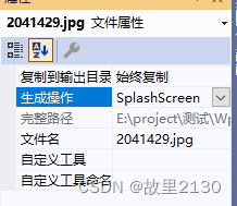
项目结构
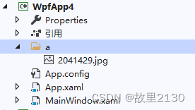
第一种方法
设置成SplashScreen即可,直接启动。
第二种方法
1.设置成资源
2.在App中重写
using System;
using System.Collections.Generic;
using System.Configuration;
using System.Data;
using System.Linq;
using System.Threading.Tasks;
using System.Windows;
namespace WpfApp4
{
/// <summary>
/// App.xaml 的交互逻辑
/// </summary>
public partial class App : Application
{
protected override void OnStartup(StartupEventArgs e)
{
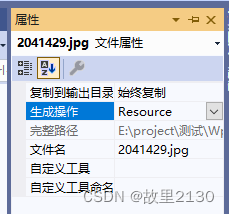
SplashScreen splashScreen = new SplashScreen(@"/a/2041429.jpg");
splashScreen.Show(false);
//上面Show()方法中设置为true时,程序启动完成后启动图片就会自动关闭,
//设置为false时,启动图片不会自动关闭,需要使用下面一句设置显示时间,例如2s
splashScreen.Close(TimeSpan.FromSeconds(2));
base.OnStartup(e);
}
}
}
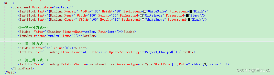
20. RelativeSource运用
RelativeSource对象使用FindAncestor模式,该模式告知查找元素树直到发现AncestorType属性定义的元素类型。
例如:
<Setter Property="Width" Value="{Binding RelativeSource={RelativeSource FindAncestor,AncestorType={x:Type DataGridCell}},Path=ActualWidth }"/> <TextBlock Text="{Binding Path=Title,RelativeSource={RelativeSource FindAncestor,AncestorType={x:Type Window}}}" VerticalAlignment="Top"/>表示,一直查找类型为Window的Title属性。
| PreviousData | 0 | 表达式绑定到数据绑定列表中的前一个数据项。在列表项中会使用这种模式 |
| TemplatedParent | 1 | 表达式绑定到应用模板的元素。只有当绑定位于控件模板或数据模板内部时,这种模式才能工作 |
| Self | 2 | 表达式绑定到同一元素的另一个属性上 |
| FindAncestor | 3 | 表达式绑定到父元素。WPF将查找元素树直至发现期望的父元素。为了指定父元素,还必须设置AncestorType属性以指示希望查找的父元素的类型。此外,还可以用AncestorLevel属性略过发现的一定数量的特定元素。例如,当在一棵树中查找时,如果希望绑定到第三个ListBoxltem类型的元素,应当使用如下设置—AncestorType={x:Type ListBoxltem};并且 AncestorLevel=3,从而略过前两个ListBoxltem元素。默认情况下,AncestorLevel属性设置为1,并在找到第一个匹配的元素时停止查找 |
下面的很重要
来源:https://blog.csdn.net/u012563853/article/details/123627405?spm=1001.2014.3001.5502


 1726
1726


 被折叠的 条评论
为什么被折叠?
被折叠的 条评论
为什么被折叠?
 到【灌水乐园】发言


