


移动头部搜索:
界面:
web工程:

代码:
index.html
<!DOCTYPE html>
<html lang="en">
<head>
    <meta charset="UTF-8">
    <!--meta:vp-->
    <meta name="viewport"
        content="width=device-width, user-scalable=no,initial-scale=1.0 "/>
    <title>首页</title>
    <link rel="stylesheet" href="css/bass.css"/>
    <link rel="stylesheet" href="css/index.css"/>

</head>
<body>
    <div class="jd_layout">
        <!--搜索头部-->
        <header class="jd_header">
            <div class="jd_header_box">
            <a href="#" class="icon_logo"></a>
            <!-- 小键盘 enter   改变成 搜索 按钮-->
            <form action="#">
                <span class="icon_search"></span>
                <input type="search" placeholder="提示站位"/>
            </form>
            <a href="#" class="login">登录</a>
            </div>
        </header>
    </div>
</body>
</html>
bass.css
index.css/*reset css*/ *, ::before ::after{ /*选择所有的标签*/ margin:0; padding:0; /*清除移动端默认的 点击高亮效果*/ -webkit-tap-highlight-color: transparent; /*设置所有的都是以边框开始计算宽度 百分比*/ -webkit-box-sizing: border-box;/*兼容*/ box-sizing: border-box; } body{ font-size: 14px; font-family: "Microsoft YaHei",sans-serif;/*设置默认字体*/ color: #333; } a{ color: #333; text-decoration: none; } a:hover{ text-decoration: none; } ul,ol{ list-style: none; } input{ border: none; outline: none; -webkit-appearance: none;/*清除移动端默认的表单样式*/ } /* common css*/ .f_left{ float: left; } .f_right{ float: right; } .clearfix::before, .clearfix::after{ content: ""; height: 0; line-height: 0; display: block; visibility: hidden; clear: both; } [class^="icon_"]{ background: url("../image/sprites.png") no-repeat; background-size: 202px 201px; }
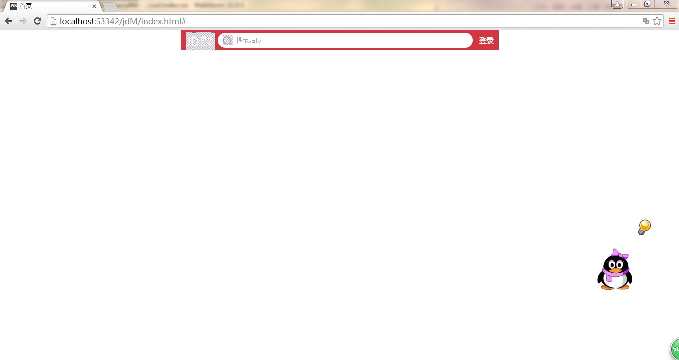
该项目为csdn传智播客讲授,自己还欠缺地方是中间form设置100%,pandding-right:80px;没有靠右并显示出“登录”两个字,改为80%后,虽如图界面显示,但不能随手机缩屏而全部展示内容。/*主体盒子*/ .jd_layout{ width: 100%; max-width: 640px;/*不让它放大*/ min-width: 300px;/*更好的显示布局*/ margin: 0 auto; } /*头部搜索*/ .jd_header{ position: fixed; left: 0; top:0; height: 40px; width: 100%; } .jd_header > .jd_header_box{ width: 100%; max-width: 640px;/*不让它放大*/ min-width: 300px;/*更好的显示布局*/ margin: 0 auto; background: rgba(201,21,35,0.85); height: 40px; position: relative; } .jd_header > .jd_header_box > .icon_logo{ width: 60px; height: 36px; position: absolute; background-position: 0 -103px ; top: 4px; left: 10px; } .jd_header > .jd_header_box > .login{ width: 50px; height: 40px; line-height: 40px; text-align: center; color: #fff; position: absolute; right: 0px; top: 0px; font-size: 15px; } .jd_header > .jd_header_box > form{ width: 80%; padding-left: 75px; padding-right: 80px; height: 40px; position: relative; } .jd_header > .jd_header_box > form > input{ width: 100%; height: 30px; border-radius: 15px; margin-top: 5px; padding-left: 35px; } .jd_header > .jd_header_box > form > .icon_search{ height: 20px; width: 20px; position: absolute; background-position: -60px -109px; top: 10px; left: 85px; }
学习点:
透明设置:background: rgba(201,21,35);
-webkit-appearance: none;/*清除移动端默认的表单样式*/
移动一般默认字体的设置:font-family: "Microsoft YaHei",sans-serif;/*设置默认字体*/
css3中的设置:[class^="icon_"]{ background: url("../image/sprites.png") no-repeat; background-size: 202px 201px; }切图防失真方法:缩小图片的大小,像素增大background-size: 202px 201px;


 扫一扫
扫一扫
 3275
3275

 被折叠的 条评论
为什么被折叠?
被折叠的 条评论
为什么被折叠?
 到【灌水乐园】发言


