


概要
本文将详细介绍如何使用WPF(Windows Presentation Foundation)开发一个分页控件,并深入解析其实现原理。我们将通过使用XAML和C#代码相结合的方式构建分页控件,并确保它具有高度的可定制性,以便在不同的应用场景中满足各种需求。
一.简介
分页控件是在许多应用程序中常见的一种界面元素,特别是在数据展示的场景中。它允许用户浏览大量数据,并根据需要切换到不同的数据页。
二.需求分析
我们首先来分析一下一个分页控件的基本构成。
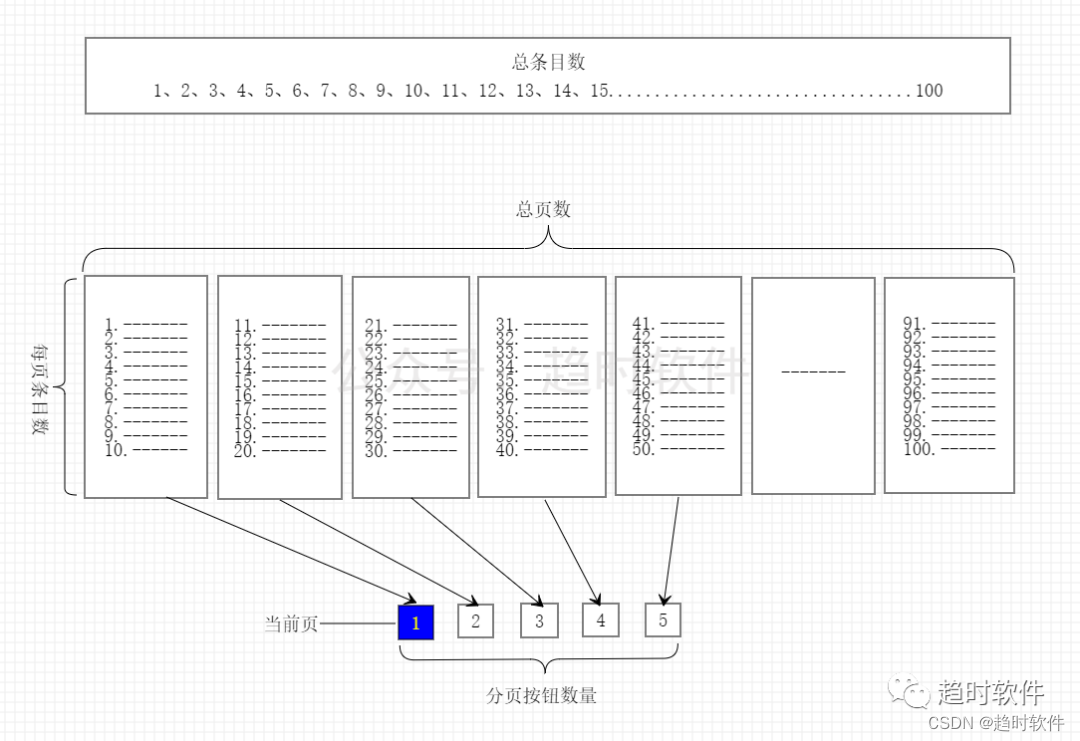
2.1 总条目数(TotalItems)
表示总数据量。
2.2 每页条目数(PageSize)
表示每页显示的条目数。
2.3 总页数(PageCount)
表示根据总条目数与每页条目数计算出来的页数。
2.4 分页/页码按钮数量(PageNumberCount)
分页控件中可以点击的页码按钮。
2.5 当前页(CurrentPage)
当前显示的页,通常高亮显示。
三.控件命令和事件
3.1 页面跳转命令(GoToPageCommand)
该命令用于在XAML代码中触发页面跳转操作。
3.2当前页变更事件
当CurrentPage参数改变后触发该事件,通常在该事件中执行数据查询操作。
四.代码实现
通过以上原理分析,我们提取出了分页控件需要包含的基本要素,下面我们通过这些信息来组装成一个分页控件。
<Style TargetType="{x:Type local:Pager}">
    <Setter Property="Template">
        <Setter.Value>
            <ControlTemplate TargetType="{x:Type local:Pager}">
                <Border Background="{TemplateBinding Background}"
                            BorderBrush="{TemplateBinding BorderBrush}"
                            BorderThickness="{TemplateBinding BorderThickness}">
                    <StackPanel Orientation="Horizontal" ClipToBounds="True">
                        <Button Command="{x:Static local:Pager.GoToPageCommand}" CommandParameter="1" Margin="0,0,5,0" Content="首页"></Button>
                        <Button Command="{x:Static local:Pager.GoToPageCommand}" CommandParameter="-" Margin="5,0" Content="上一页"></Button>
                        <ItemsControl ItemsSource="{TemplateBinding PageButtons}">
                            <ItemsControl.ItemsPanel>
                                <ItemsPanelTemplate>
                                    <StackPanel Orientation="Horizontal"/>
                                </ItemsPanelTemplate>
                            </ItemsControl.ItemsPanel>
                            <ItemsControl.ItemTemplate>
                                <DataTemplate>
                                    <ToggleButton MinWidth="{Binding RelativeSource={RelativeSource Mode=Self},Path=ActualHeight}"
                                                      Content="{Binding Page}"
                                                      IsChecked="{Binding IsCurrentPage}"
                                                      Command="{x:Static local:Pager.GoToPageCommand}"
                                                      CommandParameter="{Binding Page}"
                                                      Margin="5,0"/>
                                </DataTemplate>
                            </ItemsControl.ItemTemplate>
                        </ItemsControl>
                        <Button Command="{x:Static local:Pager.GoToPageCommand}" CommandParameter="+" Margin="5,0" Content="下一页"></Button>
                        <Button Command="{x:Static local:Pager.GoToPageCommand}" CommandParameter="尾页" Margin="5,0,0,0" Content="{DynamicResource LastPage}"></Button>
                    </StackPanel>
                </Border>
            </ControlTemplate>
        </Setter.Value>
    </Setter>
</Style>
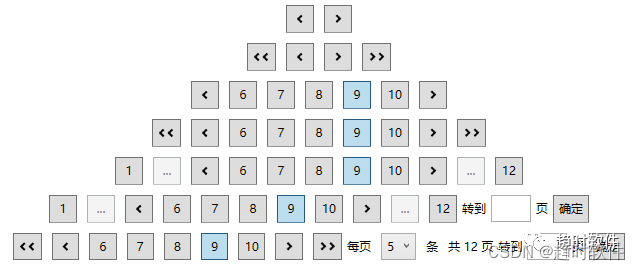
五.多样化需求
在不同的业务场景下需要的分页控件可能不尽相同,那么如何来满足多样化需求呢,答案就是自定义控件模板。下面演示几种常见的分页控件如何实现。
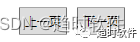
只需要“上一页”、“下一页”的情况
<Style TargetType="{x:Type Controls:Pager}">
    <Setter Property="Template">
        <Setter.Value>
            <ControlTemplate TargetType="{x:Type Controls:Pager}">
                <Border Background="{TemplateBinding Background}"
                            BorderBrush="{TemplateBinding BorderBrush}"
                            BorderThickness="{TemplateBinding BorderThickness}">
                    <StackPanel Orientation="Horizontal" ClipToBounds="True">
                        <Button Command="{x:Static Controls:Pager.GoToPageCommand}" CommandParameter="-" Margin="5,0" Content="{DynamicResource PreviousPage}"></Button>
                        <Button Command="{x:Static Controls:Pager.GoToPageCommand}" CommandParameter="+" Margin="5,0" Content="{DynamicResource NextPage}"></Button>
                    </StackPanel>
                </Border>
            </ControlTemplate>
        </Setter.Value>
    </Setter>
</Style>
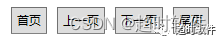
只需要“首页”、“上一页”、“下一页”、“尾页”的情况。
<Style TargetType="{x:Type Controls:Pager}">
    <Setter Property="Template">
        <Setter.Value>
            <ControlTemplate TargetType="{x:Type Controls:Pager}">
                <Border Background="{TemplateBinding Background}"
                            BorderBrush="{TemplateBinding BorderBrush}"
                            BorderThickness="{TemplateBinding BorderThickness}">
                    <StackPanel Orientation="Horizontal" ClipToBounds="True">
                        <Button Command="{x:Static Controls:Pager.GoToPageCommand}" CommandParameter="1" Margin="0,0,5,0" Content="{DynamicResource FirstPage}"></Button>
                        <Button Command="{x:Static Controls:Pager.GoToPageCommand}" CommandParameter="-" Margin="5,0" Content="{DynamicResource PreviousPage}"></Button>
                        <Button Command="{x:Static Controls:Pager.GoToPageCommand}" CommandParameter="+" Margin="5,0" Content="{DynamicResource NextPage}"></Button>
                        <Button Command="{x:Static Controls:Pager.GoToPageCommand}" CommandParameter="{TemplateBinding PageCount}" Margin="5,0,0,0" Content="{DynamicResource LastPage}"></Button>
                    </StackPanel>
                </Border>
            </ControlTemplate>
        </Setter.Value>
    </Setter>
</Style>
数字显示“首页”、“尾页”的情况。
<Style TargetType="{x:Type Controls:Pager}">
    <Setter Property="Template">
        <Setter.Value>
            <ControlTemplate TargetType="{x:Type Controls:Pager}">
                <Border Background="{TemplateBinding Background}"
                            BorderBrush="{TemplateBinding BorderBrush}"
                            BorderThickness="{TemplateBinding BorderThickness}">
                    <StackPanel Orientation="Horizontal" ClipToBounds="True">
                        <Button Command="{x:Static Controls:Pager.GoToPageCommand}"
                                        CommandParameter="1"
                                        Content="1"
                                        MinWidth="{Binding RelativeSource={RelativeSource Mode=Self},Path=ActualHeight}"
                                        Margin="0,0,5,0">
                            <Button.Visibility>
                                <MultiBinding Converter="{StaticResource PageNumberToVisibilityConverter}" ConverterParameter="First">
                                    <Binding RelativeSource="{RelativeSource AncestorType=Controls:Pager}" Path="CurrentPage"/>
                                    <Binding RelativeSource="{RelativeSource AncestorType=Controls:Pager}" Path="PageNumberCount"/>
                                    <Binding RelativeSource="{RelativeSource AncestorType=Controls:Pager}" Path="PageCount"/>
                                </MultiBinding>
                            </Button.Visibility>
                        </Button>
                        <Button IsEnabled="False" Margin="5,0" MinWidth="{Binding RelativeSource={RelativeSource Mode=Self},Path=ActualHeight}" Content="...">
                            <Button.Visibility>
                                <MultiBinding Converter="{StaticResource PageNumberToVisibilityConverter}" ConverterParameter="First">
                                    <Binding RelativeSource="{RelativeSource AncestorType=Controls:Pager}" Path="CurrentPage"/>
                                    <Binding RelativeSource="{RelativeSource AncestorType=Controls:Pager}" Path="PageNumberCount"/>
                                    <Binding RelativeSource="{RelativeSource AncestorType=Controls:Pager}" Path="PageCount"/>
                                </MultiBinding>
                            </Button.Visibility>
                        </Button>
                        <Button Command="{x:Static Controls:Pager.GoToPageCommand}" CommandParameter="-" Margin="5,0" Content="{DynamicResource PreviousPage}"></Button>
                        <ItemsControl ItemsSource="{TemplateBinding PageButtons}">
                            <ItemsControl.ItemsPanel>
                                <ItemsPanelTemplate>
                                    <StackPanel Orientation="Horizontal"/>
                                </ItemsPanelTemplate>
                            </ItemsControl.ItemsPanel>
                            <ItemsControl.ItemTemplate>
                                <DataTemplate>
                                    <ToggleButton MinWidth="{Binding RelativeSource={RelativeSource Mode=Self},Path=ActualHeight}"
                        Content="{Binding Page}"
                        Margin="5,0"
                        IsChecked="{Binding IsCurrentPage}"
                        Command="{x:Static Controls:Pager.GoToPageCommand}"
                        CommandParameter="{Binding Page}"/>
                                </DataTemplate>
                            </ItemsControl.ItemTemplate>
                        </ItemsControl>
                        <Button Command="{x:Static Controls:Pager.GoToPageCommand}" CommandParameter="+" Margin="5,0" Content="{DynamicResource NextPage}"></Button>
                        <Button IsEnabled="False" Margin="5,0" MinWidth="{Binding RelativeSource={RelativeSource Mode=Self},Path=ActualHeight}" Content="...">
                            <Button.Visibility>
                                <MultiBinding Converter="{StaticResource PageNumberToVisibilityConverter}">
                                    <Binding RelativeSource="{RelativeSource AncestorType=Controls:Pager}" Path="CurrentPage"/>
                                    <Binding RelativeSource="{RelativeSource AncestorType=Controls:Pager}" Path="PageNumberCount"/>
                                    <Binding RelativeSource="{RelativeSource AncestorType=Controls:Pager}" Path="PageCount"/>
                                </MultiBinding>
                            </Button.Visibility>
                        </Button>
                        <Button Command="{x:Static Controls:Pager.GoToPageCommand}"
                                        CommandParameter="{Binding RelativeSource={RelativeSource AncestorType=Controls:Pager},Path=PageCount}"
                                        Content="{Binding RelativeSource={RelativeSource AncestorType=Controls:Pager},Path=PageCount}"
                                        MinWidth="{Binding RelativeSource={RelativeSource Mode=Self},Path=ActualHeight}"
                                        Margin="5,0,0,0">
                            <Button.Visibility>
                                <MultiBinding Converter="{StaticResource PageNumberToVisibilityConverter}">
                                    <Binding RelativeSource="{RelativeSource AncestorType=Controls:Pager}" Path="CurrentPage"/>
                                    <Binding RelativeSource="{RelativeSource AncestorType=Controls:Pager}" Path="PageNumberCount"/>
                                    <Binding RelativeSource="{RelativeSource AncestorType=Controls:Pager}" Path="PageCount"/>
                                </MultiBinding>
                            </Button.Visibility>
                        </Button>

                        <StackPanel Orientation="Horizontal" Margin="5,0,0,0">
                            <TextBlock Text="转到" VerticalAlignment="Center"/>
                            <TextBox x:Name="tbox_Page" Width="40" Margin="5,0" Padding="5" HorizontalContentAlignment="Center" VerticalAlignment="Center"/>
                            <TextBlock Text="页" VerticalAlignment="Center"/>
                            <Button Margin="5,0,0,0" Command="{x:Static Controls:Pager.GoToPageCommand}" CommandParameter="{Binding ElementName=tbox_Page,Path=Text}">确定</Button>
                        </StackPanel>
                    </StackPanel>
                </Border>
            </ControlTemplate>
        </Setter.Value>
    </Setter>
</Style>

可以调整每页显示条目,可以显示总页数,可以跳转到指定页的情况。
<Style TargetType="{x:Type Controls:Pager}">
    <Setter Property="Template">
        <Setter.Value>
            <ControlTemplate TargetType="{x:Type Controls:Pager}">
                <Border Background="{TemplateBinding Background}"
                            BorderBrush="{TemplateBinding BorderBrush}"
                            BorderThickness="{TemplateBinding BorderThickness}">
                    <StackPanel Orientation="Horizontal" ClipToBounds="True">
                        <Button Command="{x:Static Controls:Pager.GoToPageCommand}" CommandParameter="1" Margin="0,0,5,0" MinWidth="{Binding RelativeSource={RelativeSource Mode=Self},Path=ActualHeight}" Content="{DynamicResource FirstPage}"></Button>
                        <Button Command="{x:Static Controls:Pager.GoToPageCommand}" CommandParameter="-" Margin="5,0" MinWidth="{Binding RelativeSource={RelativeSource Mode=Self},Path=ActualHeight}" Content="{DynamicResource PreviousPage}"></Button>
                        <ItemsControl ItemsSource="{TemplateBinding PageButtons}">
                            <ItemsControl.ItemsPanel>
                                <ItemsPanelTemplate>
                                    <StackPanel Orientation="Horizontal"/>
                                </ItemsPanelTemplate>
                            </ItemsControl.ItemsPanel>
                            <ItemsControl.ItemTemplate>
                                <DataTemplate>
                                    <ToggleButton MinWidth="{Binding RelativeSource={RelativeSource Mode=Self},Path=ActualHeight}"
                        Content="{Binding Page}"
                        Margin="5,0"
                        IsChecked="{Binding IsCurrentPage}"
                        Command="{x:Static Controls:Pager.GoToPageCommand}"
                        CommandParameter="{Binding Page}"/>
                                </DataTemplate>
                            </ItemsControl.ItemTemplate>
                        </ItemsControl>
                        <Button Command="{x:Static Controls:Pager.GoToPageCommand}" CommandParameter="+" Margin="5,0" MinWidth="{Binding RelativeSource={RelativeSource Mode=Self},Path=ActualHeight}" Content="{DynamicResource NextPage}"></Button>
                        <Button Command="{x:Static Controls:Pager.GoToPageCommand}" CommandParameter="{TemplateBinding PageCount}" Margin="5,0,0,0" MinWidth="{Binding RelativeSource={RelativeSource Mode=Self},Path=ActualHeight}" Content="{DynamicResource LastPage}"></Button>
                        <StackPanel Orientation="Horizontal" Margin="5,0,0,0">
                            <TextBlock Margin="0,0,5,0" Text="每页" VerticalAlignment="Center"/>
                            <ComboBox Margin="5,0" SelectedIndex="0" VerticalContentAlignment="Center" SelectedItem="{Binding RelativeSource={RelativeSource AncestorType=Controls:Pager},Path=PageSize,Mode=OneWayToSource}">
                                <sys:Int32>5</sys:Int32>
                                <sys:Int32>10</sys:Int32>
                                <sys:Int32>15</sys:Int32>
                                <sys:Int32>20</sys:Int32>
                            </ComboBox>
                            <TextBlock Text="条" VerticalAlignment="Center" Margin="5,0"/>
                            <TextBlock VerticalAlignment="Center" Margin="5,0">
                                        <Run Text="共"/>
                                        <Run Text="{Binding RelativeSource={RelativeSource AncestorType=Controls:Pager},Path=PageCount}"/>
                                        <Run Text="页"/>
                            </TextBlock>
                            <TextBlock Text="转到" VerticalAlignment="Center"/>
                            <TextBox x:Name="tbox_Page" Width="40" Margin="5,0" Padding="5" HorizontalContentAlignment="Center" VerticalAlignment="Center"/>
                            <TextBlock Text="页" VerticalAlignment="Center"/>
                            <Button Margin="5,0,0,0" Command="{x:Static Controls:Pager.GoToPageCommand}" CommandParameter="{Binding ElementName=tbox_Page,Path=Text}">确定</Button>
                        </StackPanel>
                    </StackPanel>
                </Border>
            </ControlTemplate>
        </Setter.Value>
    </Setter>
</Style>

除了修改模板实现不同的形态的分页控件以外,还可以用图标替换掉“首页”、“上一页”、“下一页”、”尾页”等文字。
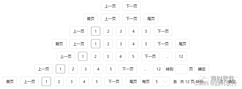
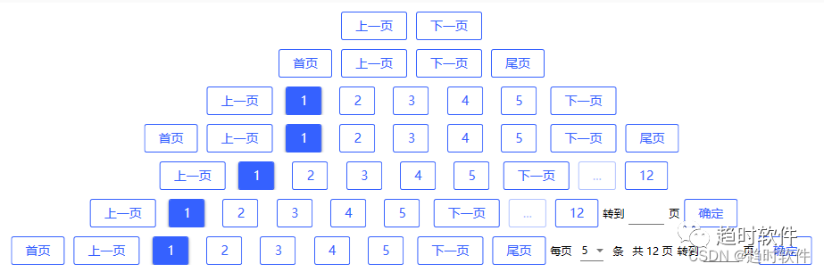
六.个性化控件外观
项目中的界面外观可能多种多样,有自己写的控件样式,也有使用第三方UI库的样式,如何跟它们搭配使用呢。
自定义控件样式
<Style TargetType="Button">
    <Setter Property="Padding" Value="5"/>
    <Setter Property="Background" Value="Red"/>
</Style>
<Style TargetType="ToggleButton">
    <Setter Property="Padding" Value="5"/>
    <Setter Property="Background" Value="Red"/>
</Style>
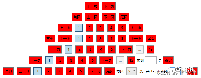
使用第三方UI库
1.HandyControl
<ResourceDictionary>
    <ResourceDictionary.MergedDictionaries>
        <ResourceDictionary Source="pack://application:,,,/HandyControl;component/Themes/SkinDefault.xaml" />
        <ResourceDictionary Source="pack://application:,,,/HandyControl;component/Themes/Theme.xaml" />
    </ResourceDictionary.MergedDictionaries>
</ResourceDictionary>
2.MaterialDesign
<ResourceDictionary>
    <ResourceDictionary.MergedDictionaries>
        <materialDesign:CustomColorTheme BaseTheme="Light" PrimaryColor="#FF3561FF" SecondaryColor="#FF3561FF" />
        <ResourceDictionary Source="pack://application:,,,/MaterialDesignThemes.Wpf;component/Themes/MaterialDesignTheme.Defaults.xaml" />
    </ResourceDictionary.MergedDictionaries>
</ResourceDictionary>


 4001
4001


 被折叠的 条评论
为什么被折叠?
被折叠的 条评论
为什么被折叠?
 到【灌水乐园】发言


