


为使手机页面在电脑浏览器中打开时依然保持居中显示的良好布局,所以需要一个良好的兼容结构。
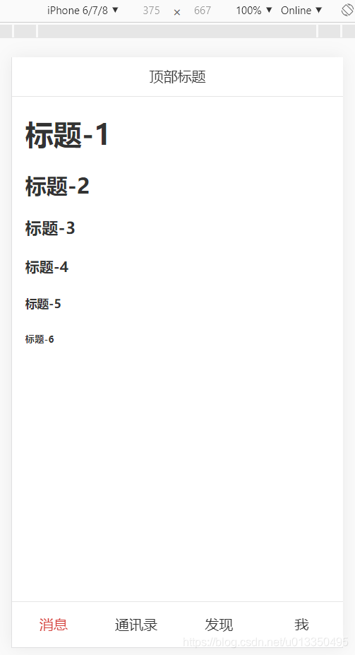
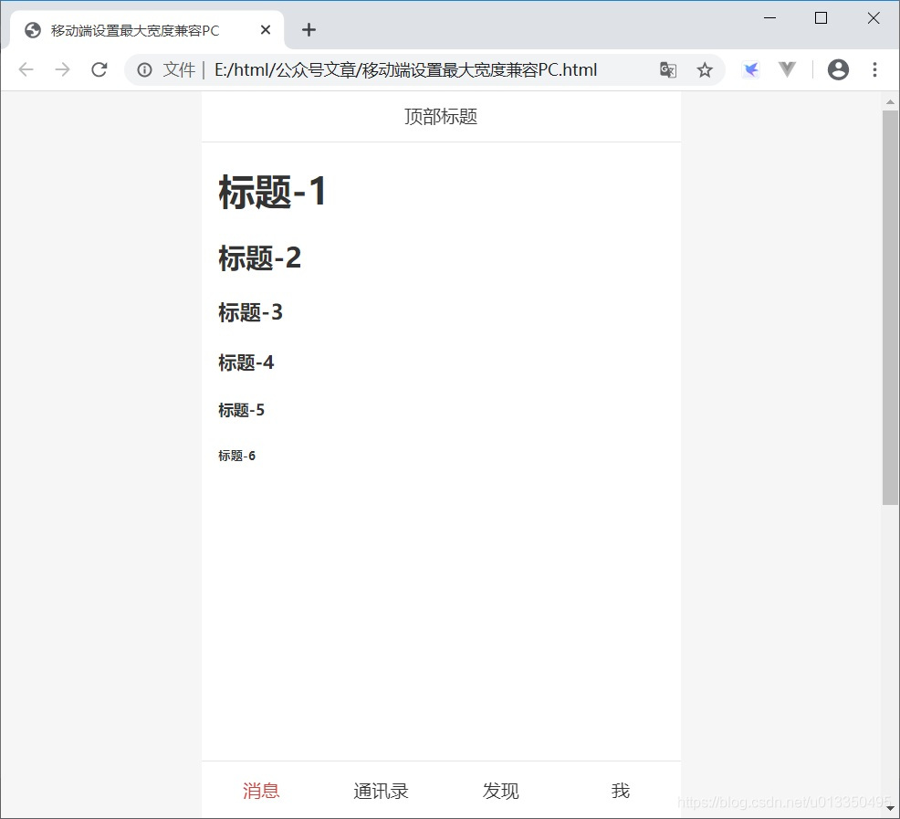
源码示例效果图:
| 手机端 | 电脑端 |
 |  |
源码示例:
<!DOCTYPE html>
<html lang="en">
<head>
    <meta charset="UTF-8">
    <meta name="viewport"
          content="width=device-width,initial-scale=1,minimum-scale=1,maximum-scale=1,user-scalable=no,viewport-fit=cover">
    <meta name="author" content="qq 1846492969,helang.love@qq.com">
    <title>移动端设置最大宽度兼容PC</title>
    <style type="text/css">
        body{
            margin: 0;
            background-color: #F6F6F6;
            color: #333;
        }
        header{
            position: fixed;
            top: 0;
            left: 0;
            width: 100%;
            z-index: 99;
        }
        header>div{
            height: 44px;
            background-color: #fff;
            max-width: 420px;
            width: 100%;
            margin: 0 auto;
            border-bottom: #e5e5e5 solid 1px;
            line-height: 43px;
            text-align: center;
            font-size: 16px;
        }
        footer{
            position: fixed;
            bottom: 0;
            left: 0;
            width: 100%;
            z-index: 98;
        }
        footer>div{
            height: 50px;
            background-color: #fff;
            max-width: 420px;
            width: 100%;
            margin: 0 auto;
            border-top: #e5e5e5 solid 1px;
        }
        footer>div>div{
            height: 100%;
            line-height: 49px;
            text-align: center;
            font-size: 16px;
        }
        footer .active{
            color: #d43f3a;
        }
        main{
            max-width: 420px;
            width: 100%;
            margin: 0 auto;
            padding: 44px 0 50px 0;
            box-sizing: border-box;
            background-color: #fff;
        }
        /* 列式弹性盒子 */
        .flex_col {
            display: -webkit-box;
            -webkit-box-orient: horizontal;
            -webkit-box-direction: normal;
            -webkit-box-pack: start;
            -webkit-box-align: center;

            display: -ms-flexbox;
            -ms-flex-wrap: nowrap;
            -ms-flex-direction: row;
            -ms-flex-pack: start;
            -ms-flex-align: center;
            -ms-flex-line-pack: center;

            display: flex;
            flex-direction: row;
            flex-wrap: nowrap;
            justify-content: flex-start;
            align-items: center;
            align-content: center;
        }
        .flex_col.flex_col_4>*{width: 25%;}
    </style>
</head>
<body>
    <header>
        <div>顶部标题</div>
    </header>
    <main>
        <div style="height: 1000px;padding: 0 15px;" id="helang">
            <script type="text/javascript">
                for (var i = 1; i <= 6; i++){
                    document.write('<h'+i+'>标题-'+i+'</h'+i+'>');
                }
            </script>
        </div>
    </main>
    <footer>
        <div class="flex_col flex_col_4">
            <div class="active">消息</div>
            <div>通讯录</div>
            <div>发现</div>
            <div>我</div>
        </div>
    </footer>
</body>
</html>作者:黄河爱浪 QQ:1846492969,邮箱:helang.love@qq.com
本文原创,著作权归作者所有,转载请注明原链接及出处。


 扫一扫
扫一扫


 6794
6794

 被折叠的 条评论
为什么被折叠?
被折叠的 条评论
为什么被折叠?
 到【灌水乐园】发言


