


matplotlib画图-静态图(初级教程)
前言
本教程编写时间: 2021-9-30
编程环境准备
- 本文使用了以下软件
| 软件 | 版本号 |
|---|---|
| windows操作系统 | 10 |
| python | 3.6 |
| pycharm | Professional 2021.1.1 |
| matplotlib | 3.4.3 |
| pandas | 1.3.3 |
| anconda | Anaconda3-2021.05 |
针对以上软件, 本文不提供安装教程, 安装教程可自行搜索
-
中文字体安装
画图过程中, 会使用到中文字体, 但是anconda中默认没有提供中文字体, 因此需要我们自己安装
首先去百度下载SimHei.ttf(快捷下载链接)字体, 几种常用的字体:
中文字体 说明 SimHei 中文黑体 Kaiti 中文楷体 LiSu 中文隶书 FangSong 中文仿宋 YouYuan 中文幼圆 STSong 华文宋体 下载的字体放在D:\Anaconda3\envs\pytorch_project\Lib\site-packages\matplotlib\mpl-data\fonts\ttf这个目录下, 每个人的电脑的位置不同, 通过以下代码可以
- 获取自己ttf的安装目
- 输出matplotlib的字体缓存目录, 并删除此目录
- 更换SimHei字体
import matplotlib
import matplotlib.pyplot as plt
import numpy as np
# 打印ttf目录
# 打印的地址是D:\Anaconda3\envs\pytorch_project\lib\site-packages\matplotlib\mpl-data\matplotlibrc
# 要找的地址是:D:\Anaconda3\envs\pytorch_project\Lib\site-packages\matplotlib\mpl-data\fonts\ttf
print(matplotlib.matplotlib_fname())

# 输出matplotlib的字体缓存目录
print(matplotlib.get_cachedir())

# 更换SimHei字体
matplotlib.rcParams['font.sans-serif']=['SimHei']
matplotlib.rcParams['axes.unicode_minus']=False   #这两行需要手动设置
C:\Users\Administrator\.matplotlib
画图正文-matplotlib画图
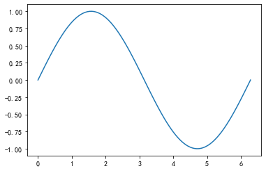
简单的正弦函数图
"""
    创作一个简单的正弦函数图
"""
# 在[0, 2pi]之间随机生成100个样本
x = np.linspace(0, 2*np.pi, 100)
y = np.sin(x)
plt.plot(x, y)
plt.show()
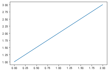
简单的直线图
"""
    创作一个简单的直线图
"""
a = [1, 2, 3]
# 画出的直线图的横坐标是[0, 2], 纵坐标是[1, 3]
plt.plot(a)
plt.show()
自定义函数画图
# 自定义x, y坐标系(我自定义的是y=x^2+1)
x_coordinate = [1, 2, 3, 4]
y_coordinate = [0, 3, 8, 15]
plt.plot(x_coordinate, y_coordinate)
plt.show()

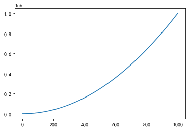
"""
    自定义函数y=x^2+1函数, 由于样本数量变多, 曲线就显得更加平滑
"""
x_coordinate1 = np.linspace(0, 1000, 1000)
y_coordinate1 = np.power(x_coordinate1, 2) -1
plt.plot(x_coordinate1, y_coordinate1)
plt.show()
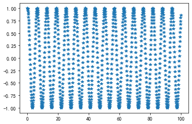
使用别的笔迹画图
"""
    开始画图, 使用不同的笔迹
"""
x_coordinate2 = np.linspace(0., 100., 1000)
y_coordinate2 = np.cos(x_coordinate2)
plt.plot(x_coordinate2, y_coordinate2, '*')
# plt.plot(x_coordinate2, y_coordinate2, '-')
plt.show()
在一幅图中画多段函数
# 加上这句话之后, 在jupyter中就可以省略 plt.show()语句
%matplotlib inline
a = [1, 2, 3]
b = [1, 2, 3]
# 画图, 并且使用红颜色的--线段
plt.plot(a, b, 'r--')
# 将两段函数画在一个图中
# 在第一幅图中, 使用绿色, 在第二幅图中, 使用红色
c = [8, 9, 10]
d = [8, 9, 10]
plt.plot(a, b, 'g--', c, d, 'r--')
[<matplotlib.lines.Line2D at 0x8dfaa00>,
 <matplotlib.lines.Line2D at 0x8dfaa30>]

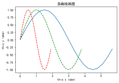
画曲线图
"""
    画一下多曲线图
"""
t = np.arange(0, 2, 0.1)
print(t)
s = np.sin(t * np.pi)
print(s)
plt.plot(t, s, 'r--', t*2, s, 'g--', t*3, s, '')
# 为图片加上x轴名字和y轴名字
plt.xlabel('this x label')
plt.ylabel('this y label')
# 为图片加上标题名字
plt.title('多曲线画图')
[0.  0.1 0.2 0.3 0.4 0.5 0.6 0.7 0.8 0.9 1.  1.1 1.2 1.3 1.4 1.5 1.6 1.7
 1.8 1.9]
[ 0.00000000e+00  3.09016994e-01  5.87785252e-01  8.09016994e-01
  9.51056516e-01  1.00000000e+00  9.51056516e-01  8.09016994e-01
  5.87785252e-01  3.09016994e-01  1.22464680e-16 -3.09016994e-01
 -5.87785252e-01 -8.09016994e-01 -9.51056516e-01 -1.00000000e+00
 -9.51056516e-01 -8.09016994e-01 -5.87785252e-01 -3.09016994e-01]

Text(0.5, 1.0, '多曲线画图')
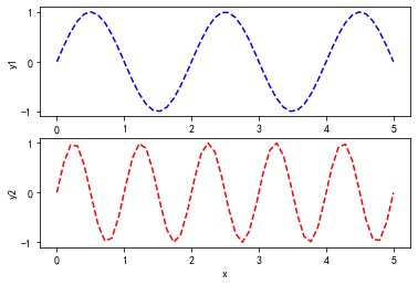
画多个子图
"""
    画子图 分为上下两个图
    plt.subplot(n, m, idx)
    n指的是图片有几行
    m指的是图片有几列
    idx指的是当前的图片占据的位置是多少
    idx的范围在[1,m*n]
    idx按照行优先的方式进行排序
"""
x = np.linspace(0.0, 5.0)
print(x)
y1 = np.sin(x*np.pi)
y2 = np.sin(x*np.pi*2)
plt.subplot(2, 1, 1)
plt.plot(x, y1, 'b--')
plt.ylabel('y1')
plt.subplot(2, 1, 2)
plt.plot(x, y2, 'r--')
plt.ylabel('y2')
plt.xlabel('x')
[0.         0.10204082 0.20408163 0.30612245 0.40816327 0.51020408
 0.6122449  0.71428571 0.81632653 0.91836735 1.02040816 1.12244898
 1.2244898  1.32653061 1.42857143 1.53061224 1.63265306 1.73469388
 1.83673469 1.93877551 2.04081633 2.14285714 2.24489796 2.34693878
 2.44897959 2.55102041 2.65306122 2.75510204 2.85714286 2.95918367
 3.06122449 3.16326531 3.26530612 3.36734694 3.46938776 3.57142857
 3.67346939 3.7755102  3.87755102 3.97959184 4.08163265 4.18367347
 4.28571429 4.3877551  4.48979592 4.59183673 4.69387755 4.79591837
 4.89795918 5.        ]

Text(0.5, 0, 'x')
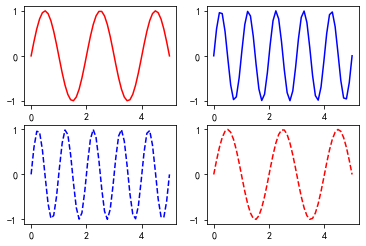
使用subplots画子图
# 画子图 使用subplots方法
"""
    (2, 2)可以看做是2行2列, 共4个值, 每一个代表一幅画
    这种画多个子图, 会看起来更清晰, 更方便
"""
figure, ax = plt.subplots(2, 2)
ax[0][0].plot(x, y1, 'r')
ax[0][1].plot(x, y2, 'b')
ax[1][0].plot(x, y2, 'b--')
ax[1][1].plot(x, y1, 'r--')
plt.show()
画图正文-pandas画图
Series-一维数组画图
import pandas as pd
from pandas import Series, DataFrame
"""
    使用Pandas绘图之Series(一维数组)
    grid是现实标尺线,label就是图例,title就是图像的名称,style是线的类型
"""
# 这里面的cumsum是累计求和的意思,比如a=[1,2,3,4,5], a.cumsum=[1,3,5,10,15].
s1 = Series(np.random.randn(1000)).cumsum()
print(type(s1))
s1.head()
s1.plot(grid=True, label='S1', title='this is a Series', style='--')
plt.show()
<class 'pandas.core.series.Series'>

在一幅图中画多个函数
"""
    使用pandas画图2
"""
p1 = Series(np.random.randn(1000)).cumsum()
p2 = Series(np.random.randn(1000)).cumsum()
# 关闭标尺线
p1.plot(grid=False, label='S1', title='title1', style='b--')
p2.plot(grid=False, label='S2', title='title2', style='r*')
plt.legend()
plt.show()

使用subplots实现与Series相同的功能
"""
    使用subplots实现与Series相同的功能
"""
fig, ax = plt.subplots(2, 1)
ax[0].plot(p1)
ax[1].plot(p2)
plt.show()

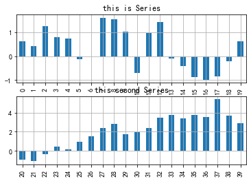
画柱状图
"""
    画一个柱状图
"""
fig, ax = plt.subplots(2, 1)
p1[0:20].plot(ax=ax[0], kind='bar', label='S1', title='this is Series', grid=True)
p2[20:40].plot(ax=ax[1], kind='bar', label='S2', title='this second Series', grid=True)
<AxesSubplot:title={'center':'this second Series'}>
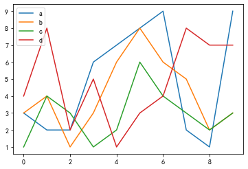
使用pandas画图-二维数组
"""
    pandas画图之DataFrame(二维数组)
    好像也可以啊,图例的a,b,c,d就是dataframe里面的a,b,c,d嘛
    所以这其实就是每一列画一条曲线,组成这个图。那么把kind换成bar再看看。
"""
# 首先创建一个DataFrame
# 画图的话, 前面使用的Series, 那么DataFrame呢?
df = DataFrame(
    np.random.randint(1, 10, 40).reshape(10, 4),
    columns=['a', 'b', 'c', 'd'])
print(df.head())
df.plot()
plt.show()
   a  b  c  d
0  3  3  1  4
1  2  4  4  8
2  2  1  3  2
3  6  3  1  5
4  7  6  2  1
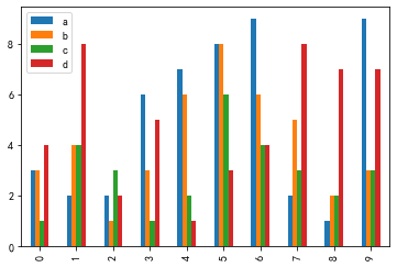
画横向柱状图
"""
    画柱状图
    它是横向的
"""
df.plot(kind='bar')
plt.show()
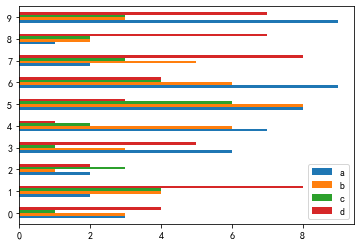
画纵向柱状图
"""
    画柱状图
    可以切换到纵向
"""
df.plot(kind='barh')
plt.show()
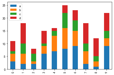
柱状图的数据堆叠
"""
    把四个数据进行堆叠
"""
df.plot(kind='bar', stacked=True)
<AxesSubplot:>
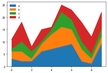
图的填充
"""
    画一个填充的图
"""
df.plot(kind='area')
plt.show()
其它
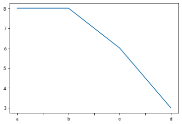
"""
    选取某一行, 画图
"""
df.iloc[5]
a = df.iloc[5]
print(type(a))
a.plot()
plt.show()
<class 'pandas.core.series.Series'>
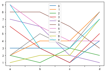
"""
    把每一行的数据展示到一张图片里面
"""
for i in df.index:
    df.iloc[i].plot(label=str(i))
plt.legend()
plt.show()

# 上面使用了for循环, 也可以使用别的方法
df.T
df.T.plot()
plt.show()

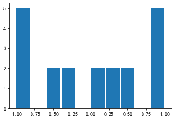
直方图和密度图
"""
    画直方图和密度图
"""
c = Series(np.random.randn(1000))
# print(s.head())
plt.hist(s, rwidth=0.9)
plt.show()
6)]
"""
    把每一行的数据展示到一张图片里面
"""
for i in df.index:
    df.iloc[i].plot(label=str(i))
plt.legend()
plt.show()

# 上面使用了for循环, 也可以使用别的方法
df.T
df.T.plot()
plt.show()
直方图和密度图
"""
    画直方图和密度图
"""
c = Series(np.random.randn(1000))
# print(s.head())
plt.hist(s, rwidth=0.9)
plt.show()


 2279
2279


 被折叠的 条评论
为什么被折叠?
被折叠的 条评论
为什么被折叠?
 到【灌水乐园】发言


