转载:Flex中定制带图标的Tooltip
“定制”无疑是TWaver中最大的一特色,无论是node,link,attachment,就连tooltip也同样可以定制,“定制”可以显示出更强更复杂的一些功能,今天给大家带来了一个定制Tooltip的例子。
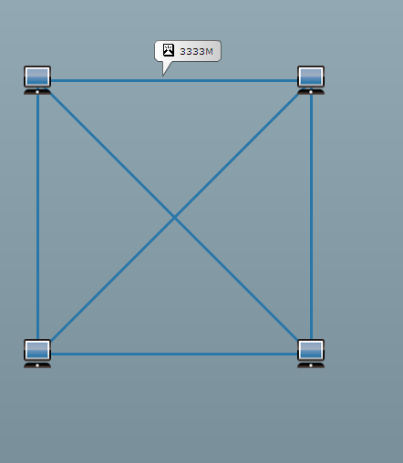
啥也不多说,先看看效果:
下面我们来细细分析一下这个功能的实现。tooltip的特点是当鼠标滑过时显示,滑出时不显示。因此我们可以定义一个tooltip组件,监听network的mouse move事件,如果鼠标下有网元,就显示tooltip组件并动态计算tooltip的位置,没有就隐藏tooltip组件。
1 | this.network.addEventListener(MouseEvent.MOUSE_MOVE, function(e:MouseEvent):void |
5 | private function updateToolTip(e:MouseEvent):void{ |
6 | var element:IElement = network.getElementByMouseEvent(e,true, 5); |
7 | if(lastElement == element){ |
10 | lastElement = element; |
12 | var point:Point = network.getLogicalPoint(e); |
13 | customTooltip.x = point.x - customTooltip.measuredWidth /2; |
14 | customTooltip.y = point.y - customTooltip.measuredHeight -10; |
15 | customTooltip.setText(element.getClient('message')); |
16 | customTooltip.visible =true; |
18 | customTooltip.visible =false; |
我们来详细了解一下如何来实现tooltip组件,首先定义一个tooltip类,继承于canvas。这样就可以将tooltip直接加到network.topCanvas上。
1 | public class CustomToolTip extendsCanvas {} |
tooltip组件上不需要交互动作和滚动条,因此可以将这些屏蔽:
1 | public function CustomToolTip() { |
2 | this.mouseEnabled =false; |
3 | this.mouseChildren =false; |
4 | this.horizontalScrollPolicy = ScrollPolicy.OFF; |
5 | this.verticalScrollPolicy = ScrollPolicy.OFF; |
重点是tooltip的绘制问题,我们需要将图标和文字加到tooltip组件上,并且在添加图标和文字时,需要计算一下位置
1 | var messageImage:Image = newImage(); |
2 | messageImage.source = newmessageIcon(); |
3 | messageImage.x = _hmargin; |
4 | messageImage.y = _vmargin; |
5 | this.addChild(messageImage); |
7 | _component = newUIComponent(); |
8 | this.addChild(_component); |
10 | _message = newTextField(); |
11 | _message.autoSize = TextFieldAutoSize.LEFT; |
12 | _message.x = _hmargin + _iconWidth + _hgap; |
14 | _component.addChild(_message); |
接下来我们需要计算tooltip显示的宽高,这个需要根据设置的文字来动态计算,因此这边我们重写了measure方法,在measure方法中来计算tooltip显示的实际宽高:
1 | override protectedfunction measure():void{ |
3 | this.measuredWidth = _hmargin *2 + _iconWidth + _hgap + _message.width; |
4 | this.measuredHeight = _vmargin + _iconHeight + _vgap + _arrowHeight; |
然后我们需要绘制一个如tooltip形状的图形。先来分析一个,tooltip就是一个矩形框,为了好看一点可以搞个圆角矩形,矩形下方有一个小三角的图形。接下来就可以通过画笔将这些图形绘制出来
1 | override protectedfunction updateDisplayList(unscaledWidth:Number, unscaledHeight:Number):void{ |
2 | super.updateDisplayList(unscaledWidth, unscaledHeight); |
3 | var g:Graphics =this.graphics; |
5 | var lineWidth:Number =1; |
6 | g.lineStyle(lineWidth,0, 0.5,true, "normal", CapsStyle.ROUND, JointStyle.ROUND); |
8 | var _width:Number = unscaledWidth, _height:Number = unscaledHeight; |
9 | Utils.beginFill(g,0xFFFFFF, 1, 0,0, _width, _height, Consts.GRADIENT_LINEAR_EAST,0xCCCCCC, 1); |
10 | g.drawRoundRect(lineWidth, lineWidth, _width - lineWidth *2, _height - lineWidth *2 - _arrowHeight,10, 10); |
11 | g.moveTo(_arrowStart, _height - lineWidth - _arrowHeight); |
12 | g.lineTo(_arrowStart, _height); |
13 | g.lineTo(_arrowStart + _arrowWidth, _height - lineWidth - _arrowHeight); |
15 | g.lineStyle(1,0xFFFFFF); |
16 | g.moveTo(_arrowStart, _height - lineWidth - _arrowHeight); |
17 | g.lineTo(_arrowStart + _arrowWidth, _height - lineWidth - _arrowHeight); |
当设置text文字时,需要调用一下invalidateSize和invalidateDisplayList方法,这样程序就重新计算tooltip的宽高:
1 | public function setText(message:String):void { |
2 | _message.htmlText ="<font color='#000000'>" + message + "</font>"; |
4 | this.invalidateDisplayList(); |
Tooltip定制好了后,最后还需要将网元和tooltip上显示的内容绑定
1 | link.setClient('message','3333M'); |
2 | customTooltip.setText(element.getClient('message')); |


 1439
1439


 被折叠的 条评论
为什么被折叠?
被折叠的 条评论
为什么被折叠?
 到【灌水乐园】发言


