


文章目录
1. CSS高级技巧重点提炼
- 理解
- 元素显示隐藏最常见的写法
- 精灵图产生的目的
- 去除图片底侧空白缝隙的方法
- 应用
- 写出最常见的鼠标样式
- 使用精灵图技术
- 用滑动门做导航栏案例
2. 元素的显示与隐藏
-
目的
让一个元素在页面中消失或者显示出来
-
场景
类似网站广告,当我们点击关闭就不见了,但是我们重新刷新页面,会重新出现!

2.1 display 显示(重点)
-
display设置或检索对象是否及如何显示。display: none 隐藏对象 display:block 除了转换为块级元素之外,同时还有显示元素的意思。 -
特点: 隐藏之后,不再保留位置。

2.1.1 example01
<!DOCTYPE html>
<html lang="en">
<head>
<meta charset="UTF-8">
<title>Document</title>
<style>
.damao {
width: 200px;
height: 200px;
background-color: pink;
}
.ermao {
width: 250px;
height: 250px;
background-color: purple;
}
</style>
</head>
<body>
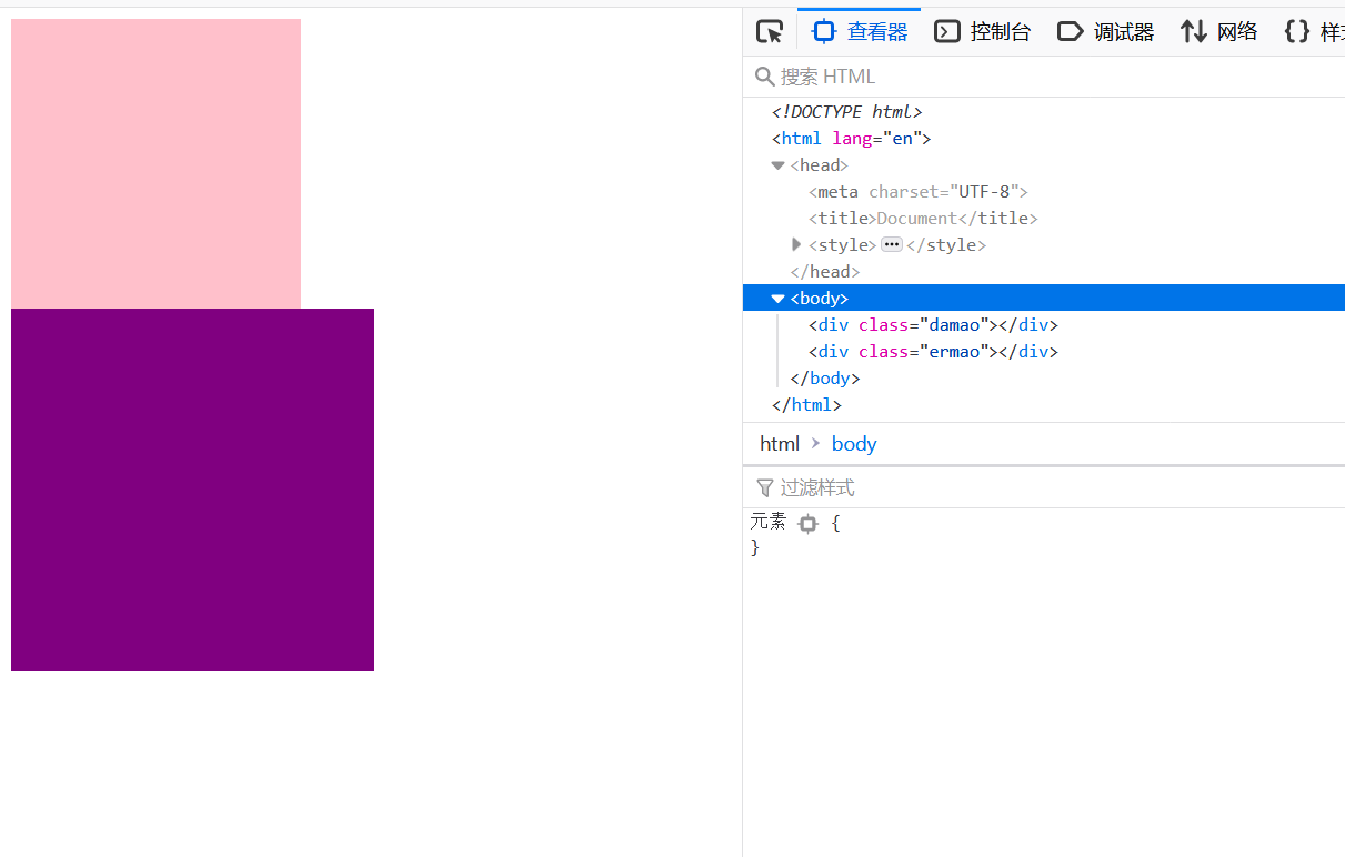
<div class="damao"></div>
<div class="ermao"></div>
</body>
</html>
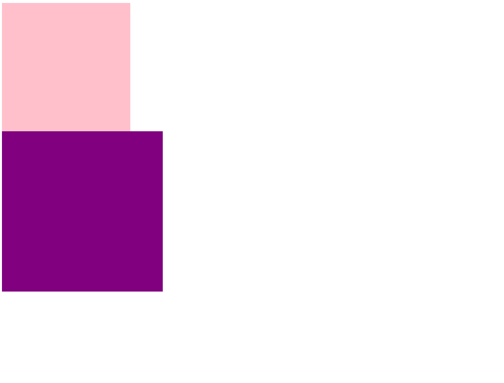
隐藏元素damao
		.damao {
			display: none;
			width: 200px;
			height: 200px;
			background-color: pink;
		}
display: none =>
- 先隐藏元素
- 不保留位置
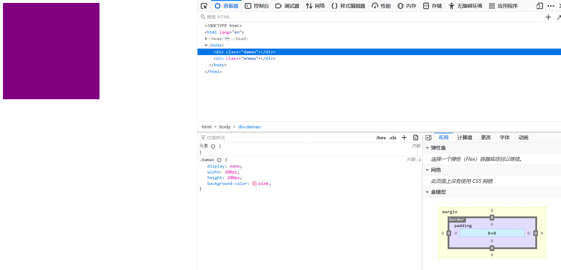
display: block; => 这里除了转换为块级元素以外,还可以 显示元素
参考:https://github.com/6xiaoDi/blog-CSS/tree/a1.74
Branch: branch03
commit description:a1.74(example01——display显示与隐藏)tag:a1.74
2.1.2 实际开发场景
配合后面js做特效,比如下拉菜单,原先没有,鼠标经过,显示下拉菜单, 应用极为广泛
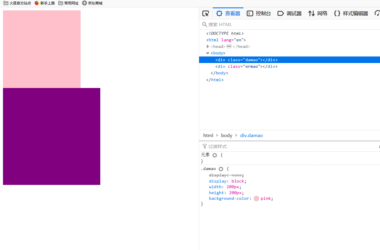
2.2 visibility 可见性 (了解)
-
设置或检索是否显示对象。
visibility:visible ; 对象可视 visibility:hidden; 对象隐藏 -
特点: 隐藏之后,继续保留原有位置。(停职留薪)

2.2.1 example02
<!DOCTYPE html>
<html lang="en">
<head>
	<meta charset="UTF-8">
	<title>Document</title>
	<style>
		.damao {
			visibility: hidden;
			width: 200px;
			height: 200px;
			background-color: pink;
		}
		.ermao {
			width: 250px;
			height: 250px;
			background-color: purple;
		}
	</style>
</head>
<body>
	<div class="damao"></div>
	<div class="ermao"></div>
</body>
</html>
visibility: hidden =>
hidden隐藏元素- 保留位置
		.damao {
			/*visibility: hidden;*/
			visibility: visible;
			width: 200px;
			height: 200px;
			background-color: pink;
		}
参考:https://github.com/6xiaoDi/blog-CSS/tree/a1.75
Branch: branch03
commit description:a1.75(example02——visibility显示与隐藏)tag:a1.75
2.3 overflow 溢出(重点)
- 检索或设置当对象的内容超过其指定高度及宽度时如何管理内容。
| 属性值 | 描述 |
|---|---|
| visible(默认) | 不剪切内容也不添加滚动条 |
| hidden | 不显示超过对象尺寸的内容,超出的部分隐藏掉 |
| scroll | 不管超出内容否,总是显示滚动条 |
| auto | 超出自动显示滚动条,不超出不显示滚动条 |

2.3.1 example03
2.3.1.1 example03-1
<!DOCTYPE html>
<html lang="en">
<head>
<meta charset="UTF-8">
<title>Document</title>
<style>
div {
width: 150px;
height: 150px;
border: 1px solid red;
}
</style>
</head>
<body>
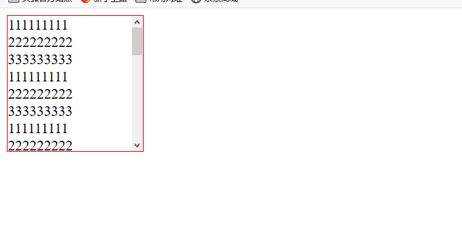
<div>
111111111 222222222 333333333
111111111 222222222 333333333
111111111 222222222 333333333
111111111 222222222 333333333
111111111 222222222 333333333
111111111 222222222 333333333
111111111 222222222 333333333
111111111 222222222 333333333
111111111 222222222 333333333
</div>
</body>
</html>
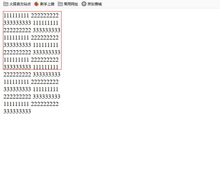
参考:https://github.com/6xiaoDi/blog-CSS/tree/a1.76
Branch: branch03
commit description:a1.76(example03-1——overflow默认visible)tag:a1.76
2.3.1.2 example03-2
overflow: hidden; => 溢出隐藏 – 超出盒子大小的部分 隐藏起来
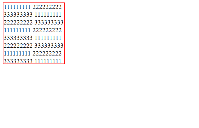
参考:https://github.com/6xiaoDi/blog-CSS/tree/a1.77
Branch: branch03
commit description:a1.77(example03-2——overflow:hidden)tag:a1.77
2.3.1.3 example03-3
overflow: scroll; => 显示滚动条总是会显示 - 不会超出盒子大小 内容能显示全但是 太丑了我们不常用
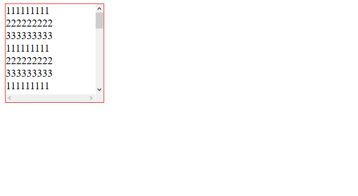
参考:https://github.com/6xiaoDi/blog-CSS/tree/a1.78
Branch: branch03
commit description:a1.78(example03-3——overflow:scroll)tag:a1.78
2.3.1.4 example03-4
overflow: auto; =>
1.如果超出,就显示滚动条
2.如果不超出,不显示滚动条
3.然并卵,我们还是不用
<!DOCTYPE html>
<html lang="en">
<head>
	<meta charset="UTF-8">
	<title>Document</title>
	<style>
		div {
			overflow: auto;
			width: 150px;
			height: 150px;
			border: 1px solid red;
		}
	</style>
</head>
<body>
	<div>
		111111111 222222222 333333333
		111111111 222222222 333333333
		111111111 222222222 333333333
<!--		111111111 222222222 333333333-->
<!--		111111111 222222222 333333333-->
<!--		111111111 222222222 333333333-->
<!--		111111111 222222222 333333333-->
<!--		111111111 222222222 333333333-->
<!--		111111111 222222222 333333333-->
	</div>
</body>
</html>
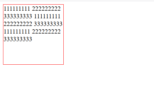
参考:https://github.com/6xiaoDi/blog-CSS/tree/a1.79
Branch: branch03
commit description:a1.79(example03-4——overflow:auto)tag:a1.79
2.3.2 实际开发场景
- 清除浮动
- 隐藏超出内容,隐藏掉, 不允许内容超过父盒子。
2.4 显示与隐藏总结
| 属性 | 区别 | 用途 |
|---|---|---|
| display | 隐藏对象,不保留位置 | 配合后面js做特效,比如下拉菜单,原先没有,鼠标经过,显示下拉菜单, 应用极为广泛 |
| visibility | 隐藏对象,保留位置 | 使用较少 |
| overflow | 只是隐藏超出大小的部分 | 1. 可以清除浮动 2. 保证盒子里面的内容不会超出该盒子范围 |
2.4.1 案例
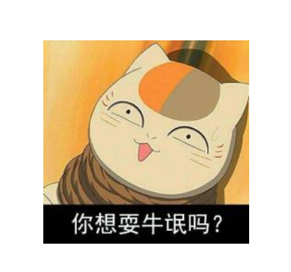
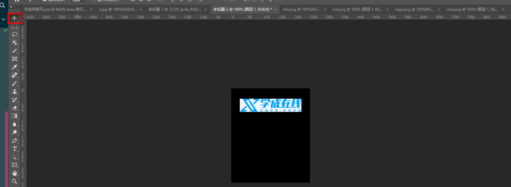
我们鼠标经过图片,就会变色并且出现一个按钮,这个如何实现呢?

实现原理很简单 =>
- 原来盒子里面装有一个 黑色半透明的盒子 刚开始是看不见的隐藏
- 当我们鼠标经过的时候,
a里面的这个黑色半透明的盒子就显示出来了

<!DOCTYPE html>
<html lang="en">
<head>
	<meta charset="UTF-8">
	<title>Document</title>
	<style>
		.box {
			width: 222px;
			height: 220px;
			margin: 100px auto;
		}
	</style>
</head>
<body>
	<div class="box">
		<img src="images/3.jpg" alt="">
	</div>
</body>
</html>
再准备一个黑色半透明的盒子
<!DOCTYPE html>
<html lang="en">
<head>
	<meta charset="UTF-8">
	<title>Document</title>
	<style>
		.box {
			width: 222px;
			height: 220px;
			margin: 100px auto;
		}
		.mask {
			width: 222px;
			height: 220px;
			background-color: pink;
		}
	</style>
</head>
<body>
	<div class="box">
		<div class="mask"></div>
		<img src="images/3.jpg" alt="">
	</div>
</body>
</html>
盒子必须压在图片上,加定位
		.box {
			position: relative;
			width: 222px;
			height: 220px;
			margin: 100px auto;
		}
		.mask {
			position: absolute;
			top: 0;
			left: 0;
			width: 222px;
			height: 220px;
			background-color: pink;
		}

参考:https://github.com/6xiaoDi/blog-CSS/tree/a1.80
Branch: branch03
commit description:a1.80(实现新建一个盒子盖住图片)tag:a1.80
背景半透明 => background: rgba(0, 0, 0, .3);
实现阴影中间的小按钮

可以直接利用css背景图片即可
background: rgba(0, 0, 0, .3) url("images/arr.png");
不平铺 =>background: rgba(0, 0, 0, .3) url("images/arr.png") no-repeat;
加水平居中、垂直居中即可 => background: rgba(0, 0, 0, .3) url("images/arr.png") no-repeat center center;
用display隐藏 =>
		.mask {
			display: none;
			position: absolute;
			top: 0;
			left: 0;
			width: 222px;
			height: 220px;
			background: rgba(0, 0, 0, .3) url("images/arr.png") no-repeat center center;
		}
鼠标经过,有显示 => 用a链接包起来
改结构
<body>
	<div class="box">
		<a href="#">
			<div class="mask"></div>
			<img src="images/3.jpg" alt="">
		</a>
	</div>
</body>
		.box a:hover .mask{
			display: block;
		}

参考:https://github.com/6xiaoDi/blog-CSS/tree/a1.81
Branch: branch03
commit description:a1.81(实现土豆网案例)tag:a1.81
3. CSS用户界面样式
- 所谓的界面样式, 就是更改一些用户操作样式,以便提高更好的用户体验。
- 更改用户的鼠标样式 (滚动条样式因为兼容性非常差<几乎就IE支持>,我们就不研究)
- 表单轮廓等
- 防止表单域拖拽
3.1 鼠标样式cursor
设置或检索在对象上移动的鼠标指针采用何种系统预定义的光标形状。
| 属性值 | 描述 |
|---|---|
| default | 小白 默认 |
| pointer | 小手 |
| move | 移动 |
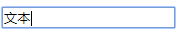
| text | 文本 |
| not-allowed | 禁止 |
鼠标放我身上查看效果哦:
<ul>
  <li style="cursor:default">我是小白</li>
  <li style="cursor:pointer">我是小手</li>
  <li style="cursor:move">我是移动</li>
  <li style="cursor:text">我是文本</li>
  <li style="cursor:not-allowed">我是文本</li>
</ul>
默认情况就是鼠标基本形状
小手 =>

移动 =>

文本 =>

禁止 =>

3.1.1 实例
<!DOCTYPE html>
<html lang="en">
<head>
	<meta charset="UTF-8">
	<title>Document</title>
</head>
<body>
	<ul>
		<li style="cursor: default;">默认的</li>
		<li style="cursor: pointer;">小手</li>
		<li style="cursor: move;">移动</li>
		<li style="cursor: text;">文本</li>
		<li style="cursor: not-allowed;">禁止</li>
	</ul>
</body>
</html>

参考:https://github.com/6xiaoDi/blog-CSS/tree/a1.82
Branch: branch03
commit description:a1.82(鼠标常用样式cursor)tag:a1.82
之前淘宝轮播图 => 优化鼠标经过小圆点出现小手
<div class="taobao">
<!-- 左按钮 小于号 -->
<a href="#" class="arrow-l"> < </a>
<!-- 右按钮 -->
<a href="#" class="arrow-r"> > </a>
<!-- 图片 -->
<img src="images/taobao.jpg" alt="">
<!-- 小圆点 -->
<ul class="circle" style="cursor: pointer;">
<li></li>
<li class="current"></li>
<li></li>
<li></li>
<li></li>
</ul>
</div>

参考:https://github.com/6xiaoDi/blog-CSS/tree/a1.83
Branch: branch03
commit description:a1.83(淘宝轮播图 => 优化鼠标经过小圆点出现小手)tag:a1.83
学成网案例 => 优化搜索按钮提示小手
		<div class="search">
			<input type="text" value="输入关键词">
			<button style="cursor: pointer"></button>
		</div>

参考:https://github.com/6xiaoDi/blog-CSS/tree/a1.84
Branch: branch03
commit description:a1.84(学成网案例 => 优化搜索按钮提示小手)tag:a1.84
3.2 轮廓线 outline
是绘制于元素周围的一条线,位于边框边缘的外围,可起到突出元素的作用。
outline : outline-color ||outline-style || outline-width
但是我们都不关心可以设置多少,我们平时都是去掉的。
最直接的写法是 : outline: 0; 或者 outline: none;
<input type="text" style="outline: 0;"/>
注意:轮廓线和边框不是一个东西,不要搞混了。
3.2.1 实例
<!DOCTYPE html>
<html lang="en">
<head>
	<meta charset="UTF-8">
	<title>Document</title>
</head>
<body>
	<input type="text">
</body>
</html>

取消轮廓线 =>
		input {
			outline: none;
		}

参考:https://github.com/6xiaoDi/blog-CSS/tree/a1.85
Branch: branch03
commit description:a1.85(去除input轮廓线)tag:a1.85
去除学成网案例的轮廓线

/*取消轮廓线*/
input {
	outline: none;
}

参考:https://github.com/6xiaoDi/blog-CSS/tree/a1.86
Branch: branch03
commit description:a1.86(去除学成网案例input轮廓线)tag:a1.86
3.3 防止拖拽文本域resize

实际开发中,我们文本域右下角是不可以拖拽:
<textarea style="resize: none;"></textarea>
3.3.1 实例
<!DOCTYPE html>
<html lang="en">
<head>
	<meta charset="UTF-8">
	<title>防止拖拽文本域</title>
	<style>
		textarea {
			width: 500px;
			height: 249px;
			border: 1px solid #036;
		}
	</style>
</head>
<body>
	<textarea>请留了言</textarea>
	1231231
</body>
</html>
存在两个问题 =>
- 存在轮廓线
- 可以拖拽,会影响界面其他元素

		textarea {
			width: 500px;
			height: 249px;
			/*取消轮廓线*/
			outline: none;
			/*边框改变颜色*/
			border: 1px solid #036;
			/*防止用户拖拽文本域*/
			resize: none;
		}

参考:https://github.com/6xiaoDi/blog-CSS/tree/a1.87
Branch: branch03
commit description:a1.87(防止拖拽文本域resize)tag:a1.87
3.4 用户界面样式总结
| 属性 | 用途 | 用途 |
|---|---|---|
| 鼠标样式 | 更改鼠标样式cursor | 样式很多,重点记住 pointer |
| 轮廓线 | 表单默认outline | outline 轮廓线,我们一般直接去掉,border是边框,我们会经常用 |
| 防止拖拽 | 主要针对文本域resize | 防止用户随意拖拽文本域,造成页面布局混乱,我们resize:none |
4. vertical-align 垂直对齐
- 有宽度的块级元素居中对齐,是
margin: 0 auto; - 让文字居中对齐,是
text-align: center;
但是我们从来没有说过有垂直居中的属性。
vertical-align 垂直对齐,它只针对于行内元素或者行内块元素,对于块级元素无效
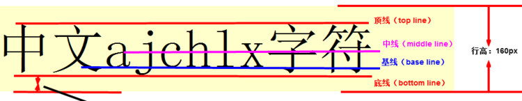
vertical-align : baseline |top |middle |bottom
设置或检索对象内容的垂直对其方式。
4.1 example04
4.1.1 example04-1
<!DOCTYPE html>
<html lang="en">
<head>
	<meta charset="UTF-8">
	<title>Document</title>
	<style>
		div {
			width: 100px;
			height: 100px;
			background-color: pink;
			margin: auto;
		}
	</style>
</head>
<body>
	<div>
	</div>
</body>
</html>
尝试垂直居中 => vertical-align: middle;
没有用!!
我们看看是否与文字有关,实际依然没用。
<!DOCTYPE html>
<html lang="en">
<head>
	<meta charset="UTF-8">
	<title>Document</title>
	<style>
		div {
			width: 100px;
			height: 100px;
			background-color: pink;
			margin: auto;
			vertical-align: middle;
		}
	</style>
</head>
<body>
	<div>
		你会失望的
	</div>
</body>
</html>
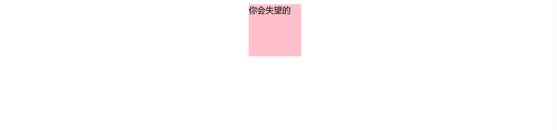
注意它只针对于行内元素或者行内块元素,对于块级元素无效
参考:https://github.com/6xiaoDi/blog-CSS/tree/a1.88
Branch: branch03
commit description:a1.88(example04-1——vertical-align对于块级无效)tag:a1.88
4.2 注意
vertical-align 不影响块级元素中的内容对齐,它只针对于行内元素或者行内块元素,
特别是行内块元素, 通常用来控制图片/表单与文字的对齐。
4.3 图片、表单和文字对齐
所以我们知道,我们可以通过vertical-align控制图片和文字的垂直关系了。
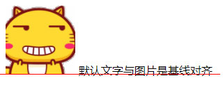
默认的图片会和文字基线对齐。
4.3.1 example04-2
<!DOCTYPE html>
<html lang="en">
<head>
<meta charset="UTF-8">
<title>Document</title>
<style>
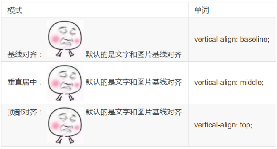
.one {
/*默认的是基线对齐*/
vertical-align: baseline;
}
.two {
/*让图片的中线 对齐 文字的中线 垂直居中*/
vertical-align: middle;
}
.three {
/*让图片的顶线 对齐 文字的顶线 顶部对齐*/
vertical-align: top;
}
</style>
</head>
<body>
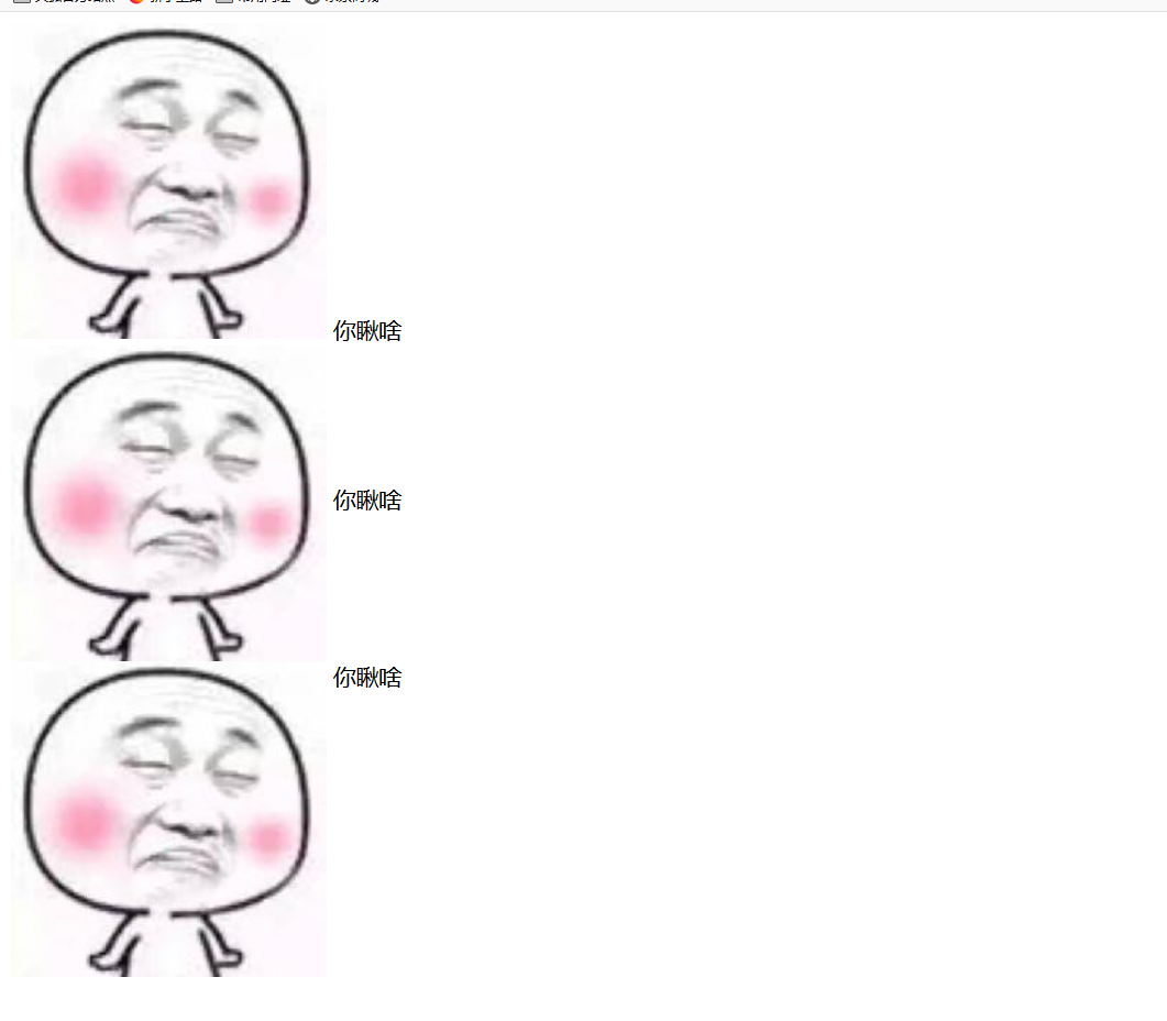
<div>
<img src="images/2.jpg" alt="" class="one"> 你瞅啥
</div>
<div>
<img src="images/2.jpg" alt="" class="two"> 你瞅啥
</div>
<div>
<img src="images/2.jpg" alt="" class="three"> 你瞅啥
</div>
</body>
</html>
参考:https://github.com/6xiaoDi/blog-CSS/tree/a1.89
Branch: branch03
commit description:a1.89(example04-2——vertical-align图片对齐文字)tag:a1.89
4.3.2 example04-3
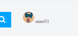
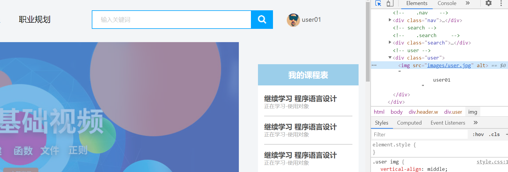
优化学成在线案例 => 用户头像旁的名称垂直居中对齐
.user img {
	vertical-align: middle;
}
参考:https://github.com/6xiaoDi/blog-CSS/tree/a1.90
Branch: branch03
commit description:a1.90(example04-3——优化学成在线案例 => 用户头像旁的名称垂直居中对齐)tag:a1.90
4.4 去除图片底侧空白缝隙
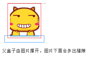
-
原因:
图片或者表单等行内块元素,它的底线会和父级盒子的基线对齐。
就是图片底侧会有一个空白缝隙。
-
解决的方法就是:
-
给
imgvertical-align:middle | top| bottom等等。 让图片不要和基线对齐。
-
给
img添加display:block; 转换为块级元素就不会存在问题了。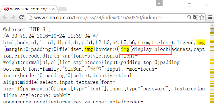
-
4.4.1 example04-4
<!DOCTYPE html>
<html lang="en">
<head>
	<meta charset="UTF-8">
	<title>Document</title>
	<style>
		div {
			border: 1px solid red;
		}
	</style>
</head>
<body>
	<div>
	</div>
</body>
</html>
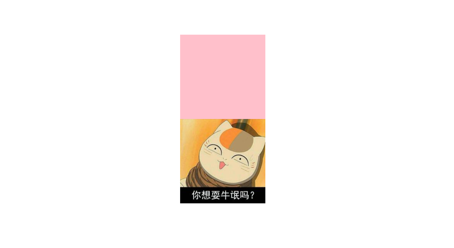
插入图片
	<div>
		<img src="images/3.jpg" alt="">
	</div>
图片应该会撑开盒子,但是底部却有空白缝隙
为甚有这种效果呢?
我们上面学到,文字默认与图片得基线对齐,虽然我们这里没写文字,但是也得把位置空出来。
		div img {
			vertical-align: baseline;
		}
因为默认的是基线对齐,所有底册有空白缝隙
修复 => 只要不是 基线对齐就好了
vertical-align: bottom;
vertical-align: middle;
注意块级元素来说 vertical-align: 是无效的 就不会有基线对齐的问题了
所以还有第三种方式 => 转成块级元素
display: block;
参考:https://github.com/6xiaoDi/blog-CSS/tree/a1.91
Branch: branch03
commit description:a1.91(example04-4——去除图片底侧空白缝隙)tag:a1.91
5. 溢出的文字省略号显示
5.1 white-space
- white-space设置或检索对象内文本显示方式。通常我们使用于强制一行显示内容
white-space:normal ;默认处理方式

white-space:nowrap ; 强制在同一行内显示所有文本,直到文本结束或者遭遇br标签对象才换行。
5.1.1 example05-1
<!DOCTYPE html>
<html lang="en">
<head>
<meta charset="UTF-8">
<title>溢出的文字省略号显示</title>
<style>
div {
width: 150px;
height: 25px;
border: 1px solid pink;
}
</style>
</head>
<body>
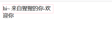
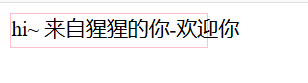
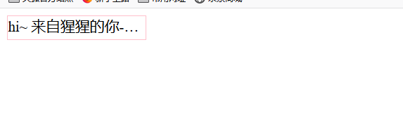
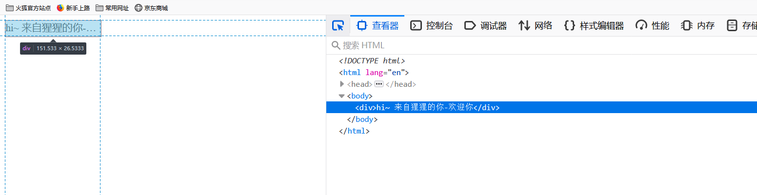
<div>hi~ 来自猩猩的你-欢迎你</div>
</body>
</html>
white-space:normal ;默认处理方式 => 当文字显示不开的时候,自动换行
white-space:nowrap => 要文字强制一行内显示 除非 遇到 br
参考:https://github.com/6xiaoDi/blog-CSS/tree/a1.92
Branch: branch03
commit description:a1.92(example05-1—— 要文字强制一行内显示 除非 遇到 br)tag:a1.92
5.2 text-overflow 文字溢出
- 设置或检索是否使用一个省略标记(…)标示对象内文本的溢出
text-overflow : clip ;(默认)不显示省略标记(...),而是简单的裁切

text-overflow:ellipsis ; 当对象内文本溢出时显示省略标记(...)
5.2.1 注意
一定要首先强制一行内显示,再次和overflow属性 搭配使用

5.3 总结三步曲
  /*1. 先强制一行内显示文本*/
      white-space: nowrap;
  /*2. 超出的部分隐藏*/
      overflow: hidden;
  /*3. 文字用省略号替代超出的部分*/
      text-overflow: ellipsis;
5.3.1 example05-2
溢出隐藏
overflow: hidden;
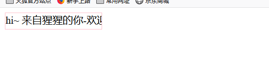
文字溢出 用省略号替代 ellipsis 省略号
text-overflow: ellipsis;
检查文字,实际是在标签中的。
参考:https://github.com/6xiaoDi/blog-CSS/tree/a1.93
Branch: branch03
commit description:a1.93(example05-2—— 文字溢出 用省略号替代 ellipsis 省略号)tag:a1.93
6. CSS精灵技术(sprite) 重点
6.1 为什么需要精灵技术

图所示为网页的请求原理图,当用户访问一个网站时,需要向服务器发送请求,网页上的每张图像都要经过一次请求才能展现给用户。
然而,一个网页中往往会应用很多小的背景图像作为修饰,当网页中的图像过多时,服务器就会频繁地接受和发送请求,这将大大降低页面的加载速度。
为什么需要精灵技术:
为了有效地减少服务器接受和发送请求的次数,提高页面的加载速度。
出现了CSS精灵技术(也称CSS Sprites、CSS雪碧)。
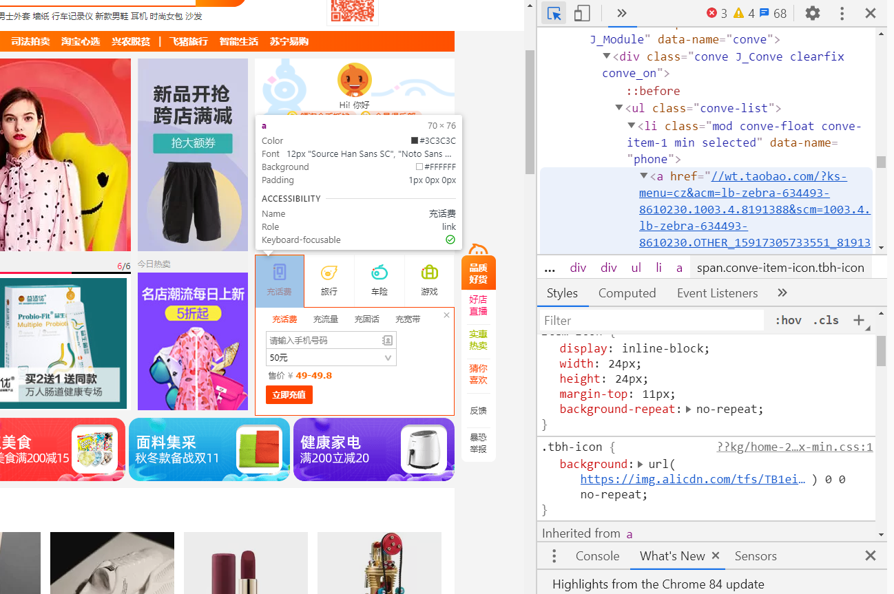
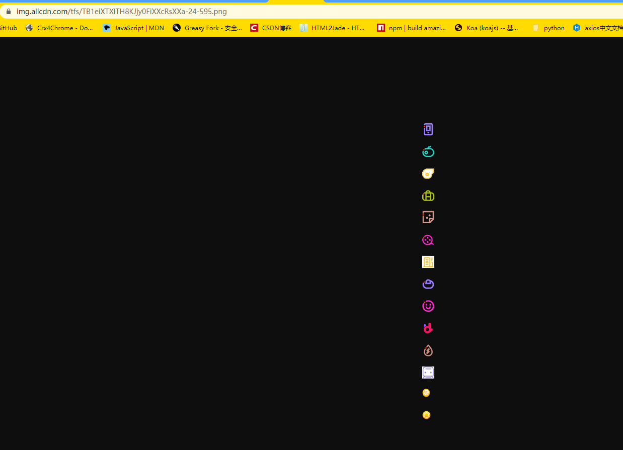
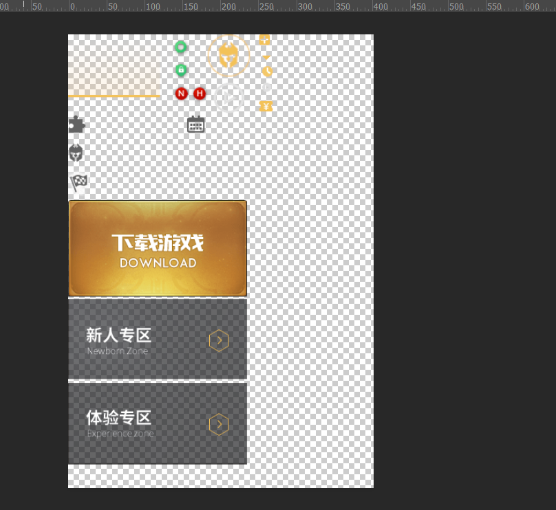
找到淘宝的小图标,我们点进去看看背景图,发现竟然是一串图 =>
这样就大大降低了服务器请求次数,这里请求一次就足够了,如果把图片拆分,就得请求15次。
6.2 精灵技术讲解
CSS 精灵其实是将网页中的一些背景图像整合到一张大图中(精灵图),然而,各个网页元素通常只需要精灵图中不同位置的某个小图,要想精确定位到精灵图中的某个小图。
这样,当用户访问该页面时,只需向服务发送一次请求,网页中的背景图像即可全部展示出来。
我们需要使用CSS的
background-imagebackground-repeatbackground-position属性进行背景定位,- 其中最关键的是使用
background-position属性精确地定位。
6.3 精灵技术使用的核心总结
首先我们知道,css精灵技术主要针对于背景图片,插入的图片img是不需要这个技术的。
- 精确测量,每个小背景图片的大小和 位置。
- 给盒子指定小背景图片时, 背景定位基本都是 负值。
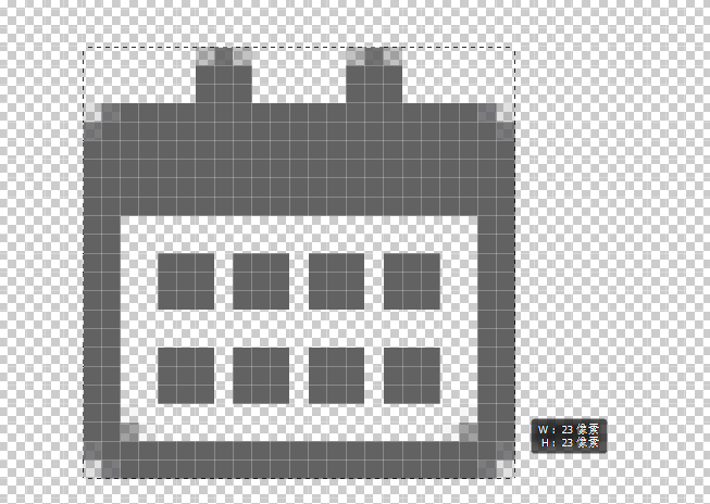
6.4 制作精灵图(了解)
CSS精灵其实是将网页中的一些背景图像整合到一张大图中(精灵图),那我们要做的,就是把小图拼合成一张大图。
大部分情况下,精灵图都是网页美工做。
我们精灵图上放的都是小的装饰性质的背景图片。
插入图片不能往上放。
我们可以横向摆放也可以纵向摆放(方便测量),但是每个图片之间留有适当的空隙
在我们精灵图的最底端,留一片空隙,方便我们以后添加其他精灵图。
6.5 小结
小公司,背景图片很少的情况,没有必要使用精灵技术,维护成本太高。 如果是背景图片比较多,可以建议使用精灵技术。
6.6 example06
精确测量图片
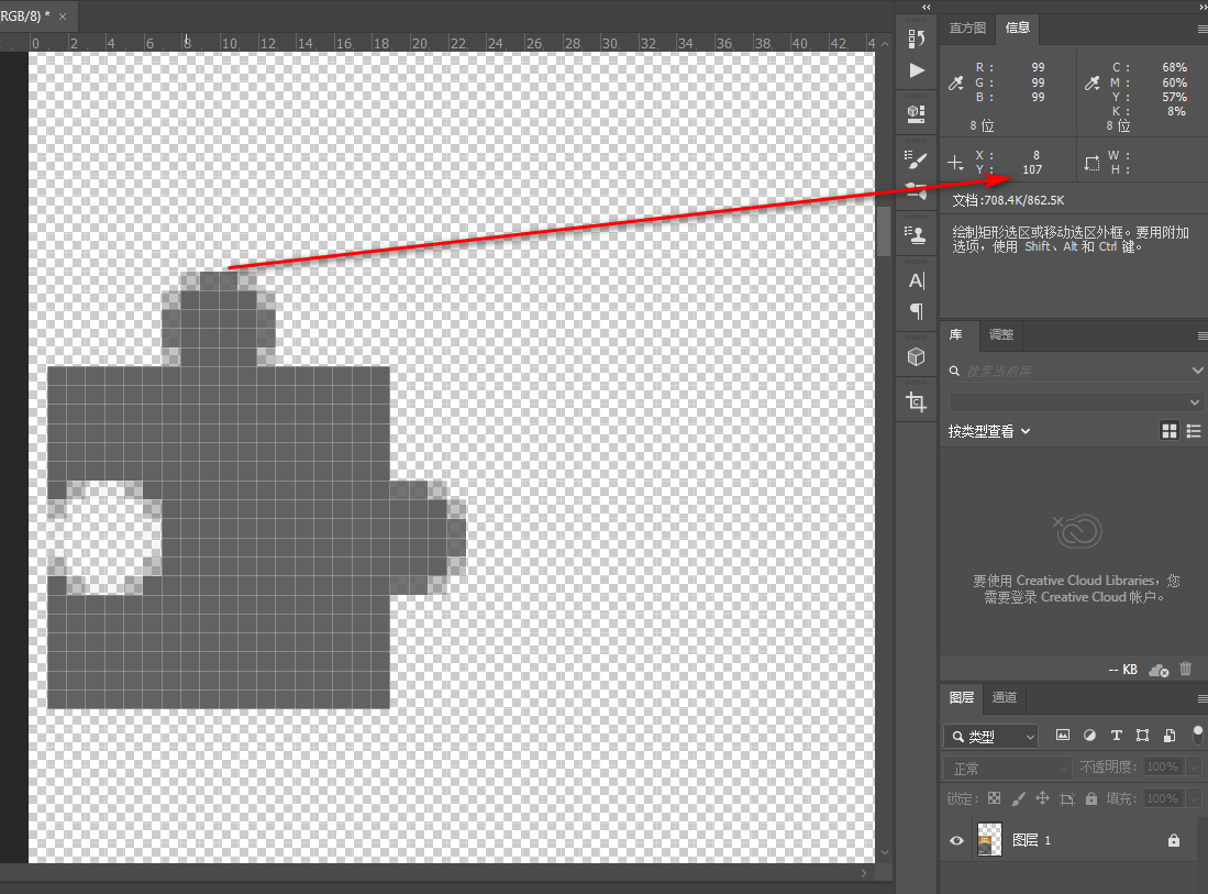
		.icon1 {
			width: 22px;
			height: 23px;
			background: url(images/index.png) no-repeat;
			/*background-position: 0 -107px;*/
		}
什么都没有,因为盒子默认与图片得左上角对齐。而我们的底图,左上角什么都没有。
因此需要移动背景图的位置,把图标的位置移动到左上角,就可以获取到图标了。(注意背景往上走是负值)
<!DOCTYPE html>
<html lang="en">
<head>
	<meta charset="UTF-8">
	<title>体会css精灵技术</title>
	<style>
		.icon1 {
			width: 22px;
			height: 23px;
			background: url(images/index.png) no-repeat  0 -107px;
			/*background-position: 0 -107px;*/
		}
	</style>
</head>
<body>
	<div class="icon1"></div>
</body>
</html>
再补上一张图
<!DOCTYPE html>
<html lang="en">
<head>
	<meta charset="UTF-8">
	<title>体会css精灵技术</title>
	<style>
		.icon1 {
			width: 22px;
			height: 23px;
			background: url(images/index.png) no-repeat  0 -107px;
			/*background-position: 0 -107px;*/
		}
		.icon2 {
			width: 23px;
			height: 23px;
			background: url(images/index.png) no-repeat -157px -107px;
			margin: 100px;
		}
	</style>
</head>
<body>
	<div class="icon1"></div>
	<div class="icon2"></div>
</body>
</html>
参考:https://github.com/6xiaoDi/blog-CSS/tree/a1.94
Branch: branch03
commit description:a1.94(example06—— CSS精灵技术)tag:a1.94
6.7 example07
拼出自己的名字
先测L
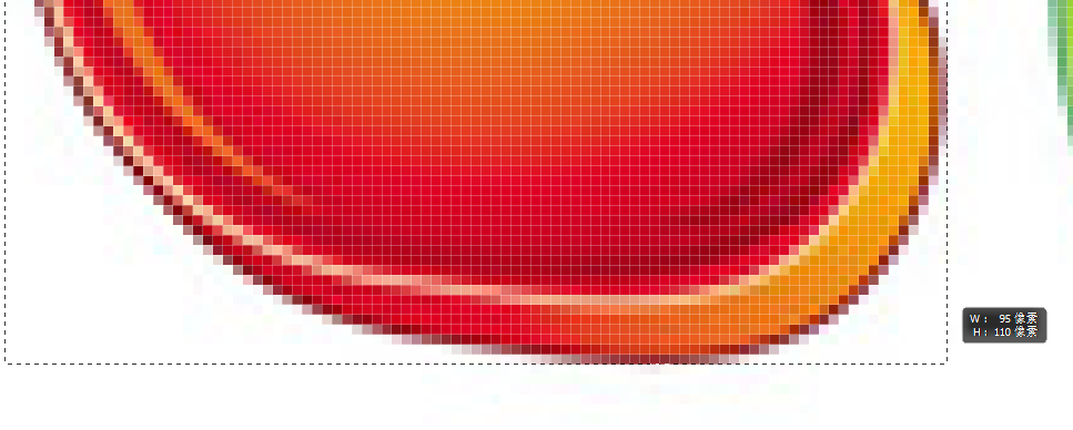
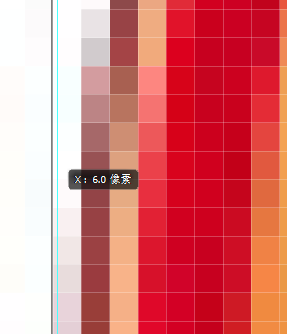

		.l {
			width: 95px;
			height: 110px;
			background-position: -6px -276px;
		}
测X

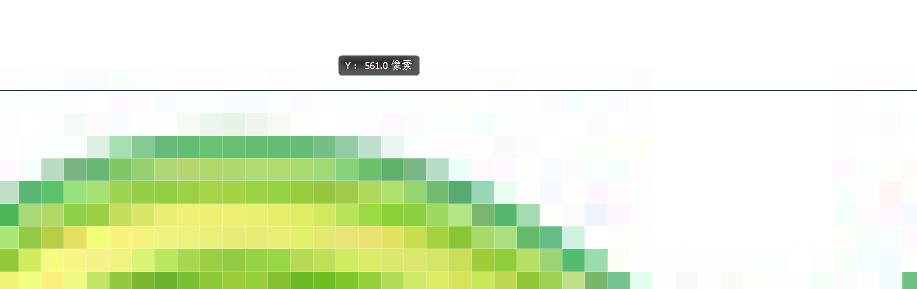
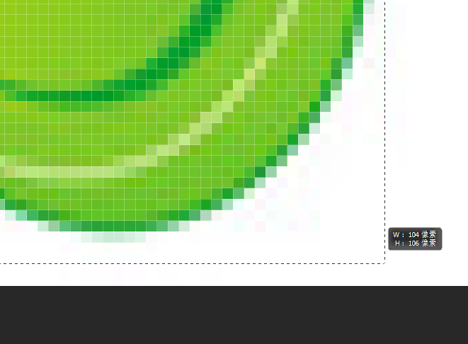
		.x {
			width: 104px;
			height: 106px;
			background-position: -254px -561px;
		}
ps测量距离还是很麻烦的,建议使用fireworks

		.d {
			width: 97px;
			height: 107px;
			background-position: -363px -8px;
		}
<!DOCTYPE html>
<html lang="en">
<head>
<meta charset="UTF-8">
<title>Document</title>
<style>
div {
float: left;
background: url(images/abcd.jpg) no-repeat;
}
.l {
width: 95px;
height: 110px;
background-position: -6px -276px;
}
.x {
width: 104px;
height: 106px;
background-position: -254px -561px;
}
.d {
width: 97px;
height: 107px;
background-position: -363px -8px;
}
</style>
</head>
<body>
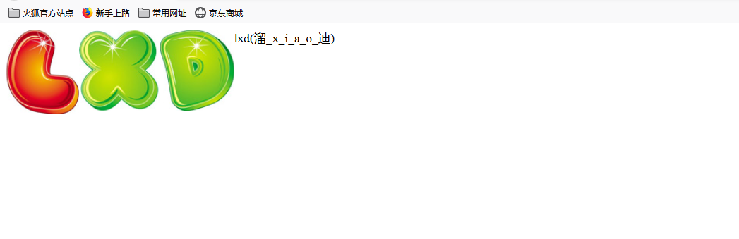
lxd(溜_x_i_a_o_迪)
<div class="l"></div>
<div class="x"></div>
<div class="d"></div>
</body>
</html>
参考:https://github.com/6xiaoDi/blog-CSS/tree/a1.95
Branch: branch03
commit description:a1.95(example07—— 拼出自己的名字)tag:a1.95
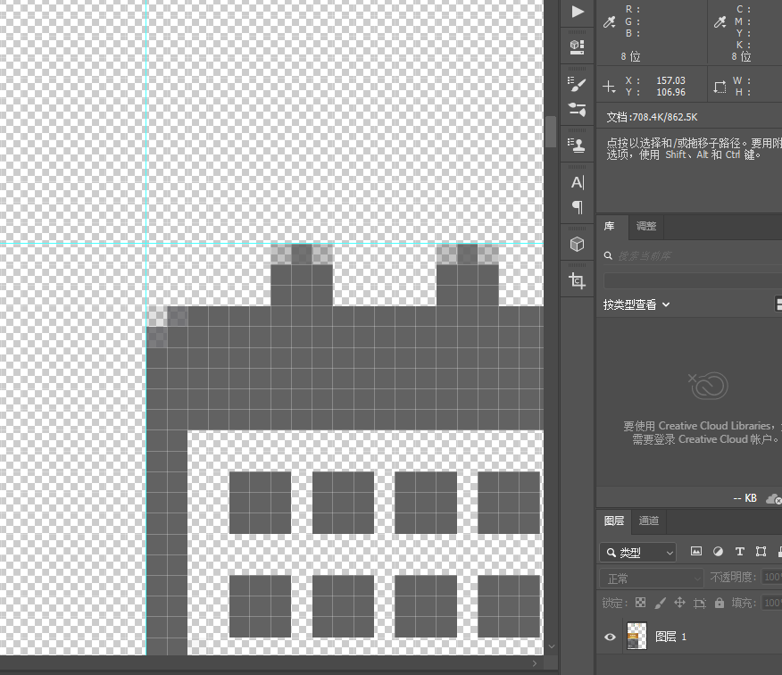
6.8 example08
制作精灵图
我们先找到最宽的图,设定合适的宽度 =>
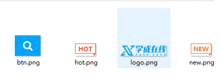
很明显logo是最宽的 =>196 x 42
分辨率建议设置成72,因为网页中的分辨率都是以72为准,这样1pt(1点)= 1px
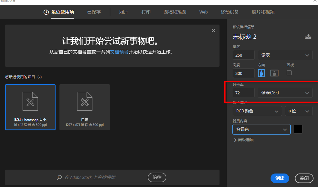
把图标全部打开用移动工具全部移动进来即可。
放置的时候一定要对齐。
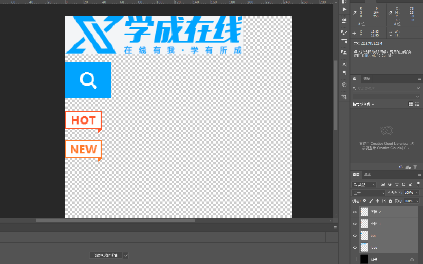
最后存储为png就行了。
参考:https://github.com/6xiaoDi/blog-CSS/tree/a1.96
Branch: branch03
commit description:a1.96(example08—— 精灵图制作)tag:a1.96
7. 滑动门
先来体会下现实中的滑动门,或者你可以叫做推拉门:

7.1 滑动门出现的背景
制作网页时,为了美观,常常需要为网页元素设置特殊形状的背景,比如微信导航栏,有凸起和凹下去的感觉,最大的问题是里面的字数不一样多,咋办?仅仅利用背景怎么实现呢?背景图都是固定大小。

为了使各种特殊形状的背景能够自适应元素中文本内容的多少,出现了CSS滑动门技术。它从新的角度构建页面,使各种特殊形状的背景能够自由拉伸滑动,以适应元素内部的文本内容,可用性更强。 最常见于各种导航栏的滑动门。
我们发现随着文字变多,导航按钮也会撑开(类似推拉门,文字多了就往两边伸,少了就往两边缩),但是也会有字数限制,字数过多,整个导航按钮都消失了。
其实就是一张大的背景图片。

7.2 核心技术
核心技术就是利用CSS精灵(主要是背景位置)和 盒子padding撑开宽度(这样就能伸缩变换了), 以便能适应不同字数的导航栏。
一般的经典布局都是这样的:
<li>
  <a href="#">
    <span>导航栏内容</span>
  </a>
</li>
css样式
* {
      padding:0;
      margin:0;

    }
    body{
      background: url(images/wx.jpg) repeat-x;
    }
    .father {
      padding-top:20px;
    }
    li {
      padding-left: 16px;
      height: 33px;
      float: left;
      line-height: 33px;
      margin:0  10px;
      background: url(./images/to.png) no-repeat left ;
    }
    a {
      padding-right: 16px;
      height: 33px;
      display: inline-block;
      color:#fff;
      background: url(./images/to.png) no-repeat right ;
      text-decoration: none;
    }
    li:hover,
     li:hover a {
      background-image:url(./images/ao.png);
    }
7.2.1 example09
滑动门实际有两道门
a是 设置 左侧 背景 (左门)span是设置 右侧 背景 (右门)
为啥a里面包着span呢?(可能还有其他形式,此种模式常用)
鼠标放在按钮上,实际整个区域都是a的范围,span应该包在其内部,因为span是不能点击的。并且整个导航栏都是链接,所以 a要包含 span。
我们是左右滑动,所以高度应该定死。
7.2.1.1 example09-1
因为我们是滑动门,左右推拉跟文字内容多少有关系,此时需要用文字撑开盒子, 就要用到行内块(块级是通栏)。
<!DOCTYPE html>
<html lang="en">
<head>
<meta charset="UTF-8">
<title>Document</title>
<style>
a {
display: inline-block;
height: 33px;
background: url(images/to.png) no-repeat;
margin: 100px;
color: #fff;
}
</style>
</head>
<body>
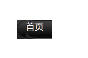
<a href="#">
<span>首页</span>
</a>
</body>
</html>
文字盖住了,调一下内边距
		a {
			display: inline-block;
			height: 33px;
			background: url(images/to.png) no-repeat;
			margin: 100px;
			padding-left: 15px;
			color: #fff;
		}

参考:https://github.com/6xiaoDi/blog-CSS/tree/a1.97
Branch: branch03
commit description:a1.97(example09-1—— 实现左侧推拉门)tag:a1.97
7.2.1.2 example09-2
<!DOCTYPE html>
<html lang="en">
<head>
	<meta charset="UTF-8">
	<title>Document</title>
	<style>
		a {
			display: inline-block;
			height: 33px;
			background: url(images/to.png) no-repeat;
			margin: 100px;
			padding-left: 15px;
			color: #fff;
		}
		a span {
			display: inline-block;
			height: 33px;
			background: url(images/to.png) no-repeat;
			padding-right: 15px;
		}
	</style>
</head>
<body>
	<a href="#">
		<span>首页</span>
	</a>
</body>
</html>
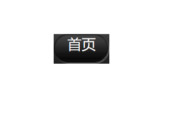
出问题了,都贴着左侧对齐了。
改右对齐 => 一定注意 span 需要背景图片 右对齐
		a span {
			display: inline-block;
			height: 33px;
			background: url(images/to.png) no-repeat right top;
			padding-right: 15px;
		}
<!DOCTYPE html>
<html lang="en">
<head>
<meta charset="UTF-8">
<title>Document</title>
<style>
a {
display: inline-block;
height: 33px;
background: url(images/to.png) no-repeat;
margin: 100px;
padding-left: 15px;
color: #fff;
}
a span {
display: inline-block;
height: 33px;
background: url(images/to.png) no-repeat right top;
padding-right: 15px;
}
</style>
</head>
<body>
<a href="#">
<span>首页</span>
</a>
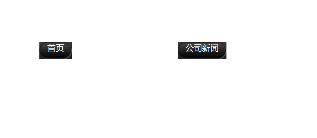
<a href="#">
<span>公司新闻</span>
</a>
</body>
</html>
就像微信首页一样,如果字数过多,图片就撑不住了,但是一般不会有那么大的导航栏。
参考:https://github.com/6xiaoDi/blog-CSS/tree/a1.98
Branch: branch03
commit description:a1.98(example09-2—— 实现推拉门原理)tag:a1.98
7.2.2 总结
a设置 背景左侧,padding撑开合适宽度。span设置背景右侧,padding撑开合适宽度 剩下由文字继续撑开宽度。- 之所以
a包含span就是因为 整个导航都是可以点击的。
7.3 example10
7.3.1 example10-1
<!DOCTYPE html>
<html lang="en">
<head>
	<meta charset="UTF-8">
	<title>微信导航栏案例</title>
	<style>
		body {
			background: url(images/wx.jpg);
		}
	</style>
</head>
<body>
</body>
</html>
默认横向和纵向都会平铺,实际我们只需要横向即可。
		body {
			background: url(images/wx.jpg) repeat-x;
		}
<!DOCTYPE html>
<html lang="en">
<head>
	<meta charset="UTF-8">
	<title>微信导航栏案例</title>
	<style>
		* {
			margin: 0;
			padding: 0;
		}
		li {
			list-style: none;
		}
		body {
			background: url(images/wx.jpg) repeat-x;
		}
		.nav a {
			display: inline-block;
			height: 33px;
			background: url(images/to.png) no-repeat;
			padding-left: 15px;
			color: #fff;
		}
		.nav a span {
			display: inline-block;
			height: 33px;
			background: url(images/to.png) no-repeat right;
			padding-right: 15px;
		}
	</style>
</head>
<body>
	<!--.nav>ul>li-->
	<div class="nav">
		<ul>
			<li>
				<a href="#">
					<span>
						首页
					</span>
				</a>
			</li>
		</ul>
	</div>
</body>
</html>
参考:https://github.com/6xiaoDi/blog-CSS/tree/a1.99
Branch: branch03
commit description:a1.99(example10-1—— 实现微博导航栏框子)tag:a1.99
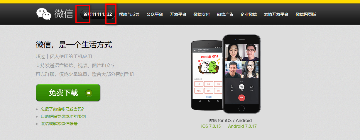
7.3.2 example10-2
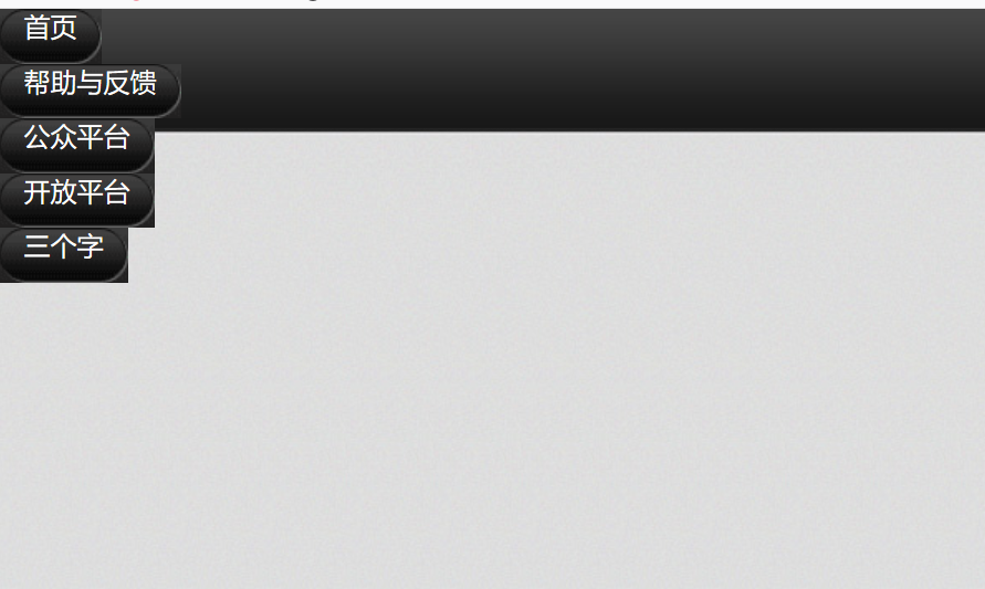
补充其他
	<div class="nav">
		<ul>
			<li>
				<a href="#">
					<span>首页</span>
				</a>
			</li>
			<li>
				<a href="#">
					<span>帮助与反馈</span>
				</a>
			</li>
			<li>
				<a href="#">
					<span>公众平台</span>
				</a>
			</li>
			<li>
				<a href="#">
					<span>开放平台</span>
				</a>
			</li>
			<li>
				<a href="#">
					<span>三个字</span>
				</a>
			</li>
		</ul>
	</div>
添加浮动
		.nav li {
			float: left;
		}

加顶部外边距
		.nav {
			margin-top: 20px;
		}
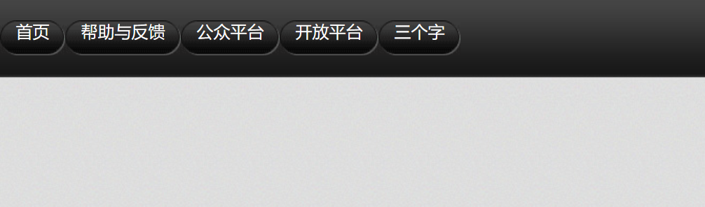
增加中间距离
		.nav li {
			float: left;
			margin: 0 5px;
		}
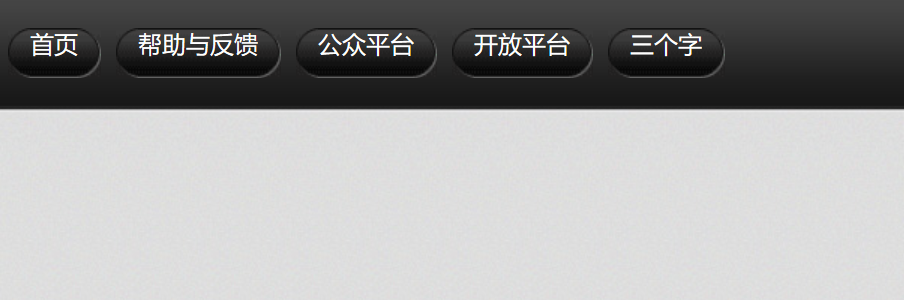
优化文字
		.nav a {
			display: inline-block;
			height: 33px;
			background: url(images/to.png) no-repeat;
			padding-left: 15px;
			color: #fff;
			line-height: 33px;
			font-size: 14px;
		}
参考:https://github.com/6xiaoDi/blog-CSS/tree/a2.01
Branch: branch03
commit description:a2.01(example10-2—— 实现微博导航栏基本样式)tag:a2.01
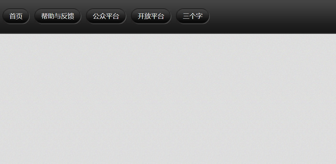
7.3.3 example10-3
原先是凸起来的,实现鼠标停留凹下去。
鼠标经过了a链接首先换背景图片 然后 链接里面的span 也要换
		.nav a:hover,
		.nav a:hover span {
			background-image: url(images/ao.png);
		}

参考:https://github.com/6xiaoDi/blog-CSS/tree/a2.02
Branch: branch03
commit description:a2.02(example10-3—— 实现微博导航栏)tag:a2.02
8. 拓展@
8.1 margin负值之美
8.1.1 1). 负边距+定位:水平垂直居中
咱们前面说过, 一个绝对定位的盒子, 利用 父级盒子的 50%, 然后 往左(上) 走 自己宽度的一半 ,可以实现盒子水平垂直居中。(这里就不演示了)
8.1.2 2). 压住盒子相邻边框

如果四个边框都给,中间的线会很粗。
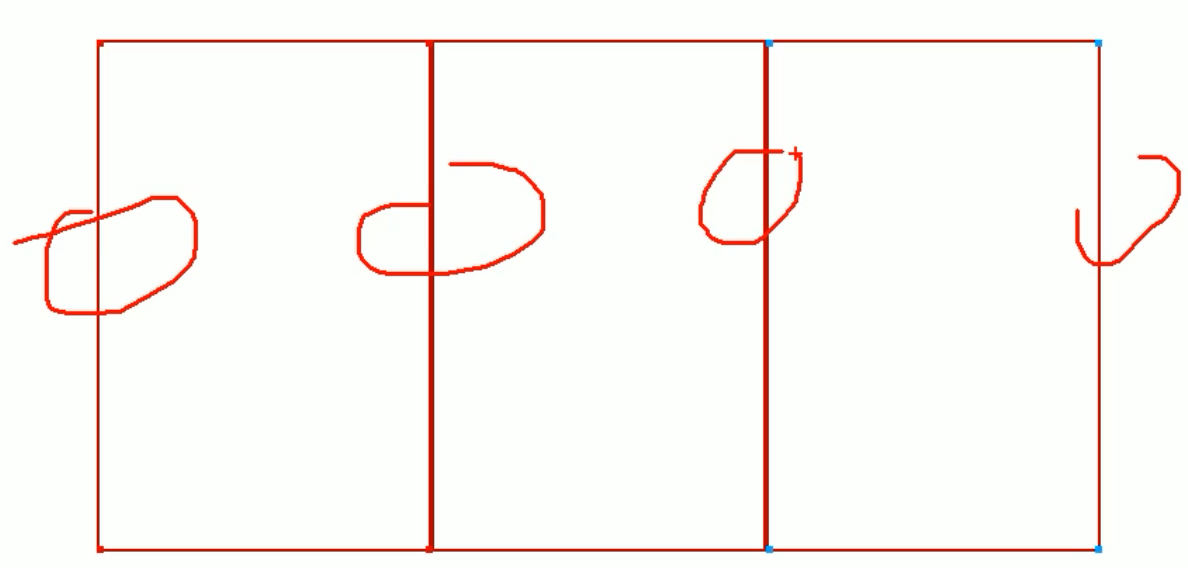
8.1.2.1 example11
利用margin负值解决这个问题
<!DOCTYPE html>
<html lang="en">
<head>
	<meta charset="UTF-8">
	<title>Document</title>
	<style>
		div {
			float: left;
			width: 200px;
			height: 300px;
			border: 1px solid red;
		}
	</style>
</head>
<body>
	<div></div>
	<div></div>
	<div></div>
	<div></div>
	<div></div>
	<div></div>
	<div></div>
	<div></div>
	<div></div>
</body>
</html>
和我们之前分析的一模一样。

		div {
			float: left;
			width: 200px;
			height: 300px;
			border: 1px solid red;
			margin-left: -1px;
			margin-top: -1px;
		}
浮动的盒子是紧贴在一起的,当第一个盒子左走了之后,有空位,因为浮动的原因,第二个盒子会紧贴过来,然后再接到命令再往左走一个像素。

参考:https://github.com/6xiaoDi/blog-CSS/tree/a2.03
Branch: branch03
commit description:a2.03(example11—— 利用margin负值解决压住盒子边框的问题)tag:a2.03
8.1.2.2 example12
8.1.2.2.1 example12-1
margin能突出显示某个盒子,鼠标经过某一项
<!DOCTYPE html>
<html lang="en">
<head>
	<meta charset="UTF-8">
	<title>margin负值之美-突出显示某个盒子</title>
	<style>
		div {
			float: left;
			width: 200px;
			height: 300px;
			border: 1px solid #ccc;
			margin-left: -1px;
			margin-top: -1px;
		}
		/*鼠标经过div 的意思  p:hover */
		div:hover {
			border: 1px solid #f40;
		}
	</style>
</head>
<body>
	<div></div>
	<div></div>
	<div></div>
	<div></div>
	<div></div>
	<div></div>
	<div></div>
	<div></div>
	<div></div>
</body>
</html>
发现被压住的边框就出问题了,因为它被下一个边框盖住了,下个边框没有被鼠标经过,因此没有任何效果。

我要让当前鼠标经过的这个div 升到最高处来就好了 => 可能第一想到的是z-index,但是它只能用在定位的盒子上,因此这里用不了(不管用)。
注意之前学到的是标准流在最底层,浮动的盒子在中间层,而定位的盒子在最上层。
=> 定位的盒子是最高层的
=> 我们只要保证当前的这个盒子 是定位 => 就会压住 标准流和浮动盒子
=> 我们只能用相对定位 它是占位置的
<!DOCTYPE html>
<html lang="en">
<head>
	<meta charset="UTF-8">
	<title>margin负值之美-突出显示某个盒子</title>
	<style>
		div {
			/*浮动的盒子是紧贴在一起的*/
			float: left;
			width: 200px;
			height: 300px;
			border: 1px solid #ccc;
			margin-left: -1px;
			margin-top: -1px;
		}
		/*鼠标经过div 的意思  p:hover */
		div:hover {
			border: 1px solid #f40;
			position: relative;
		}
	</style>
</head>
<body>
	<div></div>
	<div></div>
	<div></div>
	<div></div>
	<div></div>
	<div></div>
	<div></div>
	<div></div>
	<div></div>
</body>
</html>

参考:https://github.com/6xiaoDi/blog-CSS/tree/a2.04
Branch: branch03
commit description:a2.04(example12-1—— margin负值之美-突出显示某个盒子)tag:a2.04
8.1.2.2.2 example12-2
还可以用另一种方法实现。

使用相对定位,鼠标经过后升一下层级,就不会受到层级覆盖的影响了。
<!DOCTYPE html>
<html lang="en">
<head>
	<meta charset="UTF-8">
	<title>margin负值之美-突出显示某个盒子</title>
	<style>
		div {
			position: relative;
			float: left;
			width: 200px;
			height: 300px;
			border: 1px solid #ccc;
			margin-left: -1px;
			margin-top: -1px;
		}
		/*鼠标经过div 的意思  p:hover */
		div:hover {
			border: 1px solid #f40;
			/*都是定位的盒子,我们通过z-index 来实现层级关系*/
			z-index: 1;

		}
	</style>
</head>
<body>
	<div></div>
	<div></div>
	<div></div>
	<div></div>
	<div></div>
	<div></div>
	<div></div>
	<div></div>
	<div></div>
</body>
</html>
参考:https://github.com/6xiaoDi/blog-CSS/tree/a2.05
Branch: branch03
commit description:a2.05(example12-2—— margin负值之美-突出显示某个盒子的另一个方法)tag:a2.05
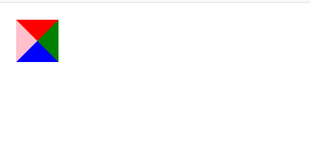
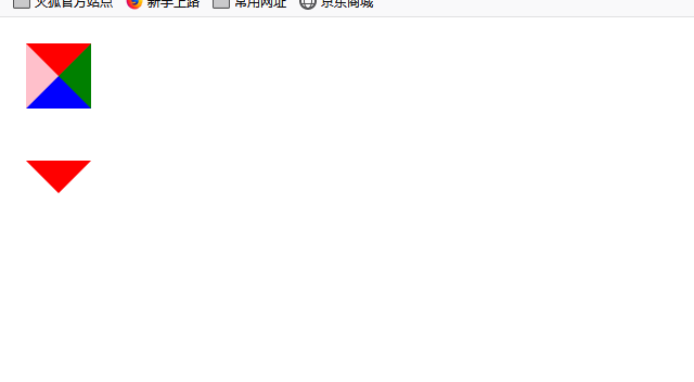
8.2 CSS三角形之美
 div {

 	width: 0;

    height: 0;
    line-height:0;
    font-size: 0;
	border-top: 10px solid red;

	border-right: 10px solid green;

	border-bottom: 10px solid blue;

	border-left: 10px solid #000;

 }
一张图, 你就知道css三角是怎么来的了, 做法如下:

- 我们用
css边框可以模拟三角效果 - 宽度高度为
0 - 我们
4个边框都要写, 只保留需要的边框颜色,其余的不能省略,都改为transparent透明就好了 - 为了照顾兼容性 低版本的浏览器,加上
font-size: 0;line-height: 0;
8.2.1 example13
8.2.1.1 example13-1
<!DOCTYPE html>
<html lang="en">
<head>
	<meta charset="UTF-8">
	<title>Document</title>
	<style>
		div {
			width: 0;
			height: 0;
			border-top: 10px solid red;
			border-right: 10px solid green;
			border-bottom: 10px solid blue;
			border-left: 10px solid pink;
		}
	</style>
</head>
<body>
	<div></div>
</body>
</html>
我们可以用css边框可以模拟三角效果
<!DOCTYPE html>
<html lang="en">
<head>
	<meta charset="UTF-8">
	<title>Document</title>
	<style>
		div {
			width: 0;
			height: 0;
			border-top: 10px solid red;
			border-right: 10px solid green;
			border-bottom: 10px solid blue;
			border-left: 10px solid pink;
		}
		p {
			width: 0;
			height: 0;
			border-style: solid;
			border-width: 10px;
			border-color:  red transparent transparent transparent;
		}
	</style>
</head>
<body>
	<div></div>
	<p></p>
</body>
</html>
为了兼容低版本浏览器,加上
			font-size: 0;
			line-height: 0;
		p {
			width: 0;
			height: 0;
			border-style: solid;
			border-width: 10px;
			/*上右下左*/
			border-color:  transparent transparent transparent red ;
			font-size: 0;
			line-height: 0;
		}
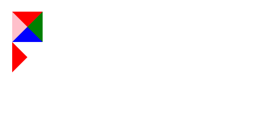
参考:https://github.com/6xiaoDi/blog-CSS/tree/a2.06
Branch: branch03
commit description:a2.06(example13-1—— css三角之美)tag:a2.06
8.2.1.2 example13-2
京东小三角
<!DOCTYPE html>
<html lang="en">
<head>
	<meta charset="UTF-8">
	<title>Document</title>
	<style>
		div {
			width: 200px;
			height: 100px;
			background-color: pink;
			margin: 100px auto;
		}
	</style>
</head>
<body>
	<div>
	</div>
</body>
</html>
<!DOCTYPE html>
<html lang="en">
<head>
	<meta charset="UTF-8">
	<title>Document</title>
	<style>
		div {
			width: 200px;
			height: 100px;
			background-color: pink;
			margin: 100px auto;
		}
		p {
			width: 0;
			height: 0;
			border-style: solid;
			border-width: 20px;
			/*上右下左*/
			border-color: transparent transparent red transparent;
		}
	</style>
</head>
<body>
	<div>
		<p></p>
	</div>
</body>
</html>
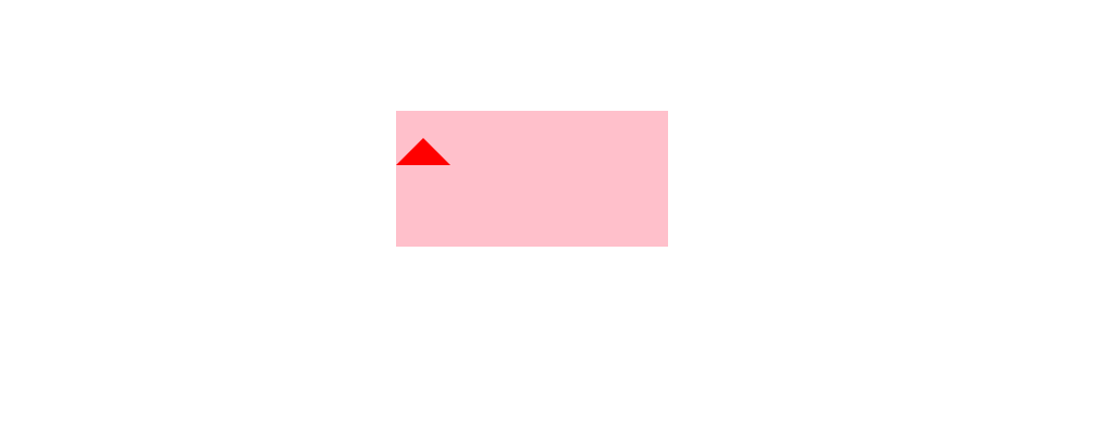
用定位使箭头上去
注意计算水平居中的时候,这里边宽20px。实际矩形宽度40px,即上三角宽度明显也是40px,除以2就是20px。
		p {
			position: absolute;
			/*水平居中*/
			left: 50%;
			margin-left: -20px;
			width: 0;
			height: 0;
			border-style: solid;
			border-width: 20px;
			/*上右下左*/
			border-color: transparent transparent red transparent;
			/*为兼容性*/
			font-size: 0;
			line-height: 0;
		}
<!DOCTYPE html>
<html lang="en">
<head>
	<meta charset="UTF-8">
	<title>Document</title>
	<style>
		div {
			position: relative;
			width: 200px;
			height: 100px;
			background-color: pink;
			margin: 100px auto;
		}
		p {
			position: absolute;
			top: -40px;
			/*水平居中*/
			left: 50%;
			margin-left: -20px;
			width: 0;
			height: 0;
			border-style: solid;
			border-width: 20px;
			/*上右下左*/
			border-color: transparent transparent pink transparent;
			/*为兼容性*/
			font-size: 0;
			line-height: 0;
		}
	</style>
</head>
<body>
	<div>
		<p></p>
	</div>
</body>
</html>
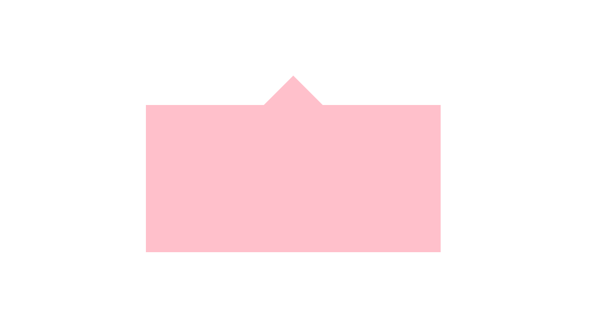
参考:https://github.com/6xiaoDi/blog-CSS/tree/a2.07
Branch: branch03
commit description:a2.07(example13-2—— 仿京东三角效果)tag:a2.07
考虑到在blog中不好体现代码更改的位置,小迪才用github托管代码,大家可以查看github,看到详细版本修改过程,搭配博客学习。
(后续待补充)


 387
387


 被折叠的 条评论
为什么被折叠?
被折叠的 条评论
为什么被折叠?
 到【灌水乐园】发言


