


应用场景
shape主要应用于为android控件制作如圆角,渐变,描边,填充等效果。
标签说明
corners 圆角
android:Radius : 设置四个角的半径
android:topLeftRadius :设置左上角的半径
android:topRightRadius :设置右上角的半径
android:bottomLeftRadius : 设置右下角的半径
android:bottomRightRadius :设置左下角的半径solid 填充
android:color指定填充的颜色strock 描边
android:width: 描边的宽度,
android:color :描边的颜色。
我们还可以把描边弄成虚线的形式,设置方式为:
android:dashWidth:虚线宽
android:dashGap:隔开距离gradient 渐变
android:startColor:起始颜色
android:endColor:结束颜色,
android:angle:渐变角度,必须为45的整数倍。
android:type=”linear”:线性渐变
android:type=”radial”:径向渐变
android:gradientRadius:径向渐变的半径padding 间距
设置上下左右四个方向的间隔。此处略!
shape使用
首先,在Drawable目录下新建btn_shape.xml的文件。
<?xml version="1.0" encoding="utf-8"?>

<shape xmlns:android="http://schemas.android.com/apk/res/android" >
    <corners
        android:topLeftRadius="15dp"
        android:topRightRadius="15dp"/><!-- 圆角 -->
    <solid android:color="@android:color/holo_blue_dark"/><!-- 填充 -->
    <stroke android:color="@android:color/holo_green_dark"/>
    <gradient android:startColor="@android:color/white"
        android:endColor="@android:color/black"
        android:angle="270"/>
</shape>
接着,在XML中引用:
<Button android:id="@+id/btn_shape"
android:layout_width="match_parent"
android:layout_height="wrap_content"
android:layout_marginLeft="20dp"
android:layout_marginRight="20dp"
android:layout_marginTop="20dp"
style="@style/ButtonStyle"
android:background="@drawable/btn_shape"
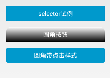
android:text="圆角按钮"/>此外,在code中也是可以引用的,引用方法和设置背景图一样,可参考其它文章。下面附上效果图一张。


 415
415


 被折叠的 条评论
为什么被折叠?
被折叠的 条评论
为什么被折叠?
 到【灌水乐园】发言


