


不知道啥时候看到过一篇帖子,使用微信小程序对罗盘,加速计,陀螺仪,设备方向,采集数据然后以波形的形式展示出来,觉得挺有意思的,这样可以直观的分析收集的移动,对数据的影响,甚至可以帮助来开发各种姿态的APP。于是乎,我也准备开发这样一个微信小程序,想练练手,也给无聊的生活增加一点乐趣
整个页面布局就四个页面,加速计,罗盘,陀螺仪,设备方向,使用TDesign 作为开发界面UI,使用echarts 作为图表绘制插件
1,加速计
开始监听
 wx.startAccelerometer()
 wx.onAccelerometerChange(function (res){
   that.addData(res,that)
 })
结束监听
wx.stopAccelerometer()2,罗盘
开始监听
      wx.startCompass()
      wx.onCompassChange(function (res){
        that.addData(res,that)
      })
结束监听
wx.stopCompass()3,陀螺仪
      wx.startGyroscope()
      wx.onGyroscopeChange(function (res){
        that.addData(res,that)
      })
结束监听
wx.stopGyroscope()4,设备方向
    wx.startDeviceMotionListening()
      wx.onDeviceMotionChange(function (res){
        that.addData(res,that)
      })
结束监听
wx.stopDeviceMotionListening()绘图逻辑
addData(res,that){
that.data.deviceData.push(res)
that.data.deviceData = that.data.deviceData.slice(-1 * that.data.scalex)
that.setData({
deviceData: that.data.deviceData,
})
// echart表格的内容配置
var option = {
title: {
// text: '数据统计',
left: 'center'
},
color: ["#37A2DA","'#60A0ff'","#05c8ac"],
legend: {
data: ['X','Y','Z'],
top: 20,
left: 'center',
backgroundColor: '#dbdbdb',
z: 100
},
grid: {
left: 0,//折线图距离左边距
right: 50,//折线图距离右边距
top: 30,//折线图距离上边距
bottom: 10,
containLabel: true
},
tooltip: {
show: true,
trigger: 'axis'
},
xAxis: {
name: '时间点',
type: 'category',
boundaryGap: false,
data: that.timeData,
//设置x轴的样式
axisLabel: {
//横坐标最后的标注颜色变深
// interval: 0,
show: true,
textStyle: {
color: '#000',
fontSize: '14',
}
},
show: true
},
yAxis: {
name: '数值',
x: 'center',
type: 'value',
min: -1 * that.data.scaley,
max: that.data.scaley,
splitLine: {
lineStyle: {
type: 'solid'
}
},
//设置y轴字体样式
axisLabel: {
show: true,
textStyle: {
color: '#000',
fontSize: '14',
}
},
show: true
},
series: [{
name: 'X',
type: 'line',
smooth: true,
data: that.data.deviceData.map(x=> x.x),
},{
name: 'Y',
type: 'line',
smooth: true,
data: that.data.deviceData.map(x=> x.y),
},{
name: 'Z',
type: 'line',
smooth: true,
data: that.data.deviceData.map(x=> x.z),
}]
};
that.data.chart.setOption(option);
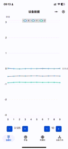
},现在小程序也太麻烦了,各种认证,还要备案,还要收费,无语。出来效果如下图所示。
因为输出的数据都比较小0.0001 ,所以针对纵坐标做了精度调整,左下角的 + - 可以对纵坐标最大最小值进行调整,右下角的+- 可以对现实的数量量做调整。


 2571
2571

 被折叠的 条评论
为什么被折叠?
被折叠的 条评论
为什么被折叠?
 到【灌水乐园】发言


