


定位元素 relative absolute fixed sticky
定位元素比普通元素的层级高
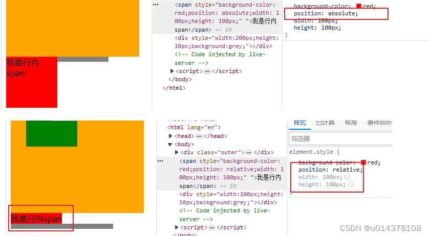
relative
不脱离文档流,参考点为原来的位置
可以设置float,,但不推荐这样做。
可以设置margin,但不推荐这样做
left
top,left,right,bottom,padding,margin 相对于原理的位置进行偏移
absulate
脱离文档流,参考点为包含块。脱离文档流对兄弟元素,父元素有影响
什么是包含块?
1. 对于没有脱离文档流的元素:包含块就是父元素;
2. 对于脱离文档流的元素:包含块是第一个拥有定位属性(absolute,relative)的祖先元素(如果所有祖先都
没定位,那包含块就是整个页面)。
可以设置float ,但是float 无效
left 于right不能同时设置,同时设置,right无效。如left:0;right:0;或rigth:0;left:0;
可以设置margin,但不推荐
无论是什么元素(行内、行内块、块级)设置为绝对定位之后,都变成了定位元素(默认宽高被内容所撑开,且可以自由设置宽高)。区别relative,relative没有这个属性
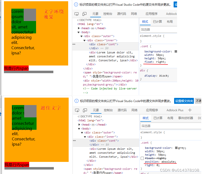
absolute 和float 都是脱离文档流的,但是有不同.
foat 呈现文字环绕的效果。.cont脱离文档流后,下面的文字会移动到 .cont原来的位置,
但是 .cont会把文字挤出来,呈现文字环绕的效果。
absoulte:.cont脱离文档流后,下面的文字会移动到 .cont原来的位置,.cont会直接把文字遮住
<style>
    .outer{
        background-color: orange;
        width:200px;
        height: 200px;
        padding:30px;
    }

    .inner{
        background-color: green;
        width: 100px;
        height: 100px;
        position: absolute;
    }


    .cont{
        background-color: grey;
        width: 50px;
        height: 50px;
        position: absolute;
        top:0;
        right:0;
    }
</style>
<body>

    <div class="outer">
        <div class="inner">
            <div class="cont">
            </div>
            <div>ddsfda</div>
        </div>
    </div>
</body>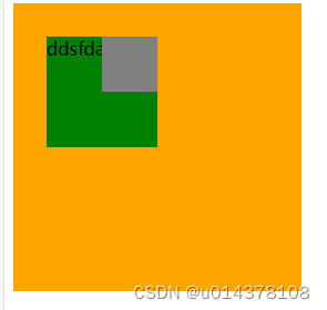
fixed
参考位置:视窗—— 对于PC 浏览器来说,视口就是我们看网页的那扇“窗户”。
与float同时设置,float失效
可以设置margin,但不推荐
无论是什么元素(行内、行内块、块级)设置为绝对定位之后,都变成了定位元素(默认宽高被内容所撑开,且可以自由设置宽高)。(absolute,fixed 有这个属性,realtive没有)
sticky
离它最近的一个拥有“滚动机制”的祖先元素,即便这个祖先不是最近的真实可滚动祖先。
不是最近的真实可滚动祖先(设置了overflow:auto,有默认滚动条)
情况1:离他最近的拥有”滚动机制的祖先元素为bod body的高度2000px
<style>
    body{
        height: 2000px;
    }
    .head{
        width: 100%;
        height: 40px;
        background-color: lightgrey;
        text-align: center;
        line-height: 40px;
    }
    .first{
        background-color: azure;
        position:sticky;
        top:0;
    }

</style>
<body>
    <div class="head">title</div>
    <div class="cont">
        <div class="item">
            <div class="first">A</div>
            <div>A1</div>
            <div>A2</div>
            <div>A3</div>
            <div>A4</div>
            <div>A5</div>
            <div>A6</div>
            <div>A7</div>
            <div>A8</div>
        </div>
        <div class="item">
            <div class="first">B</div>
            <div>A1</div>
            <div>A2</div>
            <div>A3</div>
            <div>A4</div>
        </div>
        <div class="item">
            <div class="first">C</div>
            <div>A1</div>
            <div>A2</div>
            <div>A3</div>
            <div>A4</div>
        </div>
    </div>
</body>
在item的父元素增加overflow:auto 让父元素拥有滚动机制,但是.cont的高度由内容撑开,没有出现滚动条,sticky不生效
 .cont{
        overflow: auto;
    }
设置.cont的height<内容高度,
   .cont{
        overflow: auto;
        height: 150px;
    }
top值是相对
离它最近的一个拥有“滚动机制”的祖先元素
最后代码
<style>
    body{
        height: 2000px;
    }
    .head{
        width: 100%;
        height: 40px;
        background-color: lightgrey;
        text-align: center;
        line-height: 40px;
    }
    .first{
        background-color: azure;
        position:sticky;
        top:0;
    }
    .cont{
        overflow: auto;
        height: 150px;
    }
    .cont>.item:last-child{
        margin-bottom:50px;
        color:red;
        padding-bottom: 100px;
        background-color: antiquewhite;
    }

</style>
<body>
    <div class="head">title</div>
    <div class="cont">
        <div class="item">
            <div class="first">A</div>
            <div>A1</div>
            <div>A2</div>
            <div>A3</div>
            <div>A4</div>
            <div>A5</div>
            <div>A6</div>
            <div>A7</div>
            <div>A8</div>
        </div>
        <div class="item">
            <div class="first">B</div>
            <div>A1</div>
            <div>A2</div>
            <div>A3</div>
            <div>A4</div>
        </div>
        <div class="item">
            <div class="first">C</div>
            <div>A1</div>
            <div>A2</div>
            <div>A3</div>
            <div>A4</div>
        </div>

    </div>
</body>


 705
705


 被折叠的 条评论
为什么被折叠?
被折叠的 条评论
为什么被折叠?
 到【灌水乐园】发言


