


STSegmentPageView
GitHub
Requirements
Installation
STSegmentPageView 可以通过 CocoaPods 安装. 请添加下列到你的 Podfile:
手动安装
下载项目,然后把“STSegmentPageView”文件夹拖拽入你的项目中
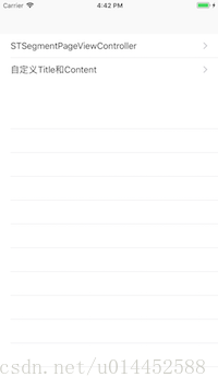
Usage
使用 集成好的STSegmentPageViewController:
GitHub
简介
高效易用的标题滚动视图,Written in Swift. (仿 美团,今日头条,网易,淘宝标题滚动视图).
Requirements
Installation
STSegmentPageView 可以通过 CocoaPods 安装. 请添加下列到你的 Podfile:
pod 'STSegmentPageView'手动安装
下载项目,然后把“STSegmentPageView”文件夹拖拽入你的项目中
Usage
使用 集成好的STSegmentPageViewController:
// use default title view configure
let config = STSegmentPageTitleViewConfigure()
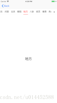
let titles = ["推荐","热点","视频","娱乐","问答","北京","朝阳","地方","八卦","综艺","推荐","热点","视频","娱乐","问答","北京","朝阳","地方","八卦","综艺"]
var models = titles.map { (title) -> STSegmentModel in
let model = STSegmentModel()
let controller = SecondViewController()
controller.label.text = title
model.segmentTitle = title
model.segmentController = controller
return model
}
//使用自定义高度
let segmentVC = STSegmentPageViewController(childrenModels: models, titleViewH: 40, titleConfig: config)
segmentVC.view.frame = CGRect(x: 0, y: 64, width: view.width, height: view.height - 64 )
segmentVC.addSegmentController(toParentController: self)使用自定义 title view and content view 来实现功能, 切记需要联动的话开发者一定要实现 `STSegmentContentViewDelegate`, `STSegmentTitleViewDelegate`, 这样才可以把 title view 和 content view 关联到一起.
let titles = ["推荐","热点","视频","娱乐","问答","北京","朝阳","地方","八卦","综艺","推荐","热点","视频","娱乐","问答","北京","朝阳","地方","八卦","综艺"]
let config = STSegmentPageTitleViewConfigure()
// title view
pageTitleView = STSegmentTitleView(config:config ,titles: titles)
pageTitleView!.frame = CGRect(x: 0, y: 64, width: view.width, height: 48)
view.addSubview(pageTitleView!)
pageTitleView?.delegate = self
// content view
var vcs = [UIViewController]()
for (i,_) in titles.enumerated(){
let controller = SecondViewController()
controller.label.text = "\(i)"
vcs.append(controller)
}
pageView = STSegmentContentView(frame: CGRect(x: 0, y: (pageTitleView?.frame.maxY ?? 0), width: view.width, height: view.height - (pageTitleView?.frame.maxY ?? 0) ), childrenControllers: vcs, parentVC:self)
pageView?.delegate = self
view.addSubview(pageView!)
/ Delegate
extension ViewController : STSegmentTitleViewDelegate{
func didSelectedSegmentTitleViewItemAt(atIndex index: Int) {
pageView?.didSelectedItemAtIndex(atIndex: index)
}
}
extension ViewController : STSegmentContentViewDelegate{
func pageContentViewDidScrollToItem(atIndex targetIndex: Int) {
pageTitleView?.didSelectedTitleItemAtIndex(atIndex: targetIndex)
}
func pageContentViewDidScroll(progress: CGFloat, originIndex: Int, targetIndex: Int) {
pageTitleView?.updateTitleViewWhenContentViewDrag(progress: progress, fromIndex: originIndex, endIndex: targetIndex)
}
}// MARK: - 指示器
/// 指示器style,默认为下划线
public var indicatorStyle : STSegmentTitleViewIndicatorStyle = .default
/// 指示器滚动样式,默认随着内容视图滚动而动
public var indicatorScrollStyle : STSegmentTitleViewIndicatorScrollStyle = .default
/// 指示器颜色,默认红色
public var indicatorColor : UIColor = .red
/// - 指示器高度
/// - 下划线样式下,固定长度样式,默认高度是2.f
/// - 遮罩样式下,默认高度和标题文本高度一致,如若大于标题视图高度,则为标题视图高度,取值范围:标题高度~标题视图高度
/// - 其他情况不做处理
public var indicatorHeight : CGFloat = 2.0
/// 指示器圆角值,默认0.1
public var indicatorCornerRadius : CGFloat = 0.1
/// - 指示器宽度,只在style类型为fixed情况下有效,默认值20.0
/// - 在fixed样式下,宽度只会和文本长度一直
public var indicatorWidthWhenFixedStyle : CGFloat = 20.0
/// 指示器动画时间,取值范围 0.1 ~ 0.4, 超出取边界值
public var indicatorAnimationTime : Double = 0.1
//MARK: - 底部底线 默认值Hex-color #eaeaea RGB(234,234,234)
public var bottomSeparatorColor : UIColor = UIColor(red: 234/255.0, green: 234/255.0, blue: 234/255.0, alpha: 1.0)
/// 底线高度,默认值0.5
public var bottonSeparatorHeight : CGFloat = 0.5
/// 底线样式,默认有底线
public var bottomSeparatorStyle : STSegmentTitleViewBottomSeparatorStyle = .default
//MARK: - 标题设置
/// 标题字体,默认系统15号字体
public var titleFont : UIFont = UIFont.systemFont(ofSize: 15)
/// 标题未选状态颜色,默认黑色
public var titleNormalColor : UIColor = .black
/// - 标题选中状态颜色,默认红色
/// - 遮罩模式,需要把指示器和字体颜色设为不一致,不然标题会看不到
public var titleSelectedColor : UIColor = .red
/// 标题之间的间隔,默认值15
public var spaceBetweenTitles : CGFloat = 15.0
/// 第一个标题左侧之间的间隔,默认值20
public var spaceBetweenFirstTitleAndLeftSide : CGFloat = 20
/// - 选中标题之后是否缩放,默认true
/// - true的情况下,设置缩放系数deltaScaleIndex才生效
/// - 指示器在default,shade样式下默认随着一起缩放; fixed不会
public var wouldScaledWhenSelected : Bool = true
/// - 缩放系数,默认0.1
/// - 取值范围 -0.1 ~ 0.1, 负数缩小,0不缩放,正数放大
/// scaleXY = 1 + deltaScaleIndex
public var deltaScaleIndex : CGFloat = 0.1
//MARK: - 内容视图
/// 标题移动渐变效果,默认true
public var shouldTitleGradientEffect : Bool = true
/// 弹性效果,默认true
public var shouldBounces : Bool = true
/// 标题视图背景颜色,默认是白色alpha为0.7
public var titleViewBackgroundColor : UIColor = UIColor(red: 1.0, green: 1.0, blue: 1.0, alpha: 0.7)
//MARK: - 右侧按钮
/// - 使用右侧按钮,默认是false不使用。
/// - true的情况下,需要设置rightButton才会显示该按钮
public var wouldUseRightButton : Bool = false
/// - 右侧按钮,如为nil,则相当于wouldUseRightButton = false
/// - 点击事件可以执行按钮点击事件Block "didClickRightButtonAt",也可以外部直接addTarget
/// - 按钮在标题视图中的宽高,为外部设置的宽高。如果高度超出了标题视图,按照实际设置的宽高比例缩放
/// - 外部用户需要设计好自己的按钮样式:
/// - 包括字体属性,以及按钮宽高,否认按钮的默认宽高将是标题视图高
public var rightButton : UIButton?
/// 右侧按钮的左侧效果,默认有效果,前提是设置了右侧按钮
public var showRightButtonSeparator : Bool = true
/// 右侧按钮点击事件
public var didClickRightButtonAt : (() -> Void)?License
STSegmentPageView is available under the MIT license. See the LICENSE file for more info.


 910
910


 被折叠的 条评论
为什么被折叠?
被折叠的 条评论
为什么被折叠?
 到【灌水乐园】发言


