


看完慕课网中的div布局,简单记录一下里面的内容:
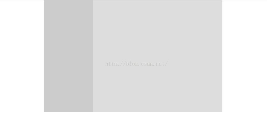
1.实现效果:

上面实现效果主要是考虑如何实现块元素居中的问题,关键代码:
margin: 0 auto;实现代码:
<!DOCTYPE html>
<html>
  <head>

    <meta name="keywords" content="keyword1,keyword2,keyword3">
    <meta name="content-type" content="text/html; charset=UTF-8">
    <meta http-equiv="Content-Type" content="text/html; charset=utf-8">
    <meta name="description" content="this is my page">
    <title>布局aaa</title>

    <!--<link rel="stylesheet" type="text/css" href="./styles.css">-->

	<style type="text/css">
	body {
		margin: 0; padding: 0
	}
	.top{height: 100px; background: blue}
	.main{width: 800px; height: 300px; background: #ccc;margin: 0 auto;}
	.foot{width: 800px; height: 100px; background: #900; margin: 0 auto;}


	</style>

  </head>

  <body>
  	<div class="top"></div>
    <div class="main"></div>
    <div class="foot"></div>
  </body>
</html>
2.实现效果:
该效果主要是考虑如何实现在一个已经居中的div中再分出两个div,关键代码(使用浮动):
<span style="font-size:18px;">height: 500px; float: left;</span>实现代码:
<!DOCTYPE HTML PUBLIC "-//W3C//DTD HTML 4.01 Transitional//EN">
<html>
  <head>
    <title>布局</title>

    <meta http-equiv="keywords" content="keyword1,keyword2,keyword3">
    <meta http-equiv="description" content="this is my page">
    <meta http-equiv="content-type" content="text/html; charset=UTF-8">

    <!--<link rel="stylesheet" type="text/css" href="./styles.css">-->

	<style type="text/css">
	body {margin: 0; padding: 0}
	.main{width: 800px; margin: 0 auto;}
	.left{width: 220px; height: 500px; float: left; background: #ccc}
	.right{width: 580px; height: 500px; float: right; background: #ddd}
	</style>

  </head>

  <body>
  <div class="main">
	  <div class="left"></div>
	  <div class="right"></div>
  </div>
  </body>
</html>
3.实现一个网页分三块,旁边两块固定宽度,中间一块自由伸缩,实现效果:
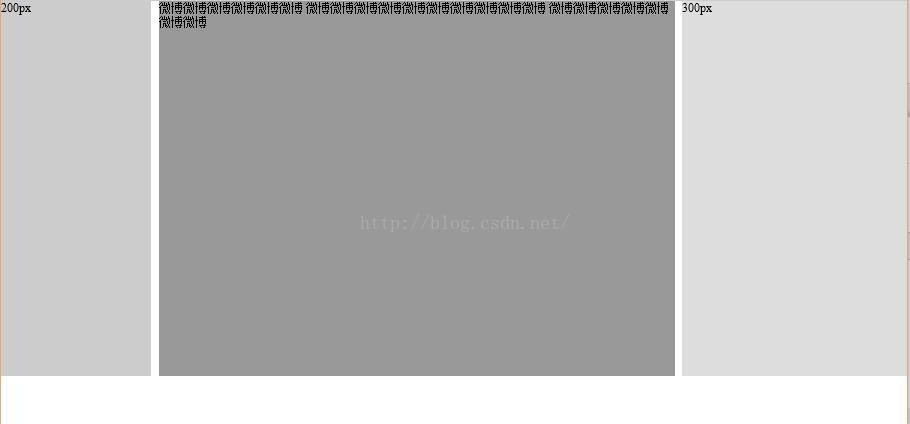
该效果主要考虑如何实现中间这一块的自由伸缩,即即使改变浏览器宽度,内容只会随着改变而换行
关键代码(使用绝对布局):
<span style="font-size:18px;"> position: absolute;left: 0; top: 0</span>实现代码:
<!DOCTYPE HTML PUBLIC "-//W3C//DTD HTML 4.01 Transitional//EN">
<html>
  <head>
    <title>布局</title>

    <meta http-equiv="keywords" content="keyword1,keyword2,keyword3">
    <meta http-equiv="description" content="this is my page">
    <meta http-equiv="content-type" content="text/html; charset=UTF-8">

    <!--<link rel="stylesheet" type="text/css" href="./styles.css">-->

	<style type="text/css">
	body {margin: 0; padding: 0}
	.left{width: 200px; height: 500px; background: #ccc; position: absolute;left: 0; top: 0}
	.middle{height: 500px;background: #999; margin: 0 310px 0 210px}
	.right{width: 300px; height: 500px; background: #ddd; position: absolute;right: 0; top: 0}
	</style>

  </head>

  <body>
   	  <div class="left">200px</div>
	  <div class="middle">微博微博微博微博微博微博
	  微博微博微博微博微博微博微博微博微博微博
	  微博微博微博微博微博微博微博</div>
	  <div class="right">300px</div>

  </body>
</html>
4.以下是三个例子:
a.实现效果:
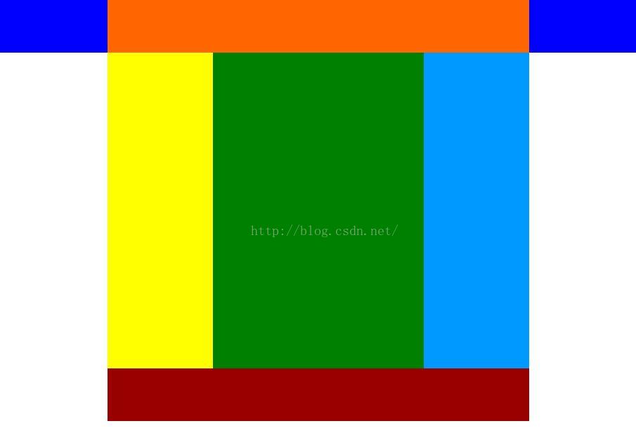
实现代码:
<!DOCTYPE html>
<html>
  <head>

    <meta name="keywords" content="keyword1,keyword2,keyword3">
    <meta name="content-type" content="text/html; charset=UTF-8">
    <meta http-equiv="Content-Type" content="text/html; charset=utf-8">
    <meta name="description" content="this is my page">
    <title>布局aaa</title>

    <!--<link rel="stylesheet" type="text/css" href="./styles.css">-->

	<style type="text/css">
	body {
		margin: 0; padding: 0
	}
	.top{height: 100px; background: blue}
	.head{height: 100px; width: 800px; background: #f60; margin: 0 auto;}
	.main{width: 800px; height: 600px; background: #ccc;margin: 0 auto;}
	.foot{width: 800px; height: 100px; background: #900; margin: 0 auto;}
	.left{width: 200px; height: 600px; background: yellow; float: left;}
	.right{width: 600px; height: 600px; background: #369; float: left;}
	.sub_l{width: 400px; height: 600px; background: green; float: left}
	.sub_r{width: 200px; height: 600px; background: #09f; float: left}


	</style>

  </head>

  <body>
  	<div class="top">
  		<div class="head"></div>
  	</div>
    <div class="main">
    	<div class="left"></div>
    	<div class="right">
    		<div class="sub_l"></div>
    		<div class="sub_r"></div>
    	</div>
    </div>
    <div class="foot"></div>
  </body>
</html>
2.实现效果:
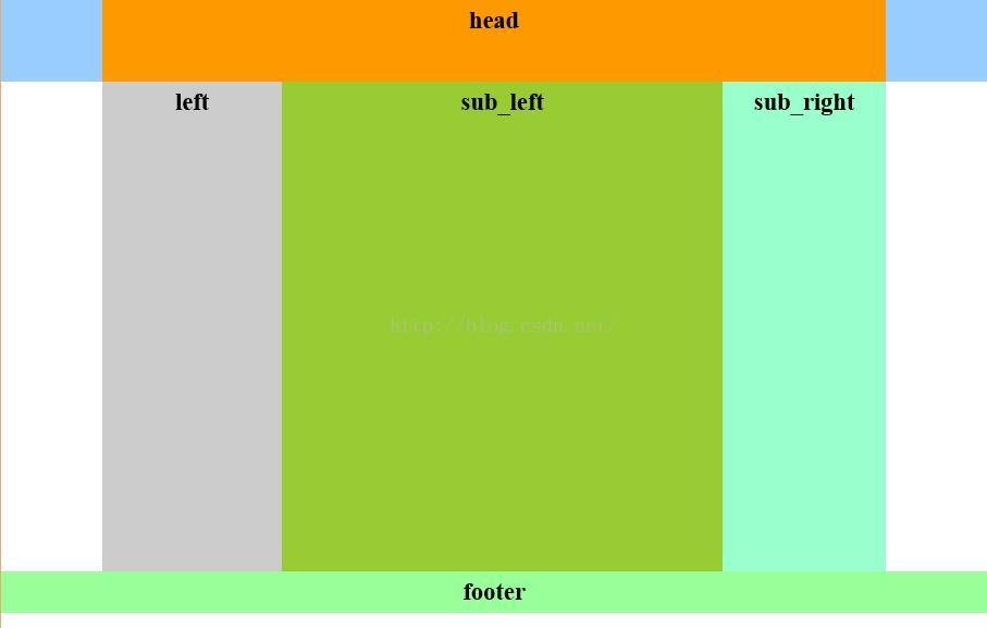
实现代码:
<!DOCTYPE html PUBLIC "-//W3C//DTD XHTML 1.0 Transitional//EN" "http://www.w3.org/TR/xhtml1/DTD/xhtml1-transitional.dtd">
<html xmlns="http://www.w3.org/1999/xhtml">
<head>
<meta http-equiv="Content-Type" content="text/html; charset=utf-8" />
<title>混合布局</title>
<style>
body{ margin:0; padding:0; font-size:30px; font-weight:bold}
div{ text-align:center; line-height:50px}
.top{ height:100px;background:#9CF}
.head,.main{ width:960px; margin:0 auto;}
.head{ height:100px; background:#F90}
.left{ width:220px; height:600px; background:#ccc; float:left;}
.right{ width:740px; height:600px;background:#FCC; float:right}
.r_sub_left{ width:540px; height:600px; background:#9C3; float:left}
.r_sub_right{ width:200px; height:600px; background:#9FC; float:left;}
.footer{ height:50px; background:#9F9; clear:both;}
</style>
</head>

<body>
<div class="top">
    <div class="head">head</div>
</div>
<div class="main">
    <div class="left">left</div>
    <div class="right">
    	<div class="r_sub_left">sub_left
        </div>
        <div class=" r_sub_right">sub_right
        </div>
    </div>
</div>
<div class="footer">footer</div>
</body>
</html>
c.实现效果:
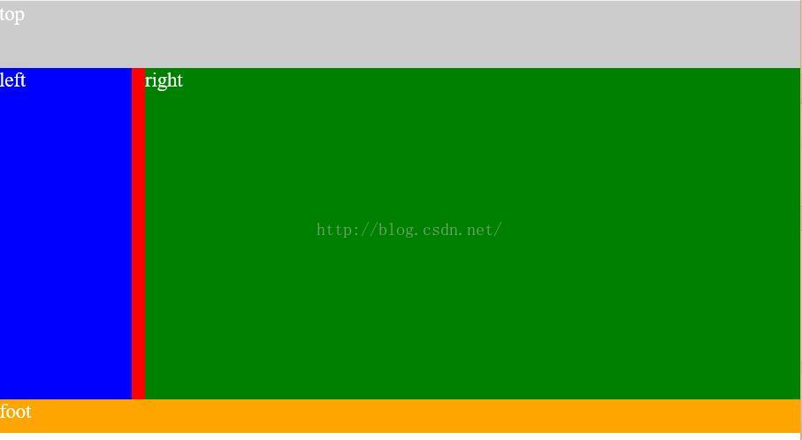
实现代码:
<!DOCTYPE html PUBLIC "-//W3C//DTD XHTML 1.0 Transitional//EN" "http://www.w3.org/TR/xhtml1/DTD/xhtml1-transitional.dtd">
<html xmlns="http://www.w3.org/1999/xhtml">
<head>
<meta http-equiv="Content-Type" content="text/html; charset=utf-8" />
<title>混合布局编程挑战</title>
<style type="text/css">
body{ margin:0; padding:0; font-size:30px; color:#fff}
.top{background-color:#ccc; margin:0 auto; height:100px;}
.main{background-color:red;height:500px;}
.left{ width:200px; background-color:blue;height:500px; position:absolute; top:100px; left 0;}
.right{background-color:green; height:500px; margin-left:220px;}
.foot{background-color:orange; margin:0 auto; height:50px;clear:both;}
</style>

</head>

<body>
<div class="top">top</div>
<div class="main">
    <div class="right">right</div>
    <div class="left">left</div>
</div>
<div class="foot">foot</div>

</body>
</html>


 扫一扫
扫一扫
 1049
1049

 被折叠的 条评论
为什么被折叠?
被折叠的 条评论
为什么被折叠?
 到【灌水乐园】发言


