


Android中常常使用shape来定义控件的一些显示属性,今天看了一些shape的使用,对shape有了大体的了解,稍作总结:
http://kofi1122.blog.51cto.com/2815761/521605
先看下面的代码:
<shape>
<!-- 实心 -->
<solid android:color="#ff9d77"/>
<!-- 渐变 -->
<gradient
android:startColor="#ff8c00"
android:endColor="#FFFFFF"
android:angle="270" />
<!-- 描边 -->
<stroke
android:width="2dp"
android:color="#dcdcdc" />
<!-- 圆角 -->
<corners
android:radius="2dp" />
<padding
android:left="10dp"
android:top="10dp"
android:right="10dp"
android:bottom="10dp" />
</shape>
solid:实心,就是填充的意思
android:color指定填充的颜色
gradient:渐变
android:startColor和android:endColor分别为起始和结束颜色,ndroid:angle是渐变角度,必须为45的整数倍。
另外渐变默认的模式为android:type="linear",即线性渐变,可以指定渐变为径向渐变,android:type="radial",径向渐变需要指定半径android:gradientRadius="50"。
stroke:描边
android:width="2dp" 描边的宽度,android:color 描边的颜色。
我们还可以把描边弄成虚线的形式,设置方式为:
android:dashWidth="5dp"
android:dashGap="3dp"
其中android:dashWidth表示'-'这样一个横线的宽度,android:dashGap表示之间隔开的距离。
corners:圆角
android:radius为角的弧度,值越大角越圆。
我们还可以把四个角设定成不同的角度,方法为:
<corners
android:topRightRadius="20dp" 右上角
android:bottomLeftRadius="20dp" 右下角
android:topLeftRadius="1dp" 左上角
android:bottomRightRadius="0dp" 左下角
/>
这里有个地方需要注意,bottomLeftRadius是右下角,而不是左下角,这个有点郁闷,不过不影响使用,记得别搞错了就行。
还有网上看到有人说设置成0dp无效,不过我在测试中发现是可以的,我用的是2.2,可能修复了这个问题吧,如果无效的话那就只能设成1dp了。
padding:间隔
这个就不用多说了,XML布局文件中经常用到。
大体的就是这样,以下是一个使用的具体示例:用在Selector中作为Button的背景,分别定义了按钮的一般状态、获得焦点状态和按下时的状态,具体代码如下:
main.xml:
<Button
android:layout_width="wrap_content"
android:layout_height="wrap_content"
android:text="TestShapeButton"
android:background="@drawable/button_selector"
/>
button_selector.xml:
<?xml version="1.0" encoding="utf-8"?>
<selector
xmlns:android="http://schemas.android.com/apk/res/android">
<item android:state_pressed="true" >
<shape>
<!-- 渐变 -->
<gradient
android:startColor="#ff8c00"
android:endColor="#FFFFFF"
android:type="radial"
android:gradientRadius="50" />
<!-- 描边 -->
<stroke
android:width="2dp"
android:color="#dcdcdc"
android:dashWidth="5dp"
android:dashGap="3dp" />
<!-- 圆角 -->
<corners
android:radius="2dp" />
<padding
android:left="10dp"
android:top="10dp"
android:right="10dp"
android:bottom="10dp" />
</shape>
</item>
<item android:state_focused="true" >
<shape>
<gradient
android:startColor="#ffc2b7"
android:endColor="#ffc2b7"
android:angle="270" />
<stroke
android:width="2dp"
android:color="#dcdcdc" />
<corners
android:radius="2dp" />
<padding
android:left="10dp"
android:top="10dp"
android:right="10dp"
android:bottom="10dp" />
</shape>
</item>
<item>
<shape>
<solid android:color="#ff9d77"/>
<stroke
android:width="2dp"
android:color="#fad3cf" />
<corners
android:topRightRadius="5dp"
android:bottomLeftRadius="5dp"
android:topLeftRadius="0dp"
android:bottomRightRadius="0dp"
/>
<padding
android:left="10dp"
android:top="10dp"
android:right="10dp"
android:bottom="10dp" />
</shape>
</item>
</selector>
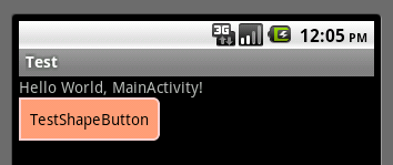
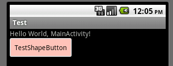
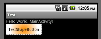
运行效果如下图:
一般状态:
获得焦点状态:
按下状态:
-----------------------------------------------------------------------------------------------------------------------------------------
http://blog.csdn.net/fanmengke_im/article/details/34861819?utm_source=tuicool&utm_medium=referral
- <?xml version="1.0" encoding="utf-8"?>
- <!--
- shape drawable xml文件中定义的一个几何图形,定义在res/drawable/目录下,文件名filename称为访问的资源ID
- 在代码中通过R.drawable.filename进行访问,在xml文件中通过@[package:]drawable/filename进行访问。
- -->
- <!--
- android:shape=["rectangle" | "oval" | "line" | "ring"]
- shape的形状,默认为矩形,可以设置为矩形(rectangle)、椭圆形(oval)、线性形状(line)、环形(ring) 下面的属性只有在android:shape="ring时可用:
- android:innerRadius 尺寸,内环的半径。
- android:innerRadiusRatio 浮点型,以环的宽度比率来表示内环的半径,
- 例如,如果android:innerRadiusRatio,表示内环半径等于环的宽度除以5,这个值是可以被覆盖的,默认为9.
- android:thickness 尺寸,环的厚度
- android:thicknessRatio 浮点型,以环的宽度比率来表示环的厚度,例如,如果android:thicknessRatio="2",
- 那么环的厚度就等于环的宽度除以2。这个值是可以被android:thickness覆盖的,默认值是3.
- android:useLevel boolean值,如果当做是LevelListDrawable使用时值为true,否则为false.
- -->
- <shape
- xmlns:android="http://schemas.android.com/apk/res/android"
- android:shape="rectangle">
- <!--
- 圆角
- android:radius 整型 半径
- android:topLeftRadius 整型 左上角半径
- android:topRightRadius 整型 右上角半径
- android:bottomLeftRadius 整型 左下角半径
- android:bottomRightRadius 整型 右下角半径
- -->
- <corners
- android:radius="8dp"
- android:topLeftRadius="5dp"
- android:topRightRadius="15dp"
- android:bottomLeftRadius="20dp"
- android:bottomRightRadius="25dp"
- />
- <!--
- 渐变色
- android:startColor 颜色值 起始颜色
- android:endColor 颜色值 结束颜色
- android:centerColor 整型 渐变中间颜色,即开始颜色与结束颜色之间的颜色
- android:angle 整型 渐变角度(PS:当angle=0时,渐变色是从左向右。 然后逆时针方向转,当angle=90时为从下往上。angle必须为45的整数倍)
- android:type ["linear" | "radial" | "sweep"] 渐变类型(取值:linear、radial、sweep)
- linear 线性渐变,这是默认设置
- radial 放射性渐变,以开始色为中心。
- sweep 扫描线式的渐变。
- android:useLevel ["true" | "false"] 如果要使用LevelListDrawable对象,就要设置为true。设置为true无渐变。false有渐变色
- android:gradientRadius 整型 渐变色半径.当 android:type="radial" 时才使用。单独使用 android:type="radial"会报错。
- android:centerX 整型 渐变中心X点坐标的相对位置
- android:centerY 整型 渐变中心Y点坐标的相对位置
- -->
- <gradient
- android:startColor="#FFFF0000"
- android:endColor="#80FF00FF"
- android:angle="45"
- />
- <!--
- 内边距,即内容与边的距离
- android:left 整型 左内边距
- android:top 整型 上内边距
- android:right 整型 右内边距
- android:bottom 整型 下内边距
- -->
- <padding
- android:left="10dp"
- android:top="10dp"
- android:right="10dp"
- android:bottom="10dp"
- />
- <!--
- size 大小
- android:width 整型 宽度
- android:height 整型 高度
- -->
- <size
- android:width="600dp"
- />
- <!--
- 内部填充
- android:color 颜色值 填充颜色
- -->
- <solid
- android:color="#ffff9d77"
- />
- <!--
- 描边
- android:width 整型 描边的宽度
- android:color 颜色值 描边的颜色
- android:dashWidth 整型 表示描边的样式是虚线的宽度, 值为0时,表示为实线。值大于0则为虚线。
- android:dashGap 整型 表示描边为虚线时,虚线之间的间隔 即“ - - - - ”
- -->
- <stroke
- android:width="2dp"
- android:color="#dcdcdc"
- />
- </shape>
--------------------------------------------------------------------------------------------------------------------------
http://blog.xianqu.org/2012/04/android-borders-and-radius-corners/
Android开发笔记——圆角和边框们
在做Android界面开发时,我们往往希望它尽可能优美,尽可能显得专业。于是你看了看其他应用,哇,好多边框和圆角啊。你是不是也想给自己的应用加上边框和圆角效果?呃……那怎么做呢?如果你是从web前端跑到Android来的,那么我想你一定想到了不下三种解决方案。如用图片替代,用CSS3定义,用JS画。在Android中,其实也有类似的用法,本文将简单介绍两种Android圆角和边框的实现。

1 图片
在Android中,给一个控件(或View)设置背景主要是通过background:xxx属性来完成。background的参数一般来说是一个drawable资源。 drawable可以是一张普通的图片,也可以是9 patch图片,还可以是一个xml文件。 给控件设置边框最简单的方式就是把background设置成你预先设计好的带圆角和边框的背景图。比如下面这张图:

但是,你很快会发现一个缺点:灵活性很差!是的,固定大小的图片很难根据控件里的内容而调整大小。它在被做出来的那天就已经被确定了!换句话说,你很难只用这一张图来应付拥有相同风格却大小各异的控件。为了给所有控件加上圆角和边框,你必须小心翼翼地计算他们的大小,然后一个一个得制作背景图片!天哪,这简直太愚蠢了。一旦遇到大小不定的控件,这方法就歇菜了。而且,大量的背景图片会让你的安装包迅速膨胀。呃……还有,你怎么应对拥有各式各样分辨率的Android设备呢?
所以,你需要……换个方法。
比较为大众采用一种解决方案是NinePatch。可以毫不夸张得说,9 patch是Android中解决自适应问题的利器。介绍和使用你可以看看这里还有这里。
使用9 patch图片有很多好处,如减轻美工压力,减少UI代码量,减少内存使用……总结起来就是:省时省力,屌爆了。
所以在给圆角和边框时,你或许会这么做。
当然,9 patch能做的是远远比这多,如做一个自适应的对话框什么的。
2 XML定义
我想大多数程序员都喜欢用代码解决问题。原因如下:
- 用代码更加cool。
- 我美工不行,我会说出去吗?
OK,好东西在这里。
2.1 基本的圆角、边框
Android除了支持原始的图片资源外,比较棒的一点就是可以用XML文件定义一些简单的图形。这有点像web的CSS,不过相比CSS3,Android的xml实现还没那么强大,例如,边框要么四周都有,要么四周都没有(我们将在后面讨论这事)。xml drawable的传送门在这里。
要画一个带灰色边框和圆角的图形很容易,在drawable资源目录下添加一个xml:
<?xml version="1.0" encoding="utf-8"?>
<!-- shape如果不声明形状则默认为正方形 -->
<shape xmlns:android="http://schemas.android.com/apk/res/android" >

    <corners android:radius="5.0dp" />
    <!-- 圆角,你也可以对不同的角设置不同的数值 -->

    <solid android:color="#FFFFFF" />
    <!-- 形状的填充色 -->

    <stroke
        android:width="1dp"
        android:color="#CCCCCC" />
    <!-- 边框宽度和颜色 -->

</shape>
在你需要用到这东西的地方如某个View下,设置background就行了。
2.2 “自由的边框“
当前版本的Android SDK并没有给stroke提供bottom、left、right之类的属性,也就是说你无法通过它来让长方形的边框少于4条。啊,真是太遗憾了。怎么办呢?有人想到了对Layer List hack。 在StackOverflow上有不少这样的把戏。
为了实现只有left,right和top边框,我们可以这么写:
<?xml version="1.0" encoding="utf-8"?>
<layer-list xmlns:android="http://schemas.android.com/apk/res/android" >
    <item>
        <shape android:shape="rectangle" >
            <stroke
                android:width="1dp"
                android:color="@color/card_stroke" />
        </shape>
    </item>

    <item
        android:left="2dp"
        android:right="2dp"
        android:top="2dp">
        <!-- 在实际使用中我发现1dp达不到显示效果,而2dp正好可以显示边框 -->

        <shape android:shape="rectangle" >
            <solid android:color="@color/solid_white" />
        </shape>
    </item>
</layer-list>
原理差不多是这样:

诡异的是理论上只要偏移量只要1dp就能显示1dp宽带边框了,但我在listview里实验了一下发现不行,换成2dp方可。有同学能解释解释么?
如果要给图形加上圆角,只需要给每个shape加上
<corners
    android:topLeftRadius="5.0dip"
    android:topRightRadius="5.0dip" />
值得注意的是,两个shape的radius在设置的时候请确保前面的图层不会把后面的挡住。
3 小结
要在Android中实现圆角和边框,比较简单的方法:图片、XML差不多就是这么用的啦。此外还有用Java代码调用draw方法画出来的,不过我没有研究过。 他们各有各的优点啦。用图片,能控制的东西更多,用代码修改起来比较另过。 最后要说的是两个方法的效率。在这个问题上,我留有疑问,没有做过专门的比较。但直观的感受是……好吧,没什么感受。
------------------------------------------------------------------------------------------------------------------------------------

在网上调查了shape的用法,大家可以参考:
http://xianqu.org/2012/04/android-borders-and-radius-corners/
http://kofi1122.blog.51cto.com/2815761/521605
layer-list可以满足需求,同时需要使用到padding选项。

- <padding
- android:left="10dp"
- android:top="10dp"
- android:right="10dp"
- android:bottom="10dp" />
但无论如何设定,padding都没有效果。后来查到 http://stackoverflow.com/questions/1283085/padding-doesnt-affect-shape-in-an-xml-layout,是同样的问题。得知在shape中要设定padding的时候,需要直接写在item的属性里。实现代码如下:
- <?xml version="1.0" encoding="utf-8"?>
- <layer-list xmlns:android="http://schemas.android.com/apk/res/android" >
- <item android:right="95px">
- <shape android:shape="oval" >
- <solid android:color="#FFFFFF" />
- </shape>
- </item>
- <item android:left="150px" android:top="60px" android:bottom="60px" >
- <shape android:shape="rectangle" >
- <solid android:color="#FFFFFF" />
- <corners android:radius="75px" />
- </shape>
- </item>
- <item android:top="3px" android:bottom="3px" android:left="3px" android:right="98px">
- <shape android:shape="oval" >
- <gradient
- android:endColor="#FFFAF0"
- android:startColor="#F8F8FF"
- android:type="linear" />
- </shape>
- </item>
- <item android:top="63px" android:bottom="63px" android:left="153px" android:right="3px">
- <shape android:shape="rectangle" >
- <gradient
- android:endColor="#FFFAF0"
- android:startColor="#F8F8FF"
- android:type="linear" />
- <corners android:radius="72px" />
- </shape>
- </item>
- </layer-list>
注:
后边的item会覆盖前边的item,这正是我们想要的效果。
为了显示边框,需要让后边的圆形和矩形,比前边的圆形和矩形略小几个像素。
当然可以使用stroke来显示边框效果,但是如果那样,矩形的一部分边框会显示在圆形里,不满足式样的要求。
另注:
gradient的几种式样:linear是线性渐变,从左到右或从上到下;sweep径向渐变,是圆心到圆边;radial是角度渐变,按照角度来变换颜色。


 3417
3417


 被折叠的 条评论
为什么被折叠?
被折叠的 条评论
为什么被折叠?
 到【灌水乐园】发言


