


Drawable的简介
Android中包含了很多的Drawable,Drawable可以是一张图片,同时也可以是颜色构造的图形,因此在Drawable有时候没有大小的分别。在本篇博客中,将会详细讲解Drawable的用法;
- BitmapDrawble
- LayerDrawable
- LevelListDrawable
- TransitonDrawable
- InsetDrawable
- ClipBitmap
BitmapDrawble详细介绍
BitmapDrawble是最常见的,也是我们经常使用的。
我们看一下布局代码,首先建立一个bitmapdrawble.xml
<?xml version="1.0" encoding="utf-8"?>
<bitmap xmlns:android="http://schemas.android.com/apk/res/android"
    android:src="@drawable/ic_launcher"
    android:tileMode="mirror"
    android:dither="true"
    android:filter="true"
    android:antialias="true"
     >
</bitmap>
我们看一下每个词语的意思
- src 表示资源图片
- dither表示是否开启抖动效果,作用是手机像素配置和图片像素配置不一致时,系统会自动调整显示效果。
- antialias表示是否抗锯齿
- tileMode表示图片的模式,其中包含了四中模式。mirror表示镜像,repeat表示重复,disable表示使用默认的样式。下面我们会看一下四中情况的详细表示。
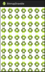
我们将bitmap作为背景图片应用于主布局main.xml中
<RelativeLayout xmlns:android="http://schemas.android.com/apk/res/android"
    xmlns:tools="http://schemas.android.com/tools"
    android:layout_width="match_parent"
    android:layout_height="match_parent"
    android:paddingBottom="@dimen/activity_vertical_margin"
    android:paddingLeft="@dimen/activity_horizontal_margin"
    android:paddingRight="@dimen/activity_horizontal_margin"
    android:paddingTop="@dimen/activity_vertical_margin"
    tools:context="com.sunshine.bitmapdrawble.MainActivity"
    android:background="@layout/bitmap" >

</RelativeLayout>我们设置tileMode为mirror时,效果如下
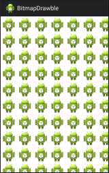
我们将tileMode为repeat时,效果如下
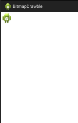
我们将tileMode为clamp时,效果如下
LayerDrawable
LayerDrawable表示一个层次化的Drawable,按照顺序绘制,最后绘制的图形显示在最上面。
我们绘制一个bitmap.xml
<?xml version="1.0" encoding="utf-8"?>
<layer-list xmlns:android="http://schemas.android.com/apk/res/android"
     >
     <item
         android:top="20dp"    //距离顶部的距离
         android:left="20dp">  //距离左边的距离
         <bitmap
             android:src="@drawable/image01"
             android:gravity="center"/>
     </item>
     <item
         android:top="20dp"
         android:left="20dp">
         <bitmap
             android:src="@drawable/image02"
             android:gravity="center"/>
     </item>
</layer-list>
我们在main.xml中定义一个ImageView,并将上面的额bitmap作为其资源。
<RelativeLayout xmlns:android="http://schemas.android.com/apk/res/android"
    xmlns:tools="http://schemas.android.com/tools"
    android:layout_width="match_parent"
    android:layout_height="match_parent"
    android:paddingBottom="@dimen/activity_vertical_margin"
    android:paddingLeft="@dimen/activity_horizontal_margin"
    android:paddingRight="@dimen/activity_horizontal_margin"
    android:paddingTop="@dimen/activity_vertical_margin"
    tools:context="com.sunshine.bitmapdrawble.MainActivity">
    <ImageView
        android:layout_width="match_parent"
        android:layout_height="match_parent"
        android:src="@drawable/bitmap"/>

</RelativeLayout>
效果图如下图所示
我们可以看出来显示了两张图片,第一张图片在最下面,第二张图片叠加在第一张图片之上。
LevelListDrawable
LevelListDrawable是一个等级的drawble。在这里主要通过设置控件的等级来实现改变图片的选择。接下来我们通过代码来实现。
我们首先建立一个level.xml
<?xml version="1.0" encoding="utf-8"?>
<level-list xmlns:android="http://schemas.android.com/apk/res/android"
>
<item
android:drawable="@drawable/image01"
android:maxLevel="10"
android:minLevel="0">
</item>
<item
android:drawable="@drawable/image02"
android:maxLevel="20"
android:minLevel="11" >
</item>
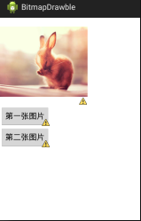
</level-list>当设定的空间的level值位于哪个图片的区间,就显示哪个图片。
这个levelListDrawable文件表示当控件的level处于0~10之间的时候,显示图片image01,当控件的level处于11~20之间的时候显示图片image02。
我们将上述的level.xml应用于主布局中的ImageView。
<LinearLayout xmlns:android="http://schemas.android.com/apk/res/android"
    xmlns:tools="http://schemas.android.com/tools"
    android:layout_width="match_parent"
    android:layout_height="match_parent"

    android:orientation="vertical">
    <ImageView
        android:id="@+id/iv"
        android:layout_width="200dp"
        android:layout_height="200dp"
        android:src="@drawable/level"/>
    <Button
        android:layout_width="wrap_content"
        android:layout_height="wrap_content"
        android:id="@+id/one"
        android:text="第一张图片"
        android:onClick="onClik"/>
    <Button
        android:layout_width="wrap_content"
        android:layout_height="wrap_content"
        android:id="@+id/two"
        android:text="第二张图片"
        android:onClick="onClik"/>

</LinearLayout>
在activity中代码如下
private ImageView iv;
@Override
protected void onCreate(Bundle savedInstanceState) {
super.onCreate(savedInstanceState);
setContentView(R.layout.activity_main);
iv = (ImageView) findViewById(R.id.iv);
iv.setImageLevel(8);
}
public void onClik(View v){
switch (v.getId()) {
case R.id.one:
iv.setImageLevel(8);
break;
case R.id.two:
iv.setImageLevel(18);
break;
default:
break;
}
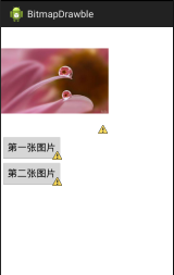
}点击第一个button显示下图,点击第二个图片显示第二幅图片
TransitonDrawable
TransitonDrawable是实现两个Drawable之间淡入淡出的效果。
<?xml version="1.0" encoding="utf-8"?>
<transition xmlns:android="http://schemas.android.com/apk/res/android"
     >
     <item
         android:drawable="@drawable/image01"
         >
     </item>
     <item
        android:drawable="@drawable/image02"
        >
     </item>
</transition>
将其应用到背景图片上面
<ImageView
        android:id="@+id/iv"
        android:layout_width="200dp"
        android:layout_height="200dp"
        android:src="@drawable/transion"/>
在activity中书写
private ImageView iv;
    @Override
    protected void onCreate(Bundle savedInstanceState) {
        super.onCreate(savedInstanceState);
        setContentView(R.layout.activity_main);
        iv = (ImageView) findViewById(R.id.iv);
        //iv.setImageLevel(8);
    }

    public void dochange(){
        TransitionDrawable drawble = (TransitionDrawable) iv.getDrawable();
        drawble.startTransition(2000);
    }
    public void onClik(View v){
        switch (v.getId()) {
        case R.id.one:
            dochange();
            //iv.setImageLevel(8);
            break;
            }
ClipDrawable
主要对Drawable进行剪裁。
<?xml version="1.0" encoding="utf-8"?>
<clip xmlns:android="http://schemas.android.com/apk/res/android"
    android:drawable="@drawable/image01"
    android:clipOrientation="horizontal"
    android:gravity="left"
     />
其中clipOrientation表示剪裁的方向。
<ImageView
        android:id="@+id/iv"
        android:layout_width="200dp"
        android:layout_height="200dp"
        android:src="@drawable/clip"/>
在mainActivity中代码如下
iv = (ImageView) findViewById(R.id.iv);
        ClipDrawable clip = (ClipDrawable) iv.getDrawable();
        clip.setLevel(5000);
level属性的取值范围为0~10000,0表示完全剪裁,10000表示完全不剪裁,5000则表示剪裁一半。
以上就是各种drawable的使用。


 1万+
1万+


 被折叠的 条评论
为什么被折叠?
被折叠的 条评论
为什么被折叠?
 到【灌水乐园】发言


