


移动WEB开发之百分比布局及flex布局

flex
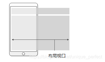
视口(viewport)就是浏览器显示页面内容的屏幕区域。 视
口可以分为布局视口、视觉视口和理想视口

布局视口 layout viewport,一般手机浏览器都默认设置了一
个布局
视口,用于解决早期的PC端页面在手机上显示的问题
iOS, Android基本都将这个视口分辨率设置为 980px,所以PC上的
网页大多都能在手机上呈现,只不过元素看上去很小,一般默认可
以通过手动缩放网页。

视觉视口 visual viewport用户正在看到的网站的区域

理想视口 ideal viewport理想视口,对设备来讲,是最理想的视口
尺寸

1.1 meta标签
meta视口标签的主要目的:布局视口的宽度应该与理想视口的宽度
一致,简单理解就是设备有多宽,我们布局的视口就多宽
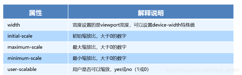
<meta name="viewport" content="width=device-width, user-scalable=no,
initial-scale=1.0, maximum-scale=1.0, minimum-scale=1.0">
meta视口标签
<!DOCTYPE html>
<html lang="en">

<head>
    <meta charset="UTF-8">
    <meta name="viewport" content="width=device-width, initial-scale=1.0,maximum-scale=1.0, minimum-scale=1.0, user-scalable=no">
    <meta http-equiv="X-UA-Compatible" content="ie=edge">
    <title>Document</title>
</head>

<body>
    黑马程序员
</body>

</html>
1.2 二倍图
物理像素点指的是屏幕显示的最小颗粒,是物理真实存在的。
这是厂商在出厂时就设置好了,比如苹果6\7\8 是 750* 1334
我们开发时候的1px 不是一定等于1个物理像素的
PC端页面,1个px 等于1个物理像素的,但是移动端就不尽相同
一个px的能显示的物理像素点的个数,称为物理像素比或屏幕像素比
<!DOCTYPE html>
<html lang="en">

<head>
    <meta charset="UTF-8">
    <meta name="viewport" content="width=device-width, initial-scale=1.0">
    <meta http-equiv="X-UA-Compatible" content="ie=edge">
    <title>Document</title>
    <style>
        /* 我们需要一个50*50像素(css像素)的图片 直接放到我们的iphone8 里面会放大2倍  100* 100 就会模糊 */
        /* 我们采取的是 放一个 100* 100 图片  然后手动的把这个图片 缩小为 50* 50 (css像素) */
        /* 我们准备的图片 比我们实际需要的大小 大2倍,这就方式就是 2倍图 */

        img:nth-child(2) {
            width: 50px;
            height: 50px;
        }
    </style>
</head>

<body>
    <!-- 模糊的 -->
    <img src="images/apple50.jpg" alt="">
    <!-- 我们采取2倍图 -->
    <img src="images/apple100.jpg" alt="">
</body>

</html>
1.3 物理像素比
<!DOCTYPE html>
<html lang="en">

<head>
    <meta charset="UTF-8">
    <meta name="viewport" content="width=device-width, initial-scale=1.0">
    <meta http-equiv="X-UA-Compatible" content="ie=edge">
    <title>Document</title>
    <style>
        * {
            margin: 0;
            padding: 0;
        }

        div {
            width: 300px;
            height: 300px;
            background-color: pink;
        }
        /* 1. 物理像素 就是我们说的分辨率  iPhone8的物理像素是 750 */
        /* 2. 在 iPhone8里面  1px 开发像素  =  2个物理像素  */
    </style>
</head>

<body>
    <div></div>
</body>

</html>
1.4 背景缩放background-size
background-size 属性规定背景图像的尺寸
单位: 长度|百分比|cover|contain;
cover把背景图像扩展至足够大,以使背景图像完全覆盖背景区域。
contain把图像图像扩展至最大尺寸,以使其宽度和高度完全适
应内容区域
背景缩放background-size
<!DOCTYPE html>
<html lang="en">

<head>
    <meta charset="UTF-8">
    <meta name="viewport" content="width=device-width, initial-scale=1.0">
    <meta http-equiv="X-UA-Compatible" content="ie=edge">
    <title>Document</title>
    <style>
        div {
            width: 500px;
            height: 500px;
            border: 2px solid red;
            background: url(images/dog.jpg) no-repeat;
            /* background-size: 图片的宽度 图片的高度; */
            /* background-size: 500px 200px; */
            /* 1.只写一个参数 肯定是宽度 高度省略了  会等比例缩放 */
            /* background-size: 500px; */
            /* 2. 里面的单位可以跟%  相对于父盒子来说的 */
            /* background-size: 50%; */
            /* 3. cover 等比例拉伸 要完全覆盖div盒子  可能有部分背景图片显示不全 */
            /* background-size: cover; */
            /* 4. contain 高度和宽度等比例拉伸 当宽度 或者高度 铺满div盒子就不再进行拉伸了 可能有部分空白区域 */
            background-size: contain;
        }
    </style>
</head>

<body>
    <div></div>
    <p></p>
</body>

</html>

背景图片2倍图
<!DOCTYPE html>
<html lang="en">

<head>
    <meta charset="UTF-8">
    <meta name="viewport" content="width=device-width, initial-scale=1.0">
    <meta http-equiv="X-UA-Compatible" content="ie=edge">
    <title>Document</title>

    <style>
        /* 1. 我们有一个 50 * 50的盒子需要一个背景图片,但是根据分析这个图片还是要准备2倍, 100*100 */
        /* 2. 我们需要把这个图片缩放一半,也就是 50*50  background-size*/

        div {
            width: 50px;
            height: 50px;
            border: 1px solid red;
            background: url(images/apple100.jpg) no-repeat;
            background-size: 50px 50px;
        }
    </style>
</head>

<body>
    <div></div>
</body>

</html>
1.5 移动端开发
移动端大量使用 CSS3盒子模型box-sizing
传统模式宽度计算:盒子的宽度 = CSS中设置的width + border + padding
CSS3盒子模型:     盒子的宽度=  CSS中设置的宽度width 里面包含了 border 和 padding
也就是说,我们的CSS3中的盒子模型, padding 和 border 不会撑大盒子了
/*CSS3盒子模型*/
box-sizing: border-box;
/*传统盒子模型*/
box-sizing: content-box;
<!DOCTYPE html>
<html lang="en">

<head>
    <meta charset="UTF-8">
    <meta name="viewport" content="width=device-width, initial-scale=1.0">
    <meta http-equiv="X-UA-Compatible" content="ie=edge">
    <title>Document</title>
    <style>
        div:nth-child(1) {
            /* 传统盒子模型= width + border + padding */
            width: 200px;
            height: 200px;
            background-color: pink;
            padding: 10px;
            border: 10px solid red;
            box-sizing: content-box;
        }

        div:nth-child(2) {
            /* 有了这句话就让盒子变成CSS3盒子模型 */
            /* padding 和 border 不会再撑大盒子了 */
            box-sizing: border-box;
            width: 200px;
            height: 200px;
            background-color: purple;
            padding: 10px;
            border: 10px solid blue;
        }
    </style>
</head>

<body>
    <div></div>
    <div></div>
</body>

</html>
1.6 移动端特殊样式
/*CSS3盒子模型*/
box-sizing: border-box;
-webkit-box-sizing: border-box;
/*点击高亮我们需要清除清除  设置为transparent 完成透明*/
-webkit-tap-highlight-color: transparent;
/*在移动端浏览器默认的外观在iOS上加上这个属性才能给按钮和输入框自定义样式*/
-webkit-appearance: none;
/*禁用长按页面时的弹出菜单*/
img,a { -webkit-touch-callout: none; }
<!DOCTYPE html>
<html lang="en">

<head>
    <meta charset="UTF-8">
    <meta name="viewport" content="width=device-width, initial-scale=1.0">
    <meta http-equiv="X-UA-Compatible" content="ie=edge">
    <title>Document</title>
    <style>
        a {
            -webkit-tap-highlight-color: transparent;
        }

        input {
            -webkit-appearance: none;
        }
    </style>
</head>

<body>
    <a href="#">黑马</a>
    <input type="button" value="按钮">
</body>

</html>
1.7 移动端常见布局
1.7.1 流式布局(百分比布局)
流式布局,就是百分比布局,也称非固定像素布局。
通过盒子的宽度设置成百分比来根据屏幕的宽度来进行伸缩,
不受固定像素的限制,内容向两侧填充。
流式布局方式是移动web开发使用的比较常见的布局方式。

max-width 最大宽度 (max-height 最大高度)
min-width 最小宽度 (min-height 最小高度)
<!DOCTYPE html>
<html lang="en">

<head>
    <meta charset="UTF-8">
    <meta name="viewport" content="width=device-width, initial-scale=1.0">
    <meta http-equiv="X-UA-Compatible" content="ie=edge">
    <title>Document</title>
    <style>
        * {
            margin: 0;
            padding: 0;
        }

        section {
            width: 100%;
            max-width: 980px;
            min-width: 320px;
            margin: 0 auto;
        }

        section div {
            float: left;
            width: 50%;
            height: 400px;
        }

        section div:nth-child(1) {
            background-color: pink;
        }

        section div:nth-child(2) {
            background-color: purple;
        }
    </style>
</head>

<body>
    <section>
        <div></div>
        <div></div>
    </section>
</body>

</html>
normalize.css # 去除默认样式
/*! normalize.css v5.0.0 | MIT License | github.com/necolas/normalize.css */

/**
 * 1. Change the default font family in all browsers (opinionated).
 * 2. Correct the line height in all browsers.
 * 3. Prevent adjustments of font size after orientation changes in
 *    IE on Windows Phone and in iOS.
 */

/* Document
   ========================================================================== */

html {
  font-family: sans-serif; /* 1 */
  line-height: 1.15; /* 2 */
  -ms-text-size-adjust: 100%; /* 3 */
  -webkit-text-size-adjust: 100%; /* 3 */
}

/* Sections
   ========================================================================== */

/**
 * Remove the margin in all browsers (opinionated).
 */

body {
  margin: 0;
}

/**
 * Add the correct display in IE 9-.
 */

article,
aside,
footer,
header,
nav,
section {
  display: block;
}

/**
 * Correct the font size and margin on `h1` elements within `section` and
 * `article` contexts in Chrome, Firefox, and Safari.
 */

h1 {
  font-size: 2em;
  margin: 0.67em 0;
}

/* Grouping content
   ========================================================================== */

/**
 * Add the correct display in IE 9-.
 * 1. Add the correct display in IE.
 */

figcaption,
figure,
main { /* 1 */
  display: block;
}

/**
 * Add the correct margin in IE 8.
 */

figure {
  margin: 1em 40px;
}

/**
 * 1. Add the correct box sizing in Firefox.
 * 2. Show the overflow in Edge and IE.
 */

hr {
  box-sizing: content-box; /* 1 */
  height: 0; /* 1 */
  overflow: visible; /* 2 */
}

/**
 * 1. Correct the inheritance and scaling of font size in all browsers.
 * 2. Correct the odd `em` font sizing in all browsers.
 */

pre {
  font-family: monospace, monospace; /* 1 */
  font-size: 1em; /* 2 */
}

/* Text-level semantics
   ========================================================================== */

/**
 * 1. Remove the gray background on active links in IE 10.
 * 2. Remove gaps in links underline in iOS 8+ and Safari 8+.
 */

a {
  background-color: transparent; /* 1 */
  -webkit-text-decoration-skip: objects; /* 2 */
}

/**
 * Remove the outline on focused links when they are also active or hovered
 * in all browsers (opinionated).
 */

a:active,
a:hover {
  outline-width: 0;
}

/**
 * 1. Remove the bottom border in Firefox 39-.
 * 2. Add the correct text decoration in Chrome, Edge, IE, Opera, and Safari.
 */

abbr[title] {
  border-bottom: none; /* 1 */
  text-decoration: underline; /* 2 */
  text-decoration: underline dotted; /* 2 */
}

/**
 * Prevent the duplicate application of `bolder` by the next rule in Safari 6.
 */

b,
strong {
  font-weight: inherit;
}

/**
 * Add the correct font weight in Chrome, Edge, and Safari.
 */

b,
strong {
  font-weight: bolder;
}

/**
 * 1. Correct the inheritance and scaling of font size in all browsers.
 * 2. Correct the odd `em` font sizing in all browsers.
 */

code,
kbd,
samp {
  font-family: monospace, monospace; /* 1 */
  font-size: 1em; /* 2 */
}

/**
 * Add the correct font style in Android 4.3-.
 */

dfn {
  font-style: italic;
}

/**
 * Add the correct background and color in IE 9-.
 */

mark {
  background-color: #ff0;
  color: #000;
}

/**
 * Add the correct font size in all browsers.
 */

small {
  font-size: 80%;
}

/**
 * Prevent `sub` and `sup` elements from affecting the line height in
 * all browsers.
 */

sub,
sup {
  font-size: 75%;
  line-height: 0;
  position: relative;
  vertical-align: baseline;
}

sub {
  bottom: -0.25em;
}

sup {
  top: -0.5em;
}

/* Embedded content
   ========================================================================== */

/**
 * Add the correct display in IE 9-.
 */

audio,
video {
  display: inline-block;
}

/**
 * Add the correct display in iOS 4-7.
 */

audio:not([controls]) {
  display: none;
  height: 0;
}

/**
 * Remove the border on images inside links in IE 10-.
 */

img {
  border-style: none;
}

/**
 * Hide the overflow in IE.
 */

svg:not(:root) {
  overflow: hidden;
}

/* Forms
   ========================================================================== */

/**
 * 1. Change the font styles in all browsers (opinionated).
 * 2. Remove the margin in Firefox and Safari.
 */

button,
input,
optgroup,
select,
textarea {
  font-family: sans-serif; /* 1 */
  font-size: 100%; /* 1 */
  line-height: 1.15; /* 1 */
  margin: 0; /* 2 */
}

/**
 * Show the overflow in IE.
 * 1. Show the overflow in Edge.
 */

button,
input { /* 1 */
  overflow: visible;
}

/**
 * Remove the inheritance of text transform in Edge, Firefox, and IE.
 * 1. Remove the inheritance of text transform in Firefox.
 */

button,
select { /* 1 */
  text-transform: none;
}

/**
 * 1. Prevent a WebKit bug where (2) destroys native `audio` and `video`
 *    controls in Android 4.
 * 2. Correct the inability to style clickable types in iOS and Safari.
 */

button,
html [type="button"], /* 1 */
[type="reset"],
[type="submit"] {
  -webkit-appearance: button; /* 2 */
}

/**
 * Remove the inner border and padding in Firefox.
 */

button::-moz-focus-inner,
[type="button"]::-moz-focus-inner,
[type="reset"]::-moz-focus-inner,
[type="submit"]::-moz-focus-inner {
  border-style: none;
  padding: 0;
}

/**
 * Restore the focus styles unset by the previous rule.
 */

button:-moz-focusring,
[type="button"]:-moz-focusring,
[type="reset"]:-moz-focusring,
[type="submit"]:-moz-focusring {
  outline: 1px dotted ButtonText;
}

/**
 * Change the border, margin, and padding in all browsers (opinionated).
 */

fieldset {
  border: 1px solid #c0c0c0;
  margin: 0 2px;
  padding: 0.35em 0.625em 0.75em;
}

/**
 * 1. Correct the text wrapping in Edge and IE.
 * 2. Correct the color inheritance from `fieldset` elements in IE.
 * 3. Remove the padding so developers are not caught out when they zero out
 *    `fieldset` elements in all browsers.
 */

legend {
  box-sizing: border-box; /* 1 */
  color: inherit; /* 2 */
  display: table; /* 1 */
  max-width: 100%; /* 1 */
  padding: 0; /* 3 */
  white-space: normal; /* 1 */
}

/**
 * 1. Add the correct display in IE 9-.
 * 2. Add the correct vertical alignment in Chrome, Firefox, and Opera.
 */

progress {
  display: inline-block; /* 1 */
  vertical-align: baseline; /* 2 */
}

/**
 * Remove the default vertical scrollbar in IE.
 */

textarea {
  overflow: auto;
}

/**
 * 1. Add the correct box sizing in IE 10-.
 * 2. Remove the padding in IE 10-.
 */

[type="checkbox"],
[type="radio"] {
  box-sizing: border-box; /* 1 */
  padding: 0; /* 2 */
}

/**
 * Correct the cursor style of increment and decrement buttons in Chrome.
 */

[type="number"]::-webkit-inner-spin-button,
[type="number"]::-webkit-outer-spin-button {
  height: auto;
}

/**
 * 1. Correct the odd appearance in Chrome and Safari.
 * 2. Correct the outline style in Safari.
 */

[type="search"] {
  -webkit-appearance: textfield; /* 1 */
  outline-offset: -2px; /* 2 */
}

/**
 * Remove the inner padding and cancel buttons in Chrome and Safari on macOS.
 */

[type="search"]::-webkit-search-cancel-button,
[type="search"]::-webkit-search-decoration {
  -webkit-appearance: none;
}

/**
 * 1. Correct the inability to style clickable types in iOS and Safari.
 * 2. Change font properties to `inherit` in Safari.
 */

::-webkit-file-upload-button {
  -webkit-appearance: button; /* 1 */
  font: inherit; /* 2 */
}

/* Interactive
   ========================================================================== */

/*
 * Add the correct display in IE 9-.
 * 1. Add the correct display in Edge, IE, and Firefox.
 */

details, /* 1 */
menu {
  display: block;
}

/*
 * Add the correct display in all browsers.
 */

summary {
  display: list-item;
}

/* Scripting
   ========================================================================== */

/**
 * Add the correct display in IE 9-.
 */

canvas {
  display: inline-block;
}

/**
 * Add the correct display in IE.
 */

template {
  display: none;
}

/* Hidden
   ========================================================================== */

/**
 * Add the correct display in IE 10-.
 */

[hidden] {
  display: none;
}
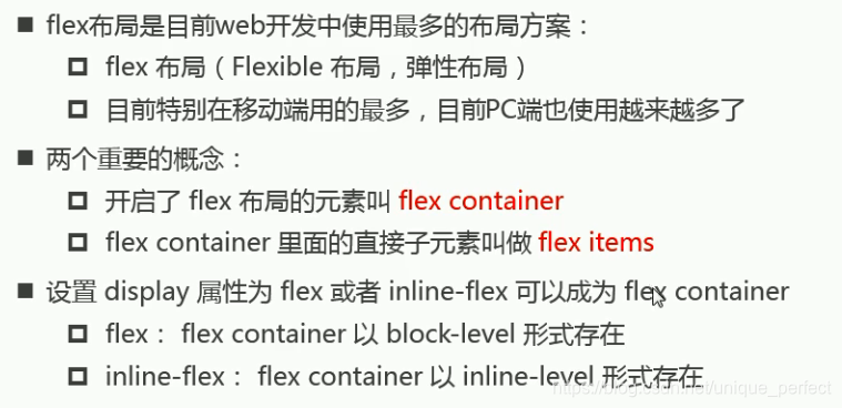
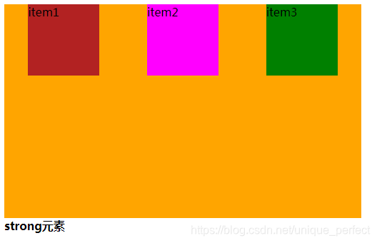
1.7.2 移动WEB开发之flex布局
1.7.2.1 flex原理
就是通过给父盒子添加flex属性,来控制子盒子的位置和排列方式

注意:
我们为父盒子设为 flex 布局以后,子元素的 float、clear 和 vertical-align 属性将失效。
伸缩布局 = 弹性布局 = 伸缩盒布局 = 弹性盒布局 =flex布局
1.7.2.2 理解布局原理

容器默认存在两根轴:水平的主轴(main axis)和垂直的交叉轴(cross axis).
主轴的开始位置(与边框的交叉点)叫做main start,结束位置叫做main end;
交叉轴的开始位置叫做cross start,结束位置叫做cross end.
项目默认沿主轴排列.单个项目占据的主轴空间叫做main size,占据的交叉
轴空间叫做cross size.
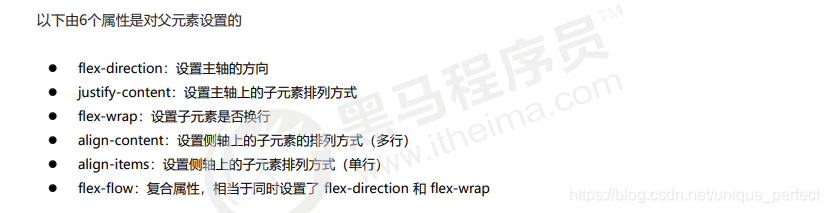
1.7.2.3 flex布局父项常见属性
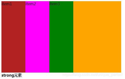
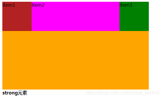
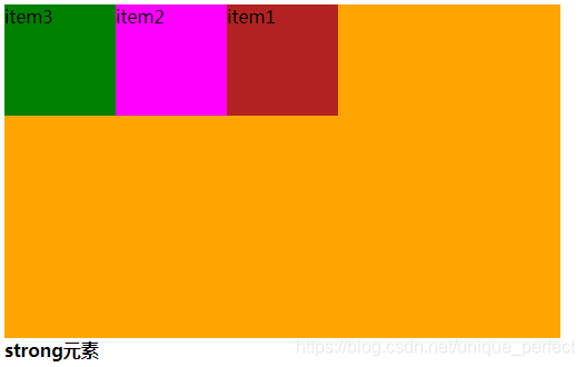
1.7.2.3.1 flex-direction
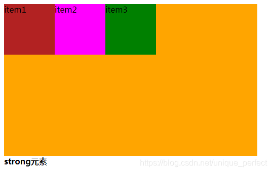
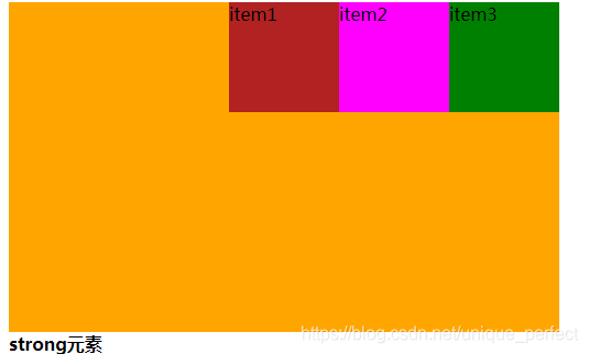
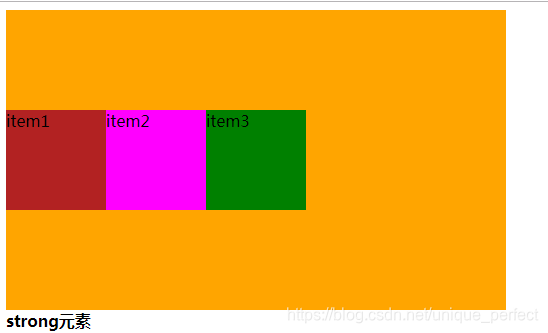
flex-direction:决定主轴的方向.
它的四个取值:
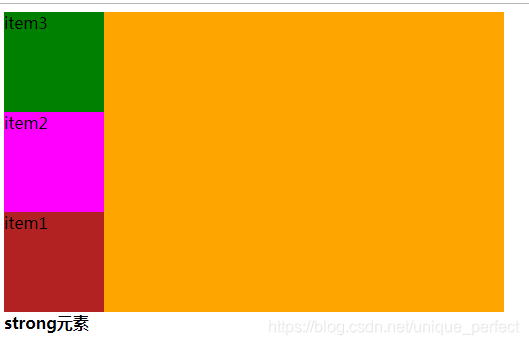
row(默认值):主轴为水平方向,起点在左端.
row-reverse:主轴为水平方向,起点在右端.
column:主轴为垂直方向,起点在上沿.
column-reverse:主轴为垂直方向,起点在下沿.
<!DOCTYPE html>
<html lang="en">
<head>
    <meta charset="UTF-8">
    <meta name="viewport" content="width=device-width, initial-scale=1.0">
    <title>Document</title>
    <style>
        .box {
            width: 500px;
            height: 300px;
            background-color: orange;

        }
        .item {
            width: 100px;
            height: 100px;
        }
        .item1{
            background-color: firebrick;
        }
        .item2{
            background-color: fuchsia;
        }
        .item3 {
            background-color: green;
        }
    </style>
</head>
<body>
    <div class="box">
        <div class="item item1">item1</div>
        <div class="item item2">item2</div>
        <div class="item item3">item3</div>
        <div></div>
    </div>
    <strong>strong元素</strong>
</body>
</html>
row:
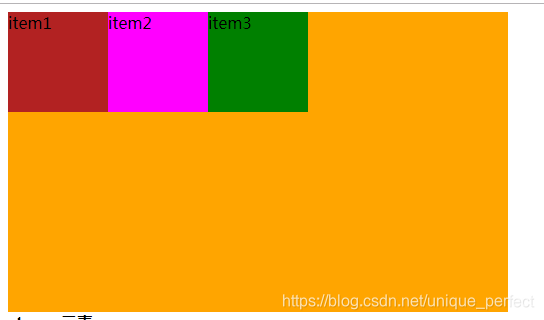
row-reverse:
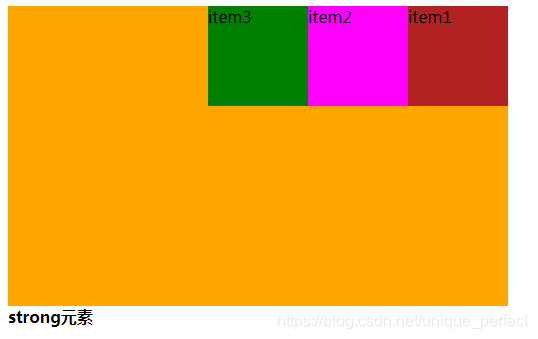
column:
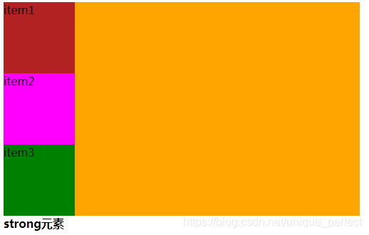
column-reverse
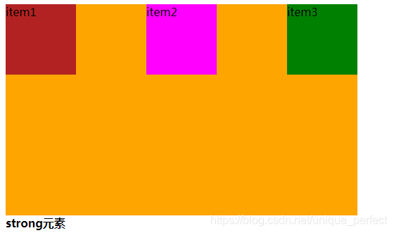
1.7.2.3.2 justify-content
决定了flex items在main axis的对齐方式
它的五个取值:
flex-start(默认值):左对齐
flex-end:右对齐
center:居中
space-evenly:
space-between:两端对齐,项目之间的间隔都相等。
space-around:每个项目两侧的间隔相等。所以,项目之间的
间隔比项目与边框的间隔大一倍。
flex-start;
flex-end
center
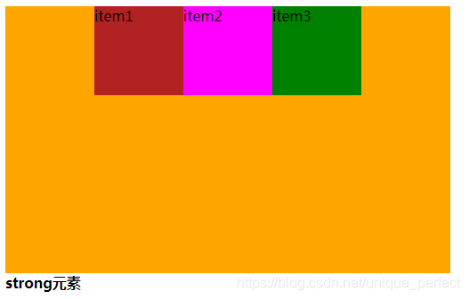
space-evenly
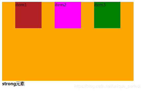
space-around
space-between
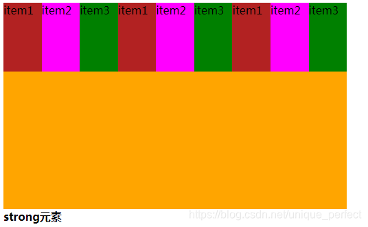
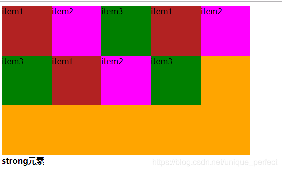
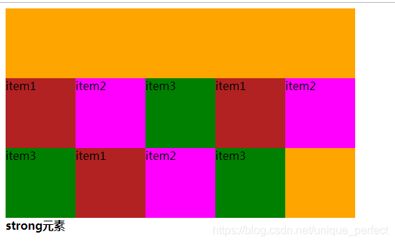
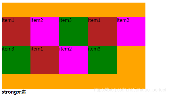
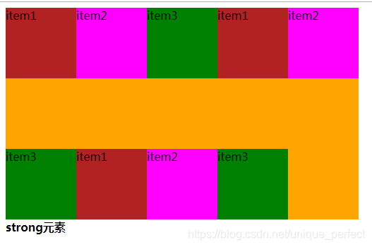
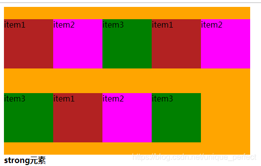
1.7.2.3.3 flex-wrap
决定flex-container是单行还是多行
nowrap(默认):不换行
wrap:换行
wrap-reverse:多行
wrap
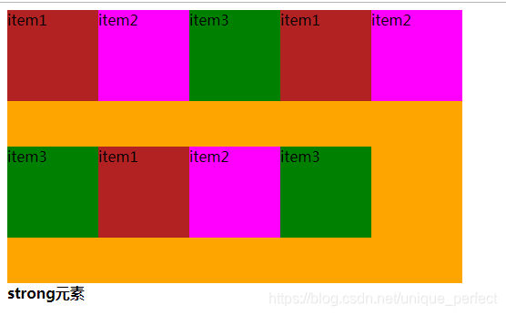
wrap-reverse
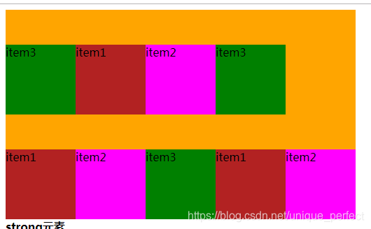
nowrap
1.7.2.3.4 align-items
设置侧轴上的子元素排列方式(单行 )
stretch(默认值):如果项目未设置高度或设为auto,将自动
拉伸填充flex containter.
flex-start:交叉轴的起点对齐.
flex-end:交叉轴的终点对齐.
center:交叉轴的中点对齐.
stretch
flex-start
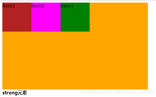
flex-end
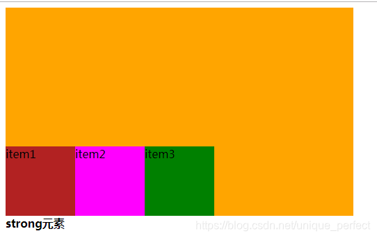
center
1.7.2.3.5 align-content
设置侧轴上的子元素的排列方式(多行)
stretch(默认值):与align-items的stretch类似
flex-start:默认值在侧轴的头部开始排列
flex-end:在侧轴的尾部开始排列
center:在侧轴中间显示
space-between:子项在侧轴先分布在两头,再平分剩余空间
space-around:子项在侧轴平分剩余空间
stretch

flex-start
flex-end
center:
space-between
space-around
1.7.2.3.6 align-content 和 align-items 区别
align-items 适用于单行情况下, 只有上对齐、下对齐、
居中和 拉伸
align-content 适应于换行(多行)的情况下(单行情况下无效),
可以设置 上对齐、 下对齐、居中、拉伸以及平均分配剩余空
间等属性值。
总结就是单行找 align-items 多行找 align-content
1.7.2.3.7 flex-flow
flex-flow 属性是 flex-direction 和 flex-wrap 属性的复
合属性
flex-flow:row wrap;
1.7.2.3.8 flex布局父项常见属性总结
flex-direction:设置主轴的方向
justify-content:设置主轴上的子元素排列方式
flex-wrap:设置子元素是否换行
align-content:设置侧轴上的子元素的排列方式(多行)
align-items:设置侧轴上的子元素排列方式(单行)
flex-flow:复合属性,相当于同时设置了 flex-direction
和 flex-wrap
1.7.2.3.9 flex布局子项常见属性
order
align-self
flex-grow
flex-shrink
flex-basis
flex 定义子项目分配剩余空间,用flex来表示占多少份数。
1.7.2.3.9.1 flex
flex 属性定义子项目分配剩余空间,用flex来表示占多少份数
<!DOCTYPE html>
<html lang="en">

<head>
    <meta charset="UTF-8">
    <meta name="viewport" content="width=device-width, initial-scale=1.0">
    <title>Document</title>
    <style>
        .box {
            width: 500px;
            height: 300px;
            background-color: orange;
            display: flex;
        }

        .item {
            width: 100px;
            height: 100px;
        }

        .item1 {
            background-color: firebrick;
        }

        .item2 {
            background-color: fuchsia;
            flex: 1;
        }

        .item3 {
            background-color: green;
        }
    </style>
</head>

<body>
    <div class="box">
        <div class="item item1">item1</div>
        <div class="item item2">item2</div>
        <div class="item item3">item3</div>

    </div>
    <strong>strong元素</strong>
</body>

</html>
1.7.2.3.9.2 align-self
若想给其中一个元素搞特殊,可以使用align-self属性,覆盖align-items的
属性.效果跟align-items一致
1.7.2.3.9.3 order
order属性定义项目的排列顺序。数值越小,排列越靠前,默认为0.
.item1{
            background-color: firebrick;
            order: 3;
        }
        .item2{
            background-color: fuchsia;
            order: 2;
        }
        .item3 {
            background-color: green;
            order: 1;
        }
想要获取该该课程markdown笔记(脑图+笔记)。可以扫描以下
微信公众号二维码。或者搜索微信公众号-Java大世界。回复
flex即可获取笔记获取方式。


 4287
4287


 被折叠的 条评论
为什么被折叠?
被折叠的 条评论
为什么被折叠?
 到【灌水乐园】发言


