


CoordinatorLayout是android.support.design.widget包中定义的用于实现滚动屏幕时,自动伸缩顶部ToolBar的控件,该控件继承于ViewGroup,故可以作为容器控件存放若干子控件,很多商业应用使用了CoordinatorLayout:
下面是豌豆荚APP滑动前、滑动中和滑动后的效果,可见当滑动过程中,搜索框随着下面的可滚动控件一起向上滑动,最终隐藏。

滑动前

正在滑动

滑动完毕
下面是chrome浏览器滑动前、滑动中和滑动后的效果,可见当滑动过程中,地址栏随着下面的页面一起向上滑动,最终隐藏。

滑动前

正在滑动

滑动完毕
下面是本文将要介绍的demo的实现效果,CoordinatorLayout是其中的重点。
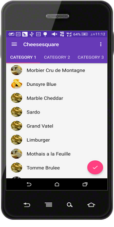
滑动前
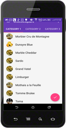
正在滑动
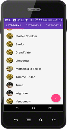
滑动完毕
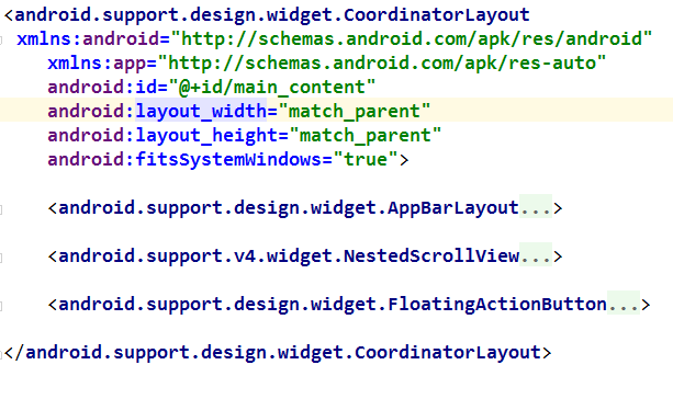
主界面的XML布局要点
界面布局如下
<android.support.design.widget.CoordinatorLayout xmlns:android="http://schemas.android.com/apk/res/android"
    xmlns:app="http://schemas.android.com/apk/res-auto"
    android:id="@+id/main_content"
    android:layout_width="match_parent"
    android:layout_height="match_parent">

    <android.support.design.widget.AppBarLayout
        android:id="@+id/appbar"
        android:layout_width="match_parent"
        android:layout_height="wrap_content"
        android:theme="@style/ThemeOverlay.AppCompat.Dark.ActionBar">

        <android.support.v7.widget.Toolbar
            android:id="@+id/toolbar"
            android:layout_width="match_parent"
            android:layout_height="?attr/actionBarSize"
            android:background="?attr/colorPrimary"
            app:layout_scrollFlags="scroll|enterAlways|snap"
            app:popupTheme="@style/ThemeOverlay.AppCompat.Light" />

        <android.support.design.widget.TabLayout
            android:id="@+id/tabs"
            android:layout_width="match_parent"
            android:layout_height="wrap_content" />

    </android.support.design.widget.AppBarLayout>

    <android.support.v4.view.ViewPager
        android:id="@+id/viewpager"
        android:layout_width="match_parent"
        android:layout_height="match_parent"
        app:layout_behavior="@string/appbar_scrolling_view_behavior" />

    <android.support.design.widget.FloatingActionButton
        android:id="@+id/fab"
        android:layout_width="wrap_content"
        android:layout_height="wrap_content"
        android:layout_gravity="end|bottom"
        android:layout_margin="@dimen/fab_margin"
        android:src="@drawable/ic_done" />

</android.support.design.widget.CoordinatorLayout>
CoordinatorLayout使用要点:
- 使用CoordinatorLayout前,需在build.gradle的dependencies中加入依赖
compile 'com.android.support:design:23.+';
- AppBarLayout是也是在
android.support.design.widget中定义的控件,该该控件继承于LinearLayout,需要和CoordinatorLayout配合使用,它是整个界面顶部的部分,如下所示:

- 需要在CoordinatorLayout中定义一个可以滚动的控件,本demo用的是ViewPager,而且需要“告诉”CoordinatorLayout,ViewPager是可以滚动的,即需要在ViewPager中添加入如下属性
app:layout_behavior="@string/appbar_scrolling_view_behavior";
- 要使CoordinatorLayout响应滚动事件,重点是需要CoordinatorLayout的属性
app:layout_scrollFlags="scroll|enterAlways|snap"写在滚动时隐藏的控件Toolbar中,用值”scoll”声明,若不加该值就会ToolBar就会像TabLayout一样固定在顶端;属性”enterAlways”表示无论滑到什么地方只要向上滚动,ToolBar就会显示出来,而不是滚动到顶部才显示出来;属性”snap”起到依附作用,当ToolBar有一般在屏幕外时,ToolBar会整个移出或移入屏幕。
每个item的XML布局要点
代码如下:
<?xml version="1.0" encoding="utf-8"?>
<android.support.design.widget.CoordinatorLayout xmlns:android="http://schemas.android.com/apk/res/android"
    xmlns:app="http://schemas.android.com/apk/res-auto"
    android:id="@+id/main_content"
    android:layout_width="match_parent"
    android:layout_height="match_parent"
    android:fitsSystemWindows="true">

    <android.support.design.widget.AppBarLayout
        android:id="@+id/appbar"
        android:layout_width="match_parent"
        android:layout_height="@dimen/detail_backdrop_height"
        android:fitsSystemWindows="true"
        android:theme="@style/ThemeOverlay.AppCompat.Dark.ActionBar">

        <android.support.design.widget.CollapsingToolbarLayout
            android:id="@+id/collapsing_toolbar"
            android:layout_width="match_parent"
            android:layout_height="@dimen/detail_backdrop_height"
            android:fitsSystemWindows="true"
            app:contentScrim="?attr/colorPrimary"
            app:expandedTitleMarginEnd="64dp"
            app:expandedTitleMarginStart="48dp"
            app:layout_scrollFlags="scroll|exitUntilCollapsed">

            <ImageView
                android:id="@+id/backdrop"
                android:layout_width="match_parent"
                android:layout_height="match_parent"
                android:fitsSystemWindows="true"
                android:scaleType="centerCrop"
                app:layout_collapseMode="parallax"
                app:layout_collapseParallaxMultiplier="1" />

            <android.support.v7.widget.Toolbar
                android:id="@+id/toolbar"
                android:layout_width="match_parent"
                android:layout_height="?attr/actionBarSize"
                app:layout_collapseMode="pin"
                app:popupTheme="@style/ThemeOverlay.AppCompat.Light" />

        </android.support.design.widget.CollapsingToolbarLayout>

    </android.support.design.widget.AppBarLayout>

    <android.support.v4.widget.NestedScrollView
        android:layout_width="match_parent"
        android:layout_height="match_parent"
        app:layout_behavior="@string/appbar_scrolling_view_behavior">

        <LinearLayout
            android:layout_width="match_parent"
            android:layout_height="match_parent"
            android:orientation="vertical"
            android:paddingTop="24dp">

            <android.support.v7.widget.CardView
                android:layout_width="match_parent"
                android:layout_height="wrap_content"
                android:layout_margin="@dimen/card_margin">

                <LinearLayout
                    style="@style/Widget.CardContent"
                    android:layout_width="match_parent"
                    android:layout_height="wrap_content">

                    <TextView
                        android:layout_width="match_parent"
                        android:layout_height="wrap_content"
                        android:text="Info"
                        android:textAppearance="@style/TextAppearance.AppCompat.Title" />

                    <TextView
                        android:layout_width="match_parent"
                        android:layout_height="wrap_content"
                        android:text="@string/cheese_ipsum" />

                </LinearLayout>

            </android.support.v7.widget.CardView>

            <android.support.v7.widget.CardView
                android:layout_width="match_parent"
                android:layout_height="wrap_content"
                android:layout_marginBottom="@dimen/card_margin"
                android:layout_marginLeft="@dimen/card_margin"
                android:layout_marginRight="@dimen/card_margin">

                <LinearLayout
                    style="@style/Widget.CardContent"
                    android:layout_width="match_parent"
                    android:layout_height="wrap_content">

                    <TextView
                        android:layout_width="match_parent"
                        android:layout_height="wrap_content"
                        android:text="Friends"
                        android:textAppearance="@style/TextAppearance.AppCompat.Title" />

                    <TextView
                        android:layout_width="match_parent"
                        android:layout_height="wrap_content"
                        android:text="@string/cheese_ipsum" />

                </LinearLayout>

            </android.support.v7.widget.CardView>

            <android.support.v7.widget.CardView
                android:layout_width="match_parent"
                android:layout_height="wrap_content"
                android:layout_marginBottom="@dimen/card_margin"
                android:layout_marginLeft="@dimen/card_margin"
                android:layout_marginRight="@dimen/card_margin">

                <LinearLayout
                    style="@style/Widget.CardContent"
                    android:layout_width="match_parent"
                    android:layout_height="wrap_content">

                    <TextView
                        android:layout_width="match_parent"
                        android:layout_height="wrap_content"
                        android:text="Related"
                        android:textAppearance="@style/TextAppearance.AppCompat.Title" />

                    <TextView
                        android:layout_width="match_parent"
                        android:layout_height="wrap_content"
                        android:text="@string/cheese_ipsum" />

                </LinearLayout>

            </android.support.v7.widget.CardView>

            <android.support.v7.widget.CardView
                android:layout_width="match_parent"
                android:layout_height="wrap_content"
                android:layout_margin="@dimen/card_margin">

                <LinearLayout
                    style="@style/Widget.CardContent"
                    android:layout_width="match_parent"
                    android:layout_height="wrap_content">

                    <TextView
                        android:layout_width="match_parent"
                        android:layout_height="wrap_content"
                        android:text="Info"
                        android:textAppearance="@style/TextAppearance.AppCompat.Title" />

                    <TextView
                        android:layout_width="match_parent"
                        android:layout_height="wrap_content"
                        android:text="@string/cheese_ipsum" />

                </LinearLayout>

            </android.support.v7.widget.CardView>

            <android.support.v7.widget.CardView
                android:layout_width="match_parent"
                android:layout_height="wrap_content"
                android:layout_marginBottom="@dimen/card_margin"
                android:layout_marginLeft="@dimen/card_margin"
                android:layout_marginRight="@dimen/card_margin">

                <LinearLayout
                    style="@style/Widget.CardContent"
                    android:layout_width="match_parent"
                    android:layout_height="wrap_content">

                    <TextView
                        android:layout_width="match_parent"
                        android:layout_height="wrap_content"
                        android:text="Friends"
                        android:textAppearance="@style/TextAppearance.AppCompat.Title" />

                    <TextView
                        android:layout_width="match_parent"
                        android:layout_height="wrap_content"
                        android:text="@string/cheese_ipsum" />

                </LinearLayout>

            </android.support.v7.widget.CardView>

            <android.support.v7.widget.CardView
                android:layout_width="match_parent"
                android:layout_height="wrap_content"
                android:layout_marginBottom="@dimen/card_margin"
                android:layout_marginLeft="@dimen/card_margin"
                android:layout_marginRight="@dimen/card_margin">

                <LinearLayout
                    style="@style/Widget.CardContent"
                    android:layout_width="match_parent"
                    android:layout_height="wrap_content">

                    <TextView
                        android:layout_width="match_parent"
                        android:layout_height="wrap_content"
                        android:text="Related"
                        android:textAppearance="@style/TextAppearance.AppCompat.Title" />

                    <TextView
                        android:layout_width="match_parent"
                        android:layout_height="wrap_content"
                        android:text="@string/cheese_ipsum" />

                </LinearLayout>

            </android.support.v7.widget.CardView>
        </LinearLayout>

    </android.support.v4.widget.NestedScrollView>

    <android.support.design.widget.FloatingActionButton
        android:layout_width="wrap_content"
        android:layout_height="wrap_content"
        android:layout_margin="@dimen/fab_margin"
        android:clickable="true"
        android:src="@drawable/ic_discuss"
        app:layout_anchor="@id/appbar"
        app:layout_anchorGravity="bottom|right|end" />

</android.support.design.widget.CoordinatorLayout>
同理,根节点依然是CoordinatorLayout,它包含3个子控件,如下所示:
AppBarLayout,NestedScrollView,FloatingActionBar
要点:
- 同样地,NestedScrollView是可以滚动的控件,需要用CoordinatorLayout的属性
app:layout_behavior="@string/appbar_scrolling_view_behavior"声明;
- 重点是控件CollapsingToolbarLayout,该控件对ToolBarLayout进行扩展,使其可以滚动,其中属性
app:layout_scrollFlags="scroll|exitUntilCollapsed"的”scroll”属性表示它可以随NestedScrollView一起滑动,并可以隐藏和出现,属性”exitUntilCollapsed”表示ToolBar收缩到其最小高度为止;属性app:contentScrim="?attr/colorPrimary"表示ToolBar收缩到最小高度时的颜色,一般可设置为ToolBar的颜色或图片的颜色;属性
app:expandedTitleMarginEnd="64dp"表示ToolBar伸展开以后标题与屏幕边缘的距离;属性app:layout_collapseMode=”parallax”
app:expandedTitleMarginStart="48dp"
与app:layout_collapseParallaxMultiplier=”1”配合使用,表示ToolBar随滚动内容伸展和收缩时的位移差,当属性app:layout _collapseParallaxMultiplier的值为0时,表示ToolBar中的图片与滚动的内容没有位移差,它们是一起滚动的,当值为1时,ToolBar中的图片不滚动,就定格在屏幕上;
演示效果
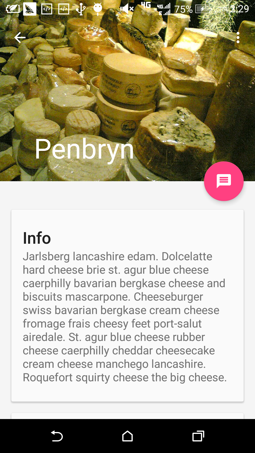
未滚动时
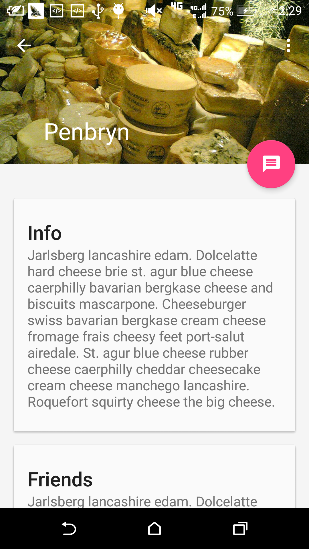
正在滚动
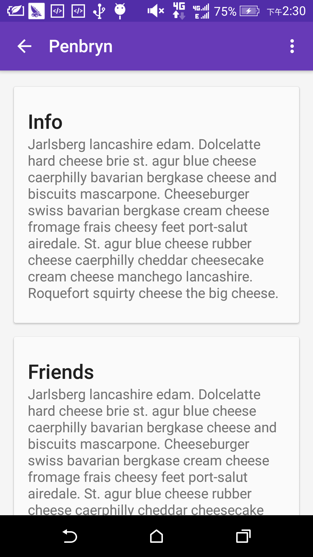
滚动完毕


 5355
5355


 被折叠的 条评论
为什么被折叠?
被折叠的 条评论
为什么被折叠?
 到【灌水乐园】发言


