


attr()
返回选择元素的属性值
例如:
展现出来的是 百度地址http://www.baidu.com
<a href="http://www.baidu.com">百度地址</a>
<style>
    a:after {content: " (" attr(href) ")";}
</style>
var()
var() 函数用于插入自定义的属性值,如果一个属性值在多处被使用,该方法就很有用
var(custom-property-name, value)
-
custom-property-name 必需。自定义属性的名称,必需以 -- 开头。
-
value 可选。备用值,在属性不存在的时候使用。
使用方法
方法一
:root {
  --main-bg-color: coral;
  --main-txt-color: blue;
  --main-padding: 15px;
}

#div1 {
  background-color: var(--main-bg-color);
  color: var(--main-txt-color);
  padding: var(--main-padding);
}

#div2 {
  background-color: var(--main-bg-color);
  color: var(--main-txt-color);
  padding: var(--main-padding);
}
方法二
使用标签中的自定义
<div class="div1" style="--color:#aff;--height:1">div1</div>.div1 {
background: var(--color);//作用于本标签
width: 100%;
height: 500px;
margin-bottom: calc(var(--height) * 20px);//结合calc()一起使用
}calc()
长度值
用于动态计算长度值
- 需要注意的是,运算符前后都需要保留一个空格,例如:width: calc(100% - 10px);
- 任何长度值都可以使用calc()函数进行计算;
- calc()函数支持 "+", "-", "*", "/" 运算;
- calc()函数使用标准的数学运算优先级规则;
width: calc(100% - 100px);颜色
rgb()
rgb(red, green, blue)
rgba()
rgba(red, green, blue, alpha)
| red | 定义红色值,取值范围为 0 ~ 255,也可以使用百分比 0% ~ 100%。 |
| green | 定义绿色值,取值范围为 0 ~ 255,也可以使用百分比 0% ~ 100%。 |
| blue | 定义蓝色值,取值范围为 0 ~ 255,也可以使用百分比 0% ~ 100%。 |
| alpha - 透明度 | 定义透明度 0(完全透明) ~ 1(完全不透明) |
hsl()
使用色相、饱和度、亮度来定义颜色。
hsl() 函数使用色相、饱和度、亮度来定义颜色。
HSL 即色相、饱和度、亮度(英语:Hue, Saturation, Lightness)。
色相(H)是色彩的基本属性,就是平常所说的颜色名称,如红色、黄色等。
饱和度(S)是指色彩的纯度,越高色彩越纯,低则逐渐变灰,取 0-100% 的数值。
亮度(L),取 0-100%,增加亮度,颜色会向白色变化;减少亮度,颜色会向黑色变化。
HSL 是一种将 RGB 色彩模型中的点在圆柱坐标系中的表示法。这两种表示法试图做到比基于笛卡尔坐标系的几何结构 RGB 更加直观。
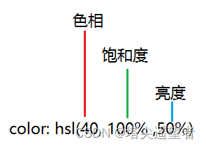
hsl(hue, saturation, lightness)
hsla()
hsla() 函数使用色相、饱和度、亮度、透明度来定义颜色。
HSLA 即色相、饱和度、亮度、透明度(英语:Hue, Saturation, Lightness, Alpha )。
- 色相(H)是色彩的基本属性,就是平常所说的颜色名称,如红色、黄色等。
- 饱和度(S)是指色彩的纯度,越高色彩越纯,低则逐渐变灰,取 0-100% 的数值。
- 亮度(L) 取 0-100%,增加亮度,颜色会向白色变化;减少亮度,颜色会向黑色变化。
- 透明度(A) 取值 0~1 之间, 代表透明度。
hsla(hue, saturation, lightness, alpha)
| hue - 色相 | 定义色相 (0 到 360) - 0 (或 360) 为红色, 120 为绿色, 240 为蓝色 |
| saturation - 饱和度 | 定义饱和度; 0% 为灰色, 100% 全色 |
| lightness - 亮度 | 定义亮度 0% 为暗, 50% 为普通, 100% 为白 |
| alpha - 透明度 | 定义透明度 0(透完全明) ~ 1(完全不透明) |
曲线
cubic-bezier() 贝塞尔曲线
可用于动画
P0 和 P3 是曲线的起点和终点。
P0是(0,0)并且表示初始时间和初始状态,P3是(1,1)并且表示最终时间和最终状态。
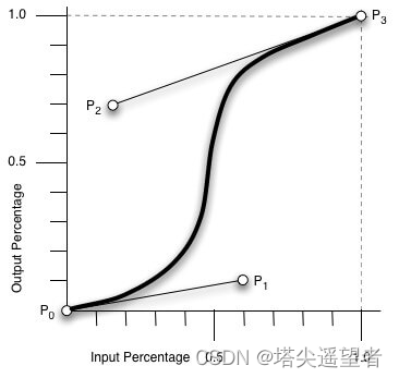
P0:默认值 (0, 0)
P1:动态取值 (x1, y1)
P2:动态取值 (x2, y2)
P3:默认值 (1, 1)
cubic-bezier(x1,y1,x2,y2)
必需。数字值,x1 和 x2 需要是 0 到 1 的数字。
例子
div {
    width: 100px;
    height: 100px;
    background: red;
    transition: width 2s;
    transition-timing-function: cubic-bezier(0.1, 0.7, 1.0, 0.1);
}
div:hover {
    width:300px;
}
渐变
conic-gradient() 圆锥渐变
conic-gradient() 函数创建一个由渐变组成的图像。
圆锥渐变是颜色过渡围绕中心点旋转(而不是从中心向外辐射)。
创建圆锥渐变,至少需要设置两个色标。
background-image: conic-gradient([from angle] [at position,] color degree, color degree, ...);
| from angle | 可选。起始角度。默认值为 0deg |
| at position | 可选。中心位置。默认居中。 |
| color degree, ..., color degree | 角渐变断点。该值包含一个颜色值,后跟一个可选的停止位置( 0 到 360 之间的度数或 0% 到 100% 之间的百分比)。 |
例子
<div id="grad1"></div>
#grad1 {
    height: 200px;
    width: 200px;
    background-color: red; /* 对于不支持渐变的浏览器 */
    background-image: conic-gradient(red, yellow, green);
}
repeating-conic-gradient() 圆锥渐变-重复
用于创建一个重复的圆锥渐变
background-image: repeating-conic-gradient([from angle] [at position,] color degree, color degree, ...);
| from angle | 可选。起始角度。默认值为 0deg。 |
| at position | 可选。中心位置。默认居中。 |
| color degree, ..., color degree | 角渐变断点。该值包含一个颜色值,后跟一个可选的停止位置( 0 到 360 之间的度数或 0% 到 100% 之间的百分比)。 |
例子
<div id="grad1"></div>
<style>
    #grad1 {
      height: 200px;
      width: 200px;
      background-color: red; /* 对于不支持渐变的浏览器 */
      background-image: repeating-conic-gradient(red 0deg 30deg, yellow 30deg 60deg, blue 60deg 90deg);
      border-radius: 50%;
    }
</style>
linear-gradient() 线性渐变
background-image: linear-gradient(direction, color-stop1, color-stop2, ...);
| direction | 用角度值指定渐变的方向(或角度)。 |
| color-stop1, color-stop2,... | 用于指定渐变的起止颜色 |
参数一:direction可选值
- to + 位置 :例如 to bottom right to right
- 角度:180deg
参数二:可颜色+位置
linear-gradient(0deg, blue, green 40%, red);repeating-linear-gradient() 线性渐变-重复
用于创建重复的线性渐变 "图像"。
background: repeating-linear-gradient(angle | to side-or-corner, color-stop1, color-stop2, ...);
| angle | 定义渐变的角度方向。从 0deg 到 360deg,默认为 180deg。 |
| side-or-corner | 指定线性渐变的起始位置。由两个关键字组成:第一个为指定水平位置(left 或 right),第二个为指定垂直位置(top 或bottom)。 顺序是随意的,每个关键字都是可选的。 |
| color-stop1, color-stop2,... | 指定渐变的起止颜色,由颜色值、停止位置(可选,使用百分比指定)组成。 |
#grad1 {
    background-image: repeating-linear-gradient(45deg, red, blue 7%, green 10%);
}

#grad2 {
    background-image: repeating-linear-gradient(190deg, red, blue 7%, green 10%);
}

#grad3 {
    background-image: repeating-linear-gradient(90deg, red, blue 7%, green 10%);
}
radial-gradient() 径向渐变
background-image: radial-gradient(shape size at position, start-color, ..., last-color);
| shape | 确定圆的类型:
|
| size | 定义渐变的大小,可能值:
|
| position | 定义渐变的位置。可能值:
(默认):设置中间为径向渐变圆心的纵坐标值。
:设置顶部为径向渐变圆心的纵坐标值。
:设置底部为径向渐变圆心的纵坐标值。 |
| start-color, ..., last-color | 用于指定渐变的起止颜色。 |
例子
#grad1 {
    background-image: radial-gradient(closest-side at 60% 55%, blue, green, yellow, black);
}

#grad2 {
    background-image: radial-gradient(farthest-side at 60% 55%, blue, green, yellow, black);
}
repeating-radial-gradient() 径向渐变-重复
background-image: repeating-radial-gradient(shape size at position, start-color, ..., last-color);
| shape | 定义渐变的形状。可以是:
|
| size | 边缘轮廓的具体位置。可以是以下值:
|
| position | 圆心位置,类似 on与 background-position 或者 transform-origin。默认为 "center" |
| start-color, ..., last-color | 用于指定渐变的起止颜色,可以使用 长度 |
max()
根据视图而定
max() 函数让你可以从一个逗号分隔的表达式列表中选择最大的值作为属性的值。
max() 函数方法接受一个或多个用逗号分隔的表达式作为他的参数,数值最大的表达式的值将会作为指定的属性的值。
max(value1, value2, ...)
| value1, value2, ... | 必须。逗号分隔值列表,选择最大值。 |
例子
/* 属性: max(expression [, expression]) */
width: max(10vw, 4em, 80px);
在上面这个例子中,宽度最小会是 80px,除非视图宽度大于 800px 或者是一个 em 比 20px 宽。简单来说,最小宽度是 80px。你也可以认为 max() 的值提供了一个属性最小可能的值。
min()
min() 函数让你可以从一个逗号分隔的表达式列表中选择最小的值作为属性的值。
min() 函数方法接受一个或多个用逗号分隔的表达式作为他的参数,数值最小的表达式的值将会作为指定的属性的值。
min(value1, value2, ...)
| value1, value2, ... | 必须。逗号分隔值列表,选择最小值。 |
width: min(1vw, 4em, 80px);在上面的例子中,宽度最多是 80px。如果视口的宽度小于 800px,或者一个 em 的宽度小于 20px,则会更窄。换句话说,最大宽度是 80px,
minmax
minmax() 函数定义了一个长宽范围的闭区间, 它与 CSS 网格布局一起使用。
minmax(200px, 1fr)
minmax(400px, 50%)
minmax(30%, 300px)
minmax(100px, max-content)
minmax(min-content, 400px)
minmax(max-content, auto)
minmax(auto, 300px)
minmax(min-content, auto)

/* <fixed-breadth>, <track-breadth> values */
minmax(200px, 1fr)
minmax(30%, 300px)
minmax(400px, 50%)
minmax(50%, min-content)
minmax(300px, max-content)
minmax(200px, auto)

/* <inflexible-breadth>, <fixed-breadth> values */
minmax(400px, 50%)
minmax(30%, 300px)
minmax(min-content, 200px)
minmax(max-content, 200px)
minmax(auto, 300px)
| length | 非负长度。 |
| percentage | 相对于列网格轨道中网格容器的行内大小以及行网格轨道中网格容器的块大小的非负百分比。如果网格容器的大小取决于它的轨道大小,那么 percentage 必须被视为 auto. 用户代理(user-agent)可以将轨道的固有大小贡献调整为网格容器的大小,将轨道的最终大小增加到可以遵守该百分比的最小数量。 |
| flex | 带有 fr 单位的非负尺寸指定轨道的弹性系数。任何被 flex 指定大小的轨道会根据其弹性系数按比例分配剩余空间。 |
| max-content | 表示网格的轨道长度自适应内容最大的那个单元格。 |
| min-content | 表示网格的轨道长度自适应内容最小的那个单元格。 |
| auto | 作为最大值,等同于 max-content。作为最小值,它代表占据网格轨道的网格项目的最小尺寸的最大值(如同min-width/min-height所指定的))。 |
counter
计数器

<h1>使用 CSS 计数器:</h1>
<h3>GOOGLE</h3>
<h3>RUNOOB</h3>
<h3>TAOBAO</h3>

<style>
body {
    counter-reset: section;           /* 重置计数器成0 */
}
h3:before {
    counter-increment: section;      /* 增加计数器值 */
    content: "Section " counter(section) ": "; /* 显示计数器 */
}
</style>
repeat 重复
repeat() 函数表示轨道列表的重复片段,允许以更紧凑的形式写入大量显示重复模式的列或行。
该函数可以用于 CSS Grid 属性 grid-template-columns 和 grid-template-rows
/* <track-repeat> values */
repeat(4, 1fr)
repeat(4, [col-start] 250px [col-end])
repeat(4, [col-start] 60% [col-end])
repeat(4, [col-start] 1fr [col-end])
repeat(4, [col-start] min-content [col-end])
repeat(4, [col-start] max-content [col-end])
repeat(4, [col-start] auto [col-end])
repeat(4, [col-start] minmax(100px, 1fr) [col-end])
repeat(4, [col-start] fit-content(200px) [col-end])
repeat(4, 10px [col-start] 30% [col-middle] auto [col-end])
repeat(4, [col-start] min-content [col-middle] max-content [col-end])

/* <auto-repeat> values */
repeat(auto-fill, 250px)
repeat(auto-fit, 250px)
repeat(auto-fill, [col-start] 250px [col-end])
repeat(auto-fit, [col-start] 250px [col-end])
repeat(auto-fill, [col-start] minmax(100px, 1fr) [col-end])
repeat(auto-fill, 10px [col-start] 30% [col-middle] 400px [col-end])

/* <fixed-repeat> values */
repeat(4, 250px)
repeat(4, [col-start] 250px [col-end])
repeat(4, [col-start] 60% [col-end])
repeat(4, [col-start] minmax(100px, 1fr) [col-end])
repeat(4, [col-start] fit-content(200px) [col-end])
repeat(4, 10px [col-start] 30% [col-middle] 400px [col-end])
| length | 正整数长度。 |
| percentage | 相对于列网格轨道中网格容器的行内大小以及行网格轨道中网格容器的块大小的非负百分比。如果网格容器的大小取决于它的轨道大小,那么 percentage 必须被视为 auto. 用户代理(user-agent)可以将轨道的固有大小贡献调整为网格容器的大小,将轨道的最终大小增加到可以遵守该百分比的最小数量。 |
| flex | 带有 fr 单位的非负尺寸指定轨道的弹性系数。任何被 flex 指定大小的轨道会根据其弹性系数按比例分配剩余空间。 |
| max-content | 代表占据网格轨道的网格项目所分配的最大内容区域的最大值。 |
| min-content | 代表占据网格轨道的网格项目所分配的最小内容区域的最小值。 |
| auto | 作为最大值,等同于 max-content。作为最小值,它代表占据网格轨道的网格项目的最小尺寸的最大值(如同min-width/min-height所指定的))。 |
| auto-fill | 如果网格容器在相关轴上具有确定的大小或最大大小,则重复次数是最大可能的正整数,不会导致网格溢出其网格容器。如果定义了,将每个轨道视为其最大轨道尺寸大小函数 ( grid-template-rows 或 grid-template-columns用于定义的每个独立值。 否则,作为最小轨道尺寸函数,将网格间隙加入计算。如果重复次数过多,那么重复值是 1 。否则,如果网格容器在相关轴上具有确定的最小尺寸,重复次数是满足该最低要求的可能的最小正整数。否则,指定的轨道列表仅重复一次。 |
| auto-fit | 行为与 auto-fill 相同,除了放置网格项目后,所有空的重复轨道都将折叠。空轨道是指没有流入网格或跨越网格的网格项目。(如果所有轨道都为空,则可能导致所有轨道被折叠。) 折叠的轨道被视为具有单个固定轨道大小函数为 0px,两侧的槽都折叠了。 为了找到自动重复的轨道数,用户代理将轨道大小限制为用户代理指定的值(例如 1px),以避免被零除。 |
例子
#container {
    display: grid;
    grid-template-columns: repeat(2, 50px 1fr) 100px;
    grid-gap: 5px;
    box-sizing: border-box;
    height: 200px;
    width: 100%;
    background-color: #8cffa0;
    padding: 10px;
}

#container > div {
    background-color: #8ca0ff;
    padding: 5px;
}
这些是我常用的一些,再有多的会补充哦~~


 1976
1976

 被折叠的 条评论
为什么被折叠?
被折叠的 条评论
为什么被折叠?
 到【灌水乐园】发言


